


SwitchButton可以点击的时候切换状态,类似CheckBox
在拖动的时候,也可以根据拖动的距离判断是否切换状态,类似ToggleButton
因此要区别出单击事件和拖动事件
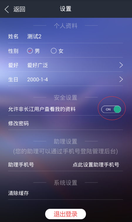
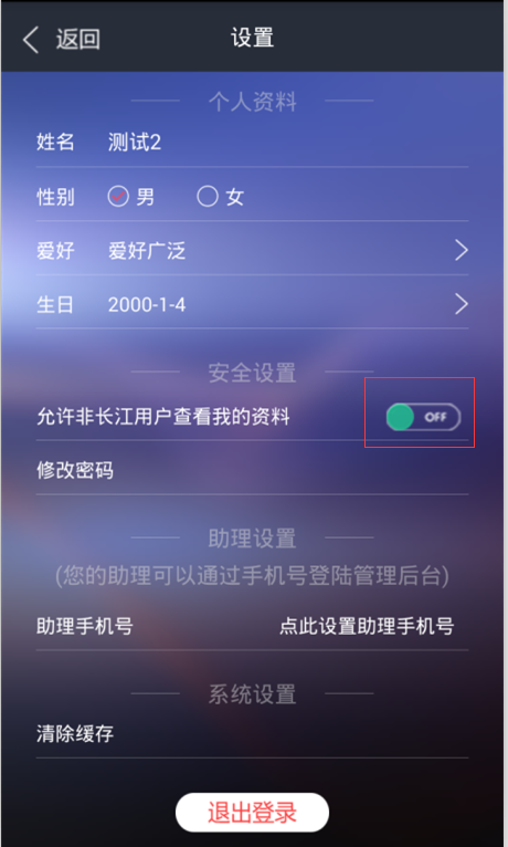
实现效果如图所示:
自定义的SwitchButton如下:
public class SwitchButton extends View implements View.OnTouchListener {
    private Bitmap bg_on, bg_off, slipper_btn;
    /**
     * 按下时的x和当前的x
     */
    private float downX, nowX;
    /**
     * 记录用户是否在滑动
     */
    private boolean onSlip = false;
    /**
     * 当前的状态
     */
    private boolean nowStatus = false;
    /**
     * 监听接口
     */
    private OnChangedListener listener;
    /*
    * 一个滑动的距离临界值,判断是滑动还是点击
    * getScaledTouchSlop():
    * Distance in pixels a touch can wander before we think the user is scrolling
    * */
    private  int mTouchSlop=new ViewConfiguration().getScaledTouchSlop();

    public SwitchButton(Context context) {
        super(context);
        init();
    }
    public SwitchButton(Context context, AttributeSet attrs) {
        super(context, attrs);
        init();
    }
    public void init(){
        //载入图片资源
        bg_on = BitmapFactory.decodeResource(getResources(), R.mipmap.switch_on_on);
        bg_off
最低0.47元/天 解锁文章


 898
898


 被折叠的 条评论
为什么被折叠?
被折叠的 条评论
为什么被折叠?
 到【灌水乐园】发言


