目前很多应用都有侧滑菜单,最初的侧滑菜单很多都有SildingMenu,相信很多人都用的很熟。Google推出了自己人侧滑菜单DrawerLayout,相信很多人已经在用了。这里记录一下DrawerLayout的使用。
DrawerLayout目前大体有两种形式吧。
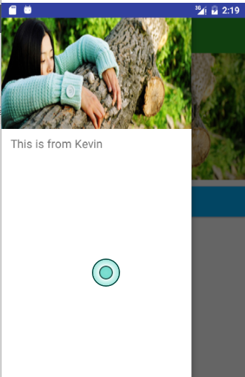
效果图
下面看一下效果图:


其实还有第三种效果,就是第一种的侧滑部分的状态栏加上。不过目前一般都是不带状态栏的,这样看起来效果会更好些。
两种效果其实写法都是一样的,只是ToolBar和DrawerLayout的布局位置不同而已。
布局代码
<?xml version="1.0" encoding="utf-8"?>
<android.support.v4.widget.DrawerLayout
    xmlns:android="http://schemas.android.com/apk/res/android"
    xmlns:app="http://schemas.android.com/apk/res-auto"
    xmlns:tools="http://schemas.android.com/tools"
    android:id="@+id/drawer_layout"
    android:layout_width="match_parent"
    android:layout_height="match_parent"
    android:fitsSystemWindows="true"
    <--这里一定要添加,否则状态栏颜色达不到你要的效果-->
    tools:context="com.student.kevin.drawerlayout.MainActivity">

    <LinearLayout
        android:layout_width="match_parent"
        android:layout_height="match_parent"
        android:orientation="vertical"
        >

        <android.support.v7.widget.Toolbar
            android:id="@+id/tool_bar"
            android:layout_width="match_parent"
            android:layout_height="?attr/actionBarSize"
            android:layout_marginTop="@dimen/topMargin"
            android:background="@color/green"></android.support.v7.widget.Toolbar>

//...这里略去其他布局代码

</android.support.v4.widget.DrawerLayout>
- 1
- 2
- 3
- 4
- 5
- 6
- 7
- 8
- 9
- 10
- 11
- 12
- 13
- 14
- 15
- 16
- 17
- 18
- 19
- 20
- 21
- 22
- 23
- 24
- 25
- 26
- 27
- 28
- 1
- 2
- 3
- 4
- 5
- 6
- 7
- 8
- 9
- 10
- 11
- 12
- 13
- 14
- 15
- 16
- 17
- 18
- 19
- 20
- 21
- 22
- 23
- 24
- 25
- 26
- 27
- 28
<?xml version="1.0" encoding="utf-8"?>
<LinearLayout xmlns:android="http://schemas.android.com/apk/res/android"
              android:layout_width="match_parent"
              android:layout_height="match_parent"
              android:orientation="vertical">

    <android.support.v7.widget.Toolbar
        android:id="@+id/tool_bar"
        android:layout_width="match_parent"
        android:layout_height="?attr/actionBarSize"
        android:layout_marginTop="@dimen/topMargin"
        android:background="@color/blue">      </android.support.v7.widget.Toolbar>

    <android.support.v4.widget.DrawerLayout
        android:id="@+id/drawer_layout"
        android:layout_width="match_parent"
        android:layout_height="match_parent">

        //...这里略去其他布局代码

    </android.support.v4.widget.DrawerLayout>
</LinearLayout>
- 1
- 2
- 3
- 4
- 5
- 6
- 7
- 8
- 9
- 10
- 11
- 12
- 13
- 14
- 15
- 16
- 17
- 18
- 19
- 20
- 21
- 22
- 1
- 2
- 3
- 4
- 5
- 6
- 7
- 8
- 9
- 10
- 11
- 12
- 13
- 14
- 15
- 16
- 17
- 18
- 19
- 20
- 21
- 22
当然,都是DrawerLayout+ToolBar,代码写法肯定是相同的。
代码
mToolbar = (Toolbar) findViewById(R.id.tool_bar)
mToolbar.setTitle("Kevin")
mToolbar.setTitleTextColor(ContextCompat.getColor(this, R.color.white))
setSupportActionBar(mToolbar)
getSupportActionBar().setDisplayHomeAsUpEnabled(true)
mDrawerLayout = (DrawerLayout) findViewById(R.id.drawer_layout)
mActionBarDrawerToggle = new ActionBarDrawerToggle(this, mDrawerLayout, mToolbar, R.string.drawer_layout_open, R.string.drawer_layout_close)
mActionBarDrawerToggle.setDrawerIndicatorEnabled(true)
mActionBarDrawerToggle.setHomeAsUpIndicator(R.mipmap.ic_launcher)
mActionBarDrawerToggle.syncState()
mDrawerLayout.setDrawerListener(mActionBarDrawerToggle)
mDrawerLayout.setStatusBarBackgroundColor(ContextCompat.getColor(this, R.color.green))
上面代码就是DrawerLayout的基本使用
实现效果一
但是只使用这样的话达不到效果一的效果的,不过可以实现效果二。
要想实现效果一,加代码^_^
添加代码
/**
* Created by Kevin on 2016/11/17.
* Blog:http://blog.csdn.net/student9128
* Description: this framelayout from the internet
*/
public class ScrimInsetsFrameLayout extends FrameLayout {
private Drawable mInsetForeground;
private Rect mInsets;
private Rect mTempRect = new Rect();
private OnInsetsCallback mOnInsetsCallback;
public ScrimInsetsFrameLayout(Context context) {
super(context);
init(context, null, 0);
}
public ScrimInsetsFrameLayout(Context context, AttributeSet attrs) {
super(context, attrs);
init(context, attrs, 0);
}
public ScrimInsetsFrameLayout(
Context context, AttributeSet attrs, int defStyle) {
super(context, attrs, defStyle);
init(context, attrs, defStyle);
}
private void init(Context context, AttributeSet attrs, int defStyle) {
final TypedArray a = context.obtainStyledAttributes(attrs,
R.styleable.ScrimInsetsView, defStyle, 0);
if (a == null) {
return;
}
mInsetForeground = a.getDrawable(
R.styleable.ScrimInsetsView_insetForeground);
a.recycle();
setWillNotDraw(true);
}
@Override
protected boolean fitSystemWindows(Rect insets) {
mInsets = new Rect(insets);
setWillNotDraw(mInsetForeground == null);
ViewCompat.postInvalidateOnAnimation(this);
if (mOnInsetsCallback != null) {
mOnInsetsCallback.onInsetsChanged(insets);
}
return true;
}
@Override
public void draw(Canvas canvas) {
super.draw(canvas);
int width = getWidth();
int height = getHeight();
if (mInsets != null && mInsetForeground != null) {
int sc = canvas.save();
canvas.translate(getScrollX(), getScrollY());
mTempRect.set(0, 0, width, mInsets.top);
mInsetForeground.setBounds(mTempRect);
mInsetForeground.draw(canvas);
mTempRect.set(0, height - mInsets.bottom, width, height);
mInsetForeground.setBounds(mTempRect);
mInsetForeground.draw(canvas);
mTempRect.set(
0,
mInsets.top,
mInsets.left,
height - mInsets.bottom);
mInsetForeground.setBounds(mTempRect);
mInsetForeground.draw(canvas);
mTempRect.set(
width - mInsets.right,
mInsets.top, width,
height - mInsets.bottom);
mInsetForeground.setBounds(mTempRect);
mInsetForeground.draw(canvas);
canvas.restoreToCount(sc);
}
}
@Override
protected void onAttachedToWindow() {
super.onAttachedToWindow();
if (mInsetForeground != null) {
mInsetForeground.setCallback(this);
}
}
@Override
protected void onDetachedFromWindow() {
super.onDetachedFromWindow();
if (mInsetForeground != null) {
mInsetForeground.setCallback(null);
}
}
/**
* Allows the calling container to specify a callback for custom
* processing when insets change (i.e. when {@link #fitSystemWindows(Rect)}
* is called. This is useful for setting padding on UI elements
* based on UI chrome insets (e.g. a Google Map or a ListView).
* When using with ListView or GridView, remember to set
* clipToPadding to false.
*/
public void setOnInsetsCallback(OnInsetsCallback onInsetsCallback) {
mOnInsetsCallback = onInsetsCallback;
}
public static interface OnInsetsCallback {
public void onInsetsChanged(Rect insets);
}
}
- 1
- 2
- 3
- 4
- 5
- 6
- 7
- 8
- 9
- 10
- 11
- 12
- 13
- 14
- 15
- 16
- 17
- 18
- 19
- 20
- 21
- 22
- 23
- 24
- 25
- 26
- 27
- 28
- 29
- 30
- 31
- 32
- 33
- 34
- 35
- 36
- 37
- 38
- 39
- 40
- 41
- 42
- 43
- 44
- 45
- 46
- 47
- 48
- 49
- 50
- 51
- 52
- 53
- 54
- 55
- 56
- 57
- 58
- 59
- 60
- 61
- 62
- 63
- 64
- 65
- 66
- 67
- 68
- 69
- 70
- 71
- 72
- 73
- 74
- 75
- 76
- 77
- 78
- 79
- 80
- 81
- 82
- 83
- 84
- 85
- 86
- 87
- 88
- 89
- 90
- 91
- 92
- 93
- 94
- 95
- 96
- 97
- 98
- 99
- 100
- 101
- 102
- 103
- 104
- 105
- 106
- 107
- 108
- 109
- 110
- 111
- 112
- 113
- 114
- 115
- 116
- 117
- 118
- 119
- 120
- 121
- 122
- 123
- 124
- 125
注:此类来自网上。
使用:怎么使用呢?直接在布局中添加此FrameLayout即可。
<?xml version="1.0" encoding="utf-8"?>
<android.support.v4.widget.DrawerLayout
    xmlns:android="http://schemas.android.com/apk/res/android"
    xmlns:app="http://schemas.android.com/apk/res-auto"
    xmlns:tools="http://schemas.android.com/tools"
    android:id="@+id/drawer_layout"
    android:layout_width="match_parent"
    android:layout_height="match_parent"
    android:fitsSystemWindows="true"
    tools:context="com.student.kevin.drawerlayout.MainActivity">

    <LinearLayout
        android:layout_width="match_parent"
        android:layout_height="match_parent"
        android:orientation="vertical"
        >

        <android.support.v7.widget.Toolbar
            android:id="@+id/tool_bar"
            android:layout_width="match_parent"
            android:layout_height="?attr/actionBarSize"
            android:layout_marginTop="@dimen/topMargin"
            android:background="@color/green"></android.support.v7.widget.Toolbar>

        <ImageView
            android:layout_width="match_parent"
            android:layout_height="wrap_content"
            android:scaleType="fitXY"
            android:src="@drawable/icon_two"/>

        <Button
            android:id="@+id/btn_next_page"
            android:layout_width="match_parent"
            android:layout_height="wrap_content"
            android:layout_marginTop="10dp"
            android:background="@color/blue"
            android:text="Click To Next Page"
            android:textAllCaps="false"
            android:textColor="@color/white"
            android:textSize="18sp"/>
    </LinearLayout>

    <com.student.kevin.drawerlayout.ScrimInsetsFrameLayout
        android:layout_width="300dp"
        android:layout_height="match_parent"
        android:layout_gravity="start"
        android:background="@color/white"
        android:fitsSystemWindows="true"
        >

        <LinearLayout
            android:layout_width="match_parent"
            android:layout_height="match_parent"
            android:orientation="vertical">

            <ImageView
                android:id="@+id/iv_menu_header"
                android:layout_width="match_parent"
                android:layout_height="wrap_content"
                android:scaleType="fitXY"
                android:src="@drawable/icon_two"/>

            <TextView
                android:id="@+id/tv_menu_item"
                android:layout_width="match_parent"
                android:layout_height="wrap_content"
                android:layout_marginLeft="15dp"
                android:layout_marginTop="10dp"
                android:text="@string/menu_tips"
                android:textSize="18sp"/>
        </LinearLayout>
    </com.student.kevin.drawerlayout.ScrimInsetsFrameLayout>
</android.support.v4.widget.DrawerLayout>
- 1
- 2
- 3
- 4
- 5
- 6
- 7
- 8
- 9
- 10
- 11
- 12
- 13
- 14
- 15
- 16
- 17
- 18
- 19
- 20
- 21
- 22
- 23
- 24
- 25
- 26
- 27
- 28
- 29
- 30
- 31
- 32
- 33
- 34
- 35
- 36
- 37
- 38
- 39
- 40
- 41
- 42
- 43
- 44
- 45
- 46
- 47
- 48
- 49
- 50
- 51
- 52
- 53
- 54
- 55
- 56
- 57
- 58
- 59
- 60
- 61
- 62
- 63
- 64
- 65
- 66
- 67
- 68
- 69
- 70
- 71
- 72
- 73
这个类的效果是让侧滑菜单的Menu区域延伸到状态栏。
不过同时还要在主题方面加设置,目前只能达到第三种效果,就是带有状态栏的,而且是默认的状态栏,如下图
主题设置:
在res/values-v21/styles中设置:
<style name="AppTheme" parent="Theme.AppCompat.Light.NoActionBar">
<!
<item name="android:windowDrawsSystemBarBackgrounds">true</item>
<item name="android:statusBarColor">@android:color/transparent</item>
<item name="drawerArrowStyle">@style/DrawerArrowStyle</item
</style>
好了这样就达到效果了。效果二和三就不用写了,因为效果一中减少一些设置就可以达到效果二和效果三了。
DrawerArrowToggle颜色和动画的设置
<style name="DrawerArrowStyle" parent="Widget.AppCompat.DrawerArrowToggle">
<item name="spinBars">true</item
<item name="color">@android:color/white</item
</style>
如果需要的话可以看看。:-)
有CSDN的可以下载一,没有的可以下载github。看方便喽
Demo下载


 298
298


 被折叠的 条评论
为什么被折叠?
被折叠的 条评论
为什么被折叠?
 到【灌水乐园】发言


