


最近更新时间:2017年10月29日14:50:47
做前端开发,熟悉了HTML+CSS+JS的开发模式,如果不看RN原理,直接用老一套的逻辑思维上手RN,可能会大跌眼镜。高效开发的前提,需要学习并理解RN的原理。本文主要记录内容是,关于RN开发的HTML层面上的问题。
1、RN的HTML
RN提供的组件(在HTML中叫标签)中常用的有:
View-视图容器,可用属性:style={[Styles.nav,{borderColor:'#0ff'}]}、onLayout={(event)=>{this.getViewInfo}}
getViewInfo(event){console.log(event.nativeEvent.layout.height)}//获取视图容器的宽高属性
Text-文本容器,可用属性:style={{textAlign:'center'}]}、numberOfLines={2}该组件设置固定宽度后超出的文字会在第二行的末尾以省略号的形式显示
TouchableOpacity-按钮/可触发点击事件的区域,可用属性:onPress={()=>{this.todo()}}、activeOpacity={1}点击触发后内容没有消隐效果
ScrollView和FlatList-滚动列表,属性较多,不罗列;
Image-图片容器,可用属性:source={require('.../.../img/top.png')}
Modal-模态框,可作为toast的无需操作2秒消失的警告或提示信息,也可作为有交互按钮的操作提示对话框;
2、RN的CSS
样式声明:const StylesComponent = StyleSheet.create({
text:{fontSize: 14},
textColor:{color:'#fff'}
});
样式使用的四种形式:
<Text style={StylesComponent.text}></Text>
<Text style={{color:'#fff'}}></Text>
<Text style={[StylesComponent.text,{color:'#fff'}]}></Text>
<Text style={[StylesComponent.text,StylesComponent.textColor]}></Text>
RN的盒子模型:box-sizing: border-box,width包括border和padding;
CSS属性的书写方式为驼峰式,如fontSize;
布局方式为flexbox,弹性盒子模型,在 React-Native 中的flexbox 是css3中flexbox的一个子集,并不支持所有的flexbox属性;关于更高级的布局方案,需要在实际项目中多练习多总结;
常用的CSS属性:官方给出的全部属性如下,
3、常规布局方案
需求一:如下图所示,右侧布局为flex布局,子元素水平布局,并且会每三个元素自动换行,两遍间距10px,中间间距16px;
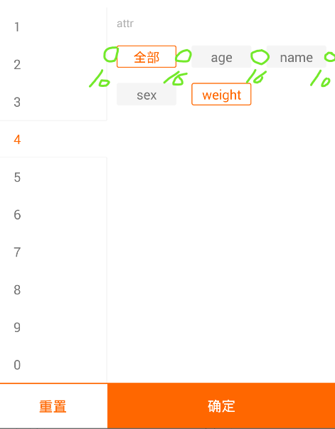
Label组件实现代码如下:
class Label extends Component{
constructor(props){
super(props);
this.state = {
selected: false
}
}
clicked(){
if(this.state.selected){
this.setState({
selected: false,
});
}else{
this.setState({
selected: true,
});
}
}
render(){
return(
<TouchableOpacity onPress={() => {this.clicked()}} activeOpacity={1}>
<View
style={{borderWidth:D(1), width:D(64), height:D(24), borderRadius:D(2), alignItems:'center', justifyContent:'center', marginTop:D(16),
backgroundColor: this.state.selected ? '#fff' : '#f5f5f5',
borderColor: this.state.selected ? '#ff6700' : '#f5f5f5',
marginRight: (this.props.index+1)%3 == 0 ? D(10) : D(16),
}}>
<Text style={{
color: this.state.selected ? '#ff6700' : '#757575',
}}>{this.props.item}</Text>
</View>
</TouchableOpacity>
)
}
}
4、maxWidth失效
布局如下,maxWidth失效:
<View style={{maxWidth:100}}>
<Text>123</Text>
</View>
改变方案如下,maxWidth生效:
<View style={{flexDirection:'row',justifyContent:'flex-start'}}>
<View style={{maxWidth:100}}><Text>123</Text><View>
</View>
生效原因,改变了主轴的方向,flex水平布局时maxWidth才会生效,但flex默认为垂直布局;
5、获取TextInput对象
<TextInput
onChange = {(e)=>{this.onChange(e)}}
ref={'textInput'}
/>
onChange(e){
console.log(e);//{eventCount:'',target:'',text:''}
}
6、获取组件的宽高和位置信息
react-native 获取组件的尺寸有两种方式:
第一种方式使用元素自身的onLayout属性去获取,但是这种方式有一个局限性,就是只有在初次渲染的时候才会触发这个函数,而且此种方法获取的是组件相对于父组件的位置坐标。
第二种方式,使用react-native中的findNodeHandle和UIManager来获取组件的尺寸;这里封装一个layout的函数,当我们需要获取组件的宽度和高度或者位置信息时,就可以通过调用这个函数去获取。
layout函数接受一个ref参数,这个参数表示组件的实例,传入组件的实例后,然后通过findNodeHandle方法获取组件节点。
UIManager.measure接受两个参数,第一个参数是通过findNodeHandle获取的组件节点,第二个参数是获取成功的回调,回调有6个参数:x,y表示组件的相对位置,width,height表示组件的宽度和高度,pageX,pageY表示组件相对于屏幕的绝对位置。
import { findNodeHandle, UIManager } from 'react-native';
<TextInput
onChange = {(e)=>{this.onChange(e)}}
ref={'textInput'}
/>
onChange(e){
this.layout(this.refs.textInput).then((item)=>{
console.log(item);//可以在then回调中同步获取数据{x,y,width,height,pageX,pageY}
})
}
layout(ref) {
const handle = findNodeHandle(ref);
return new Promise((resolve) => {
UIManager.measure(handle, (x, y, width, height, pageX, pageY) => {
resolve({x,y,width,height,pageX,pageY});
});
});
}
最后,关于更多布局上的交互实践动态布局问题,请查看我的博文React-Native开发总结-前端常规需求实现方案


 扫一扫
扫一扫
 5390
5390

 被折叠的 条评论
为什么被折叠?
被折叠的 条评论
为什么被折叠?
 到【灌水乐园】发言


