


概述
:nth-child(n) 选择器匹配属于其父元素的第 N 个子元素,不论元素的类型。
n 可以是数字、关键词或公式。
用法
1.每行显示3个盒子:nth-child(3n-1)
以375px设计稿为例,如果移动端,使用rem等缩放道理也一样
<!DOCTYPE html>
<html>
	<head>
		<meta charset="utf-8">
		<meta name="viewport" content="width=device-width, initial-scale=1.0, maximum-scale=1.0, user-scalable=no">
		<title>学习css</title>
		<style>
		html,body{
			margin:0;
			padding:0;
			font-size: 14px;
		}

		.flex{
			display: flex;
			align-items: center;
			flex-wrap: wrap;
			padding:0 10px;
		}
		.item{
			width:115px;
			height: 115px;
			margin-bottom: 5px;
			background-color: blue;
			color: #fff;
		}
		.item:nth-child(3n-1) {
			margin-left: 5px;
			margin-right: 5px;
			background-color: pink;
		}
		</style>
	</head>
	<body>
		<div class="flex">
			<div class="item">1</div>
			<div class="item">2</div>
			<div class="item">3</div>
			<div class="item">4</div>
			<div class="item">5</div>
			<div class="item">6</div>
		</div>
	</body>
</html>
运行效果

2.选择列表中的偶数标签 :nth-child(2n)
<!DOCTYPE html>
<html>
	<head>
		<meta charset="utf-8">
		<meta name="viewport" content="width=device-width, initial-scale=1.0, maximum-scale=1.0, user-scalable=no">
		<title>学习css</title>
		<style>
		html,body{
			margin:0;
			padding:0;
			font-size: 14px;
		}

		.flex{
			display: flex;
			align-items: center;
			flex-wrap: wrap;
			padding:0 10px;
		}
		.item{
			width:115px;
			height: 115px;
			margin-bottom: 5px;
			background-color: blue;
			color: #fff;
		}
		.item:nth-child(2n) {
			margin-left: 5px;
			margin-right: 5px;
			background-color: pink;
		}
		</style>
	</head>
	<body>
		<div class="flex">
			<div class="item">1</div>
			<div class="item">2</div>
			<div class="item">3</div>
			<div class="item">4</div>
			<div class="item">5</div>
			<div class="item">6</div>
		</div>
	</body>
</html>
运行效果
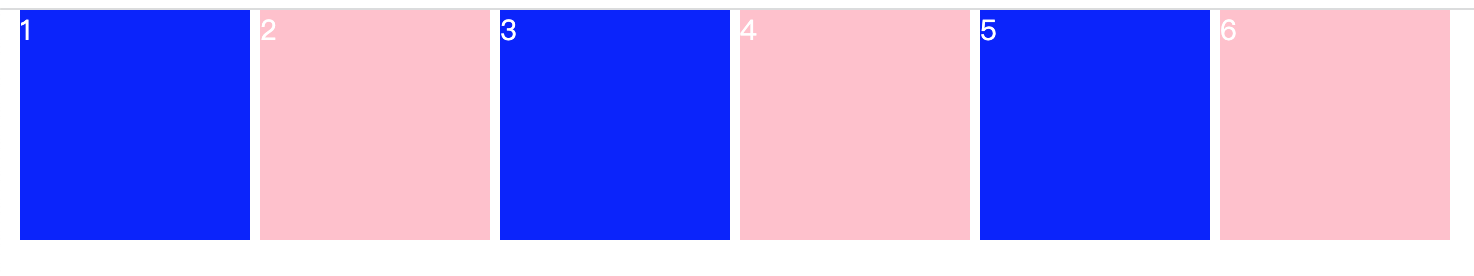
3.选择列表中的偶数标签 :nth-child(2n-1)
<!DOCTYPE html>
<html>
	<head>
		<meta charset="utf-8">
		<meta name="viewport" content="width=device-width, initial-scale=1.0, maximum-scale=1.0, user-scalable=no">
		<title>学习css</title>
		<style>
		html,body{
			margin:0;
			padding:0;
			font-size: 14px;
		}

		.flex{
			display: flex;
			align-items: center;
			flex-wrap: wrap;
			padding:0 10px;
		}
		.item{
			width:115px;
			height: 115px;
			margin-bottom: 5px;
			background-color: blue;
			color: #fff;
		}
		.item:nth-child(2n-1) {
			margin-left: 5px;
			margin-right: 5px;
			background-color: pink;
		}
		</style>
	</head>
	<body>
		<div class="flex">
			<div class="item">1</div>
			<div class="item">2</div>
			<div class="item">3</div>
			<div class="item">4</div>
			<div class="item">5</div>
			<div class="item">6</div>
		</div>
	</body>
</html>
运行效果

总结
:nth-child(n) 是css 一种 伪类选择器,主要用于匹配属于其父元素的第 N 个子元素,不论元素的类型,n 可以是表达式。
语雀地址:Css-:nth-child · 语雀


 531
531


 被折叠的 条评论
为什么被折叠?
被折叠的 条评论
为什么被折叠?
 到【灌水乐园】发言


