


CSS的position具有的值
position有如下四种值:
1. static:固定定位。为position的默认值。没有定位,元素按照其自有特性出现在正常的流中,对象占有文档空间。如块级元素换行显示;
2. absolute:绝对定位。相对于第一个非static定位的父元素进行定位。元素的位置通过”top”、”right”、”bottom”以及”left”进行定位。
3. relative:相对定位。相对于本元素在正常文档流中的位置进行定位。元素的位置通过”top”、”right”、”bottom”以及”left”进行定位。不过”top:10px”表示元素向下偏移10px。
4. fixed:固定定位。对象脱离正常文档流,使用top,right,bottom,left等属性以窗口为参考点进行定位,当出现滚动条时,对象不会随着滚动。而其层叠通过z-index属性定义。
在这里首先要明确几个概念:
- 标准文档流:指的是网页中元素按照其属性正常布局。行内元素(包括行内块级元素)从左到右,块级元素从上到下显示,这是传统HTML文档的文本布局。
- 盒子模型:盒子模型中的margin、border和padding属性。在这里特别指出一点,行内元素(inline)设置width和height是无效的,设置margin-top、margin-bottom和padding-top,padding-bottom也是没有作用的。
三种定位的作用
static定位
此种定位即是position的默认定位方式,元素按照其自有特性出现在正常的流中。设置top、bottom、left、right无效。
relative定位
相对定位相对于本元素在正常文档流中的位置进行定位。概念不好理解,我们通过几个例子来阐述。
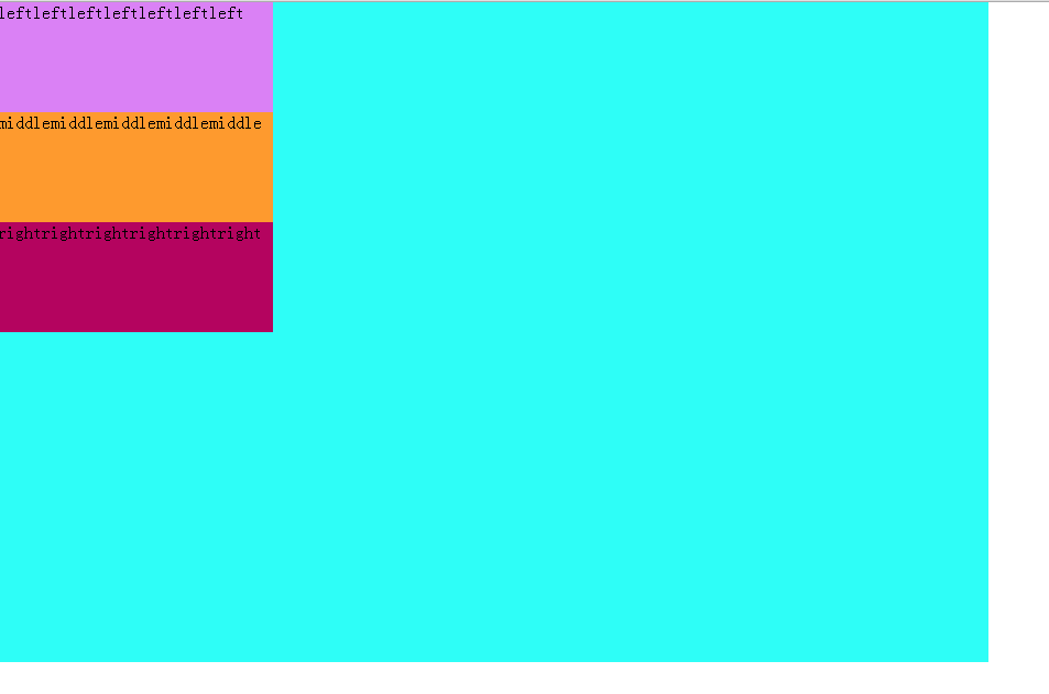
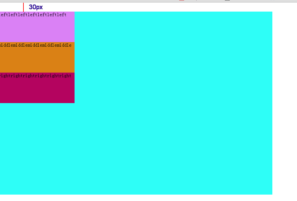
如下是正常文档流下的元素分布:
<!DOCTYPE <!DOCTYPE html>
<html>
<head>
    <meta http-equiv="Content-Type" content="text/html; charset=utf-8" />
    <style type="text/css">
    * {
        margin: 0;
        padding: 0;
    }
    .main {
        width: 900px;
        height: 600px;
        background-color: #2EFEF7;
    }
    .left {
        width: 250px;
        height: 100px;
        background-color: #DA81F5;
    }
    .middle {
        width: 250px;
        height: 100px;
        background-color: #FE9A2E;
    }
    .right {
        width: 250px;
        height: 100px;
        background-color: #B4045F;
    }
    </style>
</head>

<body>
    <div class="main">
        <p class="left">leftleftleftleftleftleftleft</p>
        <p class="middle">middlemiddlemiddlemiddlemiddle</p>
        <p class="right">rightrightrightrightrightright</p>
    </div>
</body>
</html>
此时显示的效果如下:
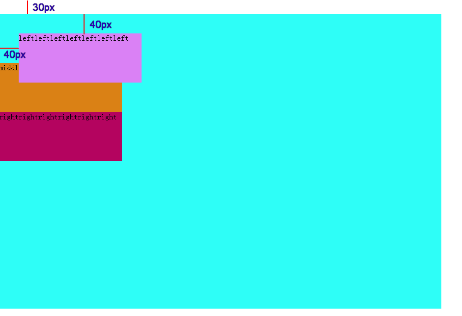
当设置left为相对定位时,代码如下:
.left {
    position: relative;
    top: 40px;
    left: 40px;
    width: 250px;
    height: 100px;
    background-color: #DA81F5;
}
此时显示的效果如下:
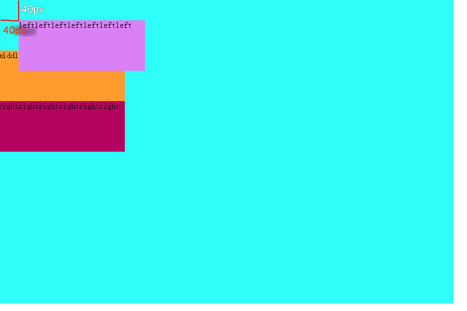
可见relative是相对于元素的本身位置进行偏移,relative定位遵循正常文档流,元素占据了文档空间,占据的文档空间不会随 top、right、left、bottom 等属性的偏移而发生变动,也就是说它后面的元素是依据left在相对定位之前的元素进行的定位,relative会使元素出现重叠现象。
而在relative定位下,margin会对元素定位产生什么影响呢?
.middle{
    position: relative;
    top: 40px;
    left: 40px;
    width: 250px;
    height: 100px;
    background-color: #DA81F5;
    margin-top: 30px;
    margin-left: 30px;
}
显示效果如下:
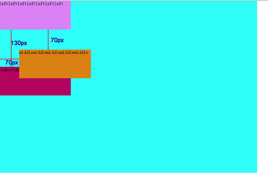
可见middle块的原始位置在margin作用下偏移了(right块向下偏移了),middle的当前块也因为margin块而偏移了。
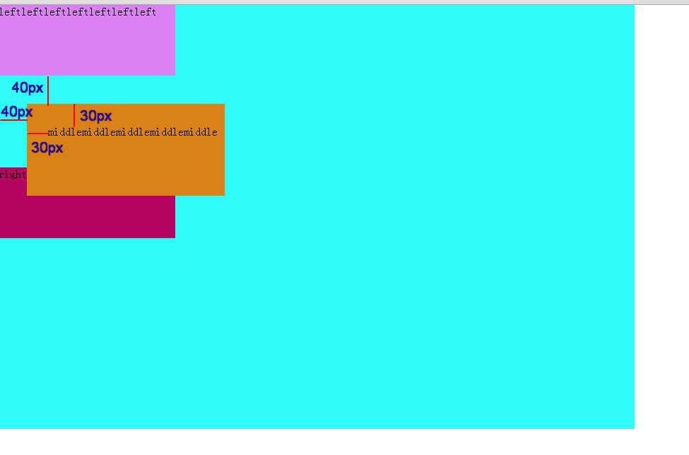
而padding是使块中的内容相对边框偏移,所以padding是起不到使块整体偏移的作用的。但是如果外边框设置为了display = visible或者没有块背景颜色的干扰,在视觉上的效果会出现块中的内容出现了偏移。但实际上块是没有偏移的。
代码:
.middle{
    position: relative;
    top: 40px;
    left: 40px;
    width: 250px;
    height: 100px;
    background-color: #DA81F5;
    margin-top: 30px;
    margin-left: 30px;
}
效果图:
但是为什么我一开始用left块做例子来演示relative定位,后面又用middle块做例子来演示relative下的margin呢?这里牵涉到一个概念:margin折叠
什么是外边框margin折叠?在CSS当中,相邻的两个盒子(可能是兄弟关系也可能是祖先关系)的外边距可以结合成一个单独的外边距。这种合并外边距的方式被称为折叠,并且因而所结合成的外边距称为折叠外边距。折叠的结果依据不同的情况有不同结果:
- 两个相邻的外边距都是正数时,折叠结果是它们两者之间较大的值。
- 两个相邻的外边距都是负数时,折叠结果是两者绝对值的较大值。
- 两个外边距一正一负时,折叠结果是两者的相加的和。
而产生折叠的条件必须是:margin必须是邻接的!!!
根据w3c规范,两个margin是邻接的必须满足以下条件:
- 必须是处于常规文档流(非float和绝对定位)的块级盒子,并且处于同一个BFC当中。
- 没有线盒,没有空隙(clearance,下面会讲到),没有padding和border将他们分隔开
- 都属于垂直方向上相邻的外边距。
具体情况可以是如下:
- 元素的margin-top与其第一个常规文档流的子元素的margin-top
- 元素的margin-bottom与其下一个常规文档流的兄弟元素的margin-top
- height为auto的元素的margin-bottom与其最后一个常规文档流的子元素的margin-bottom
- 高度为0并且最小高度也为0,不包含常规文档流的子元素,并且自身没有建立新的BFC的元素的margin-top和margin-bottom
而如果我使用了left块来作为例子讲解margin属性,会使main块向下移动30px。具体看如下代码:
<html>
<head>
    <meta http-equiv="Content-Type" content="text/html; charset=utf-8" />
    <style type="text/css">
    * {
        margin: 0;
        padding: 0;
    }
    .main {
        width: 900px;
        height: 600px;
        background-color: #2EFEF7;
    }
    .left {
        /*position: relative;
        top: 40px;
        left: 40px;*/
        width: 250px;
        height: 100px;
        background-color: #DA81F5;
        margin-top: 30px;
    }
    .middle{
        width: 250px;
        height: 100px;
        background-color: #DA8115;
    }
    .right {
        width: 250px;
        height: 100px;
        background-color: #B4045F;
    }
    </style>
</head>

<body>
    <div class="main">
        <p class="left">leftleftleftleftleftleftleft</p>
        <p class="middle">middlemiddlemiddlemiddlemiddle</p>
        <p class="right">rightrightrightrightrightright</p>
    </div>
</body>
</html>
此时效果图如下:
这印证了上述具体情况的第一条:元素的margin-top与其第一个常规文档流的子元素的margin-top。同样的,如果设置left的margin-bottom: 30px;同时设置middle的margin-top: 50px;,则在left和middle之间只会有50px的间距。原因见上述具体情况的第二条。
因此当设置left块如下时:
.left {
        position: relative;
        top: 40px;
        left: 40px;
        width: 250px;
        height: 100px;
        background-color: #DA81F5;
        margin-top: 30px;
    }
效果图如下:
其现象也就不足为怪了。
absolute定位
绝对定位会使元素脱离文档流,相对于第一个非static定位的父元素进行定位,不占用文档空间。其他元素会认为绝对定位的元素不存在于文档流中。
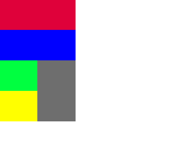
首先是没有设置绝对定位的情况(程序1):
<head>
    <meta http-equiv="Content-Type" content="text/html; charset=utf-8" />
    <style type="text/css">
    * {
        margin: 0;
        padding: 0;
    }
    .top {
        width: 250px;
        height: 100px;
        background-color: #DF013A;  /*红色*/
    }
    .middle {
        width: 250px;
        height: 100px;
        background-color: #0000FF;  /*蓝色*/
    }
    .bottom {
        width: 250px;
        height: 200px;
        background-color: #6E6E6E;   /*灰色*/
    }
    .bottom-one {
        /*position: absolute;
        top: 30px;
        left: 30px;*/
        width: 125px;
        height: 100px;
        background-color: #00FF40;  /*绿色*/
    }
    .bottom-two {
        width: 125px;
        height: 100px;
        background-color: #FFFF00;   /*黄色*/
    }
    </style>
</head>

<body>
    <p class="top"></p>
    <p class="middle"></p>
    <div class="bottom">
        <p class="bottom-one"></p>
        <p class="bottom-two"></p>
    </div>
</body>
</html>
此时的效果图:
在程序1的基础上设置(程序2):
.bottom-one {
        /*position: absolute;
        top: 30px;
        left: 30px;*/
        width: 125px;
        height: 100px;
        background-color: #00FF40;  /*绿色*/
    }
会发现:
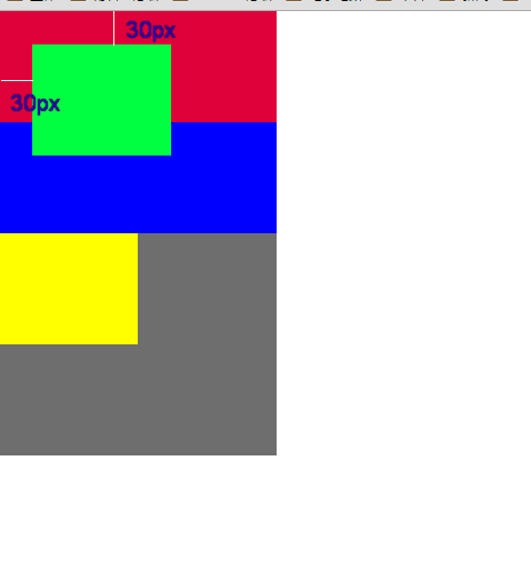
由于bottom-one块的第一个父级元素bottom是一个static定位(默认定位方式),因此还必须向上找父级元素,直到找到非static定位的父级元素(这里没有)或者body元素,此时就以body元素为基准定位。
而如果在程序1和2的基础上再增加bottom块的非static定位(程序3):
.bottom {
        position: relative;
        top: 0;
        left: 0;
        width: 250px;
        height: 200px;
        background-color: #6E6E6E;   /*灰色*/
    }
此时效果图如下:
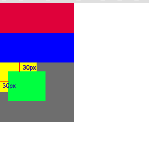
此时由于bottom-one的父元素bottom设置了非static定位(此处为relative),因此bottom-one向上寻找定位基准的父元素时,就是以bottom为基准了。
这里必须指出:使用absoulte或fixed定位的话,必须指定 left、right、 top、 bottom 属性中的至少一个,否则left/right/top/bottom属性会使用它们的默认值 auto ,这将导致对象遵从正常的HTML布局规则,在前一个对象之后立即被呈递,简单讲就是都变成relative,会占用文档空间。而如果top和bottom一同存在的话,那么只有top生效;如果left和right一同存在的话,那么只有left生效。
margin对position的影响:
.bottom {
        position: relative;
        top: 0;
        left: 0;
        width: 250px;
        height: 200px;
        background-color: #6E6E6E;   /*灰色*/
        margin-top: 50px;
        margin-left: 50px;
    }
此时bottom会向下和向右各偏移50px,bottom块中的bottom-one和bottom-two会和bottom块一起做整体移动。
而设置bottom的padding值:
.bottom {
        position: relative;
        top: 0;
        left: 0;
        width: 250px;
        height: 200px;
        background-color: #6E6E6E;   /*灰色*/
        padding-top: 50px;
        padding-left: 50px;
    }
效果图:
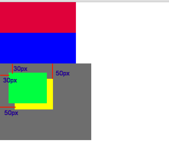
使得bottom中的子元素bottom-two相对边框移动50px,而绝对定位的bottom-one则不受影响,即absoulte是根据祖先类的border进行定位的。
fixed定位
fixed:对象脱离正常文档流,使用top,right,bottom,left等属性以窗口为参考点进行定位,当出现滚动条时,对象不会随着滚动。


 扫一扫
扫一扫
 3163
3163

 被折叠的 条评论
为什么被折叠?
被折叠的 条评论
为什么被折叠?
 到【灌水乐园】发言


