


1 Side Labelled Pie Chart
class pietests(_DrawingEditorMixin,Drawing):
    def __init__(self,width=400,height=200,*args,**kw):
        Drawing.__init__(self,width,height,*args,**kw)
        self._add(self,Pie(),name='pie',validate=None,desc=None)
        self.pie.sideLabels       = 1
        self.pie.labels           = ['Label 1', 'Label 2', 'Label 3', 'Label 4', 'Label 5']
        self.pie.data             = [20, 10, 5, 5, 5]
        self.pie.width            = 140
        self.pie.height           = 140
        self.pie.y                = 35
        self.pie.x                = 125

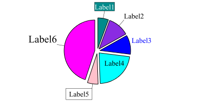
2 Customized Labels for Pie Chart
#Autogenerated by ReportLab guiedit do not edit
from reportlab.graphics.charts.piecharts import Pie
from reportlab.lib.colors import darkcyan, blue, cyan
from reportlab.graphics.charts.legends import Legend
from reportlab.graphics.shapes import Drawing, _DrawingEditorMixin
from reportlab.lib.styles import black, white
from reportlab.graphics.charts.textlabels import Label

class Drawing_000(_DrawingEditorMixin,Drawing):
    def __init__(self,width=400,height=200,*args,**kw):
        Drawing.__init__(self,width,height,*args,**kw)
        self._add(self,Pie(),name=None,validate=None,desc=None)

        # Set the size and location of the chart
        self.contents[0].width             = 120
        self.contents[0].height            = 120
        self.contents[0].y                 = 40
        self.contents[0].x                 = 130

        # Fill in the chart with sample data and labels
        self.contents[0].data              = [1, 2, 1.8, 4, 1, 8]
        self.contents[0].labels            = ['Label1','Label2','Label3','Label4','Label5','Label6','Label7']

        # Make the slices pop out and add a border to the slices
        self.contents[0].slices.popout                    = 5
        self.contents[0].slices.strokeWidth               = 1


        # Set the font size and position the label
        self.contents[0].slices.fontSize                  = 14
        self.contents[0].slices.labelRadius               = 1.25

        # Turn off simple labels so we can use customized labels
        self.contents[0].simpleLabels                     = 0
        # Define a simple pointer for all labels
        self.contents[0].slices.label_simple_pointer      = 1

        # Define a first label with a black border,
        # white text and dark cyan background
        self.contents[0].slices[0].label_boxStrokeColor   = black
        self.contents[0].slices[0].fontColor              = white
        self.contents[0].slices[0].label_boxFillColor     = darkcyan
        # Change the anchor point of the label box
        self.contents[0].slices[0].label_boxAnchor        = 's'

        # Turn off pointer for the third label, change the text color
        self.contents[0].slices[2].label_simple_pointer   = 0
        self.contents[0].slices[2].fontColor              = blue
        # and position it closer to the chart
        self.contents[0].slices[2].labelRadius            = 1.05

        # Turn off pointer for the fourth label
        # and position it within the chart
        self.contents[0].slices[3].label_simple_pointer  = 0
        self.contents[0].slices[3].labelRadius           = 0.25

        # Define a fifth label with a black border, text padding
        # and position it closer to the chart
        self.contents[0].slices[4].label_boxStrokeColor  = black
        self.contents[0].slices[4].label_height          = 22
        self.contents[0].slices[4].label_topPadding      = 2
        self.contents[0].slices[4].label_leftPadding     = 6
        self.contents[0].slices[4].label_rightPadding    = 6
        self.contents[0].slices[4].labelRadius           = 1.15

        # Change font size for the sixth label
        self.contents[0].slices[5].fontSize              = 20

if __name__=="__main__": #NORUNTESTS
    Drawing_000().save(formats=['png'],outDir='.',fnRoot=None)
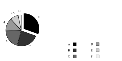
3 Simple Pie Chart
# Autogenerated by ReportLab guiedit do not edit
# this code was generated by Diagra, ReportLab Commercial drawing editor
# It took only few clicks to generate the code.
from reportlab.lib.pagesizes import cm, inch
from reportlab.graphics.charts.piecharts import Pie
from reportlab.graphics.charts.legends import Legend
from reportlab.lib.colors import Color, PCMYKColor
from reportlab.graphics.shapes import Drawing, _DrawingEditorMixin

class MyDrawing(_DrawingEditorMixin,Drawing):
    def __init__(self,width=400,height=200,*args,**kw):
        apply(Drawing.__init__,(self,width,height)+args,kw)
        self._add(self,Pie(),name='chart',validate=None,desc=None)
        self.chart.x                    = 20
        self.chart.y                    = (self.height-self.chart.height)/2
        self.chart.slices.strokeWidth   = 1
        self.chart.slices.popout        = 1
        self.chart.direction            = 'clockwise'
        self.chart.width                = self.chart.height
        self.chart.startAngle           = 90
        self.chart.slices[0].popout     = 10
        self._add(self,Legend(),name='legend',validate=None,desc=None)
        self.legend.x                   = width - 20
        self.legend.y                   = 0
        self.legend.boxAnchor           = 'se'
        self.legend.subCols[1].align    = 'right'
        # these data can be read from external sources
        data                = (9, 7, 6, 4, 2.5, 1.0)
        categories          = ('A','B','C','D','E','F',)
        colors              = [PCMYKColor(0,0,0,x) for x in (100,80,60,40,20,5)]
        self.chart.data     = data
        self.chart.labels   = map(str, self.chart.data)
        self.legend.colorNamePairs = zip(colors, categories)
        for i, color in enumerate(colors): self.chart.slices[i].fillColor  = color

if __name__=="__main__":
    drawing = MyDrawing()
    # you can do all sorts of things to drawing, lets just save it as pdf and png.
    drawing.save(formats=['pdf','png'],outDir='.',fnRoot=None)
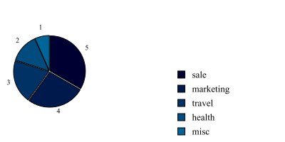
4 Just another ordinary pie chart
# Autogenerated by ReportLab guiedit do not edit
# this code was generated by Diagra, ReportLab Commercial drawing editor
# It took only few clicks to generate the code.
from reportlab.lib.pagesizes import cm, inch
from reportlab.graphics.charts.piecharts import Pie
from reportlab.graphics.charts.legends import Legend
from reportlab.lib.colors import Color, PCMYKColor
from reportlab.graphics.shapes import Drawing, _DrawingEditorMixin

class MyDrawing(_DrawingEditorMixin,Drawing):
    def __init__(self,width=400,height=200,*args,**kw):
        apply(Drawing.__init__,(self,width,height)+args,kw)
        self._add(self,Pie(),name='chart',validate=None,desc=None)
        self.chart.x                        = 20
        self.chart.y                        = (self.height-self.chart.height)/2
        self.chart.slices.strokeWidth       = 1
        self.chart.slices.popout            = 1
        self.chart.direction                = 'clockwise'
        self.chart.width                    = self.chart.height
        self.chart.startAngle               = 90
        self._add(self,Legend(),name='legend',validate=None,desc=None)
        self.legend.x                       = width - 20
        self.legend.y                       = 0
        self.legend.boxAnchor               = 'se'
        self.legend.subCols[1].align        = 'right'
        self.chart.height                   = 99
        self.chart.width                    = 99
        self.legend.alignment               = 'right'
        self.legend.columnMaximum           = 9
        self.legend.fontSize                = 13
        # these data can be read from external sources
        data = (5, 4, 3, 2, 1)
        categories = ('sale','marketing','travel','health','misc')
        colors = [PCMYKColor(100,50,30,x) for x in (50,40,30,20,10)]
        self.chart.data         = data
        self.chart.labels       = map(str, self.chart.data)
        self.legend.colorNamePairs = zip(colors, categories)
        for i, color in enumerate(colors): self.chart.slices[i].fillColor  = color

if __name__=="__main__": #NORUNTESTS
    MyDrawing().save(formats=['pdf','png'],outDir='.',fnRoot=None)
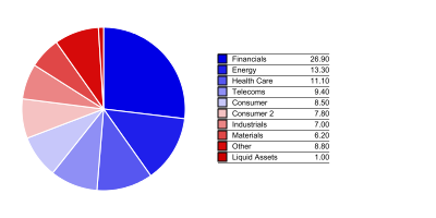
5 A breakdown pie chart
#Autogenerated by ReportLab guiedit do not edit
from reportlab.graphics.charts.piecharts import Pie
from reportlab.lib.colors import black, red, purple, green, maroon, brown, pink, white, HexColor
from reportlab.graphics.charts.legends import Legend
from reportlab.graphics.shapes import Drawing, _DrawingEditorMixin
from reportlab.lib.validators import Auto
from reportlab.lib.colors import HexColor, black

pdf_chart_colors = [
        HexColor("#0000e5"),
        HexColor("#1f1feb"),
        HexColor("#5757f0"),
        HexColor("#8f8ff5"),
        HexColor("#c7c7fa"),
        HexColor("#f5c2c2"),
        HexColor("#eb8585"),
        HexColor("#e04747"),
        HexColor("#d60a0a"),
        HexColor("#cc0000"),
        HexColor("#ff0000"),
        ]

def setItems(n, obj, attr, values):
    m = len(values)
    i = m // n
    for j in xrange(n):
        setattr(obj[j],attr,values[j*i % m])

class BreakdownPieDrawing(_DrawingEditorMixin,Drawing):
    def __init__(self,width=400,height=200,*args,**kw):
        apply(Drawing.__init__,(self,width,height)+args,kw)
        # adding a pie chart to the drawing
        self._add(self,Pie(),name='pie',validate=None,desc=None)
        self.pie.width                  = 150
        self.pie.height                 = self.pie.width
        self.pie.x                      = 20
        self.pie.y                      = (height-self.pie.height)/2
        self.pie.data = [26.90,13.30,11.10,9.40,8.50,7.80,7.00,6.20,8.80,1.00]
        self.pie.labels = ['Financials','Energy','Health Care','Telecoms','Consumer','Consumer 2','Industrials','Materials','Other','Liquid Assets']
        self.pie.simpleLabels           = 1
        self.pie.slices.label_visible   = 0
        self.pie.slices.fontColor       = None
        self.pie.slices.strokeColor     = white
        self.pie.slices.strokeWidth     = 1
        # adding legend
        self._add(self,Legend(),name='legend',validate=None,desc=None)
        self.legend.x               = 200
        self.legend.y               = height/2
        self.legend.dx              = 8
        self.legend.dy              = 8
        self.legend.fontName        = 'Helvetica'
        self.legend.fontSize        = 7
        self.legend.boxAnchor       = 'w'
        self.legend.columnMaximum   = 10
        self.legend.strokeWidth     = 1
        self.legend.strokeColor     = black
        self.legend.deltax          = 75
        self.legend.deltay          = 10
        self.legend.autoXPadding    = 5
        self.legend.yGap            = 0
        self.legend.dxTextSpace     = 5
        self.legend.alignment       = 'right'
        self.legend.dividerLines    = 1|2|4
        self.legend.dividerOffsY    = 4.5
        self.legend.subCols.rpad    = 30
        n = len(self.pie.data)
        setItems(n,self.pie.slices,'fillColor',pdf_chart_colors)
        self.legend.colorNamePairs = [(self.pie.slices[i].fillColor, (self.pie.labels[i][0:20], '%0.2f' % self.pie.data[i])) for i in xrange(n)]

if __name__=="__main__": #NORUNTESTS
    drawing = BreakdownPieDrawing()
    # the drawing will be saved as pdf and png below, you could do other things with it obviously.
    drawing.save(formats=['pdf','png'],outDir='.',fnRoot=None)
例子转自:http://www.reportlab.com/snippets/


 1728
1728

 被折叠的 条评论
为什么被折叠?
被折叠的 条评论
为什么被折叠?
 到【灌水乐园】发言


