


JavaFX中控件的边框也可以进行设置。主要有两种方式,一种是Java方式,一种是CSS方式。
JavaFX中控件继承自Region类。setBorder方法用来设置边框属性。
// The border of the Region, which is made up of zero or more BorderStrokes, and zero
// or more BorderImages. It is possible for a Border to be empty, where it has neither
// strokes nor images, and is semantically equivalent to null.
public final void setBorder(Border value)
边框类Border是一个不可变的对象,它封装了渲染区域边框所需的全部数据集。由于该类是不可变的,因此可以在多个不同的 "区域 "中自由重复使用相同的边框。
class Border {

    // 四个构造函数。
    public Border(List<BorderStroke> strokes, List<BorderImage> images);

    public Border(BorderStroke[] strokes, BorderImage[] images);

    public Border(BorderStroke... strokes);

    public Border(BorderImage... images);
}
每个边框类Border都由笔画BorderStoke和/或图像组成。两个列表都不会为空,但其中一个或两个都可能为空。在渲染时,如果没有指定图像或没有图像加载成功,那么所有笔画都将按顺序渲染。如果指定了任何图像且加载成功,则不会绘制任何笔画,但这些笔画仍会对边框的内侧和外侧产生影响。
class BorderStroke {
    public BorderStroke(Paint stroke,
                        BorderStrokeStyle style,
                        CornerRadii radii,
                        BorderWidths widths);

    public BorderStroke(Paint stroke,
                        BorderStrokeStyle style,
                        CornerRadii radii,
                        BorderWidths widths,
                        Insets insets);

    public BorderStroke(Paint topStroke,
                        Paint rightStroke,
                        Paint bottomStroke,
                        Paint leftStroke,
                        BorderStrokeStyle topStyle,
                        BorderStrokeStyle rightStyle,
                        BorderStrokeStyle bottomStyle,
                        BorderStrokeStyle leftStyle,
                        CornerRadii radii,
                        BorderWidths widths,
                        Insets insets);
}

    topStroke - The fill to use on the top. If null, defaults to Color.BLACK.
    rightStroke - The fill to use on the right. If null, defaults to the same value as topStroke.
    bottomStroke - The fill to use on the bottom. If null, defaults to the same value as topStroke.
    leftStroke - The fill to use on the left. If null, defaults to the same value as rightStroke.
    topStyle - The style to use on the top. If null, defaults to BorderStrokeStyle.NONE.
    rightStyle - The style to use on the right. If null, defaults to the same value as topStyle.
    bottomStyle - The style to use on the bottom. If null, defaults to the same value as topStyle.
    leftStyle - The style to use on the left. If null, defaults to the same value as rightStyle.
    radii - The radii. If null, defaults to square corners by using CornerRadii.EMPTY.
    widths - The thickness of each side. If null, defaults to DEFAULT_WIDTHS.
    insets - The insets indicating where to draw the border relative to the region edges. If null, defaults to Insets.EMPTY.
定义边框的描边类BorderStroke,用于为区域设计样式。描边是一种基于矢量的渲染,用于勾勒边框区域的轮廓。它可以从 Region 的边缘嵌入(或外移),在计算 Region 的嵌入(用于定义内容区域)时,会考虑到描边的值。在使用任何边框图像时,都不会使用描边视觉效果。
BorderStrokeStyle:定义 BorderStroke 一侧使用的描边样式。有几种预定义的样式,不过这些预定义样式的属性可能与最终绘制它们时使用的设置不一致。您也可以创建一个新的 BorderStrokeStyle,然后手动定义每个描边设置,这与任何形状类似。注:BorderStrokeStyle.NONE是默认值,设置边框不显示。
具体示例:
package javafx8.ch10;
import javafx.application.Application;
import javafx.geometry.Rectangle2D;
import javafx.scene.Scene;
import javafx.scene.layout.Border;
import javafx.scene.layout.BorderStroke;
import javafx.scene.layout.BorderStrokeStyle;
import javafx.scene.layout.BorderWidths;
import javafx.scene.layout.CornerRadii;
import javafx.scene.layout.Pane;
import javafx.scene.paint.Paint;
import javafx.stage.Screen;
import javafx.stage.Stage;
/**
* @copyright 2003-2023
* @package javafx8.ch10
* @file BorderTest.java
* @date 2023-10-16 15:47
* @author qiao wei
* @version 1.0
* @brief 测试控件边框设置。
* @history
*/
public class BorderTest extends Application {
public BorderTest() {}
@Override
public void start(Stage primaryStage) throws Exception {
start02(primaryStage).show();
}
public static void main(String[] args) {
Application.launch(BorderTest.class, args);
}
/**
* @class BorderTest
* @date 2023-10-16 16:13
* @author qiao wei
* @version 1.0
* @brief 创建Stage。边框设置不做任何设置。
* @param primaryStage 主窗体。
* @return 修改后的主窗体primaryStage。
* @throws
*/
private Stage start01(Stage primaryStage) {
Pane pane = new Pane();
// 设置pane尺寸。
Rectangle2D screenRectangle = Screen.getPrimary().getBounds();
double screenWidth = screenRectangle.getWidth();
double screenHeight = screenRectangle.getHeight();
pane.setPrefSize(screenWidth / 3, screenHeight / 3);
primaryStage.setScene(new Scene(pane));
primaryStage.setTitle("添加Pane,对边框不做任何设置");
return primaryStage;
}
/**
* @class BorderTest
* @date 2023-10-16 17:37
* @author qiao wei
* @version 1.0
* @brief
* @param
* @return
* @throws
*/
private Stage start02(Stage primaryStage) {
Pane pane = new Pane();
// 设置pane尺寸。
Rectangle2D screenRectangle = Screen.getPrimary().getBounds();
double screenWidth = screenRectangle.getWidth();
double screenHeight = screenRectangle.getHeight();
pane.setPrefSize(screenWidth / 3, screenHeight / 3);
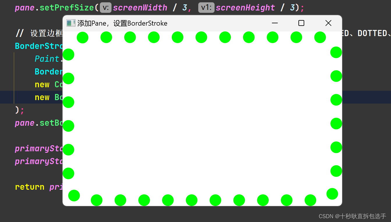
// 设置边框画笔。BorderStrokeStyle字段设置绘制边框,NONE不显示边框,DASHED、DOTTED、SOLD是预定义的边框。
BorderStroke borderStroke = new BorderStroke(
Paint.valueOf("#00FF00"),
BorderStrokeStyle.DOTTED,
new CornerRadii(30),
new BorderWidths(20)
);
pane.setBorder(new Border(borderStroke));
primaryStage.setScene(new Scene(pane));
primaryStage.setTitle("添加Pane,设置BorderStroke");
return primaryStage;
}
}
start01方法结果:

start02方法结果:


 2744
2744


 被折叠的 条评论
为什么被折叠?
被折叠的 条评论
为什么被折叠?
 到【灌水乐园】发言


