


mint ui基础界面
重点 (Top highlight)
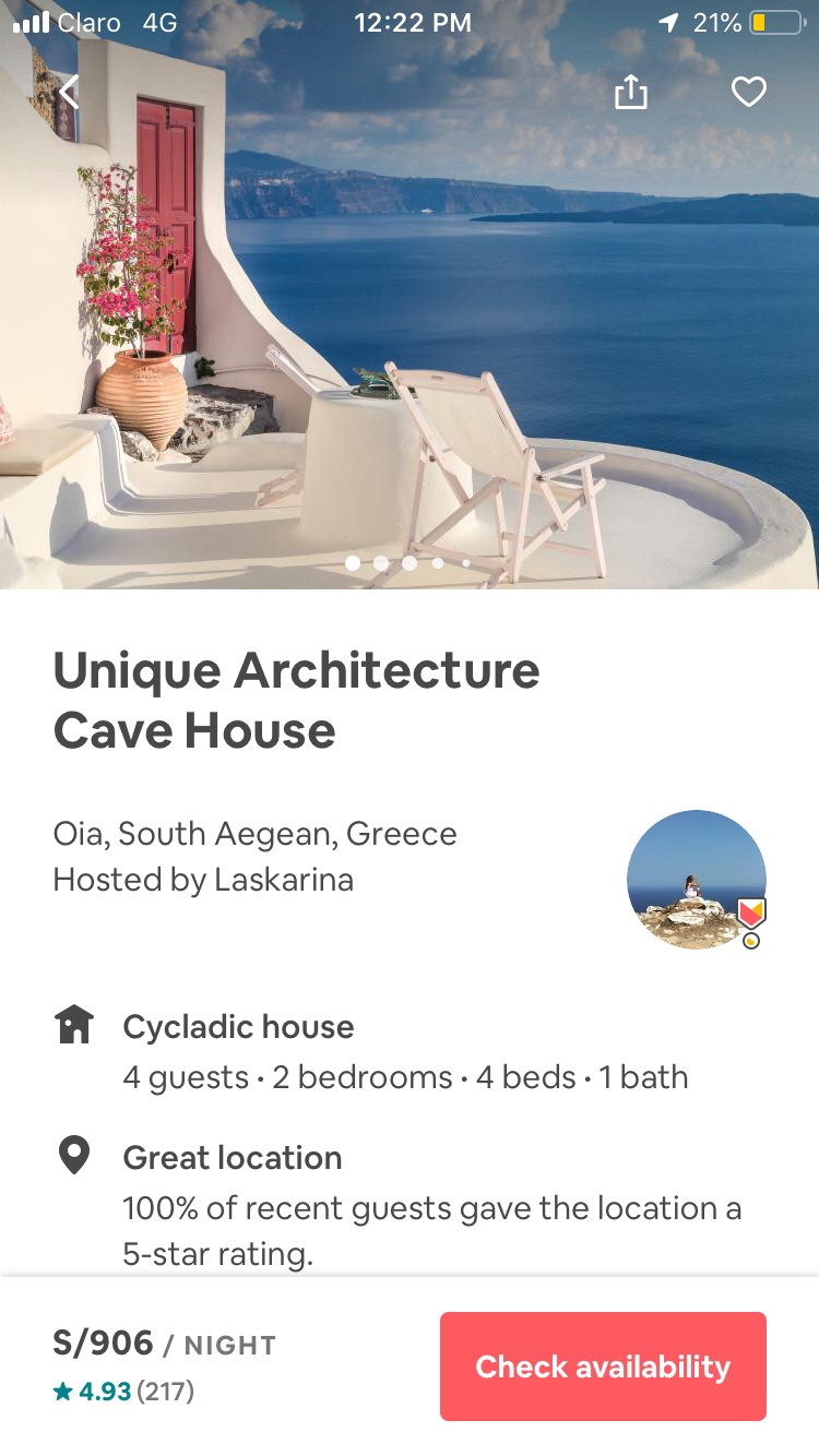
Visual hierarchy is the order in which the user process information by importance. In interface design, like in any other form of design, this concept is necessary to be functional at sight. With the correct use of hierarchy, the mind can group and prioritize elements to give them a specific order, which facilitates the understanding of what you want to communicate and the sense of achievement by the user.
V isual层次是顺序,其中由重要性用户进程的信息。 在界面设计中,就像任何其他形式的设计一样,此概念对于在外观上起作用是必不可少的。 通过正确使用层次结构,头脑可以对元素进行分组和优先级排序,以赋予它们特定的顺序,从而有助于您理解要交流的内容以及用户的成就感。
A regular problem in interface design is the excessive use of elements or components scattered on the screen, which if not placed through a correct hierarchy, generate disorder and greater effort in navigation. The exercise of prioritizing these elements is important to avoid this problem.
界面设计中经常遇到的问题是过多地使用了分散在屏幕上的元素或组件,如果未按正确的层次放置这些元素或组件,则会导致混乱并导致导航工作量更大。 对这些元素进行优先级排序对于避免此问题很重要。
The average user tends to “scan” the entire content of a screen. Therefore, the highlights should give a clear idea of what the website or application is about.
一般用户倾向于“扫描”屏幕的整个内容。 因此,重点应该清楚地说明网站或应用程序的内容。
This prioritization should not only be treated as an aesthetic problem, but also as an important part of the user experience. Many of the elements included, especially in mobile devices, will be relevant to site navigation. While the hierarchy in graphic design has existed for years, the constant interaction factor is added to the UI design. The fact that users interact with the elements makes it more relevant to design an intuitive interface.
这种优先次序不仅应被视为美学问题,而且应被视为用户体验的重要组成部分。 其中包括的许多元素(尤其是在移动设备中)将与站点导航相关。 尽管图形设计中的层次结构已经存在多年,但不断交互的因素已添加到UI设计中。 用户与元素交互的事实使设计直观的界面更加相关。
There are seven resources that must be taken into account to create a correct hierarchy:
创建正确的层次结构必须考虑七种资源:
尺寸 (Size)
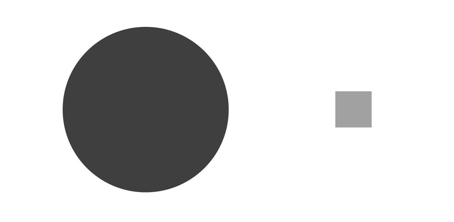
The larger the element, the more it will attract attention. It is a fact that people first see larger objects, and this includes text and images. The idea behind the use of size hierarchy is to give a focal point to start the visual journey.
元素越大,越会引起注意。 人们首先看到较大的物体是事实,其中包括文本和图像。 使用大小层次结构背后的想法是为开始视觉之旅提供一个焦点。
If the jump from one text to another is smaller, say from 32pt to 24pt, it can make the reading order more difficult when sending two messages at the same time. This may not be a big problem, but you should keep in mind that this could create a less efficient hierarchy.
如果从一个文本到另一个文本的跳跃较小,例如从32pt到24pt,则当同时发送两条消息时,阅读顺序会变得更加困难。 这可能不是一个大问题,但是您应该记住,这可能会创建效率较低的层次结构。
It is equally unnecessary that the important elements were too large. Creating an unnecessary imbalance can end up overshadowing the rest of the design and cause other information to get lost in the reading. Like everything else in design, balance is the key.
同样没有必要将重要元素太大。 造成不必要的不平衡可能最终使设计的其余部分黯然失色,并使其他信息在阅读中丢失。 像设计中的所有其他内容一样,平衡是关键。
颜色 (Color)
Bright colors stand out more than muted tones. Color is a powerful visual resource, its proper use can effectively separate the elements in a screen to prioritize or depriorize them. In interface design, often the strongest color is for interaction, because of the user’s need to take action or receive feedback from the system.
鲜艳的色彩比柔和的色调更加突出。 颜色是一种强大的视觉资源,它的正确使用可以有效地将屏幕中的元素分开,以对它们进行优先排序或降低优先级。 在界面设计中,通常最强的颜色是用于交互,因为用户需要采取措施或从系统接收反馈。
There are three ways to create hierarchy using color:
有三种使用颜色创建层次结构的方法:
Hue: Some colors stand out over others. The color tone can create several types of conflict for human eyesight, red versus green, blue versus yellow or turquoise versus brown.
色相:某些颜色优于其他颜色。 色调可能会为人类的视力造成几种冲突,红色与绿色,蓝色与黄色或绿松石与棕色会产生冲突。
Saturation: Saturated colors stand out more than gray colors. Grays and their scales always tend to be relegated by colors of great saturation, which even give the user more sense of closeness. The use of red on a gray background is an example.
饱和度:饱和色比灰色更突出。 灰色及其标度总是倾向于饱和度高的颜色,这甚至给用户带来更亲近的感觉。 例如,在灰色背景上使用红色。
Brightness: Bright colors stand out over dark ones and vice versa. Playing with bright elements on dark backgrounds creates an immediate hierarchy, this also applies when we have a white background and some dark elements.
亮度:明亮的颜色比深色的颜色突出,反之亦然。 在深色背景上玩明亮的元素会立即建立层次结构,当我们有白色背景和一些深色元素时,这也适用。
It is important to know that the abuse of color can end up confusing the user, since it creates the illusion that everything is important in the composition. The idea of hierarchy, on the other hand, starts from the idea of orienting oneself on what is most relevant as opposed to what is not.
重要的是要知道,滥用颜色会最终使用户感到困惑,因为这会产生一种幻觉,即一切对构图都很重要。 另一方面,等级制度的思想始于将自己定位于最相关的事物而不是最不相关的事物。
接近 (Proximity)
Elements close to each other attract more attention than distant elements. Making groups using distance is a very viable resource when creating a reading order. Human sight tends to categorize elements, therefore, making this aggrupations basically facilitates the mental work of the user.
彼此靠近的元素比远处的元素吸引更多的注意力。 创建阅读顺序时,使用距离进行分组是非常可行的资源。 人的视力倾向于对元素进行分类,因此,使这种粘合基本上有助于用户的脑力劳动。
Proximity is therefore the grouping of objects in a design to create connections and associations. When things are closer, it usually means they must be related. If things are further away, it should mean that they may not be related. In short, proximity creates these relationships and brings organization and hierarchy to information.
因此,邻近度是设计中对象的分组,以创建连接和关联。 当事情接近时,通常意味着它们必须相关。 如果事情离得更远,则意味着它们可能不相关。 简而言之,接近会创建这些关系,并将组织和层次结构带入信息。
对准 (Alignment)
Any element that separates from the alignment of the others will attract attention. This is because alignment creates order between the elements, any change in this rule will be interesting to human sight and will therefore stand out considerably.
任何与其他对齐方式分开的元素都将引起关注。 这是因为对齐会在元素之间创建顺序,因此此规则的任何更改对于人类来说都是很有趣的,因此会非常突出。
Alignment of elements is very important to create visual coherence in the design of an interface, as it allows to assign relevance to the elements on the screen and also establish the beginning and end of specific elements, either interactive or informative.
元素的对齐对于在界面设计中创建视觉连贯性非常重要,因为它可以为屏幕上的元素分配相关性,还可以确定交互式或信息性特定元素的开头和结尾。
The human brain loves patterns, that’s why many of the best websites are symmetrical. This gives us the opportunity to break this rule to strategically call the user’s attention to a specific point. A user will be able to associate these elements according to their alignment or misalignment.
人类的大脑喜欢模式,这就是为什么许多最好的网站都是对称的。 这使我们有机会打破此规则,从策略上将用户的注意力吸引到特定点。 用户将能够根据它们的对齐或未对齐来关联这些元素。
重复 (Repetition)
Repeated styles give the impression that the elements are related. This type of hierarchy consists of reusing the same or similar elements in an interface. Repetition also gives some preponderance based on visual patterns. If something is repeated, it is because is important.
重复的样式给人以元素相关的印象。 这种层次结构包括在接口中重用相同或相似的元素。 重复还基于视觉模式提供了一些优势。 如果重复某件事,那是因为很重要。
In interface design, repetition creates a sense of unity and consistency throughout the experience. For example, in this Medium article, the subtitles (h2) are marked with a repeated style, the use of bold and a larger font size give the user a sense of orientation and hierarchy based on repetition. We must know that human nature finds comfort in familiarity.
在界面设计中,重复会在整个体验过程中产生团结一致的感觉。 例如,在此“中型”文章中,字幕(h2)用重复的样式标记,粗体的使用和较大的字体大小为用户提供了基于重复的方向感和层次感。 我们必须知道,人性会在熟悉中找到安慰。
负空间 (Negative space)
The more space around the element, the more attention it generates. The negative space is the area where the empty canvas is shown, this can be found not only around, but between and inside the same element. It is not proper to a single color, but adopts the color of the background to give the illusion of space.
元素周围的空间越大,它产生的注意力就越多。 负空间是显示空白画布的区域,不仅可以在同一元素的周围而且可以在同一元素之间和内部找到。 它不适用于单一颜色,而是采用背景色来营造出空间感。
While some designers may think more is better, the visual perception is very different. Designs with a large load of closed elements cause the interface to be saturated and without a hierarchy indicating which element is more important, causing confusion and a sense of overwhelm on the part of the user.
尽管有些设计师可能认为更好是更好,但视觉感受却大不相同。 具有大量封闭元素的设计会导致界面饱和,并且没有层次结构指示哪个元素更重要,从而给用户带来混乱和不知所措的感觉。
The idea is that the more important the element, the more negative space there is around it. Isolating one element from the others is not only an elegant resource to create hierarchy, but also serves to give the design a support structure. That is to say, it creates the necessary spaces so that the view can pass from one element to another in a fluid way and without visual noise.
这个想法是,元素越重要,周围的负空间就越大。 将一个元素与另一个元素分离不仅是创建层次结构的一种优雅资源,而且还可以为设计提供支持结构。 也就是说,它创建了必要的空间,以便视图可以流畅地从一个元素传递到另一个元素,而没有视觉噪音。
质地 (Texture)
Varied and complex textures attract more attention than flat ones. The flat surface of a wall will stand out less than the surface of a pavement. This is because complexity will always attract more user attention than minimalism. The use of textures also incorporates other important design elements such as style and atmosphere.
多样而复杂的纹理比平坦的纹理更引人注目。 墙壁的平坦表面将比人行道表面突出。 这是因为复杂性总是比简单性吸引更多的用户注意。 纹理的使用还结合了其他重要的设计元素,例如风格和氛围。

This resource should be used in a dosed manner, as the abuse of textures will end up distracting rather than informing or perhaps leading to unnecessary squeumorphism. Textures tend to overlap other hierarchical resources, including size, so you must take into account the entire composition and everything the user will see on the screen of their device before incorporating texturized elements. Again, balance is the key.
此资源应按一定剂量使用,因为纹理的滥用最终会分散注意力,而不是告知或可能导致不必要的压缩。 纹理往往会与其他分层资源(包括大小)重叠,因此在合并纹理化元素之前,您必须考虑整个合成以及用户在设备屏幕上看到的所有内容。 同样,平衡是关键。
When a design does not have a clear visual hierarchy, the user’s navigation is forced into other forms of reading, such as F and Z patterns. As designers, we can reinforce these patterns or break them to find more dynamic forms of communication. In UI design, nothing is just aesthetic, and the visual hierarchy is undoubtedly one of the best weapons we have for directing the user experience, re-powering design standards and offering a direct path to interface objectives.
当设计没有清晰的视觉层次时,用户的导航将被迫进入其他形式的阅读,例如F和Z模式。 作为设计师,我们可以加强这些模式或打破它们,以找到更多动态的交流形式。 在UI设计中,没有什么仅仅是美感,视觉层次无疑是我们拥有的最好的武器,它可以用来指导用户体验,重新设计标准并提供直接实现界面目标的途径。
Thank you for reading.
感谢您的阅读。
翻译自: https://medium.com/swlh/fundamentals-of-hierarchy-in-interface-design-ui-ba8e3017dceb
mint ui基础界面


 266
266


 被折叠的 条评论
为什么被折叠?
被折叠的 条评论
为什么被折叠?
 到【灌水乐园】发言


