


交互设计 超越人机交互
重点 (Top highlight)
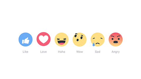
A few weeks ago, after a lot of persuading from his friends and kids, my not so tech-savvy grandad joined Facebook. Finally. As I was teaching him setting up the profile, creating posts, & following pages, he came across one of the funny memes floating around and somehow stumbled upon the famous LIKE button. He hovered over the like button, 6 emojis popped up, & he clicked on the HAHA smiley which left him in awe of the tiny animation. This is how powerful a micro-interaction can be for a product or an app.
几个星期前,有很多来自他的朋友和孩子们说服后,我没有那么精通技术的爷爷加入了Facebook。 最后。 在我教他设置个人资料,创建帖子和后续页面时,他遇到了一个有趣的模因,周围漂浮着,偶然地偶然发现了著名的LIKE按钮。 他将鼠标悬停在“赞”按钮上,弹出了6个表情符号,然后单击“ HAHA”笑脸,这使他对这个小动画感到敬畏。 这就是微交互对产品或应用程序的强大功能。
We as consumers, see and interact with these micro-interactions on a daily basis even without knowing. A ‘Like’ button is one of the simplest examples. Few others are:
作为消费者,我们每天都在不知不觉中看到并与这些微交互进行交互。 “喜欢”按钮是最简单的示例之一。 其他几个是:
A simple scroll bar that appears as you scroll the mouse
滚动鼠标时出现的简单滚动条
Swiping left to clear a notification on your iPhone home screen
向左滑动即可清除iPhone主屏幕上的通知
Ability to see that the other person is ‘typing’ on messaging apps
能够看到其他人在消息传递应用程序上“打字”
A progress bar indicating the download percentage
进度条指示下载百分比
Pull to refresh, to reload the content on the screen of an app
拉动以刷新 ,以重新加载应用程序屏幕上的内容
Interactive error pages like the dinosaur game on google chrome and
交互式错误页面,例如Google Chrome和
Clapping for a Medium article are a few of the most commonly encountered micro-interactions. So, why are these very effective? why does every app have them?
为“中型”文章鼓掌是一些最常见的微交互。 那么,为什么这些非常有效? 为什么每个应用程序都有它们?
什么是微互动? (What are Micro-Interactions?)
Micro-Interactions are like any other interactions with devices, which are used to communicate meaningful feedback to the users because a user has to constantly know what happens when an action is performed. It’s a human tendency to expect something to happen when you click a button, scroll a page, add an item to the cart, left swipe a card.
微交互就像与设备的任何其他交互一样,用于与用户进行有意义的反馈,因为用户必须不断知道执行某项操作后会发生什么。 这是一种人类期望发生某些事情的趋势 单击按钮时,滚动页面,将商品添加到购物车,向左滑动卡片。
This is usually achieved by providing the status of the system (Nielsen’s Heuristics) or helping users to avoid common errors. A red border, with an error message, is a micro-interaction that appears when you do not fill a required form field.
通常可以通过提供系统状态(尼尔森的启发式方法)或帮助用户避免常见错误来实现。 当您未填写必填表格字段时,带有错误消息的红色边框是微交互。
那么,公司为什么要使用这些微交互? (So, why do companies use these micro-interactions?)
To better understand these, here are a few successful examples of mobile apps using interactions for a variety of purposes.
为了更好地理解这些内容,以下是一些成功实现移动应用程序的示例,这些应用程序出于各种目的使用了交互。
滑动手势 (Swipe Gestures)
These types of interactions are used to save space on mobile by hiding a few action items using gestures. For example, you can see that a left swipe will delete an email and a right swipe will archive an email. Similarly, dismissing/clearing a notification on the lock screen.
通过使用手势隐藏一些动作项,这些类型的交互可用于节省移动设备上的空间。 例如,您可以看到向左滑动将删除电子邮件,向右滑动将存档电子邮件。 同样,在锁定屏幕上取消/清除通知。
快速行动 (Quick Actions)
A simple example of quick action is a 3D touch on apple devices when you tap and hold an app icon, it presents you with contextual action items which are most frequently used by the users. This saves clicks and time. For example, Instagram presents actions like camera, New Post, Activity, etc.,
一个简单的快速动作示例就是,当您点击并按住某个应用程序图标时,在Apple设备上进行3D触摸,它将为您提供用户最常使用的上下文动作项。 这样可以节省点击次数和时间。 例如,Instagram会提供诸如相机,新帖子,活动等动作,

交流信息 (Communicating Information)
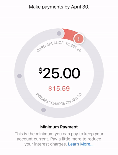
These types of interactions breakdown the complicated information, & use visuals, animations to convey the message easily to the consumers. A perfect example of this is to explain the interest charges on your credit card. It’s a sensitive topic and Apple Card once again wins the customers by using a circular interactive animation to inform the user about the minimum and maximum charges.
这些类型的交互会分解复杂的信息,并使用视觉,动画将信息轻松传达给消费者。 一个完美的例子是解释信用卡上的利息费用。 这是一个敏感的话题,Apple Card通过使用圆形互动动画来告知用户最低和最高费用,再次赢得了客户。
互动参与 (Interactive Engagement)
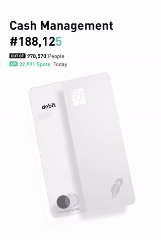
Sometimes, you want the user to interact with the interface by surprising them. This surprise combined with actions is more powerful. Robinhood App recently released a debit card with a waitlist of over a million people. To move your spot up in the waitlist, the users can go to their app and tap on the card (maximum of 60 times). This is a fun way of making users interact with the app.
有时,您希望用户通过使他们感到惊讶来与界面进行交互。 这种令人惊讶的动作结合起来更加强大。 Robinhood App最近发布了一张借记卡,其候补名单超过100万人。 要在候补名单中上移您的位置,用户可以转到其应用并点击该卡(最多60次)。 这是使用户与应用程序交互的一种有趣方式。
提供反馈 (Providing Feedback)
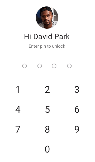
Motion can be effectively used to send feedback to the user after they have triggered something or entered something. Error states and Success states are examples for these and here is an example of correct and incorrect password entries for a mobile app.
在用户触发某些内容或输入某些内容后,Motion可以有效地用于向用户发送反馈。 错误状态和成功状态就是这些示例,这是移动应用程序正确和不正确密码输入的示例。
向用户教授界面 (Teaching the interface to the user)
Whenever a new product or an app is launched with a fancy feature, it will fail if the user finds it too difficult to understand. So, at times like these, apps can leverage micro-interactions to teach the user about the functionality. For example, the N26 Fintech App used animation to show how a user can move money from one savings bucket to another.
每当启动具有精美功能的新产品或应用程序时,如果用户发现它太难理解,它将失败。 因此,在此类情况下,应用程序可以利用微交互来向用户介绍功能。 例如,N26 Fintech App使用动画来演示用户如何将钱从一个储蓄桶转移到另一个。

指导用户的注意 (Directing User’s Attention)
When most of the space in the mobile screens are filled with information, it is tough to highlight a particular feature which we want the user to notice. Micro-Interactions can play a vital role in bringing delight to the user by the use of animation and transition effects. For example, on Slack, before you start typing the send button is grayed out and once you have started typing, it turns blue indicating to the user that it is the call to action button.
当移动屏幕上的大部分空间都充满信息时,很难突出显示我们希望用户注意的特定功能。 通过使用动画和过渡效果,微交互可以在为用户带来愉悦感方面发挥至关重要的作用。 例如,在Slack上,在您开始键入之前,发送按钮会变灰,一旦开始键入,它将变为蓝色,向用户表明这是号召性用语按钮。

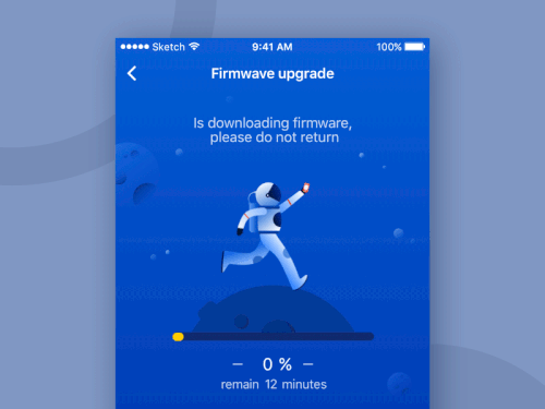
使加载屏幕有趣 (Making Loading Screens Interesting)
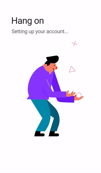
Most loading screens are boring. Let’s accept that. But micro-interactions and animations can turn them into very interesting stuff. Google leverages this space to create wonderful intuitive experiences for its users whenever there is a wait time during loading or setup. Here is an example:
大多数加载屏幕都很无聊。 让我们接受。 但是微交互和动画可以将它们变成非常有趣的东西。 每当加载或设置过程中有等待时间时,Google都会利用此空间为其用户创造出色的直观体验。 这是一个例子:
These are just a few of the examples and the applications of these micro-interactions are unlimited. But, one should remember that these should be used in a subtle way not to overwhelm the user. When designing always put yourselves in the shoes of the customers and also, functional animation should be a priority over visual animation. Hope this article gave you an idea of why micro-interactions are powerful and how they can improve the overall experience of a product.
这些只是几个例子,这些微交互的应用是无限的。 但是,请记住,这些内容应以一种微妙的方式使用,以免使用户不知所措。 在进行设计时,总是要让顾客自己动手,而且,功能动画应该比视觉动画优先。 希望本文能够使您了解微交互为何如此强大以及它们如何改善产品的整体体验。
创建微互动的工具: (Tools to create Micro-Interactions:)
There are tons of tools in the market to create these simple transition effects and use them in your app. But based on how simple or complex you want them to be, there are different tools:
市场上有大量工具可以创建这些简单的过渡效果并在您的应用程序中使用它们。 但是根据您希望它们变得多么简单或复杂,可以使用不同的工具:
If you’re familiar with coding:
如果您熟悉编码:
Mobile: Xcode, Android studio
手机: Xcode,Android Studio
Mobile or Web: Framer
手机或网络: 成帧器
Web: CSS animation
网页: CSS动画
If you want to create more detailed Interactions with simple drag and drop options:
如果要使用简单的拖放选项创建更详细的交互,请执行以下操作:
If you want to create detailed interactions + Animations:
如果要创建详细的交互+动画,请执行以下操作:
- After Effects 后遗症
👉 Follow me on 💥🚀 Daily Design for learning one design principle every day on Design thinking, Cognitive Psychology, Motion, and Interaction Design. We have mentors to review portfolios, career guidance, etc.,
👉跟着我讲授💥🚀 每日设计 ,每天学习一种有关设计思维,认知心理学,运动和交互设计的设计原则。 我们有导师审查投资组合,职业指导等,
For any work-related queries check www.vamsibatchu.com or email me @vamsibatchuk@gmail.com
对于任何与工作相关的查询,请访问www.vamsibatchu.com或给我发送电子邮件@ vamsibatchuk @ gmail.com
翻译自: https://uxdesign.cc/micro-interactions-a-superpower-of-successful-design-ef7706154934
交互设计 超越人机交互


 被折叠的 条评论
为什么被折叠?
被折叠的 条评论
为什么被折叠?
 到【灌水乐园】发言


