


色盲悖论

成为色盲设计师 (Being a Designer Who is Colorblind)
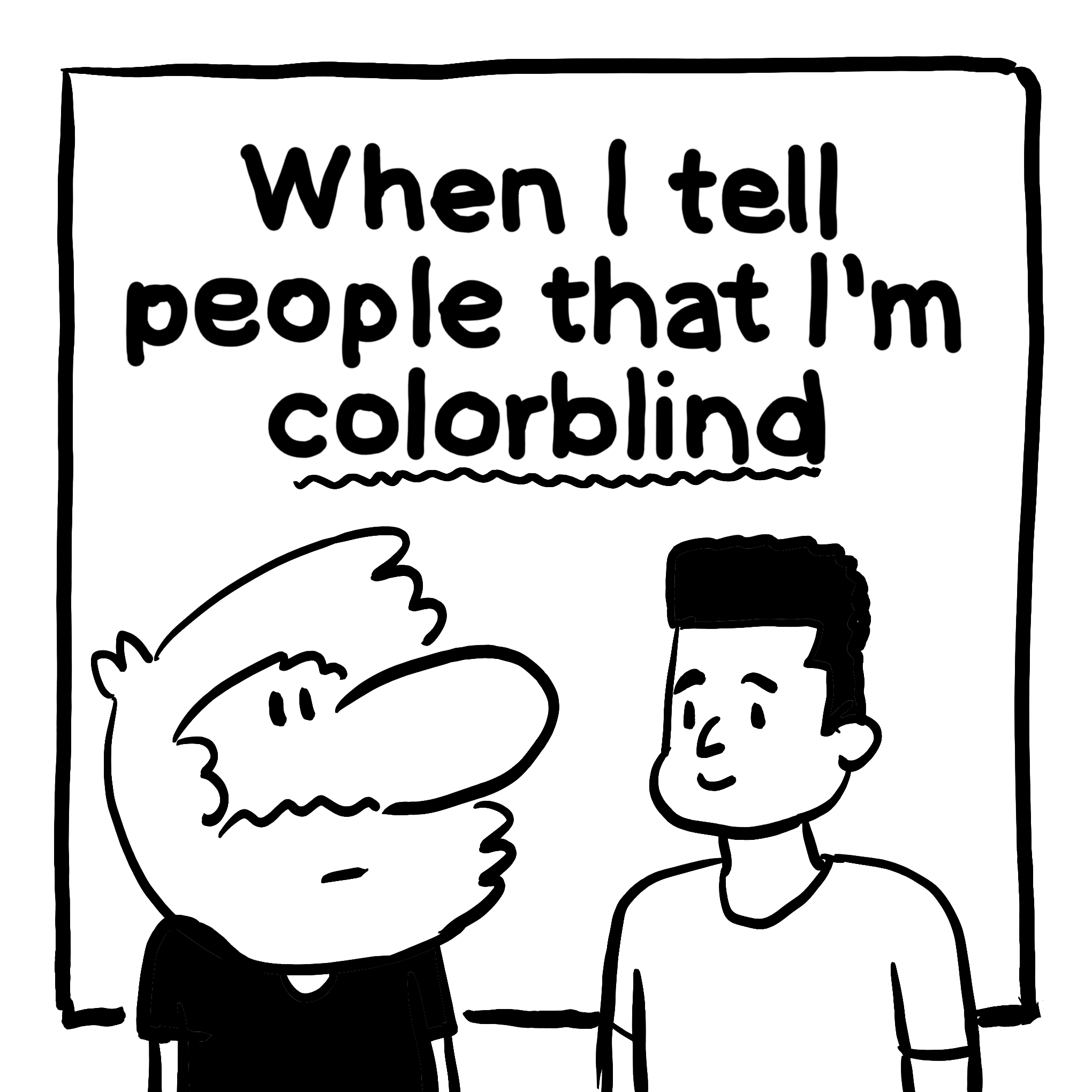
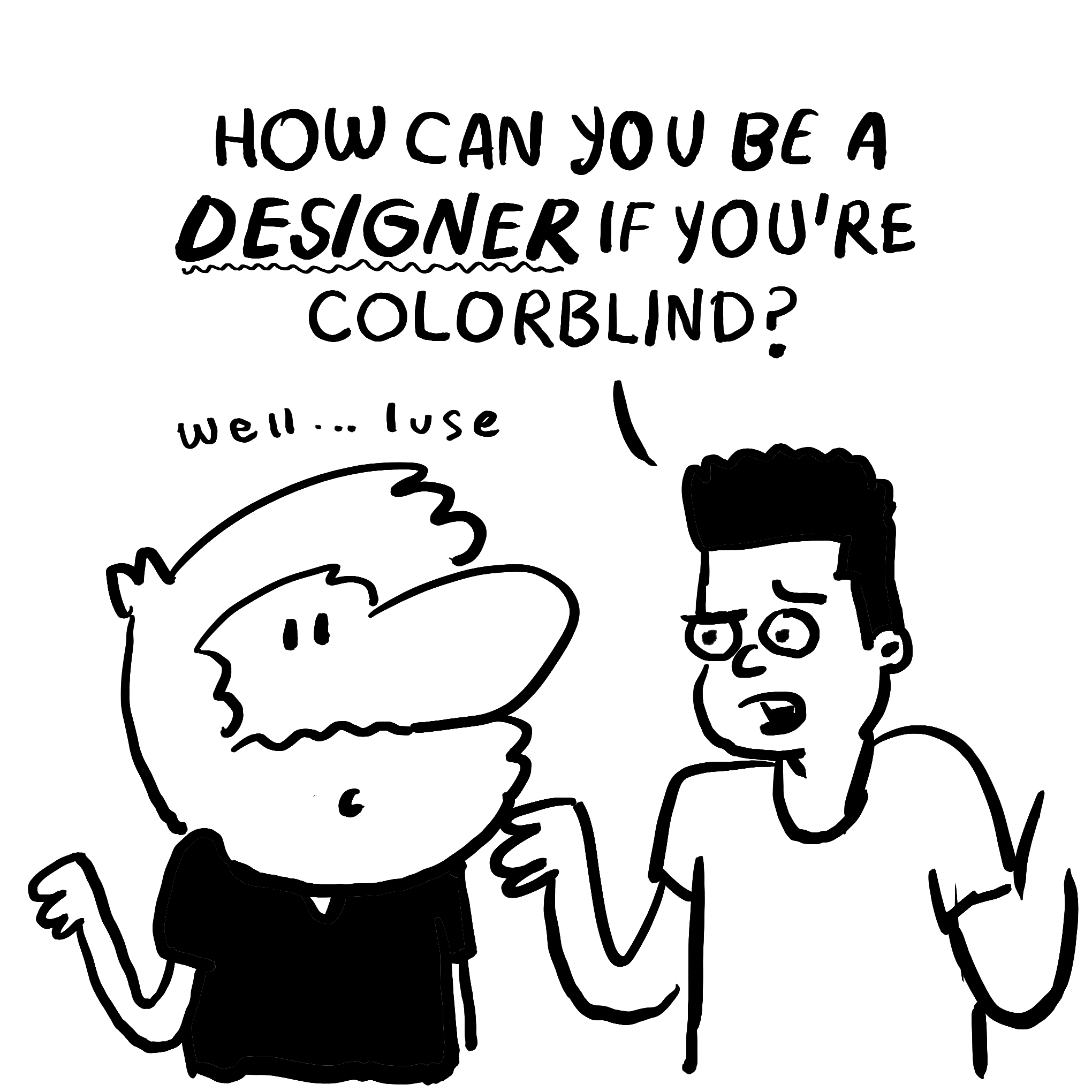
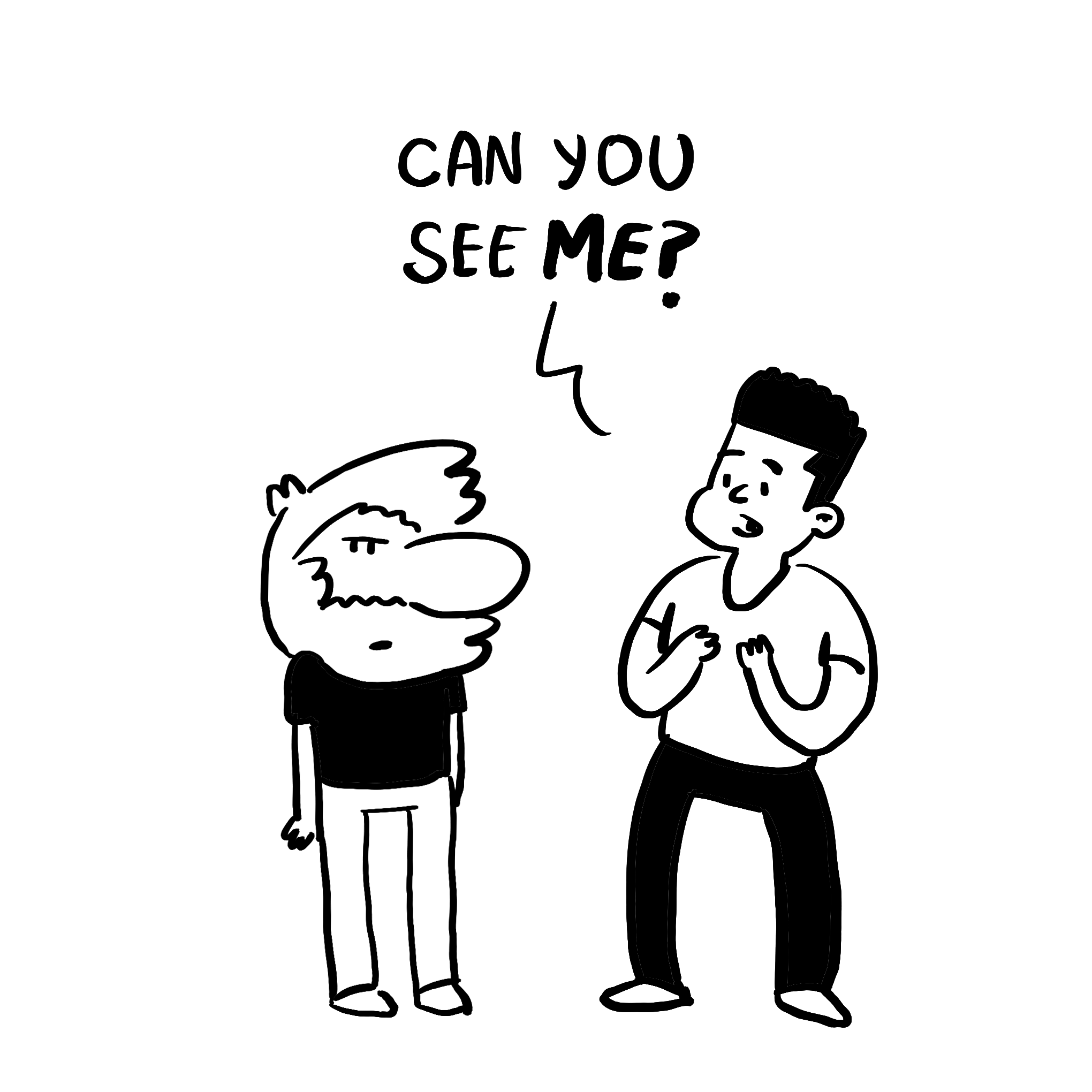
Whenever I have to tell people that I’m colorblind, it sparks their curiosity, especially since I’m a designer. They are baffled by the idea of someone that can make things look pretty but can’t see color.
每当我不得不告诉人们我是色盲时,都会激发他们的好奇心,尤其是因为我是设计师。 他们对一个可以使事物看起来漂亮但看不到颜色的人的想法感到困惑。
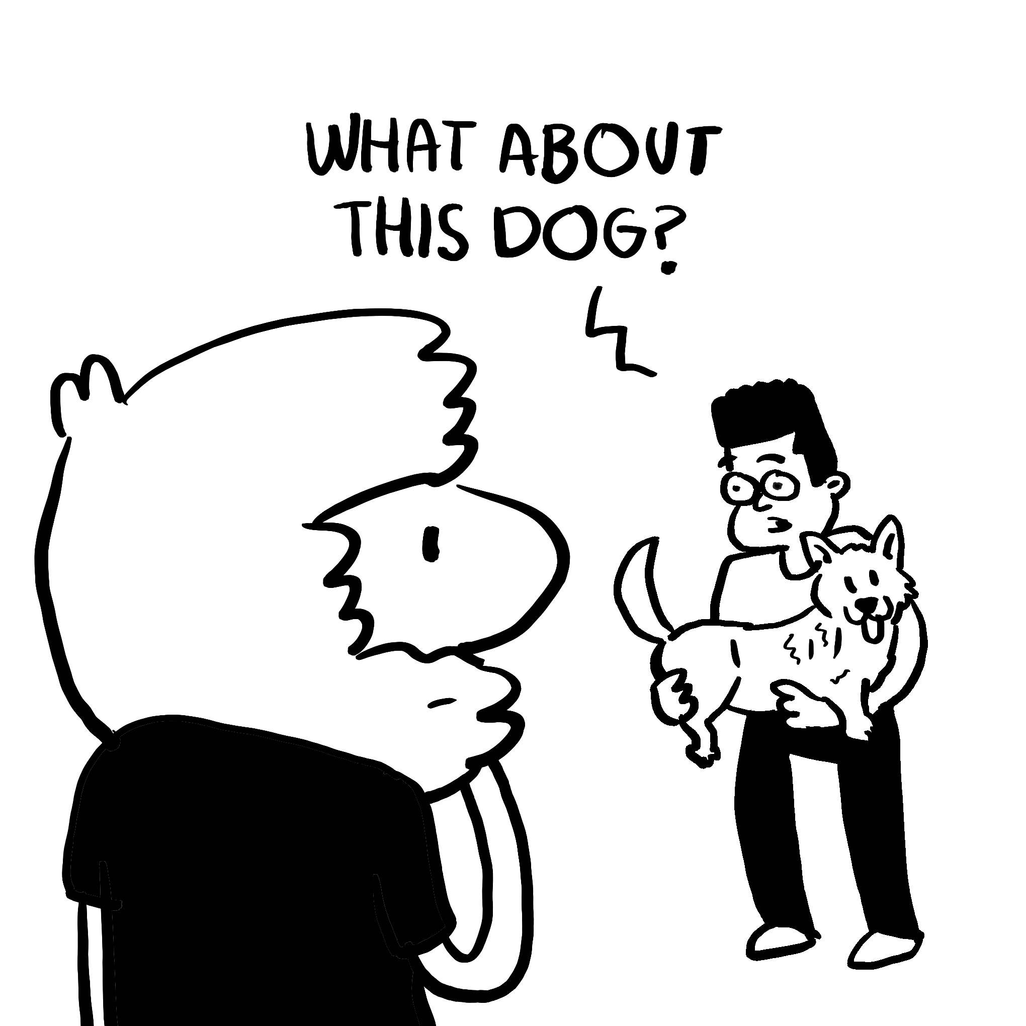
But that’s because the term “colorblind” is pretty misleading. I still see colors; I just don’t see as many colors. This causes me to confuse hues; for example, I think that something is green when it’s actually orange. I just recently found out that the Golden Gate Bridge is red — even though I lived in SF for some time!
但这是因为“色盲”一词极具误导性。 我仍然看到颜色; 我只是看不到太多颜色。 这使我迷惑了色彩。 例如,我认为某些东西实际上是橙色时是绿色的。 我最近才发现,金门大桥是红色的-即使我在旧金山住了一段时间!
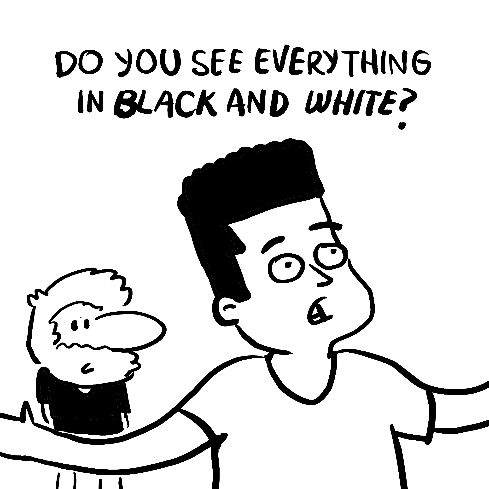
The truth is that I don’t even know what I’m missing out. I don’t have an ON/OFF switch that allows me to see the difference. You can live your life with color blindness normally, with some hassles here and there. Some people even go all of their life without knowing they have this condition — like my mom, who just found out recently. Lol.
事实是,我什至不知道我错过了什么。 我没有可让我看到差异的ON / OFF开关。 您通常可以在色盲症中生活,这里到处都有麻烦。 有些人甚至一生都在不知不觉中患有这种情况,例如最近才发现的我妈妈。 大声笑。
有点烦人 (It’s a bit annoying.)
Not gonna lie, it gets irritating in some instances. For example, when you are trying to read some text that is over a background with a color that doesn’t create enough contrast. Or when vital information, like in a graph, depends too much on color to be understood. And user interfaces can be frustrating when they only use color to denote a state, a notification, or a necessary action.
不会撒谎,在某些情况下会令人讨厌。 例如,当您尝试读取背景上的某些文本时,其颜色无法产生足够的对比度。 或者,当重要信息(如图表)过于依赖颜色而无法理解时。 当用户界面仅使用颜色表示状态,通知或必要的操作时,它们可能会令人沮丧。
So, as a designer, having this condition has helped me design stuff more obviously. It’s my secret superpower, yo! It has also sparked my interest in how to design for accessibility. So I put together a list of cool tools that might help you too!
因此,作为设计师,具有这种条件可以帮助我更明显地设计东西。 这是我的秘密超级大国,哟! 它还激发了我对如何设计可访问性的兴趣。 因此,我整理了一些不错的工具,它们也可能对您有所帮助!
But first, let’s talk about colorblindness a bit.
但是首先,让我们谈谈色盲。
关于色盲 (About Color Blindness)
Colorblindness is more common than people think. One in every twelve men has this condition. It’s way more frequent in men than women because many of the genes involved in color vision are on the X chromosome.
色盲比人们想像的更为普遍。 每十二个人中就有一个患有这种情况。 男性比女性更常见,因为涉及色觉的许多基因都在X染色体上。
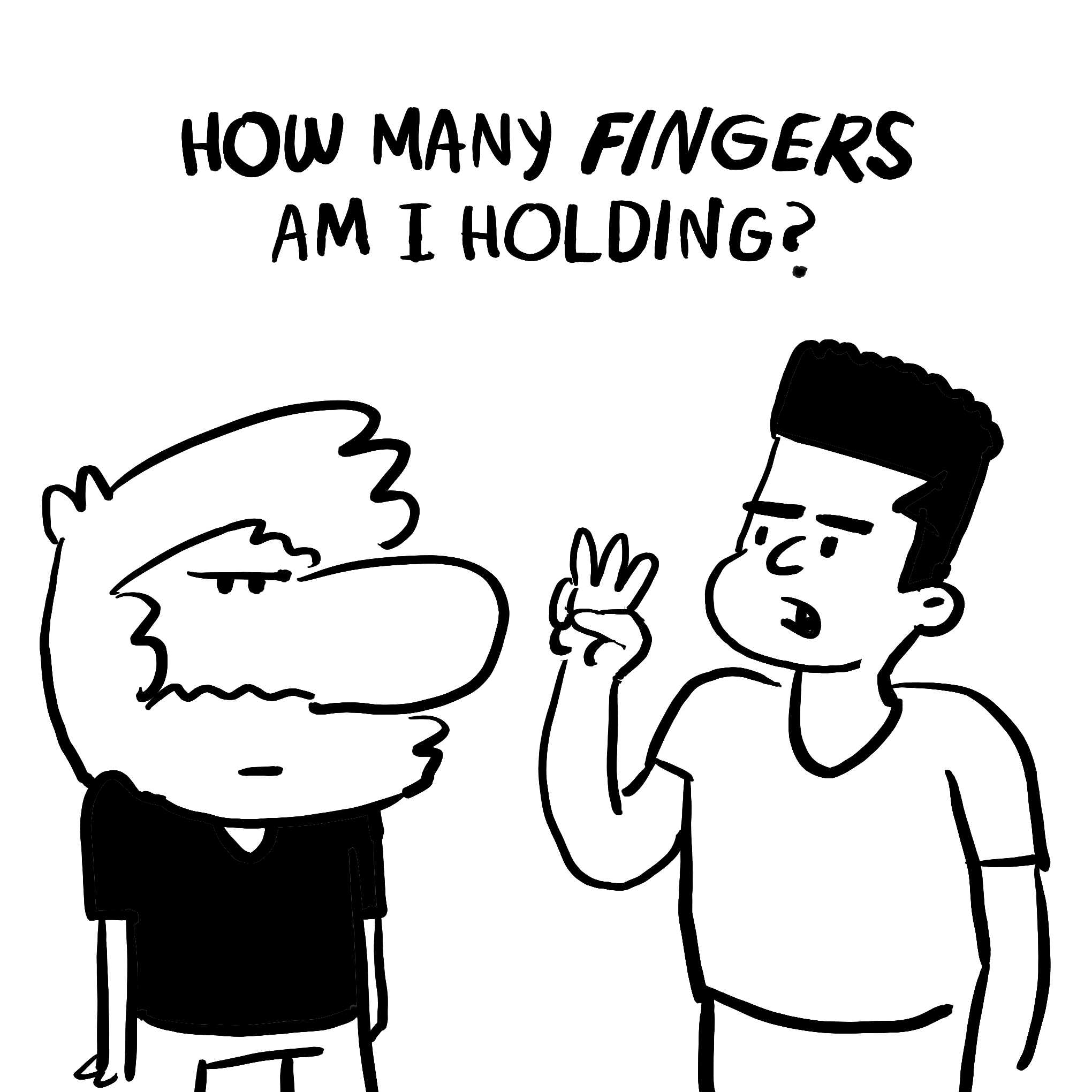
I have protanopia, which is a type of red-green color blindness. A defect in the light-sensitive cone cells causes it. This condition allows me to tell about 20 hues apart from each other. Usually, people can distinguish around 100 different tones.⠀
我有泛盲 ,这是一种红绿色盲。 感光锥细胞中的缺陷会导致这种情况。 这种情况使我可以分辨出大约20种色调。 通常,人们可以分辨大约100种不同的音调。⠀
Blue-yellow color blindness is less common. It makes it hard to tell the difference between blue and green, and between yellow and red. Complete color blindness (seeing in grayscales) is extremely rare. Most people are not actually “color blind” but “color deficient.”
蓝黄色色盲较少见。 很难区分蓝色和绿色之间以及黄色和红色之间的区别。 完全色盲(灰度级可见)非常罕见。 大多数人实际上不是“色盲”,而是“色差”。
Oh, also, contrary to popular belief, dogs are not colorblind. Lol.
哦,而且,与普遍的看法相反,狗不是色盲的。 大声笑。
色彩工具! (Color Tools!)
If you’re interested in designing UIs with colors that take into consideration people with different abilities, here’s a list of tools that might help you.
如果您对设计颜色时考虑到具有不同能力的人的UI感兴趣,下面列出了一些可能对您有帮助的工具。
谁可以使用 (WhoCanUse)
A tool that helps you understand how color contrast can affect people with different visual abilities.
一种可帮助您了解颜色对比度如何影响具有不同视觉能力的人的工具。
赫罗玛 (Khroma)
I freaking love this tool. Khroma uses machine learning to determine which colors you like and creates limitless palettes for you to discover, search, and save. I have been surprised by the combinations in gives you — leading me to try combos that I would’ve never thought of. It can also filter out combinations that don’t have proper contrast ratios.
我非常喜欢这个工具。 Khroma使用机器学习来确定您喜欢的颜色,并创建无限的调色板供您发现,搜索和保存。 我为您提供的组合感到惊讶-引导我尝试我从未想到的组合。 它还可以滤除没有适当对比度的组合。
彩盒 (ColorBox)
ColorBox is a color tool to produce color sets in a custom number of steps, editing the values with an easing curve. How cool and nerdy is that? It also gives you a preview of how the text would look on top of the color. Made by Lyft Design — read more about it here.
ColorBox是一种颜色工具,可按自定义步骤生成颜色集,并使用缓和曲线编辑值。 那有多酷和书呆子? 它还使您可以预览文本在颜色顶部的外观。 由Lyft Design制造- 在此处了解更多信息。
格拉丹塔 (Gradienta)
Beautiful gradients that you can download as CSS code, SVG, or JPG. Great for adding lightweight, colorful, responsive backgrounds. This is an open-source side project by designer Shahadat Rahman. This tool is not about accessibility, but… I mean… come on, gradients are cool!
您可以下载为CSS代码,SVG或JPG的精美渐变。 非常适合添加轻便,色彩鲜艳,响应Swift的背景。 这是设计师Shahadat Rahman的开源项目。 这个工具不是关于可访问性的,而是……我的意思是……来吧,渐变很酷!
快乐的色调 (Happy Hues)
A site with curated color pallets that allows you to see them applied in context. A great page built by Mackenzie Child without any code using Webflow, yo!
一个具有精选调色板的站点,使您可以查看它们在上下文中的应用。 Mackenzie Child使用Webflow编写了一个无需任何代码的出色页面,哟!
斯塔克 (Stark)
Stark is a tool that allows you to check the color contrast ratio of your text. This is to see if your colors meet accessibility compliance. The cool thing is that it works right on your design tools as a plugin!
Stark是一个工具,可用于检查文本的颜色对比度。 这是为了查看您的颜色是否符合辅助功能选项。 很棒的是,它可以作为插件在您的设计工具上正常工作!
颜色安全 (Color Safe)
A web app that allows you to test hues and see them in context. You can get beautiful and accessible color palettes based on WCAG Guidelines of text and background contrast ratios.
一个网络应用程序,可让您测试色相并在上下文中查看它们。 您可以根据文本和背景对比度的WCAG准则获得漂亮且易于使用的调色板。
颜色Oracle (Color Oracle)
A free color blindness simulator app that shows you in real-time what people with common color vision abilities will see. It applies a full-screen color filter, independently of the software in use.
一个免费的色盲模拟器应用程序,可实时显示具有常见色觉能力的人会看到什么。 它独立于使用的软件应用全屏滤色器。
What about you? Do you know of any cool tools? Do you have a similar condition or know someone that does? Are they a designer too? Has this condition affected you in any way? Share in the comments!
你呢? 您知道有什么很棒的工具吗? 您是否有类似情况或认识某人? 他们也是设计师吗? 这种状况对您有任何影响吗? 分享评论!
Also, I’ve been adding a lot of comics on Instagram, in case you wanna read more stuff like this :)
另外,如果您想阅读更多类似的内容,我会在Instagram上添加大量漫画:)
翻译自: https://thedesignteam.io/about-being-colorblind-bc0a58bcdfc2
色盲悖论


 被折叠的 条评论
为什么被折叠?
被折叠的 条评论
为什么被折叠?
 到【灌水乐园】发言


