


java项目指南
重点 (Top highlight)
Labels, Tags, or Badges are all types of classification component that help to categorize, organize, and label elements. In this article, we will explore how best to use these UI components, with guiding examples from different design systems — from Shopify’s Polaris, to Google’s Material Design.
标签,标签或徽章是有助于分类,组织和标记元素的所有类型的分类组件 。 在本文中,我们将通过Shopify的Polaris到Google的Material Design等不同设计系统的指导示例,探索如何最好地使用这些UI组件。
组件术语 (Component Terminology)
Classification components go by many names, depending on who you talk to.
分类组件有许多名称,具体取决于您与谁交谈。
标签 (Label)
I’d say the most generic term for a classification component would be ‘Label’, which Semantic defines as any classification content.
我会说,分类组件的最通用术语是“ 标签” , 语义将其定义为任何分类内容。
徽章 (Badges)
As seen in Shopify’s Design System, although Badges can be more specifically defined as components holding a numeric attribute, such as Apple’s app notification count:
从Shopify的设计系统中可以看出,虽然可以将徽章更具体地定义为具有数字属性的组件 ,例如Apple的应用程序通知计数:
标签 (Tags)
Another term is a Tag, which is notably known as something users can uniquely add to items for SEO purposes. However, the United States Web Design System uses Tags to call attention to new or updated content.
另一个术语是标签 ,众所周知, 标签是用户可以出于SEO目的而唯一地添加到项目中的东西。 但是, 美国Web设计系统使用标签来引起对新内容或更新内容的注意。

薯条 (Chips)
Chips were made famous by Material Design, although their Chips can also be used for selecting, filtering and inputting.
芯片被唱红材质设计 ,虽然他们的芯片也可用于选择,过滤和输入。

荣誉奖 (Honorable mentions)
Pills, Lozenges, and Tokens. These are more defined by their shape, rather than their functionality.
定义 (Definition)
For the sake of this article, I will use the term Label and will define it as:
为了本文的方便,我将使用标签一词,并将其定义为:
A component that further classifies an item / element, e.g. the status of an item.
进一步对项目/元素进行分类的组件,例如项目的状态。

解剖学 (Anatomy)

设计规则 (Design Rules)
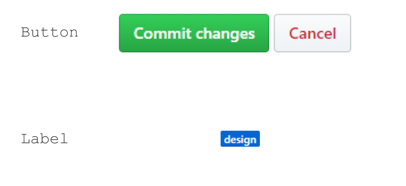
1.不要让标签看起来像按钮 (1. Do not make Labels look like buttons)
This is especially true if the Labels are not dynamic. If they can’t be clicked then they should not look like other components that can be clicked. The United States Web Design System seemed to have the same concern. 😏
如果标签不是动态的,则尤其如此。 如果无法单击它们,则它们看起来不应像其他可以单击的组件。 美国网页设计系统似乎也有同样的问题。 😏

Labels should be smaller than buttons, have different casing, corner radius, color and padding.
标签应小于按钮,并具有不同的大小写,边角半径,颜色和填充。

Zendesk follows this rule:
Zendesk遵循以下规则:

So does Github, besides the corner radius.
除了转角半径外,Github也是如此。
2。 将标签尽可能靠近物品放置 (2. Place Labels as close to the item as possible)
To optimize a Label’s effectiveness (discoverability), it should really sit right next to the item.
为了优化标签的有效性(可发现性), 标签应确实位于商品旁边。
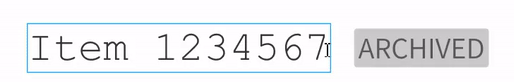
The Label can even be ON the item:
标签甚至可以位于以下项目上:

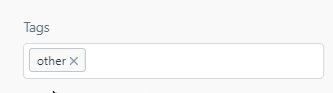
3.如果标签是动态的,请确保易于单击 (3. If the Label is dynamic make sure it is easy to click)
If the only action that can be taken on a Label is removing it, then clicking anywhere on the Label should remove it. Below is a Tag, but shows how a user has to annoyingly click the small little exit icon to remove it. This is not a very accessible button…
如果唯一可以对标签执行的操作是将其删除,则单击标签上的任何位置都应将其删除。 以下是一个Tag ,但显示了用户如何烦人地单击小小的出口图标将其删除。 这不是一个非常易于使用的按钮…
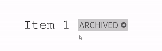
This is better:
这个更好:
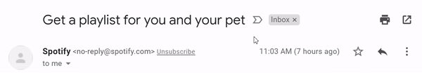
Gmail is an exception, as clicking on different sections of the Label will result in a different action:
Gmail是一个例外,因为单击“ 标签”的不同部分将导致不同的操作:
That’s it!
而已!
Let me know if you think there are other design rules to follow for Labels, or whatever you call them. 🙃
让我知道您是否认为Labels或其他您可以遵循的其他设计规则。 🙃
其他标签示例 (Additional tag examples)


翻译自: https://blog.prototypr.io/design-guide-classifying-items-db5b121985d
java项目指南


 被折叠的 条评论
为什么被折叠?
被折叠的 条评论
为什么被折叠?
 到【灌水乐园】发言


