


ios应用开发入门指南
重点 (Top highlight)
黑暗模式-人机界面指南 (DARK MODE — HUMAN INTERFACE GUIDELINES)
At the WWDC 2019 conference, Apple announced all the new features coming to iOS 13. Out of all the super exciting features, the announcement about Dark Mode excited me the most. For those of you who follow me on social media, you might know that I am a hardcore fan of Dark Mode. I just love it!
在WWDC 2019大会上,苹果宣布了iOS 13的所有新功能。在所有超级令人兴奋的功能中,关于暗模式的公告最让我兴奋。 对于那些在社交媒体上关注我的人,您可能知道我是“黑暗模式”的忠实粉丝。 我就喜欢!
With iOS 13, people can choose to adopt a dark system-wide appearance. This basically means that when dark mode is turned on, all the apps on the iPhone will have a dark appearance.
使用iOS 13,人们可以选择采用深色系统外观。 这基本上意味着打开暗模式时,iPhone上的所有应用程序都将具有暗外观。
Hence, as designers and developers, it's extremely important to design and implement Dark Mode for your apps.
因此,作为设计师和开发人员,为您的应用程序设计和实现暗模式非常重要。
Apple has released the Human Interface Guidelines for designing Dark Mode to your apps. However, the guidelines are super short, unlike Google’s Material Design Guidelines. So the only place to learn more about the guidelines is the talk given by Mike Stern. He is the Design Evangelism Manager at Apple. Anyway, you can definitely watch the 30-minute long video. But I plan to make your life a lot easier with a step by step process.
苹果已经发布了为您的应用程序设计暗模式的人机交互指南 。 但是,与Google的《材料设计指南》不同,该指南非常简短。 因此,唯一更多了解准则的地方是Mike Stern的演讲 。 他是Apple的设计传播经理。 无论如何,您绝对可以观看长达30分钟的视频。 但是我计划通过逐步的过程使您的生活更加轻松。
I also have a super quick 2 part Instagram series on it if you want to brush through the fundamentals of Dark Mode.
如果您想了解黑暗模式的基础知识,那么我也有一个非常快的2部分Instagram系列文章。

You can also check out my full-fledged Tutorial on YouTube as well!

I will be covering only the design aspect and not the development aspect. In order to understand the development aspect of Dark Mode, you can check out this video by Apple.
我将只涉及设计方面,而不涉及开发方面。 为了了解Dark Mode的开发方面,您可以通过Apple 观看此视频 。
I also released a full-fledged article on designing Dark Theme for Android. If you have an Android app as well, definitely do consider checking that out!
我还发布了有关设计Dark Theme f 或Android的完整文章。 如果您也有Android应用程式,请务必考虑进行检查!
Alright, assuming that you now have a design system ready let’s get started!
好吧,假设您现在已经准备好设计系统, 那就开始吧!
For the purpose of explaining the guidelines better, i’ll take WhatsApp as an example. At the time of writing this article, Dark Mode for Whatsapp does not exist. Hence, I think it will be a good idea to explain the Dark Mode guidelines for iOS.
为了更好地解释指南,我将以WhatsApp为例。 在撰写本文时,Whatsapp的暗模式不存在。 因此,我认为解释iOS的黑暗模式指南是一个好主意。
免责声明 (Disclaimer)
There is no hard and fast rule that you need to follow the guidelines provided by Apple. These are just guidelines, hence you are allowed to have a custom Dark Mode for your app 🤙.
没有硬性规定要遵循Apple提供的准则。 这些只是指导原则,因此允许您为应用程序have自定义黑暗模式。
Btw, I am a huge fan of superheroes. So I decided to jazz things up a bit with that theme. I hope you guys enjoy it 🤩.
顺便说一句,我是超级英雄的忠实粉丝。 因此,我决定用该主题来爵士乐一点。 我希望你们喜欢它。
海拔 (Elevation)
Unlike Google where elevation is based on the difference in color and drop shadows, Apple treats elevation only in terms of color.
与Google的海拔高度基于颜色和阴影的差异不同,Apple仅将海拔高度视为颜色。

The guidelines provide 4 colors that can be used to show an elevation. They are called ‘system background colors’.
准则提供了4种可用于显示高程的颜色。 它们被称为“系统背景色”。
The iOS 13 UI Kit is available only for Adobe XD and Sketch. However, if you want a UI kit for Figma, you can get it on Apply Pixels.
iOS 13 UI套件仅适用于Adobe XD和Sketch。 但是,如果您需要Figma的UI套件,可以在Apply Pixels上获得。
系统背景色 (System Background Colors)
As per the guidelines, the background always has a pure black of #000000. Google, on the other hand, prefers a dark grey with a value of #121212.
根据准则,背景始终具有#000000的纯黑色。 而Google 则更喜欢深灰色,值为#121212。

Apple calls this background surface as System Background. And there are 3 levels of system backgrounds namely Primary, Secondary and Tertiary. Each of these has a different color which is provided in the iOS 13 UI Kit. These are applied to elements that either give a feeling of being higher in elevation or those that differentiate (or group) content.
苹果将此背景表面称为“ 系统背景”。 系统背景分为3个级别,即主要,次要和第三级。 iOS 13 UI Kit中提供的每种颜色都有不同。 这些元素适用于给人以更高的感觉或区分(或分组)内容的元素。

One thing to note is that the colors in Dark Mode are not inverted from Light Mode. A separate set of colors have to be assigned to all the elements.
要注意的一件事是,暗模式下的颜色不会与亮模式下的颜色相反。 必须为所有元素分配一组单独的颜色。
As you can see below, the pure white color in light mode does not get converted into pure black in dark mode. Refrain from inverting the colors in Dark Mode.
如下所示,在明亮模式下纯白色不会在黑暗模式下转换为纯黑色 。 不要在深色模式下反转颜色。

Sounds good man! Btw, is there anything I need to discuss with the developers who will be implementing Dark Mode for my app. Anything I need to let them know in advance?
听起来好男人! 顺便说一句,我有什么需要与将为我的应用程序实现暗模式的开发人员讨论的。 我需要事先告知他们吗?
Sure. Let’s talk about Semantic colors!
当然。 让我们谈谈语义颜色!
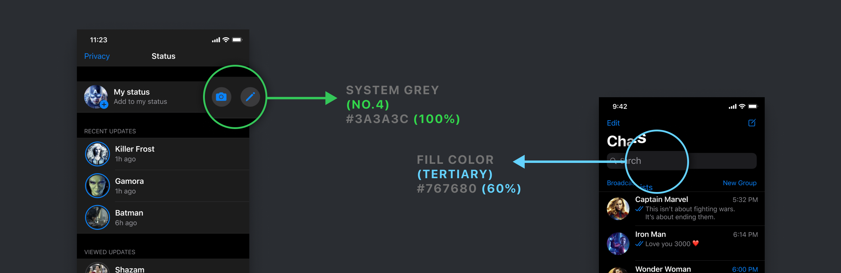
语义色 (Semantic Colors)
I know. I know. It sounds like an advanced term. But the concept of semantic colors is super simple.
我知道。 我知道。 听起来像个高级名词。 但是语义颜色的概念非常简单。
Let’s take an example of the Base element that we previously talked about. In Light Mode, the color is pure white #FFFFFF. But in Dark Mode, the color is pure black #000000.
让我们以前面讨论的Base元素为例。 在灯光模式下,颜色为纯白色#FFFFFF。 但是在暗模式下,颜色是纯黑色#000000。
Now the hard way to implement this is to hard-code it. This basically means that you need to assign 2 colors for each and every element on your screen. Each and every element! It’s gonna be a total nightmare.
现在,实现此目标的困难方法是对其进行硬编码。 这基本上意味着您需要为屏幕上的每个元素分配2种颜色。 每个元素! 这将是一场噩梦。
So what’s the solution?
那么解决方案是什么?
This is where Semantic colors come to the rescue. Instead of giving each element a color, you can give it a semantic color that has both the colors for either of the modes.
这就是抢救语义色彩的地方。 除了为每个元素提供颜色之外,您还可以给它提供一种语义颜色 ,该语义颜色同时具有两种模式的两种颜色。
Umm… What? What the hell are you saying?
嗯...什么? 你他妈在说什么?
What I am trying to say is that, if you assign a semantic color, for example, ‘SystemBackground’ or ‘LabelColor’ or ‘FillColor’” to each of the elements, the OS will know what color to show automatically based on the mode.
我要说的是,如果您 为每个元素 分配 语义颜色 ,例如'SystemBackground'或'LabelColor'或'FillColor'”,则操作系统将根据模式知道自动显示哪种颜色。
You don’t have to tell it to show white color in light mode and black color in dark mode.
您不必告诉它在明亮模式下显示白色,而在黑暗模式下显示黑色。

Oh!!! Now I get it. But wait! What if I want to show a custom color to an element in Dark Mode?
哦!!! 现在我懂了。 可是等等! 如果要在暗模式下为元素显示自定义颜色怎么办?
Sure, you can easily do that. You can assign a custom color for each of the modes. So for example, if you don’t want the base to be pure black but a dark grey instead, you can easily assign a custom color in your code.
当然,您可以轻松地做到这一点。 您可以为每种模式分配自定义颜色。 因此,例如,如果您不希望基准是纯黑色,而是深灰色,则可以在代码中轻松分配自定义颜色。
And voila! So that’s all you need to know about having a healthy conversation with your developer.
瞧! 这就是与开发人员进行健康对话所需的全部知识。
Alright! So what’s next?
好的! 下一个是什么?
填充颜色和灰色 (Fill Colors and Grey Colors)
The guidelines provide 4 fill colors (also grey in color) and 6 additional grey colors to choose from. They are ideally used for all elements on the interface such as glyphs (icons), UI controls and more.
准则提供了4种填充颜色(也为灰色)和6种其他灰色可供选择。 它们是界面上所有元素的理想选择,例如字形(图标),UI控件等。
So what’s the difference between fill and grey colors?
那么填充和灰色之间有什么区别?
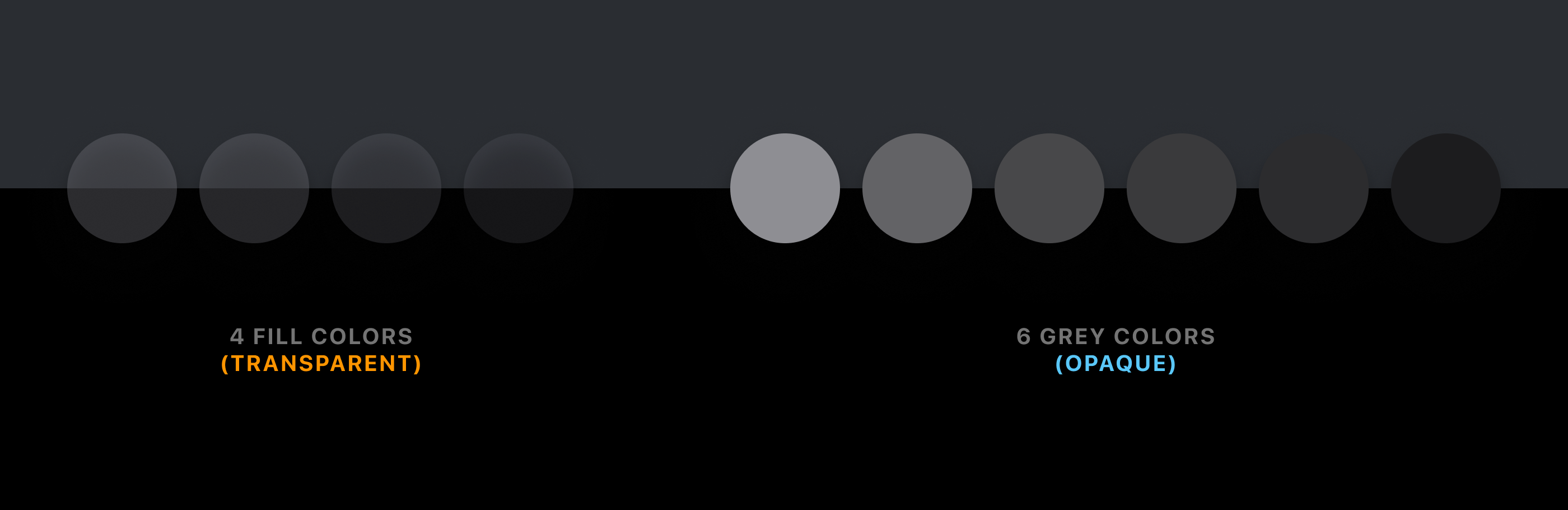
Fill colors have a certain level of transparency, while grey colors are fully opaque. So ideally you can either use only fill colors or grey colors, or a mix of them. You can obviously choose to pick your own custom grey colors if you wish to.
填充色具有一定的透明度,而灰色则完全不透明。 因此,理想情况下,您可以只使用填充色或灰色,也可以混合使用。 您显然可以根据需要选择自己的自定义灰色。
Let me give you a very small example of how you can use them in your UI.
让我给你一个很小的例子,说明如何在用户界面中使用它们。
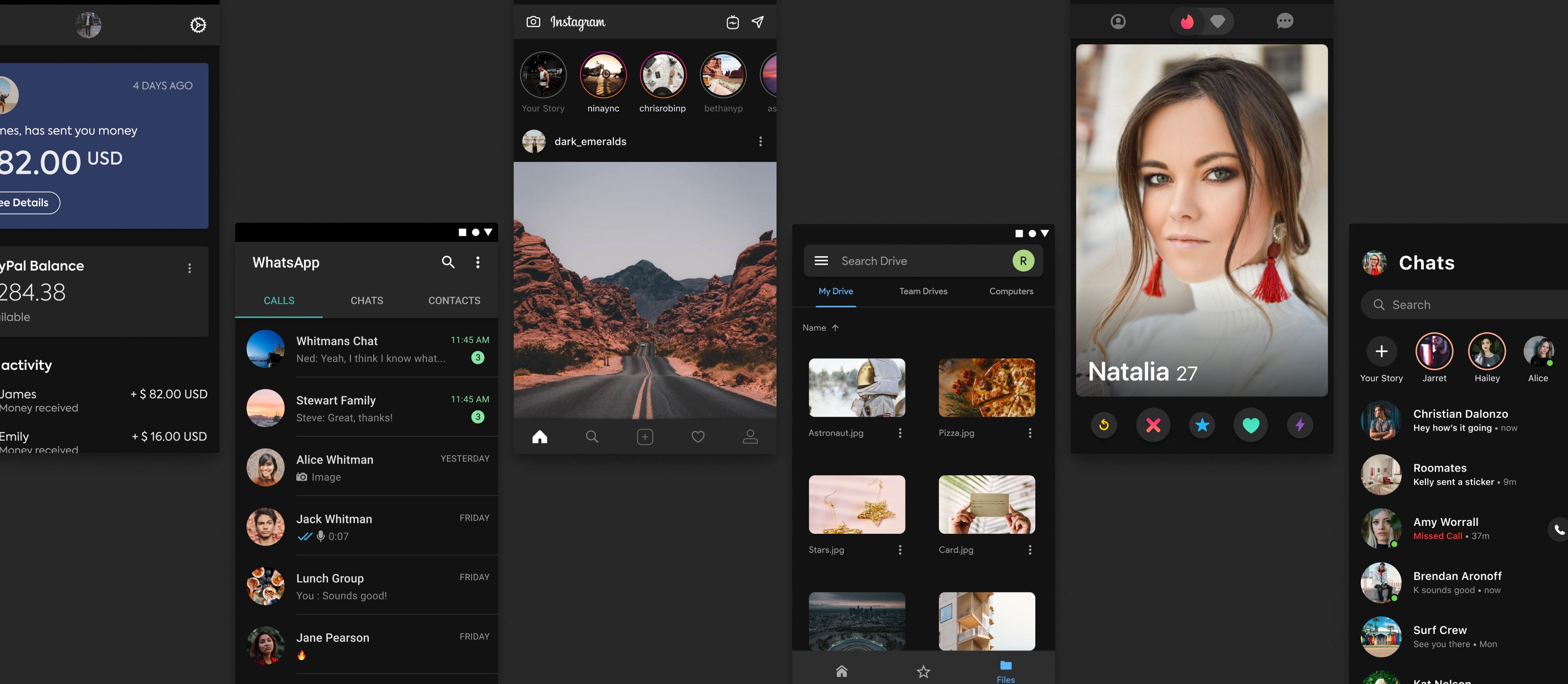
In the above image, you can see that for the camera and pen icon touch target, I have used a grey color. And for the search bar, I have used a fill color.
在上图中,您可以看到相机和笔图标触摸目标 ,我使用了灰色。 对于搜索栏 ,我使用了填充色。
So Chethan, do these colors have to be used this way?
那么Chethan,是否必须以这种方式使用这些颜色?
Nope. As I mentioned before, you can use all the 10 colors (4 fill + 6 greys) anyway that you wish to.
不。 如前所述,您可以随意使用所有10种颜色(4种填充+ 6种灰色)。
分隔色 (Separator Colors)
The guidelines provide us with 2 variants for separator lines. They are also called dividers in general. One is opaque and the other is transparent.
该准则为我们提供了分隔线的2种变体。 它们通常也称为分隔线。 一个是不透明的,另一个是透明的。

Feel free to use either of them. It’s better to use the opaque variant. But there is no hard and fast rule.
随意使用它们之一。 最好使用不透明的变体。 但是没有硬性规定。

标签颜色 (Label Colors)
They are used strictly for texts and there are 4 colors that are based on the visual hierarchy. The texts are categorized into Primary, Secondary, Tertiary and Quarternary.
它们严格用于文本,并且基于视觉层次有4种颜色。 课文分为小学,中学,大学和中学。

Tertiary label color is used for placeholder texts such as search bars. Quarternary label color is used for disabled texts.
第三级标签颜色用于占位符文本,例如搜索栏。 四分之一标签颜色用于禁用的文本。
Psst. However, there is a slight deviation. If you look at the UI Kit, the Search Bar placeholder text uses the Secondary label color instead of the Tertiary label color 🤫.
Psst。 但是,会有一些偏差。 如果您查看UI Kit,搜索栏占位符文本将使用“二级”标签颜色而不是“第三级”标签颜色🤫。
色调颜色 (Tint Colors)
Apple provides 9 different tint colors that can be used throughout the app. They can be used for texts or icons or shapes. Here is a small visualization of Whatsapp’s interface if they used colors other than blue.
Apple提供了9种不同的色调颜色,可在整个应用程序中使用。 它们可以用于文本,图标或形状。 如果它们使用的不是蓝色,则为Whatsapp界面的可视化示意图。

However, these 9 colors are slightly different for light mode and dark mode. If you choose to use these system tint colors, the app will automatically change the light mode tint color to the dark mode tint color.
但是,这9种颜色在亮模式和暗模式下略有不同。 如果您选择使用这些系统色调颜色,则该应用程序将自动将亮模式色调颜色更改为暗模式色调颜色。
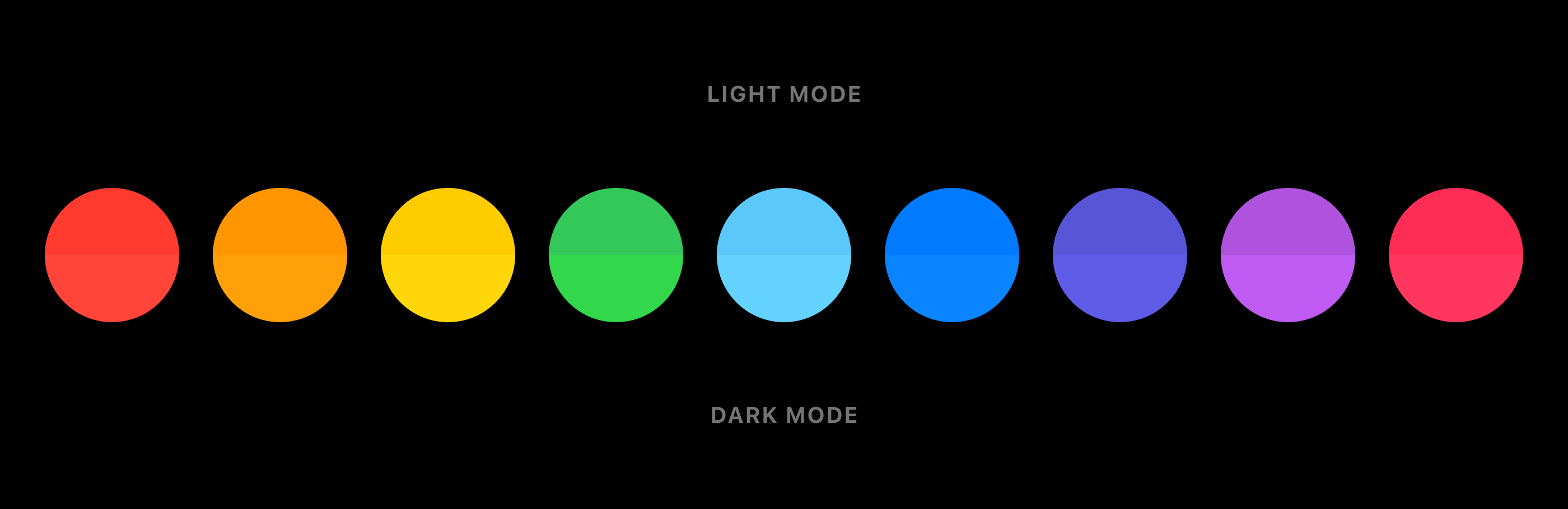
The difference is almost not noticeable, but Apple has still created 2 variations for each tint color.
差异几乎不明显,但Apple仍为每种色调创建了2种变化。
So should I pick only from these 9 colors or can I pick my own colors?
因此,我应该只从这9种颜色中进行选择还是可以选择自己的颜色?
Of course, you can. I’ll get to that part in a minute, but there is an advantage of using the system tint colors.
当然可以。 我会在稍后介绍这一部分,但是使用系统色调颜色有一个优势。
What is it?
它是什么?
When someone turns on the Increase Contrast switch in the Accessibility settings, the tint colors become a bit brighter. This leads to increased contrast.
当有人打开“ 辅助功能”设置中的“ 增加对比度”开关时,色调颜色会变亮。 这导致对比度增加。

Hence, if you try to use your own custom tint color you might have to configure the increased contrast tint color on your own.
因此,如果尝试使用自己的自定义色调颜色,则可能必须自行配置增加的对比度色调颜色。
选择自己的色调颜色 (Picking your own Tint Color)
It's quite obvious that you can pick your own tint colors. But there are few things to note if you choose to do that.
很明显,您可以选择自己的色调颜色。 但是,如果您选择这样做,则没有什么要注意的。
- Try to pick a color (same RGB value) that works well in both light mode and dark mode. 尝试选择一种在亮模式和暗模式下均能正常工作的颜色(相同的RGB值)。
- Or you can choose to pick 2 different colors, one for light mode and other for dark mode. 或者,您可以选择2种不同的颜色,一种用于亮模式,另一种用于暗模式。
Irrespective of what colors you pick, the colors need to pass the accessibility contrast ratio test for both the modes.
无论选择哪种颜色,两种模式的颜色都必须通过可及性对比度测试。
The colors need to pass a minimum contrast ratio of 4.5:1
颜色必须通过4.5:1的最小对比度
Here are 3 tools that you can use for quickly checking the color contrast. Do let me know if you use any other tools apart from these.
您可以使用以下3种工具快速检查颜色对比度。 如果您还使用其他工具,请告诉我。
So let me take an example to illustrate.
因此,让我以一个例子来说明。

As you can see, the colors used here pass the contrast ratio test of 4.5:1. The ratio of these 2 colors is 4.6:1.
如您所见,此处使用的颜色通过了4.5:1的对比度测试。 这两种颜色的比例为4.6:1。
Let’s take another example.
让我们再举一个例子。
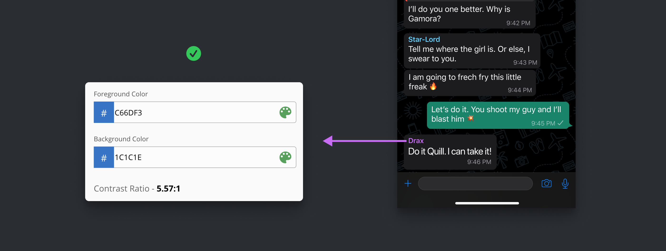
In this example, the contrast ratio is 5.57:1 which also passes the contrast ratio test.
在此示例中,对比度为5.57:1,该比率也通过了对比度测试。
Now let’s take an example where we have 2 different colors for the same element.
现在让我们来看一个示例,其中同一元素具有2种不同的颜色。

As you can see above, the same text has 2 different colors for both light and dark mode.
正如您在上面看到的,对于明暗模式,同一文本具有两种不同的颜色。
The reason is that, sometimes it’s hard to pick the same color that passes the contrast ratio test in both the modes. Hence you can pick 2 different colors for both the modes.
原因是,有时很难选择在两种模式下都通过对比度测试的相同颜色。 因此,您可以为两种模式选择2种不同的颜色。
Alright man, is that all or are there more guidelines? Btw, what about the blurry background that we see all over iOS? I forgot what they were called. What’s the deal with that?
好吧,是全部还是还有更多指南? 顺便说一句,那我们在iOS上看到的模糊背景呢? 我忘了他们叫什么。 怎么办
Yes. They are called Materials. Let’s get into that.
是。 它们称为材料。 让我们开始吧。
用料 (Materials)
Any element that has properties which blurs the content below it is called Material.
具有使下面的内容模糊的属性的任何元素称为“材质”。
What does that mean in design language?
设计语言是什么意思?
It’s simple!
这很简单!
If any element has both — transparency and the ‘background blur’ effect applied to it, then it becomes a material.
如果任何元素同时具有透明度和“背景模糊”效果,则它将成为材质。
So where and how do we use it?
那么我们在哪里以及如何使用它呢?
The guidelines provide us with 4 materials to choose from. However, there is a secret 5th material, that the guidelines do not consider as a Material, but is technically a Material.
该准则为我们提供了4种材料可供选择。 但是,有一个秘密的第五种材料,该指南不将其视为材料,而从技术上讲是材料。
Let’s see these Materials in action.
让我们看看这些材料的作用。

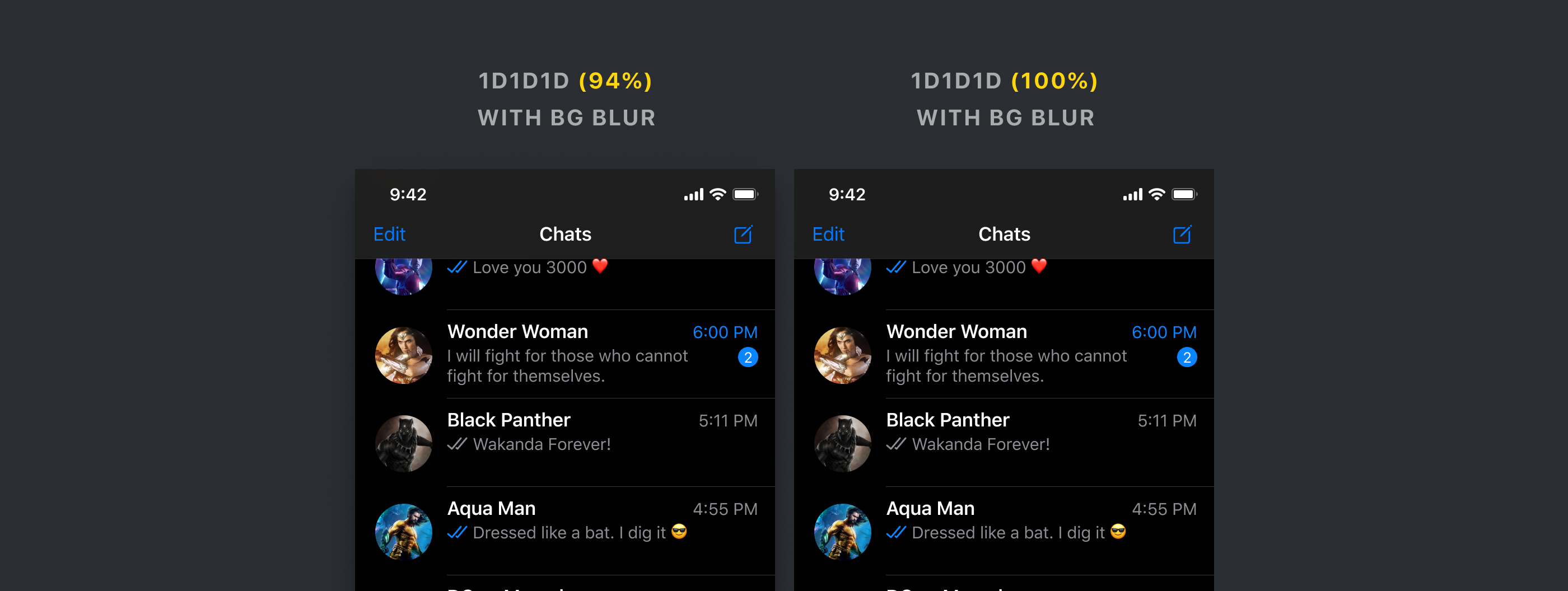
Let’s start with the Top Navigation Bar and the Bottom Tab Bar. While the guidelines do not consider these as materials, they clearly behave as Materials.
让我们从顶部导航栏和底部标签栏开始。 尽管准则不将其视为材料,但它们显然表现为材料。
Make sure you use the exact same components from the UI Kit for these 2 bars. There is a background blur value applied to these components.
确保为这两个栏使用UI套件中完全相同的组件。 有一个背景模糊值应用于这些组件。
Now you might not see the blur on the content behind the bars because the transparency value is very high (94%). But it gives a very subtle effect.
现在,由于透明度值非常高(94%),您可能看不到条形内容的模糊。 但这会产生非常微妙的效果。
Quick question? Do these bars have to be materials? Can I make them fully opaque with 100% opacity?
快速提问? 这些条必须是材料吗? 我可以使它们完全不透明,且不透明度为100%吗?
Yes. Of course. Let me show you an example.
是。 当然。 让我给你看一个例子。
Both of the Nav Bars have a background blur applied to it. The one on the left is not fully opaque. But as you can see, there is hardly any difference. Also, the content below is not being blurred.
两个导航栏都应用了背景模糊 。 左边的那个不是完全不透明的。 但是正如您所看到的,几乎没有任何区别。 另外,以下内容也不会模糊。
Now let's see these with a proper material.
现在让我们用合适的材料查看它们。

As you can see there are 4 variants. You can choose whichever you wish to. But do remember that it's recommended to use the exact components from the UI kit as they have all the values for blur and opacity defined.
如您所见,有4个变体。 您可以选择任何想要的。 但是请记住,建议使用UI套件中的确切组件,因为它们已定义了模糊和不透明度的所有值。
Let’s look at the materials on the bottom Tab Bar.
让我们看一下底部标签栏上的材料。

They look beautiful 🤩. Don’t they?
他们看起来很漂亮。 不是吗
Btw, Materials are also used for components such as notifications and modals. Here is an example of Materials used in Modals.
顺便说一句,材料还用于诸如通知和模态之类的组件。 这是模态中使用的材料的示例。

We are almost there! Just one last thing and then it’s a wrap!
我们就快到了! 只是最后一件事,然后就好了!
控制项 (Controls)
For elements such as segmented controls (Tabs), sliders, search bars, switches, try using the components from the UI kit.
对于分段控件(Tab),滑块,搜索栏,开关等元素,请尝试使用UI套件中的组件。
Of course, you can definitely, use own colors, but why waste time making them from scratch.
当然,您当然可以使用自己的颜色,但是为什么要浪费时间从头开始制作它们。
Always remember that the more work for you — the more work for the developer.
永远记住,为您提供更多的工作-为开发人员提供更多的工作。
还有……那是个包裹! (And… That’s a wrap!)
So that is pretty much everything you need to know about designing Dark Mode for your iOS app. Feel free to reach out to me anytime if you need any clarification or get stuck anywhere. You can send me a message on any social media platform. I will be more than happy to help you out 😁.
因此,这几乎是您为iOS应用程序设计暗模式所需的所有知识。 如果您需要任何澄清或卡在任何地方,请随时与我联系。 您可以在任何社交媒体平台上给我发送消息。 我会很乐意为您提供帮助。
资源资源 (Resources)
🔥免费2个月的Skillshare Premium! (🔥 2 Free months of Skillshare Premium!)
If you want to learn to build a fully functional website from scratch without using a single line of code in Webflow, make sure to check out my Mega Webflow Course for Beginners! You can find the course on Skillshare
如果您想学习从头开始构建功能齐全的网站,而无需在Webflow中使用任何代码,请务必查看我的Mega Webflow初学者课程! 您可以在Skillshare上找到课程
Register with my link and get 2 free months of Skillshare Premium and watch it for free.
使用我的链接注册并免费获得2个月的Skillshare Premium,并免费观看。

翻译自: https://blog.prototypr.io/designing-a-dark-mode-for-your-ios-app-the-ultimate-guide-6b043303b941
ios应用开发入门指南


 扫一扫
扫一扫

 被折叠的 条评论
为什么被折叠?
被折叠的 条评论
为什么被折叠?
 到【灌水乐园】发言


