


重点 (Top highlight)
Inspired by Suchit Poojari’s article, Redesigning the bottom navigation for 2020, I have decided to re-evaluate the way we treat bottom navigation.
受Suchit Poojari的文章“ 重新设计2020 年底 部导航”的 启发 ,我决定重新评估我们对待底部导航的方式。
底部导航栏的重要性 (The importance of the bottom navigation bar)
The bottom navigation bar breaks an interface into its core components and allows users to quickly and easily toggle between high-level functions. Its easily accessible and comfortable location makes it incredibly pervasive on mobile applications.
底部导航栏将界面分为其核心组件,并允许用户快速轻松地在高级功能之间切换。 它易于访问且舒适的位置使其在移动应用程序中无处不在。

底部导航栏的当前状态 (The current state of the bottom navigation bar)
While the bottom navigation bar is incredibly useful, the sheer diversity in device size, shape, and edges makes it very difficult to design a uniform bottom navigation bar.
尽管底部导航栏非常有用,但是设备尺寸,形状和边缘的多样性使得设计统一的底部导航栏非常困难。

As Poojari puts it, the problem is “that designers, as well as developers, would/are facing is the different corner radius and bottom chin of the devices.”
正如Poojari所说 ,问题是“设计人员以及开发人员将面临的是设备的不同拐角半径和下巴。”
With all of this in mind, how might we redesign the bottom navigation bar to accommodate for the increase in device diversity?
考虑到所有这些,我们如何重新设计底部导航栏以适应设备多样性的增加?
底部导航栏浏览 (Bottom Navigation Bar Exploration)
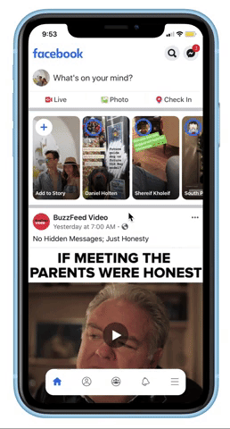
I created 6 different iterations for what the future of the bottom navigation bar could be. I used the Facebook app when creating my mockups as it is commonly used and has 4 key functions (generally navigation bars have between 3–5).
我为底部导航栏的未来创建了6个不同的迭代。 我在创建模型时使用了Facebook应用程序,因为它很常用,并且具有4个关键功能(通常导航栏为3-5)。
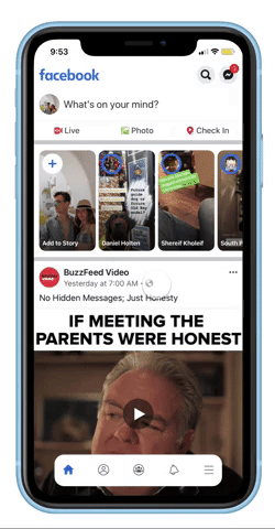
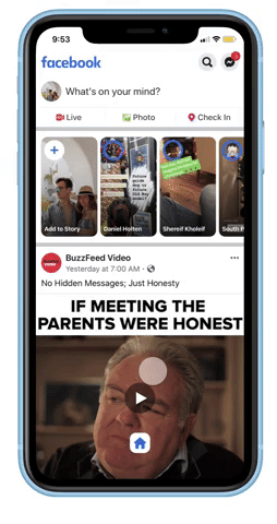
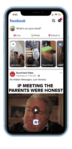
垂直弹出式侧面导航 (The Vertical Pop Up Side Navigation)
The Vertical Pop Up Side Nav relies on a single icon to show more options. It can be fixed to either the right or left side of the device depending on which hand the user prefers.
“垂直弹出式侧面导航”依靠单个图标显示更多选项。 可以将其固定在设备的右侧或左侧,具体取决于用户喜欢哪只手。

The floating icon would change depending on the page the user is currently on. For example, if the user is on Notifications, the floating icon would change to the Bell icon. Its fixed location slightly above the bottom edge accommodates any device type.
浮动图标将根据用户当前所在的页面而变化。 例如,如果用户使用“通知”,则浮动图标将更改为“响铃”图标。 它位于底边缘稍上方的固定位置可容纳任何设备类型。
水平弹出式侧面导航 (The Horizontal Pop Up Side Navigation)
The Horizontal Pop Up Side Nav also relies on an icon to open up more options. The open nav does not span the full screen to accommodate for all device types.
“水平弹出侧面导航”还依赖于图标来打开更多选项。 打开的导航栏不会覆盖全屏,无法容纳所有设备类型。

This iteration provides slightly more space to view content and is similar to existing interaction patterns. This should make it easier for new users to adjust to this navbar.
此迭代提供了更多的空间来查看内容,并且类似于现有的交互模式。 这应该使新用户更容易适应此导航栏。
减少水平导航 (Reduced Horizontal Navigation)
This design is based on Pinterest’s beta version navigation. The interaction patterns are the same, but the goal of this iteration is to show their concept could be applied to other applications.
此设计基于Pinterestbeta版本导航 。 交互模式相同,但是此迭代的目的是表明它们的概念可以应用于其他应用程序。
This design condenses the navigation more toward the center which accommodates any device size. When a user scrolls down the navigation disappears allowing them to see more content. When they scroll up, the navigation bar re-appears and users can dive into any function.
这种设计使导航更趋向于可容纳任何设备尺寸的中心。 当用户向下滚动时,导航消失,从而允许他们查看更多内容。 当他们向上滚动时,导航栏会重新出现,用户可以进入任何功能。
中心导航下拉 (Center Navigation Drop Down)
This design relies on a centered icon to display more options. Upon pressing the icon, the entire navigation window opens and is fixed on the scroll.
此设计依靠居中图标显示更多选项。 按下图标后,整个导航窗口将打开并固定在滚动条上。
Having one icon slightly above the rest is a salient design choice to show the user where they are on the interface. From a development/design standpoint, it fits slightly more content on your navigation horizontally. The icon in the center is relatively small, so it shouldn’t distract too much from the page content.
一个显着的设计选择是使图标略微位于其余图标的上方,以向用户显示它们在界面上的位置。 从开发/设计的角度来看,它在水平导航中略微容纳了更多内容。 中间的图标相对较小,因此不应过多分散页面内容。
钻石导航 (Diamond Navigation)
The diamond navigation bar has a central icon that folds out similar to the way people navigate on a game controller. While this interaction pattern is slightly less space-efficient, it does easily divide up the content.
菱形导航栏具有一个中央图标,该图标可以折叠,类似于人们在游戏控制器上导航的方式。 尽管此交互模式的空间效率略低,但确实很容易划分内容。
This iteration is more playful which could make it useful for entertainment applications. For apps like Facebook or Instagram, I am not sure how productive it would be.
此迭代更有趣,可以使其在娱乐应用程序中有用。 对于诸如Facebook或Instagram之类的应用程序,我不确定它的生产率如何。
浓缩固定导航 (Condensed Fixed Navigation)
This navigation option is most similar to the traditional bottom navigation bar. However, the content is slightly more condensed to the center of the page, accommodating any device shape.
此导航选项与传统的底部导航栏最相似。 但是,内容稍微浓缩到页面中心,以适应任何设备形状。
Due to its similarities with existing navigation bars, this would be the easiest adjustment for users. The rounded edges also make the application feel more friendly and organic.
由于其与现有导航栏的相似性,因此这对用户而言是最简单的调整。 圆角的边缘还使应用程序感觉更友好和有机。
结论思想 (Concluding Thoughts)
2020 could be the year where we change the traditional bottom navigation bar. Although the existing iteration is very strong, new design choices could improve the overall user experience and make it far easier for designers/ developers to create uniform navigation.
2020年可能是我们更改传统底部导航栏的一年。 尽管现有的迭代非常强大,但是新的设计选择可以改善整体用户体验,并使设计人员/开发人员更轻松地创建统一的导航。
This was a preliminary exploration of how might we improve the bottom navigation and I encourage you to try some iterations as well. Please let me know your thoughts on which navigation style you like the best!
这是对我们如何改善底部导航的初步探索,我鼓励您也尝试一些迭代。 请让我知道您对哪种导航风格最满意的想法!
Thanks for reading!
谢谢阅读!
I am a student designer with a lot to learn! Any insights, differing opinions, or expert advice is always welcome. I am always open to having a dialogue with others and recognize that I am not an industry expert just yet. Thanks so much for reading!
我是一个学习很多的学生设计师! 始终欢迎任何见解,不同意见或专家建议。 我一直乐于与他人进行对话,并认识到我还不是行业专家。 非常感谢您的阅读!
Sources:
资料来源:
https://www.uxmatters.com/mt/archives/2013/02/how-do-users-really-hold-mobile-devices.php
https://www.uxmatters.com/mt/archives/2013/02/how-do-users-really-hold-mobile-devices.php
https://uxdesign.cc/please-dont-replace-the-bar-with-the-drawer-d9808850ca87
https://uxdesign.cc/please-dont-replace-the-bar-with-the-drawer-d9808850ca87
https://uxplanet.org/redesigning-the-bottom-navigation-for-2020-d332ee487ddb
https://uxplanet.org/redesigning-the-bottom-navigation-for-2020-d332ee487ddb
https://uxplanet.org/perfect-bottom-navigation-for-mobile-app-effabbb98c0f
https://uxplanet.org/perfect-bottom-navigation-for-mobile-app-effabbb98c0f
翻译自: https://medium.com/swlh/re-imagining-the-bottom-navigation-bar-f6f4cb64afa6


 扫一扫
扫一扫
 1134
1134

 被折叠的 条评论
为什么被折叠?
被折叠的 条评论
为什么被折叠?
 到【灌水乐园】发言


