


响应式设计设备尺寸
This is my second article on designing for different screen sizes and devices. In the previous part I outline the basics of fixed layouts, adaptivity, fluiditity and responsivity. In this article, I discuss some more important aspects, for instance responsive images, pixel density, responsive texts and some other related techniques like infinite scrolling.
这是我的第二篇有关针对不同屏幕尺寸和设备进行设计的文章。 在上一部分中,我概述了固定布局,适应性,流动性和响应性的基础。 在本文中,我将讨论一些更重要的方面,例如响应式图像,像素密度,响应式文本以及其他一些相关技术,例如无限滚动。
响应度和图像 (Responsivity & Images)
First let’s talk about images.
首先让我们谈谈图像。
One safe solution for including images in your layouts is using a fix aspect ratio, e.g. for many years Instagram only allowed users to upload square images with a 1:1 aspect ratio (and your photo grid screen still contains square images, it crops anything that is not a square).
一种将图像包含在布局中的安全解决方案是使用固定的宽高比 ,例如,多年以来,Instagram仅允许用户上传宽高比为1:1的正方形图像(并且您的照片网格屏幕仍包含正方形图像,它会裁剪任何不是正方形)。
Now, what happens if you are not working with a 1:1 aspect ratio? In case of a fluid container, the aspect ratio might change depending on the changes of the viewport size. And if you have a fix height, and a dynamically changing, fluid width, you might end up with a distorted image.
现在,如果您不使用1:1的宽高比会发生什么? 如果是流体容器,则宽高比可能会根据视口大小的变化而变化。 而且,如果您具有固定的高度和动态变化的流体宽度,则最终可能会导致图像失真。
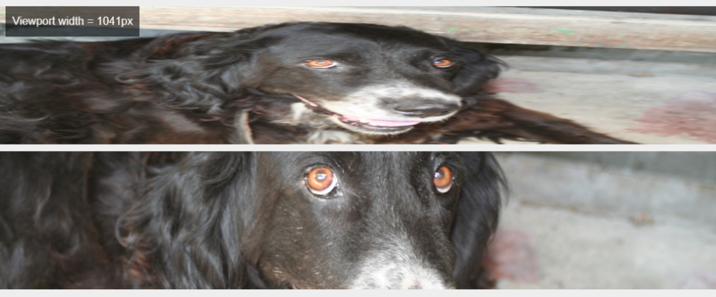
In the following example, both of these images have a fix and identical height.
在下面的示例中,这两个图像均具有固定值和相同的高度。
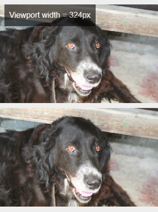
Upon changing the viewport size, the image above gets distorted. On the contrary, the image below doesn’t get distorted, the biggest possible portion of the image is displayed without any distortion:
更改视口大小后,上面的图像会变形。 相反,下面的图像不会失真,显示的图像最大可能部分没有任何失真:
The key takeaway here is that you, as a designer should specify what should happen with the images upon viewport size changes, how these elements are displayed on different viewport sizes.
这里的主要要点是,作为设计师 , 您应该指定在更改视口大小时图像应如何处理 ,以及如何在不同视口大小下显示这些元素。
And how can we specify what part of the image will be displayed and what part will be cropped out?
以及我们如何指定将显示图像的哪一部分以及将裁剪出哪一部分?
艺术方向 (Art direction)
Usually it’s handled by dynamic cropping — but what happens if the most important part of the image is off-center, e.g. if the rule of thirds was applied, and the subject of the image is placed at the intersection points nearer to the left or right side of the picture? In these cases, dynamic cropping might crop out the main subject. A possible solution is that you can identify focal points, and there are tools that include for instance face detection. So you can either address this issue by manually setting focal points, or there are solutions for automatic art direction (this is the specific term for this activity).
通常,它是通过动态裁剪处理的-但是,如果图像的最重要部分偏离中心 ,例如应用了三分法则,并且图像的主题放置在更靠近左侧或右侧的交点处,会发生什么情况图片的一面? 在这些情况下,动态裁剪可能会裁剪出主要主题。 一个可能的解决方案是您可以确定焦点 ,并且有一些工具包括例如面部检测 。 因此,您可以通过手动设置焦点来解决此问题,也可以采用自动艺术指导的解决方案(这是此活动的专用术语)。
Btw. it is not only about keeping the important part. Let’s say you have a landscape photo with a group of people in the middle (e.g. a family or a group of friends). On larger viewport sizes, it might be easy to tell who is in the picture, you can see their faces very well. However, on smaller viewport sizes it might become hard to recognize someone on such pictures (at least without zooming in).
顺便说一句。 这不仅仅是保留重要部分。 假设您有一幅风景照片,中间有一群人 (例如一家人或一群朋友)。 在较大的视口中,可能很容易分辨出图片中的人,因此可以很好地看到他们的脸。 但是, 在较小的视口中,可能很难识别此类图片上的人物(至少没有放大)。
So another solution is that you can define different pictures for the different viewport sizes (e.g. in Bootstrap’s system, one for the small, one for the medium and so on), and these different images show different parts of the original picture, so for instance you can sort of zoom in (crop out the unnecessary parts), and only show the faces on a smaller viewport size. That way, you’ll be able to assign a good quality image to each size — e.g. your smaller picture’ll be good enough for a smaller screen, and it’ll positively impact the performance, it’ll load faster, so it’s great from a UX perspective. And at the same time, on a large screen, a big enough picture’ll be displayed.
因此,另一种解决方案是您可以为不同的视口尺寸定义不同的图片 (例如,在Bootstrap的系统中,一个用于小尺寸,一个用于中号,依此类推),并且这些不同的图像显示原始图像的不同部分,例如您可以进行某种程度的放大(剪裁掉不必要的部分),并且只在较小的视口中显示这些面。 这样,您就可以为每种尺寸分配高质量的图像-例如,较小的图片足以适应较小的屏幕,并且会对性能产生积极影响,并且加载速度更快,因此效果非常好从用户体验的角度来看。 同时,在大屏幕上,将显示足够大的图片。
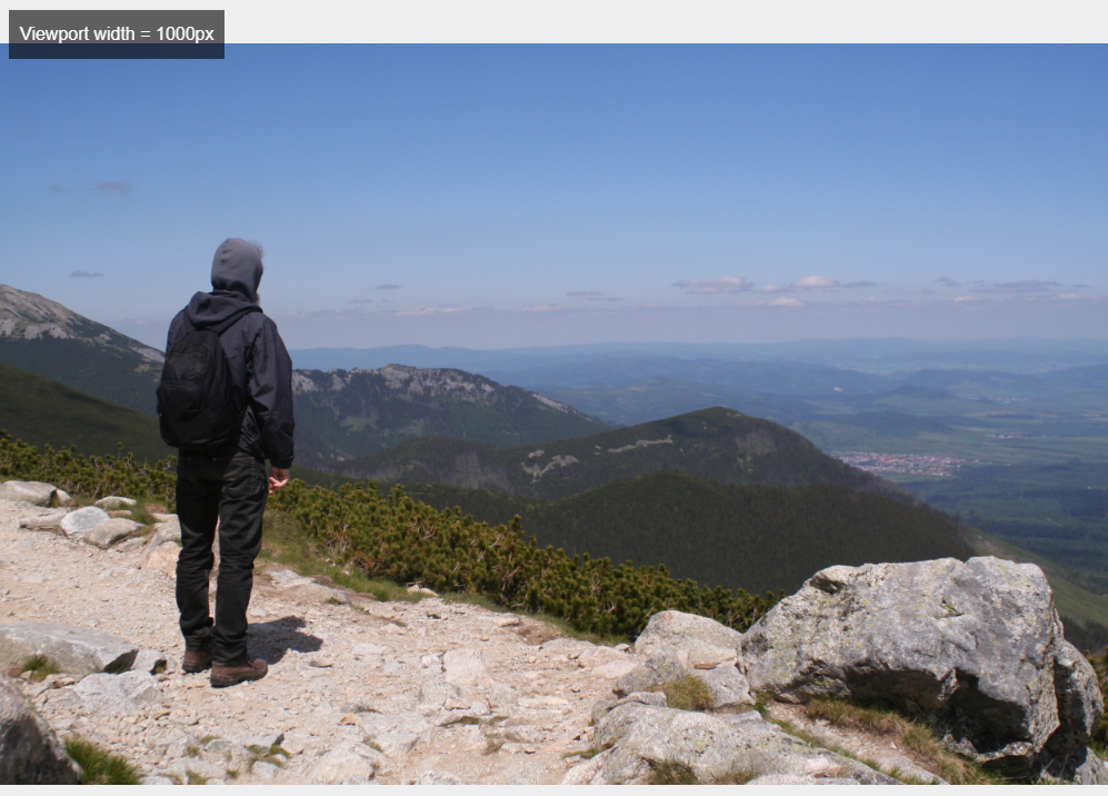
Let’s take a look at an art direction example, as you’ll see on the landscape version of the photo, the main subject is off-center:
让我们看一个艺术指导示例,就像您在照片的风景版本上看到的那样,主要主题偏离中心:
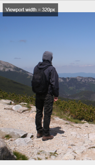
On smaller viewport sizes, the image is displayed in portrait mode — the person on the image is the main subject, he is the relevant part:
在较小的视口上,图像以纵向模式显示-图像上的人是主要主题,而他是相关部分:
So until this point I talked about
所以直到现在我谈论
Automatically and manually defined focal points
自动和手动定义的焦点
And using different parts, zoom-levels or orientations of the same image.
并使用同一图像的不同部分 ,缩放级别或方向。
There is one more option: you can attach completely different images for the different viewport sizes (so not only different parts of the same image). For instance on a national park website you can include a detailed drone photo of the park for bigger viewport sizes, and a picture of a flower for smaller sizes.
还有一个选项: 您可以为不同的视口大小附加完全不同的图像 (因此,不仅是同一图像的不同部分)。 例如,在国家公园网站上,您可以包括详细的无人机照片,以查看较大的视窗大小,并提供花朵的图片以较小的大小。
屏幕分辨率和像素密度 (Screen resolution and pixel density)
Sn aspect I’d like to mention in connection with pixels is that there are high pixel density screens.
我想在像素方面提到的一个方面是,有高像素密度的屏幕 。
A screen resolution refers to the number of pixels: how many pixels are displayed horizontally and vertically. Now, pixel density [Pixels per inch (PPI)] tells you how many pixels are displayed within a given area of the screen.
屏幕分辨率是指像素数:水平和垂直显示多少个像素。 现在, 像素密度 [每英寸像素(PPI)]告诉您在屏幕的给定区域内显示了多少像素。
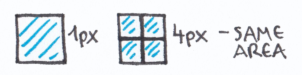
For example this is one pixel on the left, and there are 4 pixels ond the right, and the size of the area is the same:
例如,这是左边的一个像素,右边是4像素,并且区域的大小是相同的:
So what this means from a UX perspective is that in case of a cheaper, low-end device, it’s not a good idea to include a high resolution image, since it can’t be displayed in its original form, it must be downscaled first (and the bigger file size might also cause performance problems).
因此,从用户体验的角度来看,这意味着在便宜的低端设备上,包括高分辨率图像不是一个好主意 ,因为它不能以其原始形式显示,因此必须先缩小比例 (较大的文件大小也可能会导致性能问题)。
At the same time you should keep in mind that you need high resolution images to provide sharp, good-looking pictures on high-end devices. So this is another aspect you need to consider.
同时,请记住,需要高分辨率的图像才能在高端设备上提供清晰,美观的图像。 因此,这是您需要考虑的另一方面。
栅格和位图图像 (Raster and bitmap images)
Until this point I mainly talked about raster or bitmap images. You surely know the difference between raster and vector images, to put it really simply, vector images are based on mathematical calculations, so these are infinitely scalable. On the other hand, raster images are made of pixels, and not scalable infinitely. Also, a vector file has a smaller file size, so it’s better for performance. A commonly used format is SVG, that is stands for Scalable Vector Graphics. So in case of a logo, icons, illustrations you should apply SVGs, these are great for all screen resolutions and pixel densities.
在此之前,我主要谈论光栅或位图图像。 您肯定知道光栅图像和矢量图像之间的区别,简单地说, 矢量图像是基于数学计算的,因此它们可以无限扩展 。 另一方面, 光栅图像由像素组成,并且不能无限缩放 。 此外,矢量文件的文件较小,因此性能更好。 SVG是一种常用格式,代表可伸缩矢量图形。 因此,如果是徽标,图标,插图,则应应用SVG,它们非常适合所有屏幕分辨率和像素密度。
And of course you can define different SVG files for different screen sizes, e.g. a detailed infographic is not always the best solution for a smaller viewport size.
当然,您可以为不同的屏幕尺寸定义不同的SVG文件,例如,对于较小的视口尺寸,详细的信息图并不总是最佳的解决方案。
文字内容和视频 (Textual content and videos)
And what about textual content? It is a good practice to specify a maximum length for each textual element. Other aspects include typographic choices, like fonts, font sizes, spacing. And in many cases, the textual content itself is also different for different viewport sizes, for example you might want to display only some short paragraphs on a mobile device, while on larger viewport sizes you might want to include longer stories.
那文本内容呢? 最好为每个文本元素指定最大长度 。 其他方面包括印刷选择 ,例如字体,字体大小,间距。 而且在许多情况下,文本内容本身对于不同的视口大小也有所不同,例如,您可能只想在移动设备上显示一些短段落,而在较大的视口中,可能要包含较长的故事。
You should also discuss with developers how to add videos — e.g. a background video. And another aspect is that you should specify what should be the printable parts of a layout (so for instance you don’t want to include the menu bar or ads displayed next to the actual content).
您还应该与开发人员讨论如何添加视频 ,例如背景视频。 另一个方面是,您应该指定布局的可打印部分 (例如,您不想在实际内容旁边显示菜单栏或广告)。
骨骼,延迟加载和无限滚动 (Skeletons, lazy loading and infinite scrolling)
Finally, I’d like to mention three additional techniques.
最后,我想提一下另外三种技术。
Applying skeleton contents or skeleton screens means that before the actual content, a low-fidelity mock-up or placeholder is displayed. It makes the perceived loading time shorter, so it increases the perceived performance.
应用骨架内容或骨架屏幕意味着在实际内容之前显示低保真模型或占位符 。 它缩短了感知的加载时间,因此提高了感知的性能。
The second technique is the so-called lazy loading. In this case the content is gradually loaded, and its loading is initiated by scrolling down. So the content outside of the viewport is only loaded if the user scrolls to them.
第二种技术是所谓的延迟加载 。 在这种情况下,将逐渐加载内容,并通过向下滚动来启动其加载。 因此,仅当用户滚动到视口之外时,才会加载视口外部的内容。
Infinite scrolling is a similar technique. It’s used by for example Facebook, Twitter or Instagram. There is no pagination, the content is continuously loaded as the user scrolls down.
无限滚动是一种类似的技术。 它被例如Facebook,Twitter或Instagram使用。 没有分页,当用户向下滚动时,内容将连续加载。
When you create layouts for websites or for applications, you should keep these techniques in mind, consider using them. Of course there are many more ways and techniques for performance optimization, you should discuss the possibilities with the developers.
在为网站或应用程序创建布局时,应牢记这些技巧,请考虑使用它们。 当然,还有许多用于性能优化的方法和技巧,您应该与开发人员讨论各种可能性。
Next to these already mentioned aspects, here are some more things to keep in mind.
除了已经提到的这些方面之外,还需要记住一些其他事项。
更多方面 (Some more aspects)
Different devices or platforms might involve…
不同的设备或平台可能涉及…
Using different design guidelines (e.g. Material Design, Human Interface Guidelines)
使用不同的设计准则 (例如,材料设计,人机界面准则)
Designing for different ways of user input, e.g. on handheld devices, you’ll design with the different gestures in mind; while on desktop, users apply cursors (e.g. you can use hover states)
针对不同的用户输入方式(例如在手持设备上)进行设计时,您将牢记不同的手势; 在桌面上时,用户会应用光标(例如,您可以使用悬停状态)
Using different UI components, UI design patterns, animations
使用不同的UI组件,UI设计模式,动画
The most important thing is that you should discuss what the available options are with the developers. For instance you should ask what libraries, reusable components, existing solutions should be used in their opinion. Creating custom solutions, for example custom UI libraries requires more development effort. Of course most of the existing libraries let you customize things to a certain extent, but you should certainly talk about these with the developers.
最重要的是, 您应该与开发人员讨论可用的选项 。 例如,您应该问他们认为应该使用哪些库,可重用组件以及现有解决方案 。 创建自定义解决方案,例如自定义UI库需要更多的开发工作。 当然,大多数现有库都可以在一定程度上自定义事物,但您当然应该与开发人员讨论。
Let me know if you have any more tips & tricks for designing for different viewport sizes & devices!
如果您还有其他针对不同视口大小和设备进行设计的提示和技巧,请告诉我!
Originally published at https://protostar.space on March 27, 2020.
最初于 2020年3月27日 在 https://protostar.space 上 发布 。
响应式设计设备尺寸


 扫一扫
扫一扫
 1806
1806

 被折叠的 条评论
为什么被折叠?
被折叠的 条评论
为什么被折叠?
 到【灌水乐园】发言


