


css 样式属性
As a front-end developer, it is critical to master CSS. You will be dealing with it on a daily basis. One of the biggest frustrations with CSS is the lack of error codes. You cannot just copy an error code into google and find an answer. As such, I believe it is very import to have a thorough understand of CSS principles and how to organize your CSS code so it is maintainable. Below is an overview of the most common CSS properties you should know.
作为前端开发人员,掌握CSS至关重要。 您将每天处理它。 CSS最大的挫败之一就是缺少错误代码。 您不能只将错误代码复制到Google中并找到答案。 因此,我认为全面了解CSS原理以及如何组织CSS代码以使其易于维护是非常重要的。 以下是您应该了解的最常见CSS属性的概述。
Reset: At the beginning of your CSS file, you should reset the box-sizing, padding, and margin by inserting the following code in *{}. This will make it easier to manage the spacing between elements.
重置:在CSS文件的开头,您应通过在* {}中插入以下代码来重置框大小,填充和边距。 这将使管理元素之间的间距更加容易。
- box-sizing: border-box ==> prevents padding from increasing the size of the element box-sizing:border-box ==>防止填充增加元素的大小
- padding: 0 ==> sets all padding to 0padding:0 ==>将所有padding设置为0
- margin: 0 ==> sets all margin to 0 margin:0 ==>设置所有margin为0
Relative Units:
相对单位:
- %: percent of parent %:父母的百分比
- em: multiple relative to parent.em:相对于父级的倍数。
- rem: multiple relative to root element rem:相对于根元素的倍数
- vw: % relative to viewport widthvw:相对于视口宽度的%
- vh: % of viewport height vh:视口高度的百分比
Display:
显示:
block: The width of each element is 100% which means each element has its own line. List of elements that are block by default: https://www.w3schools.com/html/html_blocks.asp
块:每个元素的宽度为100%,这意味着每个元素都有自己的线。 默认情况下被阻止的元素列表: https : //www.w3schools.com/html/html_blocks.asp
- inline: Elements will be bunched up against each other horizontally. Width and margin properties cannot be applied to inline elements. 内联:元素将在水平方向上相互束扎。 宽度和边距属性不能应用于内联元素。
- inline-block: Elements will be squeezed together horizontally. You may apply width and margin properties. inline-block:元素将水平挤压在一起。 您可以应用width和margin属性。
- flex: All direct children become flex items. More detail below. flex:所有直接子代都将成为flex项目。 下面有更多详细信息。
- grid: All direct children become grid items. More detail below. 网格:所有直接子代均成为网格项。 下面有更多详细信息。
Padding/Margin
填充/边距
Padding: Spacing between the element and inner elements. By default, padding increases the size of the element. Note, if you set box-sizing: border-box, padding will not increase the size of the element. When inspecting elements using chrome developer tools, padding is green.
填充:元素和内部元素之间的间距。 默认情况下,填充会增加元素的大小。 请注意,如果设置box-sizing:border-box,则填充不会增加元素的大小。 使用chrome开发工具检查元素时,填充为绿色。
Margin: Spacing between the element and outer elements. Margins do not increase the size of the element. When inspecting elements using chrome developer tools, margin is orange.
边距:元素与外部元素之间的间距。 边距不会增加元素的大小。 使用chrome开发人员工具检查元素时,边距为橙色。
- Centering: You can center the child elements by using margin: auto auto. The first auto is for horizontal and the second is for vertical. To use margin: auto, the element must be “display: block.” 居中:您可以使用margin:auto auto使子元素居中。 第一个是水平的,第二个是垂直的。 要使用margin:auto,该元素必须为“ display:block”。
Positioning:
定位:
- position: static ==> Not affected by “top”, “bottom”, “left”, and “right” properties 位置:静态==>不受“顶部”,“底部”,“左”和“右”属性的影响
- position: relative ==> Enables the element to be positioned using “top”, “bottom”, “left”, and “right”.position:relative ==>允许使用“顶部”,“底部”,“左侧”和“右侧”定位元素。
- position: absolute ==> Fixed relative to the nearest parent element that is “relative” positioned. position:absolute ==>相对于“相对”定位的最近父元素固定。
- position: fixed ==> Fixed relative to the viewport 位置:固定==>相对于视口固定
- position: sticky; top: 0 ==> Fixed relative to the scroll position. It must be accompanied with a top property like “top:0” to determine how far from the top the element will remain when the user scrolls. 位置:粘性; top:0 ==>相对于滚动位置固定。 它必须伴随有top属性(如“ top:0”),以确定用户滚动时元素将离开顶部的距离。
Line Spacing:
行间距:
- line-height: 1.6em 行高:1.6em
Float: Newer styling practices use flexbox instead of floats.
Float:较新的样式实践使用flexbox而不是float。
- float: left ==> the element will move to the left of the parent container. If the parent element is using display: box, all of the elements will become inline (horizontal) instead of vertical. Note, there is no float: top or float: bottom float:left ==>元素将移动到父容器的左侧。 如果父元素使用display:框,则所有元素将变为内联(水平)而不是垂直。 注意,没有浮点数:顶部或浮点数:底部
Overflow: Determines what happens when the inner elements overflow their container.
溢出:确定内部元素溢出其容器时发生的情况。
- overflow: visible ==> By default, content that overflows outside of the element is displayed 溢出:可见==>默认情况下,显示在元素外部溢出的内容
- overflow: hidden ==> Overflow content is hidden溢出:隐藏==>溢出内容被隐藏
- overflow: auto ==> A scrollbar is added. Overflow content is hidden. The remaining content can be viewed by scrolling. 溢出:自动==>添加了滚动条。 溢出内容被隐藏。 剩余内容可以通过滚动查看。
Pseudo-Classes:
伪类:
- :last-child ==> selects the last element among its siblings. You can use this pseudo-selector to avoid writing a whole new class for this element. Note, p:last-child will only select the <p> if the last child among its siblings is <p>. :last-child ==>在同级中选择最后一个元素。 您可以使用此伪选择器来避免为此元素编写一个全新的类。 请注意,如果p:last-child兄弟姐妹中的最后一个孩子是<p>,则只会选择<p>。
- :hover ==> styles the element when the user hovers over the element. :hover ==>当用户将鼠标悬停在元素上时,会对元素进行样式设置。
- :focus ==> styles the element when the user selects it :focus ==>在用户选择元素时为其设置样式
- ::before ==> inserts content and styling before an element:: before ==>在元素之前插入内容和样式
- ::after ==> inserts content and styling after an element:: after ==>在元素之后插入内容和样式
z-index:
Z索引:
- If elements overlap, the element with the higher z-index will be displayed. 如果元素重叠,则将显示具有较高z-index的元素。
Invisibility:
隐形性:
- visibility: hidden ==> The element still occupies its normal place in the DOM but the user will not see it. 可见性:隐藏==>元素仍然在DOM中占据其正常位置,但用户看不到它。
- display: none ==> The element is removed from the DOM and the user will not see it. 显示:无==>元素已从DOM中删除,用户将看不到它。
Create a circular element/image:
创建一个圆形元素/图像:
- border-radius: 50% 边界半径:50%
Pictures:
图片:
- png files can have transparent backgrounds png文件可以具有透明背景
- jpg files can’t have transparent backgroundsjpg文件不能具有透明背景
- object-fit: cover ==> Cuts off the sides of the image, preserves the aspect ratio, and fills in the space.object-fit:cover ==>切除图像的侧面,保留长宽比,并填充空间。
- Background Image: Centers the image on the x-axis and y-axis and covers the entire page. 背景图像:将图像在x轴和y轴上居中,并覆盖整个页面。
background: url('') no-repeat center center/cover;
height: 100vh;
Flexbox: Flexbox is primarily used for 1-dimensional layouts (ie header). CSS grid is used for 2-dimensional layouts.
Flexbox:Flexbox主要用于一维布局(即标题)。 CSS网格用于二维布局。
- display: flex ==> set the display in the parent and all the children will be flex items. display:flex ==>在父级中设置显示,所有子级均为flex项目。
- default: The main axis is horizontal (row) and the cross-axis is vertical (column) 默认值:主轴为水平(行),横轴为垂直(列)
- flex-direction: row ==> the elements will be positioned horizontally side-by-side flex-direction:row ==>元素将水平并排放置
- flex-direction: column ==> the elements will be positioned vertically on top of each other.flex-direction:column ==>元素将垂直放置在彼此的顶部。
- flex-shrink: 0 ==> In flexbox, if the size of all of the children elements is larger than the container, items will shrink so that they can fit inside of the container. The items will shrink according to the flex-shrink property. If you set flex-shrink to “0” the item will not shrink at all. flex-shrink:0 ==>在flexbox中,如果所有子元素的大小都大于容器,则项目将收缩以使其适合容器内部。 这些项目将根据flex-shrink属性收缩。 如果将flex-shrink设置为“ 0”,则该项目将完全不收缩。
- flex-grow: 1 ==> The item will increase in size so that the entire row or column is filled. flex-grow:1 ==>该项目的大小将增加,以便填充整个行或列。
- flex-basis: 0 ==> Sets the initial length of the element. This depends on the flex-direction. flex-basis:0 ==>设置元素的初始长度。 这取决于伸缩方向。
- flex: 1 0 200px ==> Shortcut for flex-grow, flex-shrink, flex-basis flex:1 0 200px ==> flex-grow,flex-shrink,flex-basis的快捷方式
- To have the flex elements wrap, use the following code:要包装flex元素,请使用以下代码:
display: flex;
flexwrap: wrap;
Flavicons: Icons that appear in the tab of the webpage. The icon you display must be an .ico file. You can convert images into .ico files using: http://tools.dynamicdrive.com/favicon/
Flavicons:出现在网页标签中的图标。 您显示的图标必须是.ico文件。 您可以使用http://tools.dynamicdrive.com/favicon/将图像转换为.ico文件。
<link rel="shortcut icon" type="image/x-icon" href="favicon.ico" />Advanced Selectors:
高级选择器:
- .classA.classB ==> If you want to select an element that has two classes you have to use this syntax. .classA.classB ==>如果要选择具有两个类的元素,则必须使用此语法。
- .classA > p ==> selects all paragraphs that are direct children of classA. .classA> p ==>选择所有属于classA的直接子代的段落。
- .classA + p ==> selects the sibling paragraphs after classA. .classA + p ==>选择classA之后的同级段落。
- a[target] ==> selects all <a> tags that have an “target” attribute a [target] ==>选择所有具有“ target”属性的<a>标签
- input[type=’text’] ==> selects all <input> tags that have a “type=text”input [type ='text'] ==>选择所有具有“ type = text”的<input>标签
- nth-child(): A pseudo-selector that matches the nth child of its parent. Attach this pseudo-selector to the element you are selecting (not the parent). Do not attach this pseudo-selector to the parent. For example, for an unordered list, attach the selector to the <li> as shown below. nth-child():与其父项的第n个子项匹配的伪选择器。 将此伪选择器附加到要选择的元素(而不是父元素)上。 不要将此伪选择器附加到父项。 例如,对于无序列表,将选择器附加到<li>,如下所示。
li:first-child
/*   first child of its parent */
li:last-child
/*   selects the last child of its parent */
li:nth-child(2)
/* selects the 2nd child of its parent */
li:nth-child(3n+2)
/*   selects every third child of its parent starting at the 2nd element. */
li:nth-child(odd)
/*   selects all the odd children of the parent */
box-shadow:
盒子阴影:
- box-shadow: 10px 10px teal; 框阴影:10px 10px蓝绿色;
Variables:
变量:
- — myVariable: green ==>Put the variable in :root{} so your entire application has access to the variable. To access the variable, var( — myVariable). — myVariable:绿色==>将变量放入:root {}中,以便整个应用程序都可以访问该变量。 要访问变量var(— myVariable)。
Animations:
动画:
- animation-fill-mode: forwards ==> at the end of the animation, it will remain at the end of the animation instead of going back to the start. animation-fill-mode:在动画结束时转发==>,它将保留在动画结束处,而不是返回到开始处。
- animation-name: yourAnimationName ==> set your animation-name to the keyframe property name animation-name:yourAnimationName ==>将您的animation-name设置为关键帧属性名称
- @keyframes: from {} to {} or 0% to 25% to 50% to 75% to 100%@keyframes:从{}到{}或0%到25%到50%到75%到100%
.box {
  background: white;
  width: 200px;
  height: 200px;
  animation-name: animate1;
  animation-duration: 2s;
}
@keyframes animate1 {
  from {
    width: 200px;
  }
  to {
    width: 600px;
  }
}
Transitions:
过渡:
- transition: Creates an animation when coupled with a pseudo state or translation property. In the example below, we transition from a white background to a red background. 过渡:与伪状态或平移属性结合时创建动画。 在下面的示例中,我们从白色背景过渡到红色背景。
.box {
  background: white;
  transition: background, border-radius 2s ease-in-out;
  /*  same result*/
  /*  transition: all 2s ease-in-out; */
}
.box:hover {
  background: red;
  border-radius: 50%;
}
Transform:
转变:
- transform: rotate(25deg) ==> rotate 25 degrees 转换:rotate(25deg)==>旋转25度
- transform: skew(25deg) ==> adjusts diagonally变换:倾斜(25deg)==>对角调整
- transform: scale(2) ==> double in size变换:scale(2)==>大小加倍
- transform: translateY(100px) ==> moves element down 100px转换:translateY(100px)==>将元素下移100px
CSS Grid: CSS grid is used for 2-dimensional layouts (rows and columns). Flexbox is primarily used for 1-dimensional layouts (ie header).
CSS网格:CSS网格用于二维布局(行和列)。 Flexbox主要用于一维布局(即标题)。
- display: grid ==> set the display in the parent element and all the children will be grid items display:grid ==>在父元素中设置显示,所有子元素均为网格项
- grid-template-columns ==> width and number of columns.grid-template-columns ==>宽度和列数。
- grid-template-rows ==> height and number of rows. grid-template-rows ==>高度和行数。
- grid-gap: 10px ==> spacing between each box will be 10px grid-gap:10px ==>每个框之间的间距将为10px
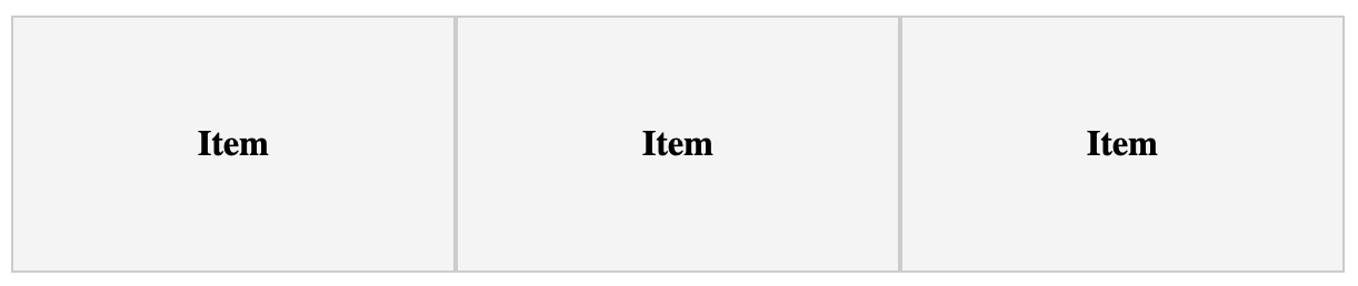
.grid {
  display: grid;
  grid-template-columns: 200px 200px 200px;
  /* auto will increase in size to fill the horizontal container */
  /* grid-template-columns: 200px auto 200px; */
  /* grid-template-columns: auto auto auto; */
  /* grid-template-columns: repeat(3, auto); */
  /* col1 = 1fraction, col2 = 2fractions, col3 = 4fractions */
  /* grid-template-columns: 1fr 2fr 4fr; */
}- grid-column: 1 / span 3 ==> Assuming this element is a grid item, the element will span from the 1st column to the 4th column grid-column:1 / span 3 ==>假设此元素是网格项,则该元素将从第一列扩展到第四列
.item:first-child {
/* the first child will take up columns 1-4 */
grid-column-start: 1;
grid-column-end: 4;
/* same as:
grid-column: 1 / span 3 */
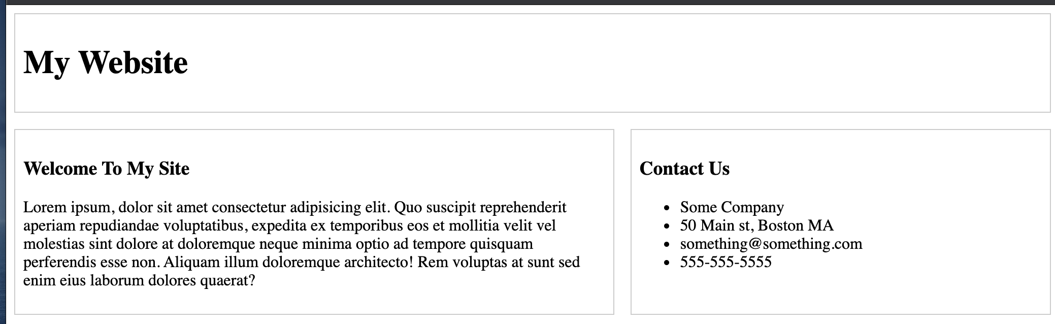
}grid-template-areas: Creates a grid representation of the output. In the example below, the header will occupy 3 columns in the first row. The content will occupy the first two columns in the second row and the sidebar will occupy 1 column in the second row. For each area in the grid-template-areas, you need to assign the area to a CSS code block using grid-area: yourArea
grid-template-areas:创建输出的网格表示。 在下面的示例中,标题将在第一行占据3列。 内容将占据第二行的前两列,而侧边栏将占据第二行的1列。 对于网格模板区域中的每个区域,您需要使用网格区域将区域分配给CSS代码块:yourArea
.container {
  display: grid;
  grid-template-areas:
    "header header header"
    "content content sidebar";
}.header {
  grid-area: header;
}.content {
  grid-area: content;
}.sidebar {
  grid-area: sidebar;
}
SASS (Syntatically Awesome Stylesheets): SASS is CSS styling with additional features mentioned below. The browser cannot read SASS directly so it must be compiled to a CSS file (typically in the “dist” folder). As such, whenever you use relative paths in your .scss file, the path should be relative to the compiled CSS file instead of the .scss file. You may use a library (like node-sass) to compile the SASS file into CSS.
SASS(语法很棒的样式表):SASS是CSS样式,具有以下提到的其他功能。 浏览器无法直接读取SASS,因此必须将其编译为CSS文件(通常在“ dist”文件夹中)。 这样,每当您在.scss文件中使用相对路径时,该路径都应相对于编译后CSS文件而不是.scss文件。 您可以使用库(例如node-sass)将SASS文件编译为CSS。
- Variables: $yourVariable: yourProperty 变量:$ your变量:yourProperty
- Nesting: 嵌套:
header {
  background: $dark-color;
  color: $light-color;
  padding: 1rem;  h1 {
    text-align: center;
  }
}- Structuring: Use & to copy the current selector and add additional selectors to it. In the example below, since &-a is inside of .section, we are selecting .section-a 结构:使用&复制当前选择器并向其添加其他选择器。 在下面的示例中,由于&-a在.section内部,因此我们选择.section-a
.section {
  padding: 3rem;
/* .section-a   */
  &-a {
    background: $primary-color;
  }
}- Imports: Typically, you put the variables in a _variables.scss file. Then you import the variables using @import “variables” Note, the underscore tells the compiler not to compile the variables file at runtime. 导入:通常,您将变量放在_variables.scss文件中。 然后使用@import“变量”导入变量。注意,下划线告诉编译器不要在运行时编译变量文件。
- Functions: Use functions to conditionally set styling. 函数:使用函数有条件地设置样式。
@function set-text-color($color) {
  @if (lightness($color) > 50) {
    @return #000;
  } @else {
    @return #fff;
  }
}header {
  color: set-text-color($dark-color);
}- Mixins: A mixin is a collection of styles you can reuse using the @include keyword. The main difference between a function and a mixin is that a function has to return a value. Mixins:mixin是可以使用@include关键字重复使用的样式的集合。 函数和mixin之间的主要区别在于,函数必须返回一个值。
@mixin transform($property) {
  transform: $property;
}.btn {
  @include transform(rotate(20deg));
}- Inheritance: In the example below, we declare a shared style of color in %btn-shared. We apply the shared styling using @extend %btn-shared. Inheritance is very similar to mixins except you cannot pass any arguments into inheritance. 继承:在下面的示例中,我们在%btn-shared中声明了一种共享的颜色样式。 我们使用@extend%btn-shared应用共享样式。 继承与mixins非常相似,不同之处在于您无法将任何参数传递给继承。
%btn-shared {
  color: #333
}.btn {
/*  .btn-light  */
  &-light {
    @extend %btn-shared;    background-color: #fff;
  }
}
Responsive Sizes and Media Queries: To test the application in various devices, click on the “iphone/tablet” icon in developer tools.
响应大小和媒体查询:要在各种设备中测试应用程序,请单击开发人员工具中的“ iphone /平板电脑”图标。
- Widescreen: @media (max-width: 1201px) {} 宽屏:@media(最大宽度:1201px){}
- Normal: @media (min-width: 769px) {} (max-width: 1200px) {} 正常:@media(最小宽度:769px){}(最大宽度:1200px){}
- Tablet: @media (min-width: 501px) {} (max-width: 768px) {} 平板电脑:@media(最小宽度:501像素){}(最大宽度:768像素){}
- Smart phone: @media (max-width: 500px) {} 智能手机:@media(最大宽度:500像素){}
- Smart phone landscape: @media (max-height: 500px) {} 智能手机景观:@media(最大高度:500像素){}
Responsive Design Practices:
响应式设计实践:
- Use fluid widths (i.e. max-width) as opposed to fixed widths 使用流体宽度(即最大宽度)而不是固定宽度
- Use media queries to set styling for various viewports使用媒体查询为各种视口设置样式
- Use rem units over px在px上使用rem单位
- Use a mobile-first approach使用移动优先的方法
- You can put the following code in the <head> of the html and the CSS will only activate if the viewport is less than 768px.您可以将以下代码放在html的<head>中,并且仅当视口小于768px时CSS才会激活。
<link rel="stylesheet" href="css/mobile.css" media="screen and (max-width: 768px)" />Bonus: You may also use javascript to manipulate CSS:
奖励:您还可以使用JavaScript来操纵CSS:
const navbar = document.getElementById("navbar");
navbar.style.background = "blue";
Bonus: The Lightbox Library will display a collection of images.
奖励:灯箱库将显示图像集合。
Download from: https://github.com/lokesh/lightbox2
从以下位置下载: https : //github.com/lokesh/lightbox2
- copy the lightbox.min.css and lighbox.min.js (make sure you have jquery added as well) 复制lightbox.min.css和lighbox.min.js(确保同时添加了jquery)
- copy all images into your image file 将所有图像复制到您的图像文件中
- add <link> in the head to lightbox.min.css在头部添加<link>到lightbox.min.css
- add a <script> with a path to the lightbox.min.js 添加带有路径的<script>到lightbox.min.js
- Wrap each <img> in <a> tags with a path to the image 将<a>标记中的每个<img>包装到图像路径
<a href="./images/cases/cases1.jpg" data-lightbox="cases" data-title="description">
  <img src="./images/cases/cases1.jpg" alt="" />
</a>
翻译自: https://medium.com/dont-leave-me-out-in-the-code/css-most-common-styling-properties-aea3e8d919ca
css 样式属性


 扫一扫
扫一扫
 360
360

 被折叠的 条评论
为什么被折叠?
被折叠的 条评论
为什么被折叠?
 到【灌水乐园】发言


