


python 可视化
Basics to create useful visuals in python using 'matplotlib' and 'seaborn'
使用'matplotlib'和'seaborn'在python中创建有用的视觉效果的基础知识
Visualizing data is the key to exploratory analysis. It is not just for aesthetic purposes, but is essential to uncover insights on data distributions and feature interactions.
可视化数据是探索性分析的关键。 它不仅出于美学目的,而且对于发现有关数据分布和功能交互的见解也是必不可少的。
In this article, you will be introduced to the basics of creating some useful and common data visualizations using the ‘matplotlib’ and ‘seaborn’ modules in python. The built-in dataset ‘iris’ from sklearn module is used for the demonstration. Only the main arguments of each plot are showcased here that will let you create simple plots without much pomp and glamour, yet serves the purpose.
在本文中,将向您介绍使用python中的“ matplotlib”和“ seaborn”模块创建一些有用且通用的数据可视化的基础知识。 sklearn模块中的内置数据集“ iris”用于演示。 这里仅展示每个情节的主要论点,使您可以创建简单的情节而没有太多的浮华和魅力,但可以达到目的。
基本图表元素 (Basic Chart Elements)
The basic chart elements such as chart title, axes labels, figure size and axes limits are common to all plots. Let’s first see how to set these and use that as the template for any plot you wish to create using ‘matplotlib’ and ‘seaborn’.
基本图表元素(例如图表标题,轴标签,图形尺寸和轴限制)对于所有绘图都是通用的。 首先,让我们看看如何设置这些参数,并将其用作要使用“ matplotlib”和“ seaborn”创建的任何图的模板。
figure, figsize : Initiate the plot area and figure sizetitle : Set the plot title xlabel, ylabel : Set the x and y axes labelsxlim, ylim : Set the x and y axes limits (optional). These limits will be automatically set based on the datashow : Display the plot
图,figsize :启动绘图区域和图形尺寸标题 :设置绘图标题xlabel,ylabel :设置x和y轴标签xlim,ylim :设置x和y轴限制(可选)。 这些限制将根据数据显示自动设置:显示图形
import matplotlib.pyplot as plt
import seaborn as snsplt.figure(figsize=(5,5))
## Line to create the desired plot ##
plt.xlabel("X Axis Label")
plt.ylabel("Y Axis Label")
plt.xlim(0,1)
plt.ylim(0,1)
plt.title("Chart title")
plt.show()
That’s it! Now, you are ready to fill in the blank chart area with any visualization of your choice. These basic elements remain the same irrespective of the plot you create. Let’s now see some common plots that come handy during data exploration.
而已! 现在,您可以选择任何可视化内容来填充空白图表区域。 这些基本元素保持不变,与您创建的图无关。 现在,让我们看一些在数据探索期间很方便的常见图。
Loading the Iris data
加载虹膜数据
First up, we need some data to play around with. Here’s how you load the commonly used ‘iris’ data from sklearn. To learn more about the different built-in datasets available in python and how to access them, check out this article.
首先,我们需要一些数据来处理。 这是从sklearn加载常用的“ iris”数据的方法 。 要了解有关python中可用的各种内置数据集以及如何访问它们的更多信息,请参阅本文 。
from sklearn import datasets
import pandas as pdiris = pd.DataFrame(datasets.load_iris().data, columns=datasets.load_iris().feature_names)
iris['species'] = [datasets.load_iris().target_names[i] for i in datasets.load_iris().target]iris.head()
可视化 (Visualizations)
Below are the plots that are demonstrated in this article.
下面是本文中演示的图。
- Histogram 直方图
- Scatter plot 散点图
- Pair plot 配对图
- Pie chart 饼形图
- Count plot 计数图
- Bar plot 条形图
- Box plot 箱形图
- Line plot 线图
- Heat maps 热图
直方图 (Histogram)
Histogram is the go-to plot for viewing how the numerical data is distributed. This is probably the simplest plot you will come across, yet the most beneficial in getting a first look of the data to study the spread of values.
直方图是查看数字数据分布方式的首选图。 这可能是您会遇到的最简单的图,但对于首先了解数据以研究值的传播最有益。
hist(x,bins) : Function to plot histogram where x is a single column of pandas dataframe and bins define the number of buckets in which the values will be segregated
hist(x,bins) :绘制直方图的功能,其中x是熊猫数据帧的单列,而bin定义了将在其中隔离值的存储桶数
plt.figure(figsize=(5,5))plt.hist(x = iris['sepal length (cm)'], bins = 10)
plt.xlabel("Sepal Length (cm)")
plt.ylabel("Frequency")
plt.title("Histogram of Sepal Length")
plt.show()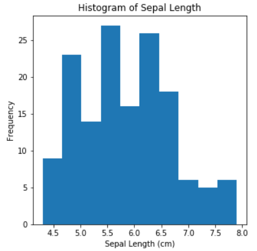
散点图 (Scatter Plot)
Scatter plot shows the relationship between two numerical variables. This is a crucial plot in setting up regression-like analyses.
散点图显示了两个数值变量之间的关系。 这是建立类似回归分析的关键图。
scatter(x,y) : Function to plot x vs y variables
scatter(x,y) :绘制x与y变量的函数
plt.figure(figsize=(5,5))plt.scatter(x=iris['petal length (cm)'], y=iris['petal width (cm)'])
plt.xlabel("Petal Length (cm)")
plt.ylabel("Petal Width (cm)")
plt.title("Petal Length vs Petal Width")
plt.show()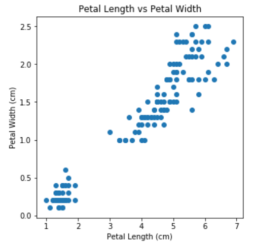
对图 (Pair Plot)
Now, let us use ‘seaborn’ to create plots among pairs of numerical variables. Histograms will be plotted for individual variables and scatter plots for the pairs. If you have any categorical variable of interest, it can be used as the ‘hue’ argument in the pairplot function to see the points in the plot separately colored for each category.
现在,让我们使用“ seaborn”在成对的数字变量之间创建图。 将为各个变量绘制直方图,并为各对绘制散点图。 如果您有任何感兴趣的类别变量,则可以将其用作pairplot函数中的“ hue”参数,以查看图中每个类别分别着色的点。
pairplot(data, hue) : Function to plot the pairs of numerical variables in ‘data’ and colored by the variable mentioned in ‘hue’
pairplot(data,hue) :用于绘制“数据”中的数值变量对并由“色相”中提到的变量着色的函数
Unlike matplotlib, a single line of code is sufficient to get the plot in the required format with all basic elements.
与matplotlib不同,单行代码就足以以所需格式包含所有基本元素来获取绘图。
sns.pairplot(data=iris, hue='species')
饼形图 (Pie Chart)
For categorical data, pie chart can be used to see the proportion of each category in a field. This is not a great choice of visualization if you have too many categories as the readability of the plot greatly reduces.
对于分类数据,可以使用饼图查看字段中每个类别的比例。 如果类别太多,这不是可视化的最佳选择,因为绘图的可读性会大大降低。
pie(x,labels,autopct) : Function to plot pie chart with ‘x’ as the counts or values, ‘labels’ denoting the categories, ‘autopct’ to define the format of the values to be displayed on each slice
pie(x,labels,autopct) :用于绘制饼图的功能,以“ x”作为计数或值,“ labels”表示类别,“ autopct”定义要在每个切片上显示的值的格式
plt.figure(figsize=(5,5))plt.pie(x=iris['species'].value_counts(),labels=iris['species'].value_counts().index, autopct='%0.2f%%')
plt.title("Iris Species Proportion")
plt.show()
计数图 (Count Plot)
The ‘countplot ‘ function in ‘seaborn’ is a better choice over pie chart to plot the proportion of each class in a categorical field. Bars are more understandable in studying proportions as compared to pie slices.
与饼图相比,“季节性”中的“计数”功能是更好的选择,可以绘制类别字段中每个类别的比例。 与饼片相比,条形在研究比例时更容易理解。
countplot(x) : Function to plot the count of data points in each class of a categorical field
countplot(x) :用于绘制分类字段每个类别中的数据点计数的函数
sns.countplot(x=iris['species'],color='green')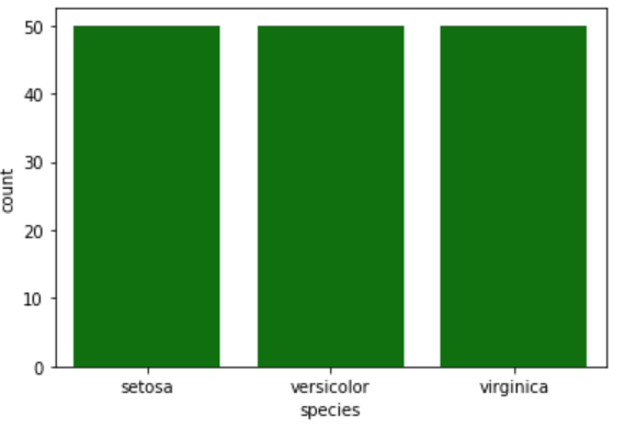
条形图 (Bar Plot)
Bar plots are used when you need to plot a numerical variable across a categorical variable.
当需要在分类变量上绘制数字变量时,可以使用条形图。
barplot(x,y) : Function in ‘seaborn’ to plot bars with x (usually a categorical field) and y (numerical field)
barplot(x,y) :在“ seaborn”函数中使用x(通常是分类字段)和y(数字字段)绘制条形图
The same can be achieved using ‘bar’ function in matplotlib with the similar arguments — x for categorical and height for numeric fields.
在matplotlib中使用带有类似参数的'bar'函数可以实现相同的效果-x代表分类, height代表数字字段。
# plt.bar(x=iris['species'], height=iris['petal length (cm)'])
sns.barplot(x=iris['species'],y=iris['petal length (cm)'])
The same plot can be converted to a horizontal bar plot if you just flip the x and y inputs in barplot function. Similarly, if you are using matplotlib, ‘barh’ function can be used with arguments y and width.
如果仅在barplot函数中翻转x和y输入,则可以将同一图转换为水平条形图。 同样,如果您使用的是matplotlib,则'barh'函数可与y和width参数一起使用。
# plt.barh(y=iris['species'], width=iris['petal length (cm)'])
sns.barplot(y=iris['species'],x=iris['petal length (cm)'])
箱形图 (Box Plot)
Box plot is useful to get a glance of the data distribution for numerical variables. The ‘box’ in box plot indicates the IQR (Inter Quartile Range) spanning from 25th to 75th percentile of the data with an enclosed line to mark the 50th percentile or the median. If a categorical variable is also provided in the arguments, the box plots will be created separately for the classes.
箱形图有助于了解数值变量的数据分布。 箱形图中的“方框”表示IQR(四分位数间距),范围从数据的第25%到第75个百分位数,并带有一条封闭线以标记第50个百分位数或中位数。 如果在参数中还提供了分类变量,则将分别为类创建箱形图。
boxplot(x,y) : Function to create boxplot. If only ‘x’ is given, horizontal box plot is created; If only ‘y’ is given, vertical box plot is created; When both x (usually categorical) and y (numerical) are given, box plots for y for each level in x are created
boxplot(x,y) :创建箱线图的函数。 如果仅给出“ x” ,则创建水平箱形图; 如果仅给出“ y”,则创建垂直箱形图; 当同时给出x(通常是分类的)和y(数字)时,将创建x中每个级别的y的箱形图
# Box plot for a numerical variable #sns.boxplot(y=iris['sepal length (cm)'])# Box plot for a numerical variable by the levels of a categorical field #sns.boxplot(x=iris['species'],y=iris['sepal length (cm)'])

线图 (Line Plot)
Line plots can be used to study the trend and relationship between two numerical variables. Multiple line plots sharing the same x-axis can be plotted in a single graph to study different relations and trends in numerical data.
线图可用于研究两个数值变量之间的趋势和关系。 可以将共享同一x轴的多个线图绘制在单个图形中,以研究数值数据的不同关系和趋势。
plot(x,y,label) : Function to create a line plot with ‘x’ on x axis and ‘y’ on y axis, ‘label’ indicating the name of the series being plotted
plot(x,y,label) :创建线图的功能,其中x轴为'x',y轴为'y','label'表示要绘制的系列的名称
x = list(range(10))
y = [i**2 for i in x]
z = [i**3 for i in x]plt.figure(figsize=(10,5))plt.plot(x,y,label='X^2')plt.plot(x,z,label='X^3')
plt.xlabel("X")
plt.ylabel("X^2, X^3")
plt.title("Square and Cube of X")
plt.legend()
plt.show()
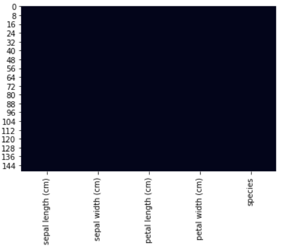
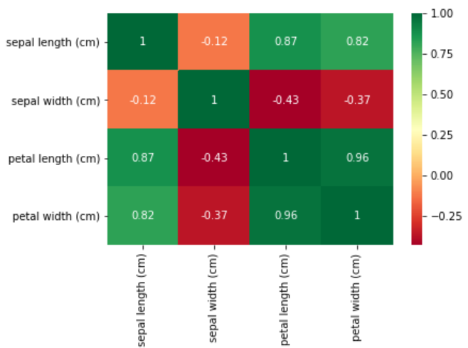
热图 (Heat-map)
The ‘heatmap’ functionality in ‘seaborn’ is very useful for visualizing missing data and correlation matrix.
“季节性”中的“热图”功能对于可视化丢失的数据和相关矩阵非常有用。
heatmap(data, cmap, cbar, annot) : Function to plot heat-map using ‘data’ with color gradient map ‘cmap’, ‘cbar’ (boolean) to indicate whether or not to use a color bar, ‘annot’ (boolean) to display data values in each cell
heatmap(data,cmap,cbar,annot) :使用带有颜色渐变图'cmap','cbar'(布尔值)的'data'来绘制热图的功能,以指示是否使用颜色条'annot'(布尔值)以显示每个单元格中的数据值
Let’s try visualizing missing data without any color bar. Since ‘iris’ data does not have any missing values, I have created a copy named ‘iris_with_nulls’ where I have randomly removed some data points. This is to show how the heat-map looks like if missing values are there.
让我们尝试在没有任何颜色条的情况下可视化丢失的数据。 由于“ iris”数据没有缺失值,因此我创建了一个名为“ iris_with_nulls”的副本,在其中我随机删除了一些数据点。 这是为了显示如果缺少值,则热图的外观。
sns.heatmap(data=iris_with_nulls.isnull(),cbar=False)sns.heatmap(data=iris.isnull(),cbar=False)
Next up, let us visualize the correlation matrix using the heat-map. The use of color bars and annotation renders the correlation matrix a powerful visual to analyze the relationships in numerical data.
接下来,让我们使用热图可视化相关矩阵。 彩条和注释的使用使相关矩阵成为分析数值数据中关系的强大工具。
sns.heatmap(data=iris.corr(),annot=True)sns.heatmap(data=iris.corr(),annot=True,cmap='RdYlGn')
Now, you have all the necessary items ready in your visualization tool-kit. Go ahead and plot away your data!
现在,您的可视化工具包中已准备好所有必需的项目。 继续并整理您的数据!
翻译自: https://medium.com/swlh/quick-guide-to-visualization-in-python-c3ee57c668b1
python 可视化


 2398
2398


 被折叠的 条评论
为什么被折叠?
被折叠的 条评论
为什么被折叠?
 到【灌水乐园】发言


