


I was recently given the challenge of coding a simple single page app that delivers new users a unique URL where they can add potential baby names to a list. using. I decided to React along with Bootstrap 4.5 to build the app. I’ve played with Bootstrap before , but never to its full potential. This was a chance to dig into Bootstrap’s documentation and hopefully gain some confidence using the popular framework in future projects.
最近,我面临着编写一个简单的单页应用程序的挑战,该应用程序为新用户提供了一个唯一的URL,他们可以在其中将潜在的婴儿名字添加到列表中。 使用。 我决定与Bootstrap 4.5一起使用React来构建应用程序。 在此之前,我曾与Bootstrap一起玩过,但从未发挥过全部潜力。 这是一个深入研究Bootstrap文档的机会,并希望在以后的项目中使用流行的框架能获得一些信心。
Bootstrap is a styling framework that includes javascript and prebuilt css. It aims to provide predictable and consistent results to the look and responsiveness of your app, with a minimum of CSS. The overarching structure is based on the CSS Flex-box layout which is described in this great article.
Bootstrap是一个样式框架,包括javascript和预构建CSS。 它旨在使用最少CSS为您的应用程序的外观和响应度提供可预测且一致的结果。 总体结构基于本文CSS Flex-box布局。
Bootstrap has put together a React version of the framework that packages most of the features into React components, but I chose to stick with the vanilla version so I could transfer the skills to a non-React environment.
Bootstrap组合了框架的React版本,该版本将大多数功能打包到React组件中,但是我选择坚持使用香草版本,这样我就可以将技能转移到非React环境中。
After setting up a boiler plate React app with a simple App.js component, I imported Bootstrap into the project using npm:
在使用简单的App.js组件设置样板React应用程序之后,我使用npm将Bootstrap导入到项目中:
npm install jquery popper.js
npm install bootstrap
In the index.js I link to Bootstrap’s CSS which is included in the Bootstrap package.
在index.js中,我链接到Bootstrap软件包中包含的BootstrapCSS。
import ‘bootstrap/dist/css/bootstrap.min.css’;
import 'bootstrap/dist/css/bootstrap.min.css';
Note that Bootstrap requires two utilities, JQuery and Popper, to assist in some of the animation. If you don’t install them, you’ll receive an error.
请注意,Bootstrap需要两个实用程序JQuery和Popper来辅助某些动画。 如果不安装它们,将会收到错误消息。
Bootstrap’s basic structure relies on a div with the container class. (Remember when working in React that “class” is a reserved word, so we use “className” instead. This means refactoring if you copy any code from the Bootstrap documentation.)
Bootstrap的基本结构依赖于具有容器类的div。 (记住,在React中工作时,“ class”是保留字,因此我们改用“ className”。这意味着如果您从Bootstrap文档中复制任何代码,则需要重构。)
// add to App.js
// add to App.js
<div className='container bg-light shadow' > <p className='display-2' > I'm the container </p></div>
<div className='container bg-light shadow' > <p className='display-2' > I'm the container </p></div>
After firing up the React server you should see text across the top in the container which itself is centered. If you adjust the width of the browser window you’ll see the container snapping to its new width as the window reaches one of the four breakpoints. Hint, open developer tools on the right to see the width of window displayed in the upper right hand corner. xs < 540 pxsm >540md >720lg > 960xl >1140
启动React服务器后,您应该在容器居中居中的顶部看到文本。 如果您调整浏览器窗口的宽度,则当窗口到达四个断点之一时,您将看到容器捕捉到其新宽度。 提示,打开右侧的开发人员工具以查看显示在右上角的窗口的宽度。 xs <540 px sm > 540 md > 720 lg > 960 xl > 1140
Change the className from “container” to “container-fluid” and now the container resizes itself continuously.
将className从“ container”更改为“ container-fluid” ,现在容器会不断调整自身大小。
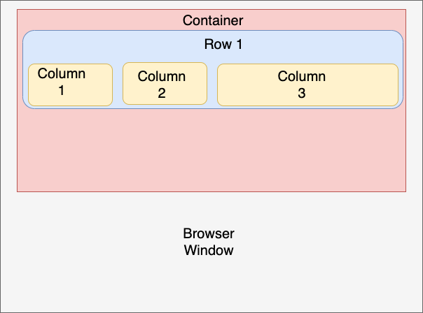
After setting up the container sections of your page can be added using divs that Rows and Columns. Rows are divided into 12 equal sections. The following will create even columns of 6 spaces each. Notice that the columns are also responsive.
设置完页面的容器部分后,可以使用行和列的 div添加div 。 行分为12个相等的部分。 以下将创建偶数列,每列6个空格。 请注意,这些列也是响应式的。
<div className='container bg-light shadow' >
 <p className='display-2' > I'm the container </p>
  <div className='row text-primary'>
    <div className='col '>Column 1</div>
    <div className='col bg-warning text-secondary'>Column 2</div>
  </div>
</div>
Now add -sm to the col (col-sm). What happens? Now the columns collapse when the width of the window is less than the sm breakpoint, stacking the columns. If you change to -md the columns collapse sooner.Add -4 to one col (col-4) and col-8 to the second. Now the columns are different relative widths (col-sm-4).
现在将-sm添加到col(col-sm)。 怎么了? 现在,当窗口的宽度小于sm断点时,列将折叠,从而将列堆叠。 如果更改为-md,则列会更早合拢。将-4添加到一个col(col-4),然后将col-8添加到第二个col 。 现在,这些列具有不同的相对宽度(col-sm-4) 。
So far we’ve concerned ourselves with how Bootstrap lays out the widths of our projects’ sections. The height of the columns is dictated by the tallest column of the row. The vertical position of the other columns can be adjusted using align-self-(start, center or end). Try adding align-self-end to column 2. Now column 2 is forced to the bottom of the row.
到目前为止,我们一直在关注Bootstrap如何布置项目各部分的宽度。 列的高度由该行的最高列决定。 其他列的垂直位置可以使用align-self-(开始,居中或结束)进行调整。 尝试将align-self-end添加到第2列。现在,将第2列强制到行的底部。
<div className='container bg-light shadow' >
  <p className='display-2 ml-5'>I'm the container</p>
  <div className='row text-primary'>
    <div className='col-sm'>
      <h4 className='text-center'> Column 1 </h4>
      <p>This is a really long statement to fill up this column.</p>
    </div>    <div className='col-sm h4 bg-warning text-secondary align-self-end'>
    Column2</div>
  </div>
</div>
I want to take a few moments to look at the other notation included in the classNames of the samples above. Much of your basic formatting can be controlled directly from the Bootstrap utilities as they are referred to in the Bootstrap documentation (although writing styling using traditional CSS or inline still works.). This is code that lives in the classNames and usually includes what you want to style followed by a dash (-), and then how (or by how much) you want that aspect styled:
我想花点时间看一下上面示例的classNames中包含的其他符号。 您可以通过Bootstrap 实用程序直接控制许多基本格式,因为它们在Bootstrap文档中已提及 (尽管使用传统CSS或内联编写样式仍然有效。) 这是存在于classNames中的代码,通常包括您要设置样式的内容,后跟连字符(-),然后包括如何(或多少)对方面进行样式设置:
<div className="mt-5"> //large top margin
<div className="mt-5"> //large top margin
margins: set using m(t,b,l,r,x,y)-(12345). So ml-5 places the greatest margin on the left side of the element (x = left & right, y = top&bottom).padding: same system as above but using pbackground color: bg-primarytext color: text-primarytext alignment: text-(left, center, right)shadow: shadow-(none, sm, (blank for default),lg)border radius: rounded
边距:使用m(t,b,l,r,x,y)-(12345)进行设置。 因此ml-5在元素的左侧放置了最大的边距(x =左侧和右侧,y =顶部和底部)。 填充:与上面相同的系统,但使用p 背景色:bg-主要文本颜色:text-主要文本对齐方式:text- (左,中,右) 阴影 :shadow- (无,sm(默认为空白),lg) 边界半径:圆形
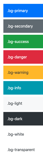
Text and background colors can likewise be set with utilities. Bootstrap comes with a default color pallet of 10 colors.
文本和背景色也可以使用实用程序设置。 Bootstrap带有默认的10种颜色调色板。
This article’s goal was to provide a hand’s on introduction to Bootstrap. Hopefully by now you’ve gained some basic confidence. Next stop, check out the Bootstrap documentation. There are a-lot of prebuilt components that, along with the tips above, can give you a fairly professional looking and responsive product. Bootstrap’s default themes can be customized as well (fonts, color pallet, etc). The process is a bit cumbersome, but I found a great site that allows you to set up themes in a simple UI. When you’re finished, the site will generate the CSS to change Bootstrap’s defaults: https://themestr.app/theme
本文的目的是提供有关Bootstrap的入门指南。 希望现在您已经有了一些基本的信心。 下一站,请查看Bootstrap文档。 有很多预构建的组件,以及上面的提示,可以为您提供外观专业,响应Swift的产品。 Bootstrap的默认主题也可以进行自定义(字体,调色板等)。 这个过程有点麻烦,但是我发现了一个不错的网站,它允许您在简单的UI中设置主题。 完成后,该站点将生成CSS来更改Bootstrap的默认设置: https : //themestr.app/theme
Enjoy making beautiful content!
享受制作精美的内容!
翻译自: https://medium.com/@rixong/using-vanilla-bootstrap-with-react-2c7d89c58d3c


 扫一扫
扫一扫
 1万+
1万+

 被折叠的 条评论
为什么被折叠?
被折叠的 条评论
为什么被折叠?
 到【灌水乐园】发言


