


 本文介绍了如何利用Figma的单单元格方法来构建能够适应不同屏幕尺寸的响应式表格,提供了一种高效的设计解决方案。
figma模版
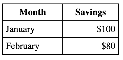
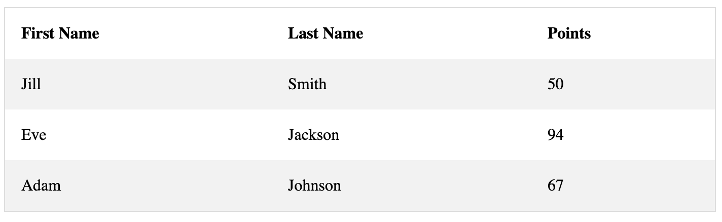
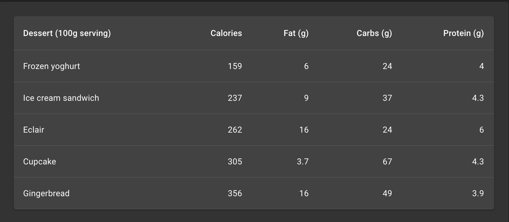
Tables are often harder to prototype than to code, but taking a single cell design strategy can make them responsive and maintainable. What’s more, all you need are Components, duplication and Auto-Layout techniques. I’ve experimented with a few ways and this method seems to have the best trade-offs. I’ll give you the whirlwind tour of the core visual styles of tables, how to build the single cell design, and the reasons why I opted for this as my preferred method of prototyping tables in Figma.
表通常比原型更难原型设计,但是采用单个单元格设计策略可以使表具有响应能力和可维护性。 而且,您所需要的只是组件,复制和自动布局技术。 我已经尝试了几种方法,这种方法似乎具有最佳的权衡。 我将向您介绍表格的核心视觉样式,如何构建单单元格设计以及为什么选择此作为我在Figma中制作表格原型的首选方法的原因。
桌子的视觉风格 (Visual styles of tables)
There are a few different visual styles that are floating around on the internet today. Most tables you see are variations of one of these three.
今天,互联网上漂浮着几种不同的视觉风格。 您看到的大多数表都是这三个表之一的变体。
经典桌 (Classic table)
This is the table you learn about in high school IT— humble and versatile to get your point across. With some minor tweaks to the vanilla HTML of good table design you can get an easily readable table. If you don’t know about how tables are created in code I recommend you read up on the w3schools documentation.
这是您在高中IT中学习的表格-谦虚而多才多艺,可以阐明您的观点。 对好的表设计的原始HTML进行一些细微的调整,就可以得到易于阅读的表。 如果您不知道如何用代码创建表,建议您阅读w3schools文档。
条纹桌 (Striped tables)
Used in places like Apple’s Pages application, these are an eye catching alternative that let the data stand out. Again, w3schools is a fantastic resource to learn more about them.
在Apple的Pages应用程序之类的地方使用,这些是引人注目的替代方案,可让数据脱颖而出。 同样, w3schools是一个很好的资源,可让他们更多地了解它们。
“排行”表 (‘Lined’ tables)
Looking at the Simple Table from Material Design as an example, you can see that each row is separated by a single line and each column is separated using generous spacing. Also known as a ‘horizontally divided table’.
以Material Design中的Simple Table为例,您可以看到每一行用单行分隔,每一列使用足够的间距分隔。 也称为“水平分割表”。
单电池设计 (Single-cell design)
Now that we have an idea of the different major styles of table design, we can move forward to setting up Components to quickly build one in Figma. Compared to all other methods I’ve tried, the single-cell design approach is perhaps the most versatile.
既然我们已经了解了表设计的不同主要样式,我们可以继续设置“组件”以在Figma中快速构建一个。 与我尝试过的所有其他方法相比,单细胞设计方法可能是最通用的。
细胞类型 (Cell types)
In total you can use three cell Components to develop the vast majority of your designs:
总共可以使用三个单元组件来开发绝大多数设计:
- Default cell—this makes up the bulk of your table data 默认单元格-这构成了表数据的大部分
- Header cell—usually with bold text, it makes up the top row or the left-hand column标题单元格-通常以粗体显示,它构成了第一行或左列
- Selected cell—only essential if you want to conduct user research on this state选定的单元格-仅在您要对此状态进行用户研究时必不可少
建立细胞(Building the cells)
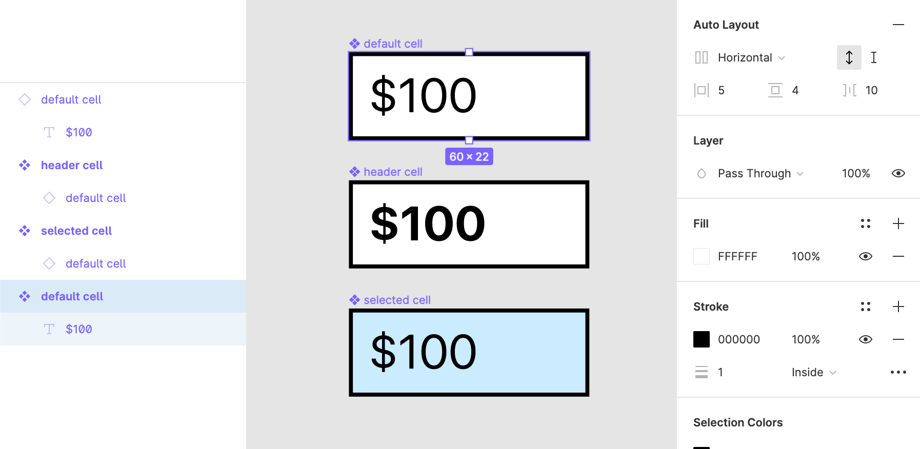
We’ll be using the classic table visual style for simplicity for this walkthrough. Starting with the Default cell, create a text layer, add in some text, then adjust the width of the text layer to 50px. This should automatically change it to an Auto Height text layer — don’t worry, we can adjust this later. It forms the basis of the ‘responsive’ nature of these tables.
在本演练中,我们将使用经典的表格视觉样式来简化操作。 从“默认”单元格开始,创建一个文本层,添加一些文本,然后将文本层的宽度调整为50px。 这会自动将其更改为“自动高度”文本图层-不用担心,我们稍后可以进行调整。 它构成了这些表“响应”性质的基础。
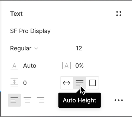
Next, turn it into a Component with Cmd + Option + K on Mac or Ctrl + Alt + K on Windows. Set the horizontal padding to 5px and the vertical to 4px. Reveal the Fill colour by clicking the eye icon, and click the plus ‘+’ button on the Stroke settings and use black as the colour. My screenshot says ‘Inside’ on the draw line option but you’ll want to use ‘Center’ or ‘Outside’ so that it displays properly later.
接下来,在Mac上将其转换为带有Cmd + Option + K的组件,在Windows上将其转换为Ctrl + Alt + K 。 将水平填充设置为5px,将垂直填充设置为4px。 通过单击眼睛图标显示“填充颜色”,然后在“笔画”设置上单击加号“ +”按钮,并使用黑色作为颜色。 我的屏幕截图在绘制线选项上显示“内部”,但是您需要使用“居中”或“外部”,以便稍后正确显示。
Hint: if you’re using the Striped visual style, you’ll want two types of Default cell with differing Fill colours. I like to name them ‘default flip’ and ‘default flop’.
提示:如果您使用的是Striped视觉样式,则需要两种类型的Default单元格具有不同的填充颜色。 我喜欢将它们命名为“默认翻转”和“默认翻转”。
Next, we can create the Header cell and the Selected cell if needed. Make copies of your Default cell by holding down Option on Mac or Alt on Windows and dragging, or use the copy and paste shortcuts. Header cells usually will need the text to be bold, and the Selected cell can have its Fill colour changed to a light shade of blue. Turn these into new Components so that any style updates to the Default cell are propagated downwards, but the text bolding and Fill colour overrides are maintained.
接下来,如果需要,我们可以创建Header单元和Selected单元。 按住Mac上的Option或Windows上的Alt并拖动,或使用复制和粘贴快捷方式,即可复制默认单元格。 标题单元格通常需要将文本加粗,并且“选定的”单元格可以将其“填充”颜色更改为浅蓝色。 将它们转换为新的Components,以便向下传播对Default单元格的所有样式更新,但保留文本粗体和Fill color覆盖。
Hint: check the screenshot above if you aren’t sure you’ve set up your layers and Component subclassing correctly.
提示:如果不确定是否正确设置了图层和Component子类,请检查上面的屏幕截图。
调整您的单元格 (Sizing your cells)
Before we start making tables it’s worth noting that in your working Design System or Palette, you’ll need a few different sizes of cells. I find it easiest to make a few using your underlying grid system as a guide. With a 12 column grid system I like to use 2, 3, and 4 column width cells, including internal guttering. Adjust the width of the text layer appropriately, and don’t forget to include the horizontal padding in your calculation.
在开始制作表格之前,值得注意的是,在工作的设计系统或调色板中,您将需要一些不同大小的单元格。 我发现使用您的基础网格系统作为指南来做一些最简单的事情。 对于12列网格系统,我喜欢使用2、3和4列宽单元,包括内部装订线。 适当调整文本层的宽度,并且不要忘记在计算中包括水平填充。
Hint: for those that aren’t well versed in grid systems, you can use the large Bootstrap grid system as a starting point; this would result in cells of 130px, 210px, and 290px.
提示:对于那些不熟悉网格系统的用户,可以使用大型的Bootstrap网格系统作为起点。 这将导致单元格分别为130px,210px和290px。
构造表 (Constructing the table)
With all that set up complete, we can now start to reap the benefits of a single cell design approach to making tables in Figma. Make sure you’ve written out the table data somewhere as it’s easier to work it out first on paper or a text editor beforehand.
完成所有设置后,我们现在就可以开始利用单单元格设计方法在Figma中制作表格的好处。 确保已在某个地方写出表数据,这样可以更轻松地先在纸上或文本编辑器中进行处理。
创建“条” (Create the ‘strips’)
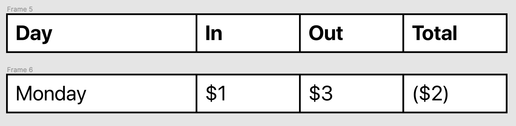
I’m going to go by row, but you can also go by column. Assuming the first row is the header, create enough instances of your Header cell to create all the headings. The first or last cell can be larger than the rest to emphasise it. Highlight them all, Frame your selection, and add Auto layout. Ensure that there’s 0px spacing between each item in the Auto layout settings. Repeat this for a row of Default cells.
我要逐行,但您也可以按列。 假设第一行是标题,则创建足够的Header单元实例以创建所有标题。 为了强调它,第一个或最后一个单元可以大于其余单元。 突出显示所有内容,构图并添加自动版式。 确保自动版式设置中每个项目之间的间距为0px。 对一行默认单元格重复此操作。
粘在一起 (Glue it together)
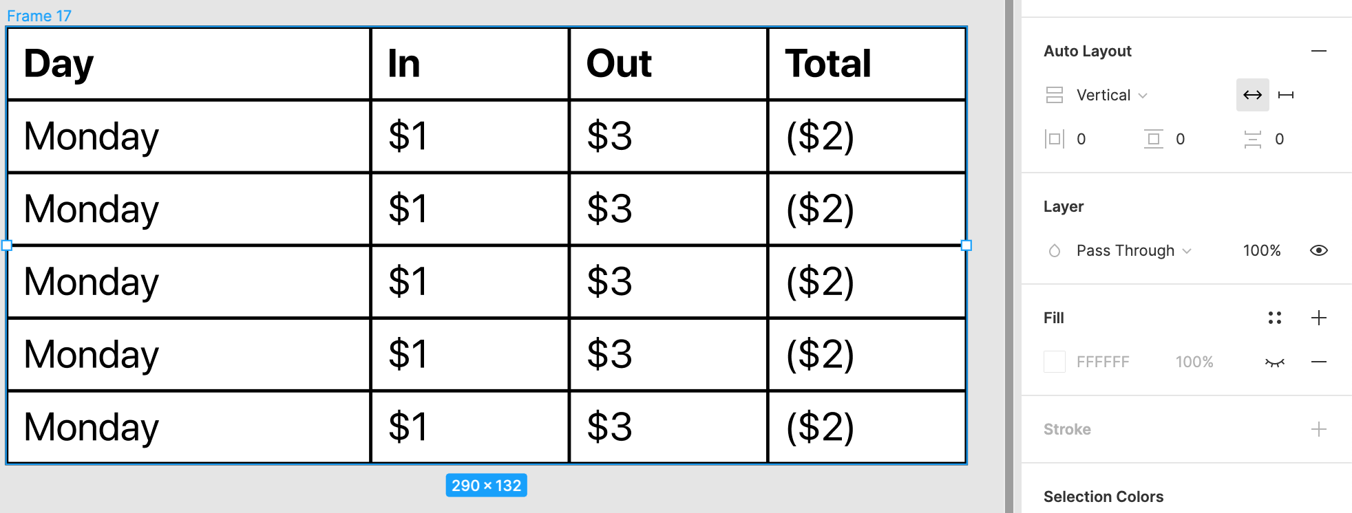
Duplicate your data row until you have enough data rows, select all the rows, Frame it, then add Auto layout again. Once you’ve set it to 0px spacing, it should look something like the above. All that’s left to do is add the correct data to the remaining cells and then use your table in your prototype. Congratulations, you have a table!
复制您的数据行,直到有足够的数据行,选择所有行,将其陷害,然后再次添加自动布局。 将其设置为0px间距后,其外观应类似于上面。 剩下要做的就是将正确的数据添加到剩余的单元格中,然后在原型中使用表。 恭喜,您有桌子!
处理多行 (Handling multiple lines)
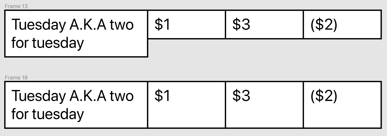
One small problem with this approach is when text runs across multiple lines, it misaligns your table and leaves gaps. It’s easy to fix though. In the other cells within the same row, double-click until the cursor is at the end of the text then press Shift + Enter for each extra line needed. You can also use the text tool and click once, or use the shortcut t. It’s the least elegant part of this approach, but in my opinion, it’s a small price to pay for the speed it offers.
这种方法的一个小问题是,当文本跨多行运行时,它会使表格未对齐并留有空隙。 虽然很容易修复。 在同一行的其他单元格中,双击直到光标位于文本的末尾,然后按Shift + Enter以增加所需的每一行。 您也可以使用文本工具并单击一次,或使用快捷方式t 。 这是这种方法中最不雅致的部分,但我认为,为此提供的速度付出的代价很小。
为什么有效 (Why it works)
There are three main principles I believe that make the single-cell design approach worthwhile.
我相信有三个主要原则使单电池设计方法值得。
灵活 (Flexible)
By building with the smallest unit possible, we can mix and match as much as we want to create tables that work. We don’t need to consider ‘merged’ cells either, as long as your cell Components all meet some standard sizing pattern you can put them together and grow the table as large as needed.
通过以最小的单位进行构建,我们可以混合和匹配尽可能多的想要创建有效表的表。 我们也不需要考虑“合并”的单元格,只要您的单元格组件都符合某种标准的大小调整模式,您就可以将它们放在一起并根据需要扩大表的大小。
一致的 (Consistent)
By designing the small set of cells to all be compatible with each other, you ensure your tables remain consistent. With consistency in how it looks and how it fits together at creation time, we allow the user to do what they came for: read and understand the data written inside.
通过将一小组小的单元格设计为彼此兼容,可以确保表保持一致。 保持外观一致以及在创建时如何契合在一起,我们允许用户做他们想做的事情:阅读和理解写入其中的数据。
可维护的 (Maintainable)
Above all, it’s maintainable. Keeping your Design System up to date is no easy feat and is a major driver of the DesignOps function. When there’s less parts, the job is smaller, and that opens up you and your team to iterate and evolve your design language much more easily.
最重要的是,它是可维护的。 使设计系统保持最新状态并非易事,并且是DesignOps功能的主要驱动力。 当零件更少时,工作量就会减少,这将使您和您的团队更加轻松地迭代和发展设计语言。
One final advantage that the single cell design has is the ability to introduce other cell types. If you want a checkbox cell for example, you can more easily swap out cells in older prototypes using the single cell approach.
单电池设计具有的最后一项优势是能够引入其他类型的电池。 例如,如果要使用复选框单元格,则可以使用单单元格方法更轻松地替换较旧原型中的单元格。
The single-cell approach is my favourite method for everyday prototyping of tables in Figma. It requires a bit of work to make the tables using single cells, but it means that they’re flexible, consistent, and most importantly maintainable in a Design System. Once you know the basics, you can quickly make a wide variety of tables. For larger or more complex tables you may be better off using a different approach. It’s crucial for you to consider your day-to-day use cases and select an approach that suits your most common use cases.
对于Figma中的表格的日常原型制作,单细胞方法是我最喜欢的方法。 使用单个单元格制作表需要一些工作,但这意味着它们是灵活,一致的,最重要的是可以在设计系统中维护。 了解基础知识之后,您可以快速制作各种表格。 对于更大或更复杂的表,最好使用其他方法。 对于您来说,考虑日常用例并选择适合您最常用用例的方法至关重要。

翻译自: https://uxdesign.cc/building-responsive-tables-in-figma-using-the-single-cell-approach-15fd6fc670c8
figma模版


 扫一扫
扫一扫


 被折叠的 条评论
为什么被折叠?
被折叠的 条评论
为什么被折叠?
 到【灌水乐园】发言


