


前端 css 通用css
If you have just started writing CSS codes it’s highly likely that you are having a hard time making the page responsive or aligning the components properly or positioning the components as you have in your mind. This article is about how to maintain the hierarchy of the page and in turn making CSS more logical. The best way to learn is to open code pen and write the code yourself also and see what happens.
如果您刚刚开始编写CSS代码,则很可能很难使页面响应或正确对齐组件或按照您的想法放置组件。 本文介绍如何维护页面的层次结构,以及如何使CSS更具逻辑性。 最好的学习方法是打开代码笔并自己编写代码,然后看看会发生什么。
MAINTAINING THE HIERARCHY
保持等级
Having a complete picture of how the page is structured is important and <div>is your lifesaver. For example, if you are making a nav bar, its structure will be something like this:
全面了解页面的结构非常重要,而<div>是您的救命稻草。 例如,如果要制作nav bar ,其结构将如下所示:
<div class="nav-bar">
 <div class="logo">
    <h1>LOGO</h1>
 </div>
 <div class="nav-links-container">
 <div class="nav-link"> Home </div>
 <div class="nav-link"> About </div>
 <div class="nav-link"> Contact </div>
 </div>
</div>
This structure will help a lot when you apply CSS on it.
当您在其上应用CSS时,此结构将有很大帮助。
ADDING BACKGROUND COLOR FOR BETTER VISUALIZATION
为更好的可视化添加背景色

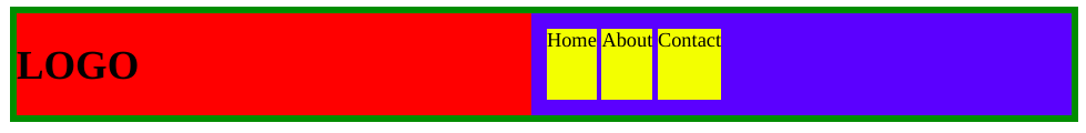
Here I have added different background colors to all the components and now you can see clearly how much space each one is taking, how it is aligned wrt its parent container. (Note : I have added few paddings so that you can see more clearly, but you don’t need to do that after you understand the structure)
在这里,我为所有组件添加了不同的背景色,现在您可以清楚地看到每个组件占用了多少空间,如何与其父容器对齐。 (注意:我添加了一些填充,以便您可以更清楚地看到,但是在您了解结构之后就不需要这样做了)
.nav-bar{
  background-color:green;
  padding:5px;
}
.logo{
  background-color:red;
}
.nav-links-container{
  background-color:blue;
  padding: 10px
}
.nav-link{
  background-color:yellow;
  margin:2px;
}
USING FLEX-BOX
使用FLEX-BOX
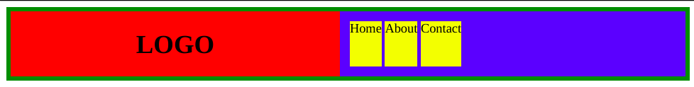
Now you know how to structure your nav bar but it doesn’t look quite good. Here comes the FLEX-BOX!!. Flex box is a module that aims at providing a more efficient way to lay out, align and distribute space among items in a container. The display property of any container is set to flex and after doing that all the child components inside that container is arranged in sort of an array either horizontally(default) or verically. Lets see what happens after I do: nav-bar{ display:flex; } (To change the direction to vertical we add flex-direction:column
现在您知道了如何构造导航栏,但是它看起来不太好。 这是FLEX-BOX !!。 Flex box是一个模块,旨在提供一种更有效的方式来布置,对齐和分配容器中各个项目之间的空间。 将任何容器的display属性设置为flex ,然后将容器内的所有子组件以水平(默认)或垂直排列为数组的形式排列。 让我们看看我做完之后会发生什么: nav-bar{ display:flex; } nav-bar{ display:flex; } (要将方向更改为垂直,我们添加flex-direction:column

You can see it is arranged horizontally but the width doesn’t look quite right. For this, we use the property flex .Keep in mind that only the child containers of the container having display set to flex can use the flex property. The flex property defines the ratio of the total width/height the child containers will take. Here we want the logo and nav-links-container to have equal width hence 1:1 . So we set flex:1 in both logo &nav-links-container, .logo,.nav-links-container{ flex:1; } (change the value to 2:1 to see how its affects)
您可以看到它水平排列,但是宽度看起来不太合适。 为此,我们使用属性flex 。请记住,只有将显示设置为flex的容器的子容器才能使用flex属性。 flex属性定义子容器将采用的总宽度/高度的比率。 在这里,我们希望徽标和nav-links-container具有相等的宽度,因此为1:1 。 因此,我们设定flex:1在这两个标志及导航链接容器, .logo,.nav-links-container{ flex:1; } .logo,.nav-links-container{ flex:1; } (将值更改为2:1以查看其影响)
You can set the display property of logo container and nav-links-container to flex to arrange the links horizontly. Lets see the final result:
您可以设置徽标容器和nav-links-container的显示属性,以灵活地水平排列链接。 让我们看一下最终结果:
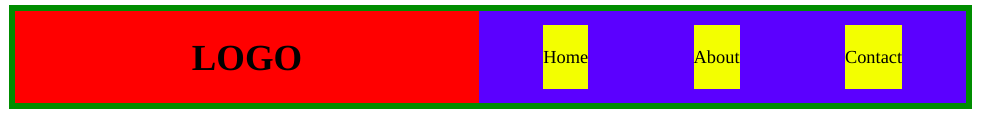
ALIGNMENT IN FLEX-BOX
柔性盒校准
Now we can focus on logo container and nav-links-container seperately. The logo is way over to the left. In flex box there are two types of alignment, along the main-axis and along the cross-axis. The main-axis is the axis along which the child components is aligned and the other one is cross-axis. To align the child components along main-axis we use justify-content:center . After adding this to the logo container .logo { justify-content : center; }
现在,我们可以分别关注徽标容器和nav-links-container。 徽标在左侧。 在伸缩框中,有两种类型的对齐方式:沿主轴对齐和沿横向对齐。 主轴是子组件对齐所沿的轴线,另一个是交叉轴线。 为了使子组件沿主轴对齐,我们使用了justify-content:center 。 将其添加到徽标容器.logo { justify-content : center; } .logo { justify-content : center; }

We are almost done, but the nav-links are too close. One way to fix this is the align it to the center and add margins to all the individual links. But it can be done more efficiently by using justify-content : space-around There are more values that can be given to justify-content that u can read about yourself. .nav-links-container { justify-content : space-around; }
我们差不多完成了,但是导航链接太近了。 解决此问题的一种方法是将其与中心对齐,并为所有单个链接添加边距。 但是,可以通过使用justify-content : space-around来更有效地完成此操作justify-content : space-around可以阅读更多有关自己可以读懂自己的justify-content值。 .nav-links-container { justify-content : space-around; }

Now we can focus on the nav-links. First lets align the nav-links along the vertical axis which is the cross-axis here, to do this we use align-items property .nav-link { display: flex ; align-items: center; }
现在,我们可以专注于导航链接。 首先,让导航链接沿垂直轴(此处为交叉轴) align-items ,为此,我们使用align-items属性.nav-link { display: flex ; align-items: center; } .nav-link { display: flex ; align-items: center; }
Remove the background colors to see final result
删除背景色以查看最终结果
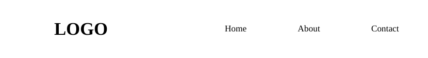
You can add shadows, animations, fonts, colors to make it one of a kind. The idea behind the blog was to learn the thought process. Only one thing is left now is to make this bar responsive.
您可以添加阴影,动画,字体,颜色以使其成为一种。 博客背后的想法是学习思考过程。 现在只剩下一件事了,那就是使该栏响应。
Media queries
媒体查询
The @media rule, introduced in CSS2, made it possible to define different style rules for different media types. That means you can have different set of CSS rules based on the screen size, viewport or orientation of the screen. We will focus on the screen size here. Let’s say after the screen size decreases to 800px or less we can say that the device is a mobile phone. We can write new CSS for this device using the following syntax :
CSS2中引入的@media规则可以为不同的媒体类型定义不同的样式规则。 这意味着您可以根据屏幕尺寸,视口或屏幕方向来设置不同CSS规则集。 我们将在这里关注屏幕尺寸。 假设在屏幕尺寸减小到800像素或更小之后,我们可以说该设备是手机。 我们可以使用以下语法为此设备编写新CSS:
@media (max-width:800px){
.nav-bar{
      flex-direction:column;
  }
}
BEFORE YOU GO
你走之前
Reading it for the first time you might find it bit tricky to understand. Try writing the code along side and you will understand better.
第一次阅读它可能会很难理解。 尝试一起编写代码,您会更好地理解。
One thing to remember is that the flex property can only be used for the child components of a container having display set to flex and all the others like justify-content align-items flex-direction etc are used for the container having display set to flex.
要记住的一件事是, flex属性只能用于显示设置为flex的容器的子组件,而所有其他属性(如justify-content align-items flex-direction等)都用于显示设置为flex的容器。
SUMMARY
摘要
display:flexTo arrange the components horizontally/vertically.display:flex用于水平/垂直排列组件。flex-directionTo change the axis along which the components are arranged.flex-direction更改组件排列所沿的轴。flexTo set the width of the child components wrt to the parent container.flex设置子组件wrt到父容器的宽度。justify-contentTo align components along main-axis.justify-content沿主轴对齐组件。align-itemsTo align components along main-axis.align-items沿主轴对齐组件。@mediaTo define different style rules for different media types.@media为不同的媒体类型定义不同的样式规则。
翻译自: https://medium.com/@thebinaryrealm/writing-css-the-easy-way-easy-front-end-49b250f12f9a
前端 css 通用css


 4912
4912

 被折叠的 条评论
为什么被折叠?
被折叠的 条评论
为什么被折叠?
 到【灌水乐园】发言


