


css清除css样式
Frameworks help us build a different style or functionality for our products with ease. And thanks to them we don’t need to re-invent the wheel. Not long ago I have come across a CSS framework so-called Nes.css which helps you build nostalgic style interfaces.
框架可帮助我们轻松地为我们的产品构建不同的样式或功能。 多亏了他们,我们不需要重新发明轮子。 不久前,我遇到了一个名为Nes.cssCSS框架,该框架可帮助您构建怀旧风格的界面。
Let’s re-design and build Medium’s homepage and story page as if we are living in the 90s. Basic knowledge of HTML and CSS is more than enough for this project. You need an internet connection and a text editor. I prefer Visual Studio Code but any editor (Sublime Text, Atom, Brackets, etc.) would do it well.
让我们重新设计和构建Medium的首页和故事页面,就好像我们生活在90年代一样。 HTML和CSS的基本知识对于该项目来说绰绰有余。 您需要互联网连接和文本编辑器。 我更喜欢Visual Studio Code,但是任何编辑器(Sublime Text,Atom,Brackets等)都可以很好地做到这一点。
Firstly let’s create a project folder and files. I use my terminal for this:
首先,让我们创建一个项目文件夹和文件。 我使用我的终端:
> cd Desktop              // Changes the directory to Desktop
> mkdir medium-8-bit      // Creates a new folder
> cd medium-8-bit         // Changes the dir. to project folder
> mkdir img               // Creates img folder for image assets
> touch index.html style.css   // Creates files with given names
> code .                     // Opens the directory in VSC editor
In your index.html file create the boilerplate to start writing the HTML code. In VS Code you can type “html:5” and press “enter” and it will automatically create the boilerplate. Or you can simply copy below and paste.
在index.html文件中,创建样板以开始编写HTML代码。 在VS Code中,您可以键入“ html:5”并按“ enter”,它将自动创建样板。 或者,您可以简单地在下面复制并粘贴。
You can change the title to whatever you want; I prefer Medium’s original title.
您可以将标题更改为所需的名称。 我更喜欢Medium的原始标题。
<title>Medium – Get smarter about what matters to you.</title>将框架和CSS文件添加到index.html (Adding frameworks and CSS file to index.html)
In order to use external sources such as frameworks and CSS or JavaScript files, we need to include their addresses in our “head” section.
为了使用外部资源,例如框架和CSS或JavaScript文件,我们需要在“标头”部分中包含其地址。
There are other useful CSS frameworks like Bootstrap, Flexboxgrid, etc. We are going to use Flexboxgrid. It is going to help us to use the grid system with less code.
还有其他有用CSS框架,例如Bootstrap,Flexboxgrid等。我们将使用Flexboxgrid 。 这将帮助我们以更少的代码使用网格系统。
<link rel="stylesheet" href="https://cdnjs.cloudflare.com/ajax/libs/flexboxgrid/6.3.1/flexboxgrid.min.css" type="text/css" >And Ness.css:
和Ness.css:
<link href="https://unpkg.com/nes.css@latest/css/nes.min.css" rel="stylesheet" />And our own style.css
还有我们自己的style.css
<link rel="stylesheet" href="style.css">In the end, your “head” element will look like:
最后,您的“ head”元素将如下所示:

Open your index.html file in your browser.Now that we can start to create our header such as logo, search bar, and profile avatar. In the resources section, you can find the images that I used for this project.
在浏览器中打开index.html文件。现在我们可以开始创建标题,例如徽标,搜索栏和个人资料头像。 在资源部分,您可以找到我用于该项目的图像。
<!-- Header -->
  <header>
    <div class="container">
      <div class="row">
        <div class="col-md-8 left-header">
          <h2>Medium</h2>
        </div>

        <div class="col-md-4 right-header">
          <div class="row">
            <div class="col-md-9">
              <div class="nes-field">
                <input type="text" id="inline_field" class="nes-input" placeholder="Search">
              </div>
            </div>
            <div class="col-md-3">
              <img src="img/girl-1848454_1920.jpg" alt="">
            </div>
          </div>
        </div>
      </div>
    </div>
  </header>
Always use code comments. It will give you and other developers hint about what you were doing and which section you are at. Container wraps and aligns (left-right) the elements.Row creates a row with 12 columns from left to right and with the classes we can assign the column size such as “col-md-8” and in this case, the remaining amount of columns will be 4; so: “col-md-4”.
始终使用代码注释。 它将为您和其他开发人员提供有关您正在做什么以及所处位置的提示。 容器包装并对齐(左右)元素。 行 创建一个从左到右具有12列的行,并使用类我们可以分配列大小,例如“ col-md-8”,在这种情况下,剩余的列数将为4; 因此:“ col-md-4”。
We firstly created a row with two parts: an 8-column sized left and 4-column sized right. The left column only includes the “Medium” logo and the right one includes another row with 9 and 3-column sized parts for the search bar and avatar.
首先,我们创建了一个包含两部分的行:左侧为8列,右侧为4列。 左列仅包含“中”徽标,右列则包含另一行,其中分别有9列和3列大小的部分用于搜索栏和头像。
And add below code to your style.css file:
并将以下代码添加到您的style.css文件中:
header {
  margin-top: 20px;
}.right-header img {
  text-align: right;
  height: 50px;
  width: 50px;
  border: rgb(103, 240, 103) solid 3px;
  border-radius: 50%;
}
Now our page looks like:
现在我们的页面看起来像:

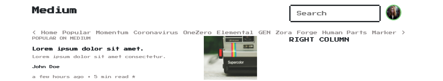
And now the navbar and its items. I copied these tabs from Medium and added HTML elements later on.
现在是导航栏及其项目。 我从Medium复制了这些标签,并在以后添加了HTML元素。
<!-- Nav -->
<nav>
<div class="container">
<a href="#"><</a>
<a href="#">Home</a>
<a href="#">Popular</a>
<a href="#">Momentum</a>
<a href="#">Coronavirus</a>
<a href="#">OneZero</a>
<a href="#">Elemental</a>
<a href="#">GEN</a>
<a href="#">Zora</a>
<a href="#">Forge</a>
<a href="#">Human Parts</a>
<a href="#">Marker</a>
<a href="#">></a>
</div>
</nav>Add below code to your style.css file:
将以下代码添加到您的style.css文件中:
nav {
  margin-top: 20px;
}nav a {
  color: rgb(146, 141, 141);
  font-size: 13px;
}
As “<” and “>” are predefined characters in HTML, we need to use entities to be able to use these characters as strings such as “<” and “>”.“lt” stands for “less than” and “gt” stands for “greater than”
由于“ <”和“>”是HTML中的预定义字符,因此我们需要使用实体才能将这些字符用作字符串,例如“&lt;” 和“&gt;”。“ lt ”代表“小于”,“ gt ”代表“大于”
When you make a change in your code, save it, and refresh the browser to display the change.
更改代码后,请保存并刷新浏览器以显示更改。
And now we are going to create the main row for the feed. Copy and paste below code beneath the “nav”.
现在,我们将为提要创建主行。 复制以下代码并将其粘贴到“导航”下方。
<!-- Feed section -->
<section>
<div class="container">
  <div class="row">  </div>
</div>
</section>
This row will include 8 and 4-column sized left and right parts.
该行将包括8列和4列大小的左右部分。
<!-- Left column -->
<div class="col-md-8">
  LEFT COLUMN
</div><!-- Right column -->
<div class="col-md-4">
  RIGHT COLUMN
</div>
This left column will show stories and the right one will show New from your network and Popular on medium.
左栏将显示故事,右栏将显示来自您的网络的“新建”和“媒体受欢迎” 。
Let’s take a look at our site:
让我们来看看我们的网站:

Up to now, we got a clear idea of the structure, but we are not done yet. Let’s continue with the left column of the feed row. Each story on the feed has multiple elements, such as title, subtitle, writer’s name, time-tag, story-tag, and image. We are gonna treat each story as a row.
到现在为止,我们对结构有了一个清晰的了解,但是还没有完成。 让我们继续在Feed行的左列。 提要中的每个故事都有多个元素,例如标题,字幕,作者的姓名,时间标签,故事标签和图像。 我们将把每个故事连续对待。
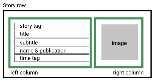
Below you can see the story row as a component. The components are reusable elements. We will use this story component multiple times.
在下面,您可以看到故事行作为一个组成部分 。 这些组件是可重用的元素。 我们将多次使用此故事组件。
<!-- story component -->
<div class="row">
<!-- left column -->
<div class="col-md-8">
<p class="story-tag">Popular on Medium</p>
<h5 class="title">Lorem ipsum dolor sit amet.</h5>
<p class="sub-title">Lorem ipsum dolor sit amet consectetur.</p>
<p class="name-tag">John Doe</p>
<p class="time-tag">a few hours ago • 5 min read ★</p>
</div>
<!-- right column -->
<div class="col-md-4">
<img src="img/markus-spiske-c0rsxq6BHN8-unsplash.jpg" alt="">
</div>
</div>As we are going to add style to all of these elements, we need to give them some classes to mention them in our style.css file.
当我们要为所有这些元素添加样式时,我们需要给它们一些类以在我们的style.css文件中提及它们。
Let’s add some styles and then see what we have.
让我们添加一些样式,然后看看我们拥有什么。
.story-tag {
  text-transform: uppercase;
  font-size: 11px;
  color: rgb(146, 141, 141);
}
The story tag might differ on the site. (“Popular on Medium”, “Based on your reading history”, “From your network”, etc.) You can choose any of them.
故事标签在网站上可能有所不同。 (“中等受欢迎”,“基于您的阅读历史记录”,“来自网络”等)。您可以选择其中任意一种。
The “subtitle” and the “time tag” are going to be smaller and lighter than the title. And the name tag will be just smaller.
“字幕”和“时间标签”将比标题更小,更轻。 并且名称标签将更小。
.sub-title, .time-tag {
  font-size: 11px;
  color: rgb(146, 141, 141);
}.name-tag {
  font-size: 11px;
}
Our image is way too big for this project. We now need to re-size it.
对于这个项目,我们的形象太大了。 现在,我们需要调整大小。
section img {
  height: 140px;
  width: 170px;
}
And our page now looks like:
现在我们的页面如下所示:
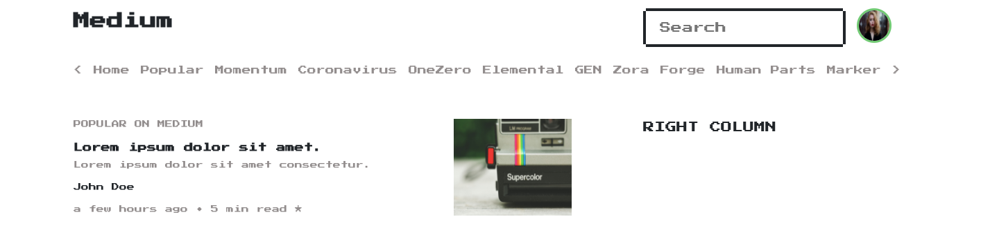
One missing thing is the space between feed and the navbar. I prefer adding 40px of a top margin to the “section” to make things clear.
缺少的一件事是feed和导航栏之间的空间。 我更喜欢在“部分”中添加40px的上边距,以使内容更清楚。
section {
  margin-top: 40px;
}
That’s it. We now have this page:
而已。 我们现在有此页面:
As we created our story component, we can copy-paste multiple times to display more stories in our feed.
创建故事组件时,我们可以多次复制粘贴以在Feed中显示更多故事。
Remember that you have to add other stories into the left column of the feed section. Don’t forget to change the images for each stories. I am also going to change the story tags.
请记住,您必须在供稿部分的左栏中添加其他故事。 不要忘记为每个故事更改图像。 我还将更改故事标签。
You can add this HTML element between stories to have a bit space.<br>In the end, you should see something like this:
最后,您应该会看到以下内容:

Now it is time to wok on the right column. Nes.css includes some fancy box-style containers and icons for our use.You can include the below code in your right column:
现在是时候在右列中启动。 Nes.css包含一些精美的盒子式容器和图标供我们使用。您可以在右栏中包含以下代码:
<div class="nes-container">
  <div class="row">
    <div class="col-md-9">
      <p>New from your network</p>
    </div>
    <div class="col-md-3">
     <i class="nes-jp-logo"></i>
    </div>
  </div>
</div>
Right below this element, we will create the story components but this time instead of story image, we will have the profile photo of the writer. Take a look at below code:
在此元素的正下方,我们将创建故事组件,但是这次将代替故事图像,而是作家的个人资料照片。 看下面的代码:
<div class="row">
<div class="col-md-2">
<img src="img/happy-1836445_1920.jpg" alt="" class="avatar">
</div>
<div class="col-md-10">
<h5>Lorem ipsum dolor sit.</h5>
<p class="name-tag">John Doe in Publication</p>
<p class="time-tag">Jan 16 • 3 min read ★</p>
</div>
</div>Once you have this component created, you can copy-paste as many times as you want. Just remember to change the profile photo of the writer and add space between each component. After this section, you will end up with this beautiful looking page:
创建此组件后,可以根据需要复制粘贴多次。 只需记住要更改作者的个人资料照片,并在每个组件之间添加空间。 在本节之后,您将看到一个漂亮的页面:

Let’s add the last parts of the homepage. “Popular on Medium”. Like in “New from your network”. We will keep it in the box-style container and add a fancy icon. First, create the box and a row for title and icon:
让我们添加主页的最后部分。 “ 中等流行 ”。 就像“ 来自您的网络的新内容 ”中一样。 我们将其保留在盒式容器中,并添加一个精美的图标。 首先,为标题和图标创建一个框和一行:
<div class="nes-container">
  <div class="row">
    <div class="col-md-10">
      <h3 class="title">Popular on Medium</h3>
    </div>
    <div class="col-md-2">
      <i class="nes-icon trophy is-medium"></i>
    </div>
  </div> ---> STORIES HERE
</div>
Like in other sections, create one component and then copy-paste several times with your own changes.
与其他部分一样,创建一个组件,然后使用自己的更改多次复制粘贴。
<div class="row">
<div class="col-md-2">
<h1>01</h1>
</div>
<div class="col-md-10">
<h6>Lorem ipsum dolor sit.</h3>
<p class="name-tag">John Doe in Publication</p>
<p class="time-tag">Jan 16 • 3 min read ★</p>
</div>
</div>And the last thing on this page is the footer:
最后一页是页脚:
<footer>
  <a href="#">Help</a>
  <a href="#">Status</a>
  <a href="#">Writers</a>
  <a href="#">Blog</a>
  <a href="#">Careers</a><br>
  <a href="#">Privacy</a>
  <a href="#">Terms</a>
  <a href="#">About</a>
</footer>
And its style to make fonts smaller and lighter:
其样式使字体更小更轻:
footer a {
  color: rgb(146, 141, 141);
  font-size: 11px;
}
Our homepage is now completed.
我们的主页现已完成。

Let’s move on to the next section and create a simple story page. Create a file called “story.html” in your project folder. We will also add a link to the first story title on the feed to route us to the story page.
让我们继续下一部分并创建一个简单的故事页面。 在项目文件夹中创建一个名为“ story.html”的文件。 我们还将在Feed上添加第一个故事标题的链接,以将我们带到故事页面。
Feed section -> Story RowReplace:<h5 class="title">Lorem ipsum dolor sit amet.</h5>With:<a href="story.html"><h5 class="title">Lorem ipsum dolor sit amet.</h5></a>Links in HTML are blue as default. You can add below code to your CSS file to make it black:
HTML中的链接默认为蓝色。 您可以将以下代码添加到CSS文件中以使其变黑:
section a {
  color: black;
}
You can copy-paste the “head” section and also header as we are going to use them on the story page as well. But this time instead of the “Medium” brand, we will use the icon which is provided by Nes.css.
您也可以复制粘贴“ head”部分和标题,因为我们还将在故事页面上使用它们。 但是这次,我们将使用Nes.css提供的图标,而不是“ Medium”品牌。
Pretend that the story we are reading is published in a publication. Next to the “M” icon, we will include the publication’s name.
假设我们正在阅读的故事已在出版物中发布。 在“ M”图标旁边,我们将包含出版物的名称。
<h3><i class="nes-icon medium is-large"></i> Publication</h3>Right below the header, I will add a progress bar like a banner. This item is provided by Nes.css.
在标题的正下方,我将添加一个进度条,例如横幅。 此项由Nes.css提供。
<progress class="nes-progress is-pattern" value="100" max="100"></progress>When you display the story page, you should see something like:
显示故事页面时,应该看到类似以下内容的内容:

We are now ready to display our story. This time instead of using Flexboxgrid’s container, we will create our own container. Create a section and a division with “block” class.
现在我们准备展示我们的故事。 这次而不是使用Flexboxgrid的容器,而是创建自己的容器。 用“ block”类创建一个节和一个分区。
<section>
  <div class="block">  </div>
</section>
We will add a style to display the story with higher left-right spaces than the homepage.
我们将添加一种样式来显示故事,该故事具有比首页高的左右空间。
.block {
  width: 50%;
  margin: auto;
}
The story page starts with the title and the subtitle.
故事页面以标题和字幕开头。
<h1>Lorem ipsum dolor sit amet consectetur.</h1>
<p class="story-sub-title">Lorem ipsum, dolor sit amet consectetur adipisicing elit. Quae ad eius saepe quos eos dolores!</p>
As we are on the story page, the subtitle should be a bit lighter.
正如我们在故事页面上一样,字幕应该更浅一些。
.story-sub-title {
  color: rgb(146, 141, 141);
}
Let’s see how it looks.
让我们看看它的外观。

Right below the subtitle, we will have a main row which has 2 columns (left & right) and the left one will also be a row with 2 columns.
在字幕的正下方,我们将有一个主行,该行有2列(左右),左边的行也是2列的行。

Let’s create it. On the story page, the profile picture of the author should be a bit bigger. That’s why we will add a different class to the img element.
让我们来创建它。 在故事页面上,作者的个人资料图片应该更大一些。 这就是为什么我们将不同的类添加到img元素。
<!-- author & social row -->
<div class="row">
<div class="col-md-8">
<div class="row">
<div class="col-md-2">
<img src="img/happy-1836445_1920.jpg" alt="" class="story-avatar">
</div>
<div class="col-md-10">
<p class="name-tag">John Doe <button type="button" class="nes-btn is-primary is-small">Following</button>
<p class="time-tag">Jan 16 • 5 min read ★</p>
</div>
</div>
</div>
<div class="col-md-4 social-icons">
<i class="nes-icon twitter"></i>
<i class="nes-icon linkedin"></i>
<i class="nes-icon facebook"></i>
•••
</div>
</div>We need to add styles to our elements to make them smaller, aligned, rounded, etc.
我们需要在元素中添加样式,以使其更小,对齐,变圆等。
.story-avatar {
  height: 70px;
  width: 70px;
  border: rgb(114, 202, 114) solid 3px;
  border-radius: 50%;
}.social-icons {
  margin-top: 40px;
}
After adding the styles, the row should look like:
添加样式后,该行应如下所示:

Now, let’s add the image for the story, its style, and the text.
现在,让我们添加故事的图像,其样式和文本。
In html file:<img src="img/pexels-leah-kelley-952594.jpg" alt="" class="story-image">In css file:.story-image {
  width: 100%;
  height: 100%;
}
And don’t forget that the media files should be credited. Let’s add the alt text for the image.
并且不要忘记应该记下媒体文件。 让我们为图像添加替代文本。
In html file:<p class="alt-text">Photo by Leah Kelley from Pexels</p>In css file:.alt-text {
  font-size: 11px;
  color: rgb(146, 141, 141);
  text-align: center;
}
And the main idea of Medium. The text. You can copy the “lorem ipsum” text from any source (VSC writes automatically when you type “lorem"). And replace it with “TEXT HERE”.
和媒介的主要思想。 文本。 您可以从任何来源复制“ lorem ipsum”文本(当您键入“ lorem ”时,VSC会自动写入),并将其替换为“ TEXT HERE”。
In html:<p class="text"> TEXT HERE </p>In css:.text {
  font-size: 13px;
}
You can duplicate the “profile and social row” slightly different for the end of the story and also for publication. You can remove social media icons and replace the time tag with a description.
您可以复制故事结尾和发布时稍有不同的“ 个人资料和社交行 ”。 您可以删除社交媒体图标,并用说明替换时间标签。

结论 (Conclusion)
Retro never dies!
复古永不消亡!
Remember, there are multiple ways to do something. And the best one of them is the one that you know at the moment. You can play with this project and create your own better versions. Or you can make it responsive using media queries. When you get stuck, you can always refer back to Flexboxgrid and Nes.css.
请记住,有多种方法可以做某事。 其中最好的一种是您目前所知道的一种。 您可以玩这个项目并创建自己的更好的版本。 或者,您可以使用媒体查询使其响应。 当您遇到困难时,可以随时参考Flexboxgrid和Nes.css 。
If you know JavaScript you can use the components like “real components” and get rid of repeating yourself.
如果您了解JavaScript,则可以使用“真实组件”之类的组件,而不必重复自己。
I really enjoyed this project and I hope you enjoyed it, too. Thank you for reading.
我真的很喜欢这个项目,希望您也喜欢它。 感谢您的阅读。
资源资源 (Resources)
You can download the completed project.
The images used in the project:
项目中使用的图像:
Photo by Dorothea OLDANI on UnsplashPhoto by Pereanu Sebastian on UnsplashPhoto by Markus Spiske on UnsplashPhoto by Namroud Gorguis on UnsplashPhoto by Anastasia Gepp from PixabayPhoto by Dimitar Veselinov from PixabayPhoto by Jörg Peter from PixabayPhoto by Pexels from PixabayPhoto by Suzy Hazelwood from PexelsPhoto by Skitterphoto from PexelsPhoto by Leah Kelley from PexelsPhoto by Pierre Bamin on Unsplash
Dorothea OLDANI在Unsplash上的照片 Pereanu Sebastian在Unsplash上拍摄的照片 Markus Spiske在Unsplash上拍摄的照片 Namroud Gorguis在《 Unsplash》上的照片 照片由Anastasia Gepp在Pixabay上发布 照片由Dimitar Veselinov在Pixabay上发布 照片由Pixabay 约尔格 ·彼得 照片由Pexels在Pixabay上发布 Pexels的Suzy Hazelwood 摄 Pexels的Skitterphoto摄 Pexels的Leah Kelley 摄 Pierre Bamin在Unsplash上拍摄的照片
翻译自: https://medium.com/@harungunes/8-bit-style-css-7bf19dfd65ca
css清除css样式


 扫一扫
扫一扫

 被折叠的 条评论
为什么被折叠?
被折叠的 条评论
为什么被折叠?
 到【灌水乐园】发言


