


样式组件化
Everyone has probably heard about them by now, though many have been probably been scared off by hearing the words “CSS in JS”. I wouldn’t blame them, I was very pessimistic when I first heard that word combination.
到目前为止,每个人都可能听说过它们,尽管听到“ CSS in JS”一词可能已吓退了许多人。 我不会怪他们,当我第一次听到那个单词组合时,我感到非常悲观。
If placing css in the HTML is considered bad practice, why would putting it in js be any better, right? We have our HTML , JS and CSS files, perfectly balanced, like everything, should be, though in the case of React , our components consist of functions returning JSX and our HTML is basically the bare minimum with a div for React to mount on.
如果将css放在HTML被认为是不好的做法,为什么将它放在js会更好,对吧? 我们拥有应平衡的HTML , JS和CSS文件,就像所有内容一样,尽管在React的情况下,我们的组件由返回JSX的函数组成,并且我们的HTML基本上是最小的,其中有一个div可供React挂载。
Perhaps css in js is not some sort of heresy after all?
也许js css毕竟不是某种异端吗?
一个简单的例子 (A somewhat simple example)
To make it a bit more interesting, let us re-create the same components using different approaches: vanilla css , css with a pre-processor and finally styled-components .
为了使它更有趣,让我们使用不同的方法重新创建相同的组件:vanilla css ,具有预处理器的css以及最终带有styled-components 。
香草CSS (Vanilla CSS)
Let’s look at how the styling for the input field would look like without using any fancy tools — how bad could it be?
让我们看看不使用任何高级工具的情况下输入字段的样式如何—情况有多严重?
.input {
  padding: 23px;
  font-size: 16px;
  width: 100%;
  box-sizing: border-box;
  outline: none;
  border: none;
}.input-label {
  position: absolute;
  top: 22px;
  left: 20px;
}.input:focus + .input-label {
  color: crimson;
  transition: ease-in-out 0.3s;
  top: 3px;
  left: 23px;
  font-size: 14px;
  font-weight: 600;
}.name-input:hover ~ .info-box::after {
  content: "hello";
  font-weight: bold;
  transition: ease-in-out 0.2s;
}.surname-input:hover ~ .info-box::after {
  content: "almost done";
  font-weight: bold;
  transition: ease-in-out 0.2s;
}
Looks great, right? Yeah sure, but there are significant drawbacks to using plain vanilla css :
看起来不错吧? 是的,但是使用普通香草css有很多缺点:
- classes are global, meaning you can in intentionally inherit or override something, which may not be obvious. 类是全局的,这意味着您可以有意地继承或覆盖某些东西,这可能并不明显。
- there is no nesting, selectors are separate blocks of code, which is not an issue by itself, but it does take extra mental capacity to process as well as some colleagues might not place everything related to one class in sequence — room for human error 没有嵌套,选择器是单独的代码块,这本身不是问题,但是它确实需要额外的智力才能处理,而且一些同事可能不会将与一个类相关的所有内容按顺序放置-可能出现人为错误
带有预处理器 (With a pre-processor)
As the name suggests, when using css pre-processors your stylesheets have to be processed before they can be understood by the browser. They come with many nice features: mixins, inheritance, variables, and most importantly — nesting. Lets take a look at the code when using the Sass pre-processor:
顾名思义,使用css预处理器时,必须先处理样式表,然后浏览器才能理解它们。 它们具有许多不错的功能:混入,继承,变量,最重要的是嵌套。 让我们看一下使用Sass预处理程序时的代码:
.input {
  padding: 23px;
  font-size: 16px;
  width: 100%;
  box-sizing: border-box;
  outline: none;
  border: none;  &:focus + .input-label {
    color: crimson;
    transition: ease-in-out 0.3s;
    top: 3px;
    left: 23px;
    font-size: 14px;
    font-weight: 600;
  }
}.input-label {
  position: absolute;
  top: 22px;
  left: 20px;
}.name-input {
  &:hover ~ .info-box {
    &::after {
      content: "hello";
      font-weight: bold;
      transition: ease-in-out 0.2s;
    }
  }
}.surname-input {
  &:hover ~ .pre-info-box {
    &::after {
      content: "almost done";
      font-weight: bold;
      transition: ease-in-out 0.2s;
    }
  }
}
As we now have nesting in our css , it becomes much easier to grasp what is going on here, so we have solved one of the issues — global class names still persist.
由于现在我们的css有嵌套,因此掌握这里发生的事情变得容易得多,因此我们解决了其中一个问题-全局类名仍然存在。
中场休息 (Intermission)
We have solved one of the to main gripes with vanilla css , what about the second? Well, that can be easily solved by using css-modules which will make all classes scoped to a given file, create-react-app comes with support for this out of the box, you only need to name your file xyz.module.scss , it even works for vanilla css !
我们已经解决了香草css主要问题之一,第二个又如何呢? 好了,这可以通过使用css-modules轻松解决,这将使所有类都限定于给定文件, create-react-app附带了对此的支持,您只需要命名文件xyz.module.scss ,它甚至适用于香草css !
Wait, looks like we solved everything already — why bother going any further? Because there is much more to gain :)
等等,看来我们已经解决了所有问题-为什么还要麻烦了? 因为有更多的收获:)
使用样式组件 (Using styled-components)
They too solve the problems mentioned above, otherwise I’d would not be in love with them. Anyhow, our input styled:
他们也解决了上述问题,否则我将不会爱上他们。 无论如何,我们的输入样式如下:
const LabelElement = styled.label`
    position: absolute;
    top: 22px;
    left: 20px;
`;const InputElement = styled.input`
  padding: 23px;
  font-size: 16px;
  width: 100%;
  box-sizing: border-box;
  outline: none;
  border: none;  :focus + ${LabelElement} {
    color: crimson;
    transition: ease-in-out 0.3s;
    top: 3px;
    left: 23px;
    font-size: 14px;
    font-weight: 600;
  }
`;
About the same line count as with using scss , but this resides in our JS file, boo hoo, big deal. Some may have noticed that we don’t have the code to change the info box on hovers here, that is because we can now put that code when we are using them to change the info box, by extending our base component:
大约与使用scss ,但是这驻留在我们的JS文件boo hoo中,很重要。 有些人可能已经注意到,这里没有用于更改悬停信息框的代码,这是因为我们现在可以通过扩展基本组件来使用它们来更改信息框时放置该代码:
const NameInput = styled(Input)`
  grid-column: 1/3;  :hover ~ ${InfoBox}::after {
    content: "hello";
    font-weight: bold;
    transition: ease-in-out 0.2s;
  }
`;const SurnameInput = styled(Input)`
  grid-column: 1/3;  :hover ~ ${InfoBox}::after {
    content: "almost done";
    font-weight: bold;
    transition: ease-in-out 0.2s;
  }
`;
We can also use this approach to position them, which is neat, but I haven't even touched the main reason — how the JS code looks, about time to do just that.
我们也可以使用这种方法来放置它们,这很简洁,但是我什至没有触及主要原因JS代码看起来如何,大约需要这样做。
JavaScript (The javascript)
With vanilla css and pre-processed css our main javascript component look as follows:
使用香草css和预处理css我们的主要javascript组件如下所示:
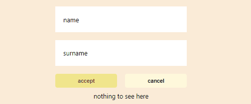
<div className="vanilla">
  <div className="simple-form">
    <Input className="both-columns name-input" label="name" />
    <Input className="both-columns surname-input" label="surname" />
    <Button clasName="left-button" label="accept" variant="primary" />
    <Button clasName="right-button" label="cancel" variant="secondary" />
    <div className="info-box both-columns"></div>
  </div>
</div>
We have div’s with classNames bunched together with React components, there is not a quick way to check the code of a given css class and overall it does look quite noisy, but we are accustomed to that, accepting it as a fact of life, but then when we look at how the styled-components js looks, it just takes my breath away:
我们将div's和classNames与React组件捆绑在一起,没有一种快速的方法来检查给定css类的代码,总的来说,它看起来确实很嘈杂,但是我们已经习惯了这一点,将其视为生活的事实,但是然后,当我们查看styled-components js外观时,这让我屏息了:
<Container>
  <Form>
    <NameInput label="name" />
    <SurnameInput label="surname" />
    <Primary label="accept" />
    <Secondary label="cancel" />
    <ThisInfoBox />
  </Form>
</Container>
So concise, so clean. No classNames being passed around, no divs floating around, pure joy to look at this. I don’t see myself going back..
如此简洁,如此干净。 没有classNames传递,没有div浮动,纯属喜悦。 我看不到自己要回去。
Cheers.
干杯。
Full code with all three implementations can be found here: https://github.com/MustSeeMelons/css-playground
包含这三种实现的完整代码可以在这里找到: https : //github.com/MustSeeMelons/css-playground
普通英语JavaScript (JavaScript In Plain English)
Did you know that we have three publications and a YouTube channel? Find links to everything at plainenglish.io!
您知道我们有三个出版物和一个YouTube频道吗? 在plainenglish.io上找到所有内容的链接!
翻译自: https://medium.com/javascript-in-plain-english/why-i-love-styled-components-ffec043293bb
样式组件化


 扫一扫
扫一扫

 被折叠的 条评论
为什么被折叠?
被折叠的 条评论
为什么被折叠?
 到【灌水乐园】发言


