


数据转换软件
📈Python金融系列 (📈Python for finance series)
Warning: There is no magical formula or Holy Grail here, though a new world might open the door for you.
警告 :这里没有神奇的配方或圣杯,尽管新世界可能为您打开了大门。
📈Python金融系列 (📈Python for finance series)
In the previews article, I briefly introduced the Volume Spread Analysis(VSA). After we did feature-engineering and feature-selection, there were two things I noticed immediately, the first one was that there were outliers in the dataset and the second issue was the distribution were no way close to normal. By using the method described here, here and here, I removed most of the outliers. Now is the time to face the bigger problem, the normality.
在预览文章中,我简要介绍了体积扩散分析(VSA)。 在进行了特征工程和特征选择之后,我立即注意到了两件事,第一件事是数据集中存在异常值,第二个问题是分布与正常值不相称。 通过使用此处 , 此处和此处所述的方法,我删除了大多数异常值。 现在是时候面对更大的问题,正常性。
There are many ways to transfer the data. One of the well-known examples is the one-hot encoding, even better one is word embedding in natural language processing (NLP). Considering one of the advantages of using deep learning is that it completely automates what used to be the most crucial step in a machine-learning workflow: feature engineering. Before we get into the deep learning in the later articles, let’s have a look at some simple ways to transfer data to see if we can make it closer to normal distribution.
有很多方法可以传输数据。 众所周知的例子之一是“ 单热”编码 ,更好的例子是自然语言处理(NLP)中的单词嵌入 。 考虑到使用深度学习的优势之一是它可以完全自动化机器学习工作流程中最关键的步骤:特征工程。 在后续文章中进行深度学习之前,让我们看一下一些简单的数据传输方法,以了解是否可以使其更接近正态分布。
In this article, I would like to try a few things. The first one is to transfer all the features to a simple percentage change. The second one is to do a Percentile Ranking. In the end, I will show you what happens if I only pick the sign of all the data. Methods like Z-score, which are standard pre-processing in deep learning, I would rather leave it for now.
在本文中,我想尝试一些事情。 第一个是将所有功能转移到简单的百分比更改中。 第二个是做百分等级。 最后,我将向您展示如果仅选择所有数据的符号会发生什么。 Z-score之类的方法是深度学习中的标准预处理,我宁愿暂时将其保留。
1.数据准备 (1. Data preparation)
For consistency, in all the 📈Python for finance series, I will try to reuse the same data as much as I can. More details about data preparation can be found here, here and here or you can refer back to my previous article. Or if you like, you can ignore all the code below and use whatever clean data you have at hand, it won’t affect the things we are going to do together.
为了保持一致性,在所有Python金融系列丛书中 ,我将尽量重用相同的数据。 有关数据准备的更多详细信息可以在这里 , 这里和这里找到,或者您可以参考我以前的文章 。 或者,如果愿意,您可以忽略下面的所有代码,而使用您手边的任何干净数据,这不会影响我们将共同完成的工作。
#import all the libraries
import pandas as pd
import numpy as np
import seaborn as sns
import yfinance as yf  #the stock data from Yahoo Finance
import matplotlib.pyplot as plt #set the parameters for plotting
plt.style.use('seaborn')
plt.rcParams['figure.dpi'] = 300#define a function to get data
def get_data(symbols, begin_date=None,end_date=None):
    df = yf.download('AAPL', start = '2000-01-01',
                     auto_adjust=True,#only download adjusted data
                     end= '2010-12-31')
    #my convention: always lowercase
    df.columns = ['open','high','low',
                  'close','volume']

    return dfprices = get_data('AAPL', '2000-01-01', '2010-12-31')#create some features
def create_HLCV(i):
#as we don't care open that much, that leaves volume,
#high,low and close
    df = pd.DataFrame(index=prices.index)
    df[f'high_{i}D'] = prices.high.rolling(i).max()
    df[f'low_{i}D'] = prices.low.rolling(i).min()
    df[f'close_{i}D'] = prices.close.rolling(i).\
                        apply(lambda x:x[-1])
    # close_2D = close as rolling backwards means today is
    # literly the last day of the rolling window.
    df[f'volume_{i}D'] = prices.volume.rolling(i).sum()

    return df# create features at different rolling windows
def create_features_and_outcomes(i):
    df = create_HLCV(i)
    high = df[f'high_{i}D']
    low = df[f'low_{i}D']
    close = df[f'close_{i}D']
    volume = df[f'volume_{i}D']

    features = pd.DataFrame(index=prices.index)
    outcomes = pd.DataFrame(index=prices.index)

    #as we already considered the different time span,
    #here only day of simple percentage change used.

    features[f'volume_{i}D'] = volume.pct_change()
    features[f'price_spread_{i}D'] = (high - low).pct_change()
    #aligne the close location with the stock price change
    features[f'close_loc_{i}D'] = ((close - low) / \
                             (high -   low)).pct_change()    #the future outcome is what we are going to predict
    outcomes[f'close_change_{i}D'] = close.pct_change(-i)

    return features, outcomesdef create_bunch_of_features_and_outcomes():
    '''
    the timespan that i would like to explore
    are 1, 2, 3 days and 1 week, 1 month, 2 month, 3 month
    which roughly are [1,2,3,5,20,40,60]
    '''
    days = [1,2,3,5,20,40,60]
    bunch_of_features = pd.DataFrame(index=prices.index)
    bunch_of_outcomes = pd.DataFrame(index=prices.index)

    for day in days:
        f,o = create_features_and_outcomes(day)
        bunch_of_features = bunch_of_features.join(f)
        bunch_of_outcomes = bunch_of_outcomes .join(o)

    return bunch_of_features, bunch_of_outcomesbunch_of_features, bunch_of_outcomes = create_bunch_of_features_and_outcomes()#define the method to identify outliers
def get_outliers(df, i=4):
    #i is number of sigma, which define the boundary along mean
    outliers = pd.DataFrame()
    stats = df.describe()

    for col in df.columns:
        mu = stats.loc['mean', col]
        sigma = stats.loc['std', col]
        condition = (df[col] > mu + sigma * i) | \
                  (df[col] < mu -   sigma * i)
        outliers[f'{col}_outliers'] = df[col][condition]

    return outliers#remove all the outliers
features_outcomes = bunch_of_features.join(bunch_of_outcomes)
outliers = get_outliers(features_outcomes, i=1)features_outcomes_rmv_outliers = features_outcomes.drop(index = outliers.index).dropna()features = features_outcomes_rmv_outliers[bunch_of_features.columns]
outcomes = features_outcomes_rmv_outliers[bunch_of_outcomes.columns]
features.info(), outcomes.info()
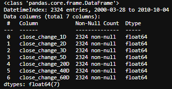
In the end, we will have the basic four features based on Volume Spread Analysis (VSA) at different time scale listed below, namely, 1 day, 2 days, 3 days, a week, a month, 2 months and 3 months.
最后,我们将基于下面列出的不同时间范围的体积扩展分析(VSA)提供基本的四个功能,分别是1天,2天,3天,一周,一个月,2个月和3个月。
- Volume: pretty straight forward 数量:挺直的
- Range/Spread: Difference between high and close 范围/价差:最高价和收市价之间的差异
- Closing Price Relative to Range: Is the closing price near the top or the bottom of the price bar? 收盘价相对于范围:收盘价是否在价格柱的顶部或底部附近?
- The change of stock price: pretty straight forward 股票价格的变化:很简单
2.回报率 (2. Percentage Returns)
I know that’s a whole lot of codes above. We have all the features transformed into a simple percentage change through the function below.
我知道上面有很多代码。 我们通过以下功能将所有功能转换为简单的百分比更改。
def create_features_and_outcomes(i):
    df = create_HLCV(i)
    high = df[f'high_{i}D']
    low = df[f'low_{i}D']
    close = df[f'close_{i}D']
    volume = df[f'volume_{i}D']

    features = pd.DataFrame(index=prices.index)
    outcomes = pd.DataFrame(index=prices.index)

    #as we already considered the different time span,
    #here only 1 day of simple percentage change used.

    features[f'volume_{i}D'] = volume.pct_change()
    features[f'price_spread_{i}D'] = (high - low).pct_change()
    #aligne the close location with the stock price change
    features[f'close_loc_{i}D'] = ((close - low) / \
    (high -    low)).pct_change()#the future outcome is what we are going to predict
    outcomes[f'close_change_{i}D'] = close.pct_change(-i)

    return features, outcomes
Now, let’s have a look at their correlations using cluster map. Seaborn’s clustermap() hierarchical clustering algorithm shows a nice way to group the most closely related features.
现在,让我们看一下使用聚类图的相关性。 Seaborn的clustermap()层次聚类算法显示了一种对最密切相关的特征进行分组的好方法。
corr_features = features.corr().sort_index()
sns.clustermap(corr_features, cmap='coolwarm', linewidth=1);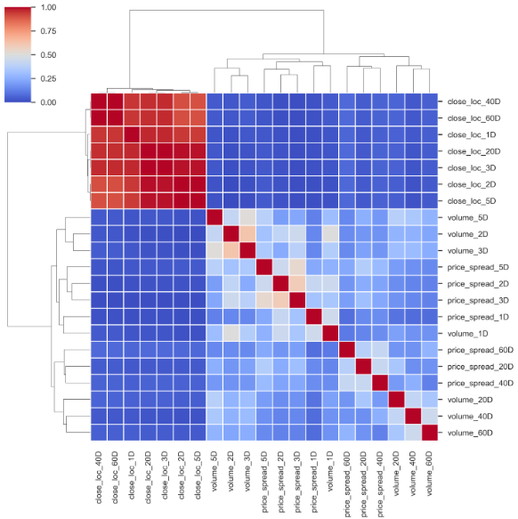
Based on this cluster map, to minimize the amount of feature overlap in selected features, I will remove those features that are paired with other features closely and having less correlation with the outcome targets. From the cluster map above, it is easy to spot that features on [40D, 60D] and [2D, 3D] are paired together. To see how those features are related to the outcomes, let’s have a look at how the outcomes are correlated first.
基于此聚类图,为了最大程度地减少所选要素中的要素重叠量,我将删除那些与其他要素紧密配对且与结果目标的相关性较小的要素。 从上方的群集图中,很容易发现[40D,60D]和[2D,3D]上的要素已配对。 要了解这些功能与结果之间的关系,让我们先看一下结果之间的关系。
corr_outcomes = outcomes.corr()
sns.clustermap(corr_outcomes, cmap='coolwarm', linewidth=2);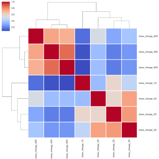
From top to bottom, 20 days, 40 days and 60 days price percentage change are grouped together, so as the 2 days, 3 days and 5 days. Whereas, 1-day stock price percentage change is relatively independent of those two groups. If we pick the next day price percentage change as the outcome target, let’s see how those features are related to it.
从上至下,将20天,40天和60天价格百分比变化分组在一起,即2天,3天和5天。 而1天的股价百分比变化相对独立于这两组。 如果我们选择第二天的价格百分比变化作为结果目标,让我们看看这些功能如何与之相关。
corr_features_outcomes = features.corrwith(outcomes. \
                                close_change_1D).sort_values()
corr_features_outcomes.dropna(inplace=True)
corr_features_outcomes.plot(kind='barh',title = 'Strength of Correlation');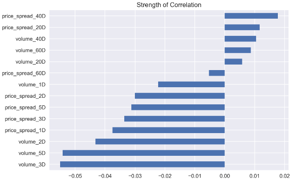
The correlation coefficients are way too small to make a solid conclusion. I will expect that the most recent data have a stronger correlation, but that is not the case here.
相关系数太小而无法得出可靠的结论。 我希望最新的数据具有更强的相关性,但事实并非如此。
How about the pair plot? We only pick those features based on a 1-day time scale as a demonstration. At the meantime, I transferred the close_change_1D to sign base on it’s a negative or positive number to add extra dimensionality to the plots.
配对图怎么样? 我们仅基于1天的时间范围选择这些功能作为演示。 同时,我将close_change_1D给签名,因为它是一个负数或正数,从而为绘图增加了尺寸。
selected_features_1D_list = ['volume_1D', 'price_spread_1D', 'close_loc_1D', 'close_change_1D']
features_outcomes_rmv_outliers['sign_of_close'] = features_outcomes_rmv_outliers['close_change_1D']. \
                                                  apply(np.sign)sns.pairplot(features_outcomes_rmv_outliers,
             vars=selected_features_1D_list,
             diag_kind='kde',
             palette='husl', hue='sign_of_close',
             markers = ['*', '<', '+'],
             plot_kws={'alpha':0.3});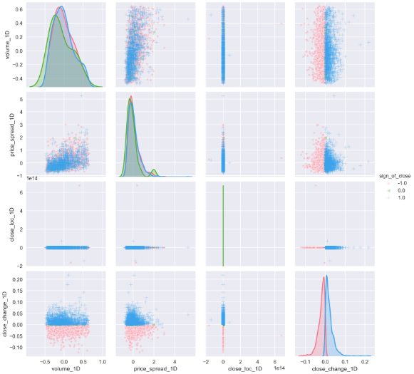
The pair plot builds on two basic figures, the histogram and the scatter plot. The histogram on the diagonal allows us to see the distribution of a single variable while the scatter plots on the upper and lower triangles show the relationship (or lack thereof) between two variables. From the plots above, we can see that price spreads are getting wider with high volume. Most of the price change locate at a narrow price spread, in another word, wider spread doesn’t always come with bigger price fluctuation. Either low volume or high volume can cause price change at almost all scale. And we can apply all those conclusions to both up days and down days.
对图建立在两个基本图形上,即直方图和散点图。 对角线上的直方图使我们能够看到单个变量的分布,而上三角形和下三角形上的散点图则显示了两个变量之间的关系(或不存在)。 从上面的图可以看出,随着交易量的增加,价差越来越大。 大多数价格变化都位于狭窄的价差中,也就是说,价差并不总是伴随着较大的价格波动。 数量少或数量大都会导致几乎所有规模的价格变化。 我们可以将所有这些结论应用到工作日和工作日中。
you can also use the close location of bars to add more dimensionality, simply apply
您还可以使用条形图的靠近位置来添加更多维度,只需应用
features[‘sign_of_close_loc’] = np.where( \
 features[‘close_loc_1D’] > 0.5, \
 1, -1)
to see how many bars’ close location above the 0.5 or below 0.5.
看看有多少个柱的收盘位置高于0.5或低于0.5。
One thing that I don’t really like in the pair plot is all the plots with the close_loc_1D condensed, looks like the outliers still there, even I know I used one standard deviation as the boundary which is a very low threshold and 338 outliers were removed. I realize that because the location of close is already a percentage change, adding another percentage change on top doesn’t make much sense. Let’s change it.
在配对图中,我真正不喜欢的一件事是所有close_loc_1D压缩的图,看起来仍然存在离群值,即使我知道我使用一个标准偏差作为边界,该阈值也很低,有338个离群值删除。 我意识到,由于关闭位置已经是百分比变化,因此在顶部添加另一个百分比变化没有多大意义。 让我们改变它。
def create_features_and_outcomes(i):
    df = create_HLCV(i)
    high = df[f'high_{i}D']
    low = df[f'low_{i}D']
    close = df[f'close_{i}D']
    volume = df[f'volume_{i}D']

    features = pd.DataFrame(index=prices.index)
    outcomes = pd.DataFrame(index=prices.index)

    #as we already considered the different time span,
    #simple percentage change of 1 day used here.

    features[f'volume_{i}D'] = volume.pct_change()
    features[f'price_spread_{i}D'] = (high - low).pct_change()
    #remove pct_change() here
    features[f'close_loc_{i}D'] = ((close - low) / (high - low))
    #predict the future with -i
    outcomes[f'close_change_{i}D'] = close.pct_change(-i)

    return features, outcomes
With pct_change() removed, let’s see how the cluster map looks like now.
删除pct_change()后,让我们看看集群图现在的样子。
corr_features = features.corr().sort_index()
sns.clustermap(corr_features, cmap='coolwarm', linewidth=1);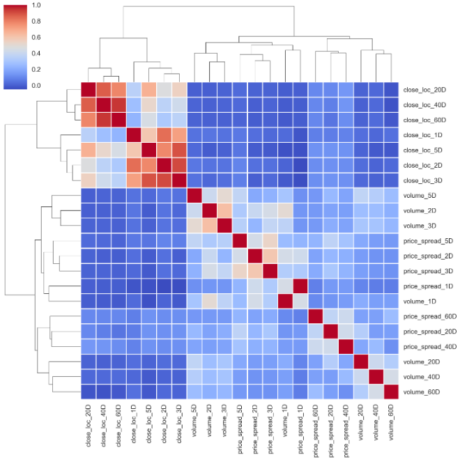
The cluster map makes more sense now. All four basic features have pretty much the same pattern. [40D, 60D], [2D, 3D] are paired together.
现在,群集图更有意义。 所有四个基本功能都具有几乎相同的模式。 [40D,60D],[2D,3D]配对在一起。
and in terms of the features correlations with the outcome.
以及与结果相关的特征。
corr_features_outcomes.plot(kind='barh',title = 'Strength of Correlation');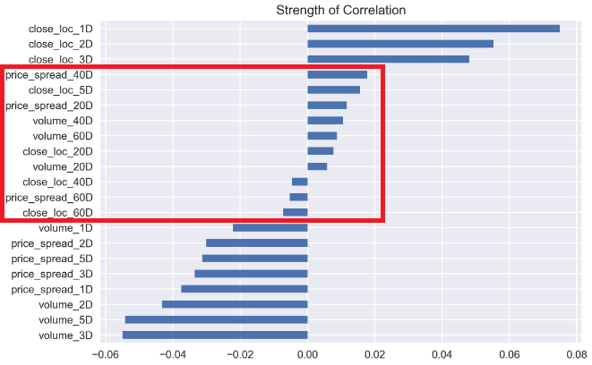
The longer-range time scale features have weak correlations with stock price return, while the more recent events have more effects on the price returns.
较长的时间尺度特征与股票价格收益之间的相关性较弱,而最近的事件对股价收益的影响更大。
By removing pct_change() of the close_loc_1D, the biggest difference is laid on the pairplot().
通过消除pct_change()中的close_loc_1D ,最大的区别就是铺在pairplot()

Finally, the close_loc_1D variable plots at the right range. This illustrates that we should be careful with over-engineering. It may lead to a totally unexpected way.
最后, close_loc_1D变量在正确的范围内绘制。 这说明我们应谨慎处理过度工程。 这可能会导致完全出乎意料的方式。
3.百分等级 (3. Percentile Ranking)
According to Wikipedia, the percentile rank is
根据维基百科,百分等级是
“The percentile rank of a score is the percentage of scores in its frequency distribution that are equal to or lower than it. For example, a test score that is greater than 75% of the scores of people taking the test is said to be at the 75th percentile, where 75 is the percentile rank.”
“分数的百分等级是指频率分布中等于或低于分数的分数的百分比。 例如,一个测验分数大于参加该测验的人分数的75%,被认为是第75个百分位,其中75是百分位。
The below example returns the percentile rank (from 0.00 to 1.00) of traded volume for each value as compared to a trailing 60-day period.
下面的示例返回与过去60天的时间段相比每个值的交易量的百分比等级(从0.00到1.00)。
roll_rank = lambda x: pd.Series(x).rank(pct=True)[-1]
# you only pick the first value [0]
# of the 60 windows rank if you rolling forward.
# if you rolling backward, we should pick last one,[-1].features_rank = features.rolling(60, min_periods=60). \
                apply(roll_rank).dropna()
outcomes_rank = outcomes.rolling(60, min_periods=60). \
                apply(roll_rank).dropna()
✍提示! (✍Tip!)
Pandasrolling(), by default, the result is set to the right edge of the window. That means the window is backward-looking windows, from the past rolls towards current timestamp. That is why, to rank() in that window frame, we pick the last value [-1].
熊猫rolling() ,默认情况下,结果设置在窗口的右边缘。 这意味着该窗口是后视窗口,从过去滚动到当前时间戳。 这就是为什么要在该窗口框架中对rank()进行选择的原因,我们选择了最后一个值[-1] 。
More information about rolling(), please check the official document.
有关rolling()更多信息,请检查官方文档。
First, we have a quick look at the outcomes’ cluster map. It is almost identical to the percentage change one with a different order.
首先,我们快速查看结果的聚类图。 它几乎与具有不同顺序的百分比变化相同。
corr_outcomes_rank = outcomes_rank.corr().sort_index()
sns.clustermap(corr_outcomes_rank, cmap='coolwarm', linewidth=2);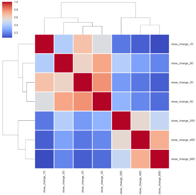
The same pattern goes to the features’ cluster map.
相同的模式也用于要素的群集地图。
corr_features_rank = features_rank.corr().sort_index()
sns.clustermap(corr_features_rank, cmap='coolwarm', linewidth=2);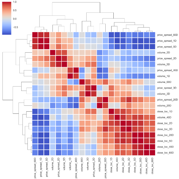
Even with a different method,
即使采用其他方法,
# using 'ward' method
corr_features_rank = features_rank.corr().sort_index()
sns.clustermap(corr_features_rank, cmap='coolwarm', linewidth=2, method='ward');
and of course, the correlation of features and outcome are the same as well.
当然,特征与结果的相关性也相同。
corr_features_outcomes_rank = features_rank.corrwith( \
                              outcomes_rank. \
                              close_change_1D).sort_values()corr_features_outcomes_rank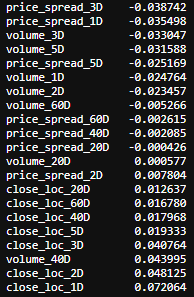
corr_features_outcomes_rank.plot(kind='barh',title = 'Strength of Correlation');
Last, you may guess the pair plot will be the same as well.
最后,您可能会猜对图也会一样。
selected_features_1D_list = ['volume_1D', 'price_spread_1D', 'close_loc_1D', 'close_change_1D']
features_outcomes_rank['sign_of_close'] = features_outcomes_rmv_outliers['close_change_1D']. \
                                                  apply(np.sign)sns.pairplot(features_outcomes_rank,
             vars=selected_features_1D_list,
             diag_kind='kde',
             palette='husl', hue='sign_of_close',
             markers = ['*', '<', '+'],
             plot_kws={'alpha':0.3});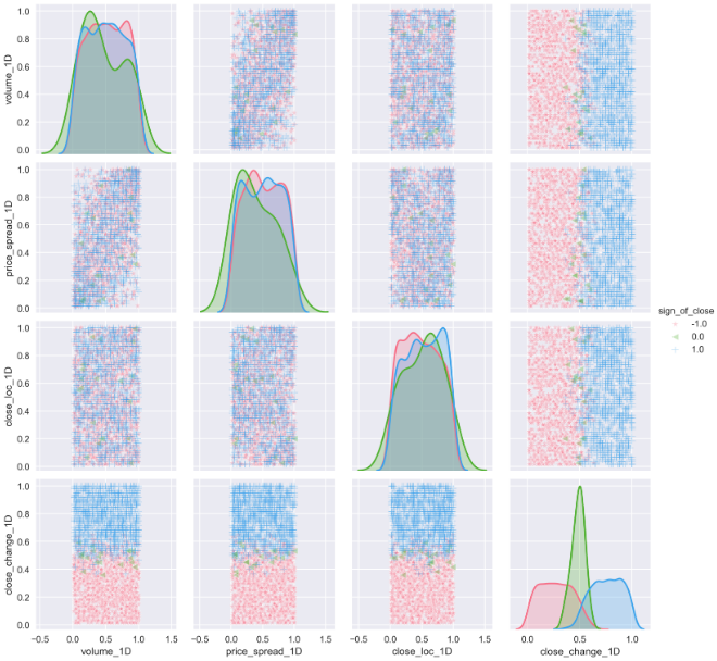
Because of the percentile rank (from 0.00 to 1.00) we utilized in the set window, the spots are evenly distributed across all features. The distribution of all the features is more or less close to a normal distribution than the same data without transformation.
由于我们在设置窗口中使用了百分比等级(从0.00到1.00),因此斑点在所有要素上均匀分布。 与没有变换的相同数据相比,所有特征的分布或多或少接近正态分布。
4.签署 (4. Signing)
The last not least, I would like to remove all the data grain and see how those features related under this scenario.
最后一点,我想删除所有数据粒度,并查看在这种情况下这些功能之间的关系。
features_sign = features.apply(np.sign)
outcomes_sign = outcomes.apply(np.sign)
Then calculate the correlation coefficiency again.
然后再次计算相关系数。
corr_features_outcomes_sign = features_sign.corrwith(
                              outcomes_sign. \
                              close_change_1D).sort_values(ascending=False)corr_features_outcomes_sign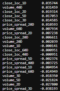
corr_features_outcomes_sign.plot(kind='barh',title = 'Strength of Correlation');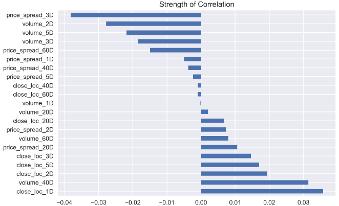
It turns out a bit weird now, like volume_1D and price_spread_1D has a very weak correlation with the outcome now.
事实证明现在有点怪异,例如volume_1D和price_spread_1D与结果之间的关联非常微弱。
Luckily, the cluster map remains pretty much the same.
幸运的是,集群图几乎保持不变。
corr_features_sign = features_sign.corr().sort_index()
sns.clustermap(corr_features_sign, cmap='coolwarm', linewidth=2);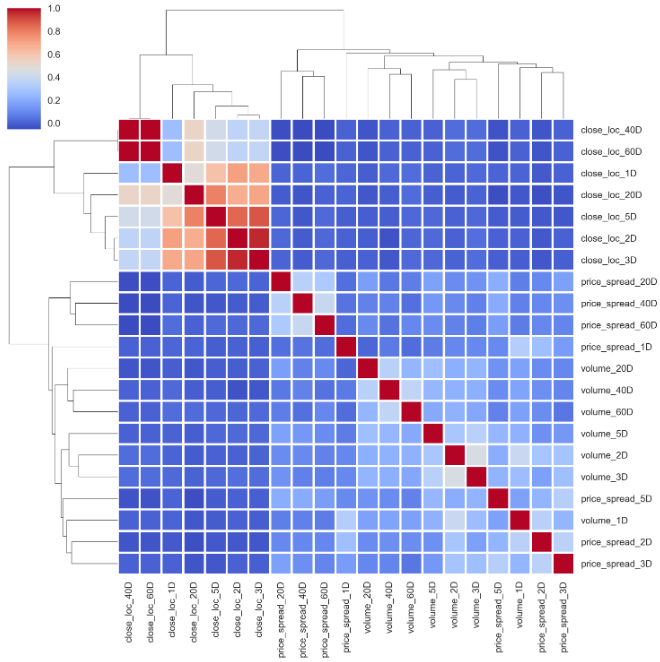
And the same goes for the relationship between outcomes.
结果之间的关系也是如此。
corr_outcomes_sign = outcomes_sign.corr().sort_index()
sns.clustermap(corr_outcomes_sign, cmap='coolwarm', linewidth=2);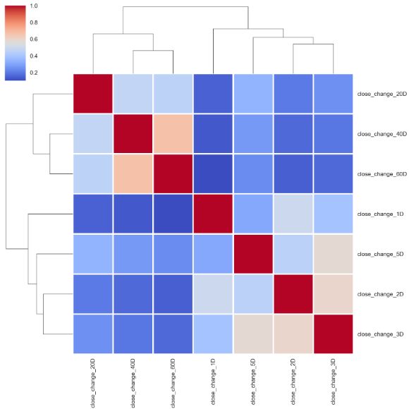
As for pair plot, as all the data are transferred to either -1 or 1, it doesn’t show anything meaningful.
至于成对图,由于所有数据都被传输为-1或1,因此没有任何意义。

It is sometimes vital to “standardize” or “normalize” data so that we get fair comparisons between features of differing scale. I am tempted to use Z-score to normalize the data set.
有时对数据进行“标准化”或“标准化”至关重要,这样我们才能在不同规模的特征之间进行公平的比较。 我很想使用Z分数来规范化数据集。
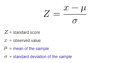
The formula of Z-score requires the mean and standard deviation, by calculating these two parameters across the entire dataset, we have the chance to peek to the future. Of course, we can take advantage of the rolling window again. But generally, people will normalize their data before injecting them into their model.
Z分数的公式需要平均值和标准偏差,通过在整个数据集中计算这两个参数,我们就有机会窥见未来。 当然,我们可以再次利用滚动窗口。 但是通常,人们将数据标准化后再将其注入模型。
In summary, by utilizing 3 different data transformations methods, now we are pretty confident we can select the most related features and discard those abundant ones as all 3 methods pretty much share the same patterns.
综上所述,通过使用3种不同的数据转换方法,现在我们非常有信心可以选择最相关的功能并丢弃那些丰富的功能,因为这3种方法几乎都共享相同的模式。
5.平稳性和正常性测试 (5. Stationary and Normality Test)
The last question can the transformed data pass the stationary/normality test? Here, I will use the Augmented Dickey-Fuller test¹, which is a type of statistical test called a unit root test. At the meantime, I want to see the skewness and kurtosis as well.
最后一个问题是转换后的数据可以通过平稳性/正常性测试吗? 在这里,我将使用增强Dickey-Fuller检验 ¹,这是一种统计检验,称为单位根检验 。 同时,我也想看看偏度和峰度。
import statsmodels.api as sm
import scipy.stats as scs
p_val = lambda s: sm.tsa.stattools.adfuller(s)[1]def build_stats(df):
    stats = pd.DataFrame({'skew':scs.skew(df),
                 'skew_test':scs.skewtest(df)[1],
                 'kurtosis': scs.kurtosis(df),
                 'kurtosis_test' : scs.kurtosistest(df)[1],
                 'normal_test' : scs.normaltest(df)[1]},
                  index = df.columns)
    return stats
The null hypothesis of the test is that the time series can be represented by a unit root, that it is not stationary (has some time-dependent structure). The alternate hypothesis (rejecting the null hypothesis) is that the time series is stationary.
该检验的零假设是,时间序列可以用单位根表示,它不是固定的(具有某些时间相关的结构)。 备用假设(拒绝原假设)是时间序列是平稳的。
Null Hypothesis (H0): If failed to be rejected, it suggests the time series has a unit root, meaning it is non-stationary. It has some time dependent structure.
零假设(H0) :如果未能被拒绝,则表明时间序列具有单位根,这意味着它是非平稳的。 它具有一些时间相关的结构。
Alternate Hypothesis (H1): The null hypothesis is rejected; it suggests the time series does not have a unit root, meaning it is stationary. It does not have time-dependent structure.
备用假设(H1) :原假设被拒绝; 这表明时间序列没有单位根,这意味着它是固定的。 它没有时间相关的结构。
Here is the result from Augmented Dickey-Fuller test:
这是增强Dickey-Fuller测试的结果:
For features and outcomes:
对于功能和结果:
features_p_val = features.apply(p_val)
outcomes_p_val = outcomes.apply(p_val)
outcomes_p_val,features_p_val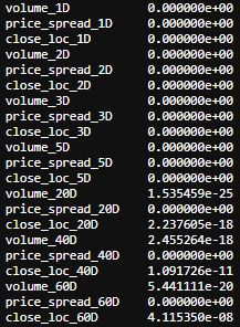
The test can be interpreted by the p-value. A p-value below a threshold (such as 5% or 1%) suggests we reject the null hypothesis (stationary), otherwise, a p-value above the threshold suggests we cannot reject the null hypothesis (non-stationary).
可以用p值解释该检验。 低于阈值的p值(例如5%或1%)表明,我们拒绝零假设(静止的),否则,一个p值高于该阈值表明,我们不能拒绝零假设(非静止的)。
p-value > 0.05: cannot reject the null hypothesis (H0), the data has a unit root and is non-stationary.
p值> 0.05 :无法拒绝原假设(H0),数据具有单位根且不稳定。
p-value <= 0.05: Reject the null hypothesis (H0), the data does not have a unit root and is stationary.
p值<= 0.05 :拒绝原假设(H0),数据没有单位根并且是固定的。
From this test, we can see that all the results are well below 5%, that shows we can reject the null hypothesis and all the transformed data are stationary.
从该测试中,我们可以看到所有结果都远低于5%,这表明我们可以拒绝原假设,并且所有变换后的数据都是平稳的。
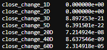
Next, let’s test the normality.
接下来,让我们测试正常性。
build_stats(features_outcomes_rmv_outliers)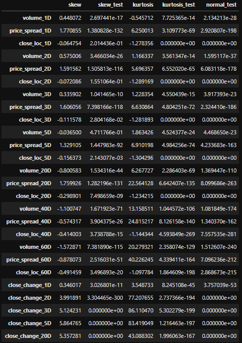
For normally distributed data, the skewness should be about zero. For unimodal continuous distributions, a skewness value greater than zero meansthat there is more weight in the right tail of the distribution and vice versa.
对于正态分布的数据,偏度应约为零。 对于单峰连续分布,偏度值大于零意味着在分布的右尾有更多的权重,反之亦然。
scs.skewtest() tests the null hypothesis that the skewness of the population that the sample was drawn from is the same as that of a corresponding normal distribution. As all the numbers are below 5% threshold, we have to reject the null hypothesis and say the skewness doesn’t correspond to normal distribution. The same thing goes to scs.kurtosistest().
scs.skewtest()测试零假设,即从中抽取样本的总体的偏斜度与相应正态分布的偏度相同。 由于所有数字均低于5%阈值,因此我们必须拒绝原假设,并说偏度与正态分布不符。 scs.kurtosistest() 。
scs.normaltest() tests the null hypothesis that a sample comes from a normal distribution. It is based on D’Agostino and Pearson’s test² ³ that combines skew and kurtosis to produce an omnibus test of normality. Again, all the numbers are below 5% threshold. We have to reject the null hypothesis and say the data transformed by percentage change is not normal distribution.
scs.normaltest()测试样本来自正态分布的原假设。 它基于D'Agostino和Pearson的test²³,结合了偏斜和峰度以进行综合的正态性检验。 同样,所有数字均低于5%阈值。 我们必须拒绝原假设,并说通过百分比变化转换的数据不是正态分布。
We can do the same tests on data transformed by Percentile Ranking and Signing. I don’t want to scare people off by complexing thing further. I am better off ending here before this article goes way too long.
我们可以对通过百分比排名和签名转换的数据进行相同的测试。 我不想通过进一步复杂化事情来吓跑人们。 在本文过长之前,我最好在这里结束。
翻译自: https://towardsdatascience.com/data-transformation-e7b3b4268151
数据转换软件


 被折叠的 条评论
为什么被折叠?
被折叠的 条评论
为什么被折叠?
 到【灌水乐园】发言


