


Karl Pearson coined the term histogram, but it’s hard to tell who invented the visualization, and it’s most likely that it was used way before Pearson named it.
卡尔·皮尔森(Karl Pearson)创造了直方图一词,但很难说是谁发明了可视化,而且很可能是在皮尔逊(Pearson)命名它之前就使用了它。
William Playfair is considered the inventor of bar charts or the first to publish such graphs, so it’s not hard to imagine that he would have drawn a couple of those charts to visualize a frequency in the late 1700s or early 1800s.
威廉·普莱费尔(William Playfair)被认为是条形图的发明者或第一个发布此类图的人,因此不难想象,他会绘制其中的几张图以可视化1700年代末或1800年代初的频率。
After all, that’s pretty much what histograms are; they’re bar charts, usually visualized with the bars connected, where the values are separated into equal ranges, called bins or classes. The heights of the bars represent the number of records in that class, also known as frequency.
毕竟,这几乎就是直方图。 它们是条形图,通常在连接的条形下可视化,其中值分为相等的范围(称为垃圾箱或类)。 条形图的高度代表该类别中的记录数,也称为频率。
In this article, I’ll go through the basics of this visualization, and we’ll also explore some of Matplotlib’s many customization options while we learn more about histograms.
在本文中,我将介绍该可视化的基础知识,并且还将在了解有关直方图的更多内容的同时探索Matplotlib的许多自定义选项。
太空任务直方图 (Space Missions Histogram)
I’ll run my code in Jupyter, and I’ll use Pandas, Numpy, and Matplotlib to develop the visuals.
我将在Jupyter中运行代码,并使用Pandas,Numpy和Matplotlib开发视觉效果。
import pandas as pd
import numpy as np
import matplotlib.pyplot as plt
from matplotlib.ticker import AutoMinorLocator
from matplotlib import gridspec
The dataset we’ll explore in this example has data on all space missions since 1957 and was scraped from nextspaceflight.com by Agirlcoding.
我们将在此示例中探索的数据集包含自1957年以来所有太空任务的数据,并由Agirlcoding从nextspaceflight.com抓取到。
df = pd.read_csv('medium/data/Space_Corrected.csv')
df
After loading the dataset, we can proceed to some cleaning and minor adjustments.
加载数据集后,我们可以进行一些清理和较小的调整。
# date column to datetime
df['Datum'] = pd.to_datetime(df['Datum'], utc=True)# costs column to numeric
df['Rocket'] = pd.to_numeric(df[' Rocket'], errors='coerce')# drop columns
# ' Rocket' had an extra space and was renamed
df.drop([' Rocket', 'Unnamed: 0', 'Unnamed: 0.1'], axis=1, inplace=True)
Now that’s all set; we can effortlessly plot our histogram with Matplotlib.
现在一切就绪; 我们可以使用Matplotlib轻松绘制直方图。
Mostly I want to visualize the data on the ‘Rocket’ column, which is the cost of the mission in millions of USD. My idea is to observe the distribution of values in that column.
通常,我想在“火箭”列上显示数据,这是以百万美元为单位的任务成本。 我的想法是观察该列中值的分布。
plt.hist(df.Rocket)
plt.show()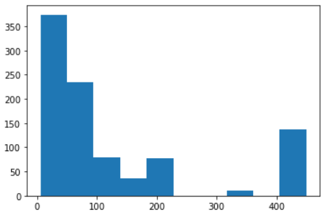
That’s ok, the default chart gives us a simple x-axis and y-axis, and the bars automatically divided into the bins.
没关系,默认图表为我们提供了一个简单的x轴和y轴,条形图自动划分为垃圾箱。
Before going any further, let’s assign the bins of our histogram to a variable to get a better look at it.
在进一步介绍之前,让我们将直方图的bin分配给变量以更好地了解它。
n, bins, patches = plt.hist(df.Rocket)bins
That means our values are divided into ten bins, like so:
这意味着我们的值被分为十个等级,如下所示:
- 5.3 ≤ n < 49.77 5.3≤n <49.77
- 49.77 ≤ n < 94.24 49.77≤n <94.24
- … …
405.53 ≤ n ≤ 450
405.53≤N≤450
Note that the top value of each bin is excluded (<), but the last range includes it (≤).
请注意,每个bin的最大值都被排除(<),但最后一个范围包括它(≤)。
Cool, now that we have a list with the edges of our bins, let’s try using it as the ticks for the x-axis.
太酷了,现在我们有了一个带有垃圾箱边缘的列表,让我们尝试将其用作x轴的刻度。
Let’s also add a figure and increase the size of our graph.
我们还要添加一个数字并增加图形的大小。
fig = plt.figure(figsize=(16,6))n, bins, patches = plt.hist(df.Rocket)plt.xticks(bins)
plt.show()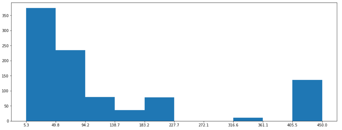
That’s better.
这样更好
Since we didn’t give Matplotlib any information about the bins, it automatically defined its numbers and ranges.
由于我们没有向Matplotlib提供有关垃圾箱的任何信息,因此它会自动定义其数量和范围。
We can set the bins by passing a list of edges when defining the plot; this allows us to create unevenly spaced bins, which is not typically recommended — but there’s that.
我们可以在定义图时通过传递边列表来设置垃圾箱。 这使我们可以创建间隔不均匀的垃圾箱,通常不建议这样做-就是这样。
Another way we can set them is by passing an integer with the number of bins we want.
设置它们的另一种方法是传递一个带有所需箱数的整数。
fig = plt.figure(figsize=(16,6))n, bins, patches = plt.hist(df.Rocket, bins=16)plt.xticks(bins)
plt.show()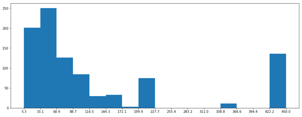
The main point of a histogram is to visualize the distribution of our data. We don’t want our chart to have too many bins because that could hide the concentrations in our data; simultaneously, we don’t want a low number of classes because we could misinterpret the distribution.
直方图的重点是可视化我们数据的分布。 我们不希望图表中的箱太多,因为这会隐藏数据中的浓度。 同时,我们不希望使用较少的类,因为我们可能会误解分布。
Choosing the number of classes in our histogram is sometimes very intuitive, but other times is quite a struggle. Luckily, we got plenty of algorithms for that, and Matplotlib allows us to chose which one to use.
在直方图中选择班级的数量有时非常直观,但其他时候则相当困难。 幸运的是,我们为此准备了很多算法,而Matplotlib允许我们选择要使用的算法。
fig = plt.figure(figsize=(16,6))# 'auto', 'sturges', 'fd', 'doane', 'scott', 'rice' or 'sqrt'
n, bins, patches = plt.hist(df.Rocket, bins='rice')plt.xticks(bins)
plt.show()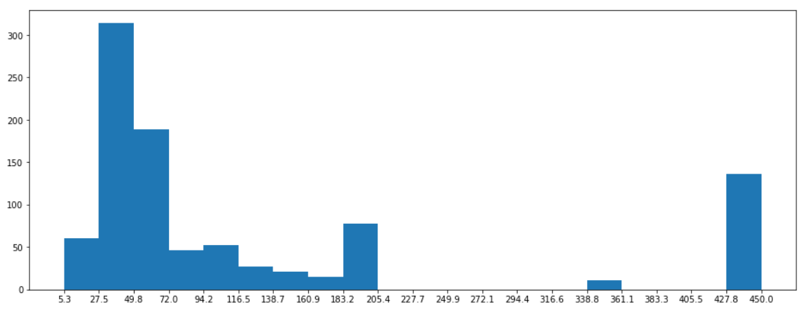
Quite simple, we already know the basics of how a histogram works. Now we can try to customize it.
非常简单,我们已经知道直方图的工作原理。 现在我们可以尝试对其进行自定义。
We could use some gridlines in the x-axis to better visualize where the bins start and end. A title would also be great.
我们可以在x轴上使用一些网格线,以更好地可视化垃圾箱的开始和结束位置。 头衔也很棒。
fig = plt.figure(figsize=(16,6))n, bins, patches = plt.hist(df.Rocket)plt.xticks(bins)
plt.grid(color='white', lw = 0.5, axis='x')plt.title('Histogram of Space Missions Costs', loc = 'left', fontsize = 18)
plt.show()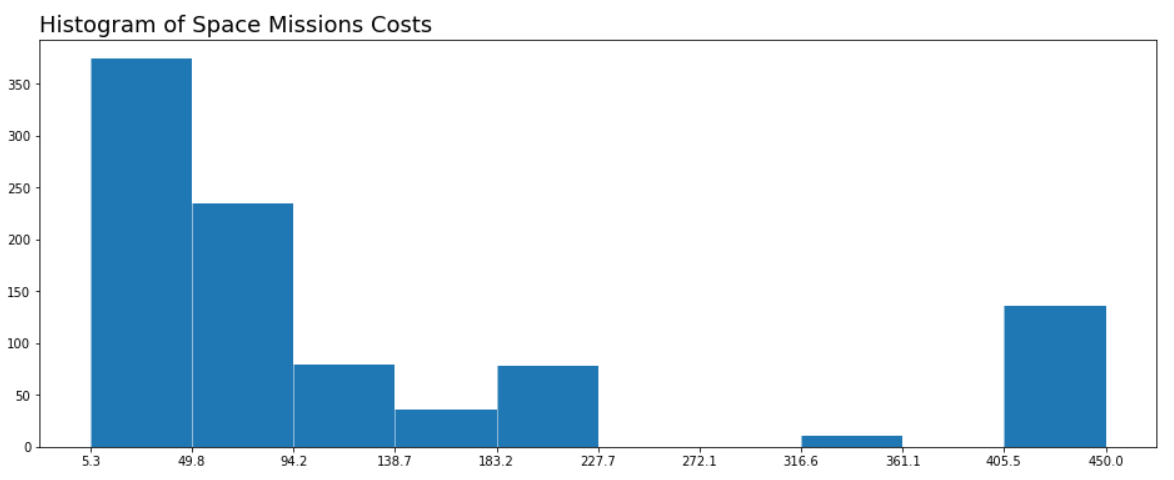
It would be better if the ticks were in the center of the bars and displayed both the lower and upper boundaries of the range.
如果刻度线位于条形的中心并同时显示范围的上下边界,则更好。
We could define the labels by going through all the bins but the last while joining the current value with the next one.
我们可以通过遍历除上一个框以外的所有框来定义标签,同时将当前值与下一个框连接起来。
Something like this:
像这样:
# x ticks labels
[ "{:.2f} - {:.2f}".format(value, bins[idx+1]) for idx, value in enumerate(bins[:-1])]
And the ticks positions should be at the center of the two values, as so:
刻度位置应位于两个值的中心,如下所示:
# x ticks positions
[(bins[idx+1] + value)/2 for idx, value in enumerate(bins[:-1])]Cool, when we add this to our plot, we need to redefine the grids. If we draw the grid lines with the ticks, we’ll have the line in the middle of the bar.
太酷了,当我们将其添加到绘图中时,我们需要重新定义网格。 如果我们用刻度线绘制网格线,则该线将位于条的中间。
To fix that, we’ll use AutoMinorLocator, the class we imported at the beginning. That class will help us set the minor ticks, which we can use to draw the grid.
为了解决这个问题,我们将使用AutoMinorLocator ,这是我们开头导入的类。 该课程将帮助我们设置较小的刻度线,我们可以使用这些刻度线来绘制网格。
fig = plt.figure(figsize=(16,6))
n, bins, patches = plt.hist(df.Rocket)# define minor ticks and draw a grid with them
minor_locator = AutoMinorLocator(2)
plt.gca().xaxis.set_minor_locator(minor_locator)
plt.grid(which='minor', color='white', lw = 0.5)# x ticks
xticks = [(bins[idx+1] + value)/2 for idx, value in enumerate(bins[:-1])]xticks_labels = [ "{:.2f}\nto\n{:.2f}".format(value, bins[idx+1]) for idx, value in enumerate(bins[:-1])]plt.xticks(xticks, labels = xticks_labels)plt.title('Histogram of Space Missions Costs (Millions of USD)', loc = 'left', fontsize = 18)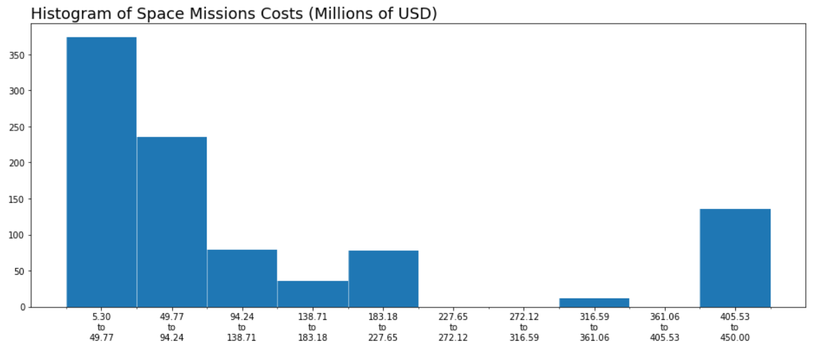
It’s starting to look great; let’s remove the spines of our chart and the markings of the ticks to make it look cleaner.
它开始看起来很棒; 让我们删除图表的尖刺和刻度线的标记,使其看起来更干净。
fig, ax = plt.subplots(1, figsize=(16,6))n, bins, patches = plt.hist(df.Rocket)# define minor ticks and draw a grid with them
minor_locator = AutoMinorLocator(2)
plt.gca().xaxis.set_minor_locator(minor_locator)
plt.grid(which='minor', color='white', lw = 0.5)# x ticks
xticks = [(bins[idx+1] + value)/2 for idx, value in enumerate(bins[:-1])]
xticks_labels = [ "{:.2f}\nto\n{:.2f}".format(value, bins[idx+1]) for idx, value in enumerate(bins[:-1])]
plt.xticks(xticks, labels = xticks_labels)# remove major and minor ticks from the x axis, but keep the labels
ax.tick_params(axis='x', which='both',length=0)# Hide the right and top spines
ax.spines['bottom'].set_visible(False)
ax.spines['left'].set_visible(False)
ax.spines['right'].set_visible(False)
ax.spines['top'].set_visible(False)plt.title('Histogram of Space Missions Costs (Millions of USD)', loc = 'left', fontsize = 18)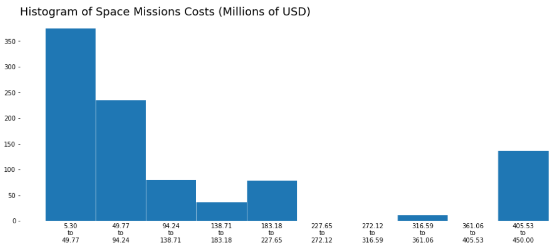
For the y-axis, we could print the values on top of the bars and remove the y ticks.
对于y轴,我们可以将这些值打印在条形图的顶部并删除y刻度。
n the first variable we get from plotting our histograms holds a list with the counts for each bin.
n从绘制直方图得到的第一个变量包含一个列表,其中包含每个bin的计数。
We can get the x position from xticks the list we built earlier, and the labels and y values from n.
我们可以从xticks得到我们先前建立的列表的x位置,从n获得标签和y值。
fig, ax = plt.subplots(1, figsize=(16,6))
n, bins, patches = plt.hist(df.Rocket)# define minor ticks and draw a grid with them
minor_locator = AutoMinorLocator(2)
plt.gca().xaxis.set_minor_locator(minor_locator)
plt.grid(which='minor', color='white', lw = 0.5)# x ticks
xticks = [(bins[idx+1] + value)/2 for idx, value in enumerate(bins[:-1])]
xticks_labels = [ "{:.2f}\nto\n{:.2f}".format(value, bins[idx+1]) for idx, value in enumerate(bins[:-1])]
plt.xticks(xticks, labels = xticks_labels)
ax.tick_params(axis='x', which='both',length=0)# remove y ticks
plt.yticks([])# Hide the right and top spines
ax.spines['bottom'].set_visible(False)
ax.spines['left'].set_visible(False)
ax.spines['right'].set_visible(False)
ax.spines['top'].set_visible(False)# plot values on top of bars
for idx, value in enumerate(n):
    if value > 0:
        plt.text(xticks[idx], value+5, int(value), ha='center')plt.title('Histogram of Space Missions Costs (Millions of USD)', loc = 'left', fontsize = 18)
plt.show()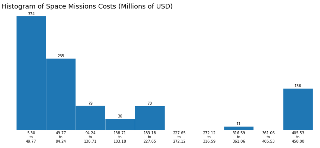
Awesome!
太棒了!
The elements are in place; all that’s left to do is change the colors, font sizes, add some labels on the x and y-axis, and customize the chart as desired.
元素就位; 剩下要做的就是更改颜色,字体大小,在x和y轴上添加一些标签,并根据需要自定义图表。
fig, ax = plt.subplots(1, figsize=(22,6), facecolor='#1d1135')
ax.set_facecolor('#1d1135')n, bins, patches = plt.hist(df.Rocket, color='#5643fd', bins='doane')#grid
minor_locator = AutoMinorLocator(2)
plt.gca().xaxis.set_minor_locator(minor_locator)
plt.grid(which='minor', color='#1d1135', lw = 0.5)# ticks
xticks = [(bins[idx+1] + value)/2 for idx, value in enumerate(bins[:-1])]
xticks_labels = [ "{:.0f}-{:.0f}".format(value, bins[idx+1]) for idx, value in enumerate(bins[:-1])]
plt.xticks(xticks, labels = xticks_labels, c='w', fontsize=13)
ax.tick_params(axis='x', which='both',length=0)
plt.yticks([])# Hide the right and top spines
ax.spines['bottom'].set_visible(False)
ax.spines['left'].set_visible(False)
ax.spines['right'].set_visible(False)
ax.spines['top'].set_visible(False)for idx, value in enumerate(n):
    if value > 0:
        plt.text(xticks[idx], value+5, int(value), ha='center', fontsize = 16, c='w')plt.title('Histogram of Space Missions Costs\n', loc = 'left', fontsize = 20, c='w')
plt.xlabel('\nMillions of USD', c='#13ca91', fontsize=14)
plt.ylabel('Number of Space Missions', c='#13ca91', fontsize=14)
plt.show()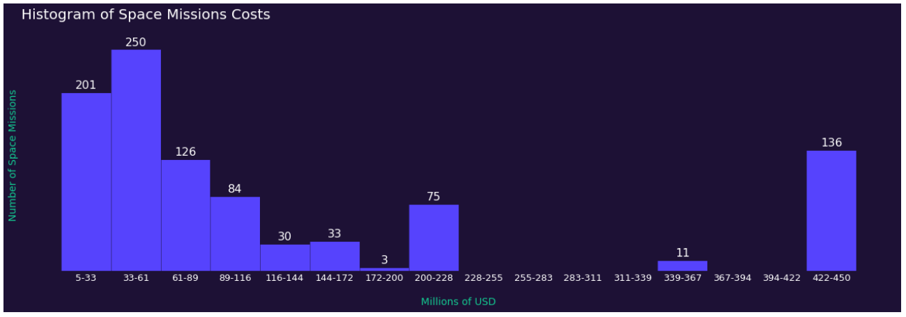
Great, we got a numerical field and described its distribution with a beautiful chart. Now let’s have a look at how to handle dates in histograms.
太好了,我们得到了一个数值字段,并用漂亮的图表描述了它的分布。 现在让我们看一下如何处理直方图中的日期。
To figure out the bins on this one, we can start by looking at the earliest and latest date in our data.
为了弄清楚这一点,我们可以从查看数据中最早和最新的日期开始。
We can easily select the bins for numerical fields with the many different algorithms Matplotlib support, but when dealing with dates, those techniques may not lead to the best results.
我们可以使用Matplotlib支持的许多不同算法轻松地为数字字段选择容器,但是当处理日期时,这些技术可能无法获得最佳结果。
Don’t get me wrong, as much as you can find that the optimal size of bin to describe the distribution of your variable is 378 days, using a whole year is way more understandable.
不要误会我的意思,因为您可以发现描述变量的分布的最佳bin大小为378天,而使用整整一年的方式更容易理解。
Alright, so let’s convert our date-time objects to a number format that Matplotlib can handle, then we’ll adjust our ticks and see how it looks.
好吧,让我们将日期时间对象转换为Matplotlib可以处理的数字格式,然后我们将调整刻度线并查看其外观。
import matplotlib.dates as mdates# convert the date format to matplotlib date format
plt_date = mdates.date2num(df['Datum'])
bins = mdates.datestr2num(["{}/01/01".format(i) for i in np.arange(1957, 2022)])# plot it
fig, ax = plt.subplots(1, figsize=(22,6))
n, bins, patches = plt.hist(plt_date, bins=bins)# x ticks and limit
ax.xaxis.set_major_locator(mdates.YearLocator())
ax.xaxis.set_major_formatter(mdates.DateFormatter('%y'))
plt.xlim(mdates.datestr2num(['1957/01/01','2021/12/31']))plt.show()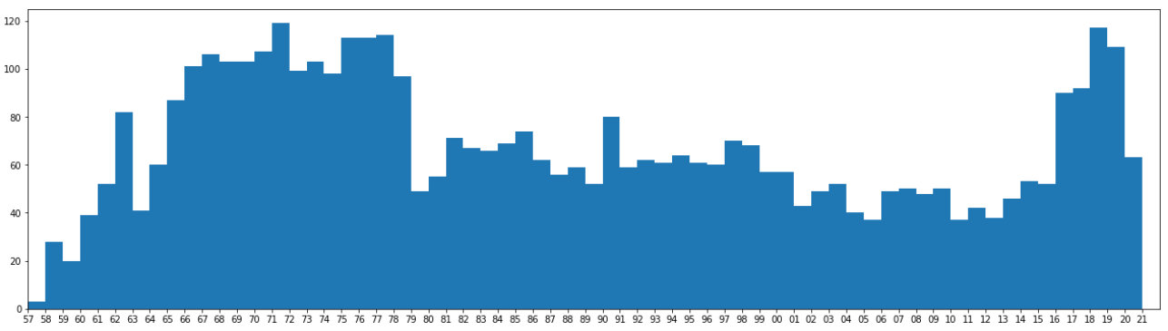
Very interesting, we can see the space race taking shape from 57 to the late ’70s, and also a more recent increase in space programs in the last five years.
非常有趣的是,我们可以看到太空竞赛从57年代到70年代后期初具规模,并且最近五年来太空计划的增长也越来越多。
Now we can adapt our previous design to our new histogram.
现在,我们可以将以前的设计调整为新的直方图。
# convert the date format to matplotlib date format
plt_date = mdates.date2num(df['Datum'])
bins = mdates.datestr2num(["{}/01/01".format(i) for i in np.arange(1957, 2022)])# plot it
fig, ax = plt.subplots(1, figsize=(22,8), facecolor='#1d1135')
ax.set_facecolor('#1d1135')n, bins, patches = plt.hist(plt_date, bins=bins, color='#5643fd')ax.xaxis.set_major_locator(mdates.YearLocator())
ax.xaxis.set_major_formatter(mdates.DateFormatter('%y'))
plt.xlim(mdates.datestr2num(['1957/01/01','2021/12/31']))#gridplt.grid(axis='y', color='#5643fd', lw = 0.5, alpha=0.7)
plt.grid(axis='x', color='#1d1135', lw = 0.5)#remove major and minor ticks from the x axis, but keep the labels
ax.tick_params(axis='both', which='both',length=0)# Hide the right and top spines
ax.spines['bottom'].set_visible(False)
ax.spines['left'].set_visible(False)
ax.spines['right'].set_visible(False)
ax.spines['top'].set_visible(False)
ax.spines['left'].set_position(('outward', 10))plt.xticks(c='w', fontsize=12)
plt.yticks(c='w', fontsize=12)plt.title('Histogram of Space Missions Dates\n', loc = 'left', fontsize = 20, c='w')
plt.xlabel('\nYear', c='#13ca91', fontsize=14)
plt.ylabel('Number of Space Missions', c='#13ca91', fontsize=14)
plt.savefig('hist.png', facecolor='#1d1135')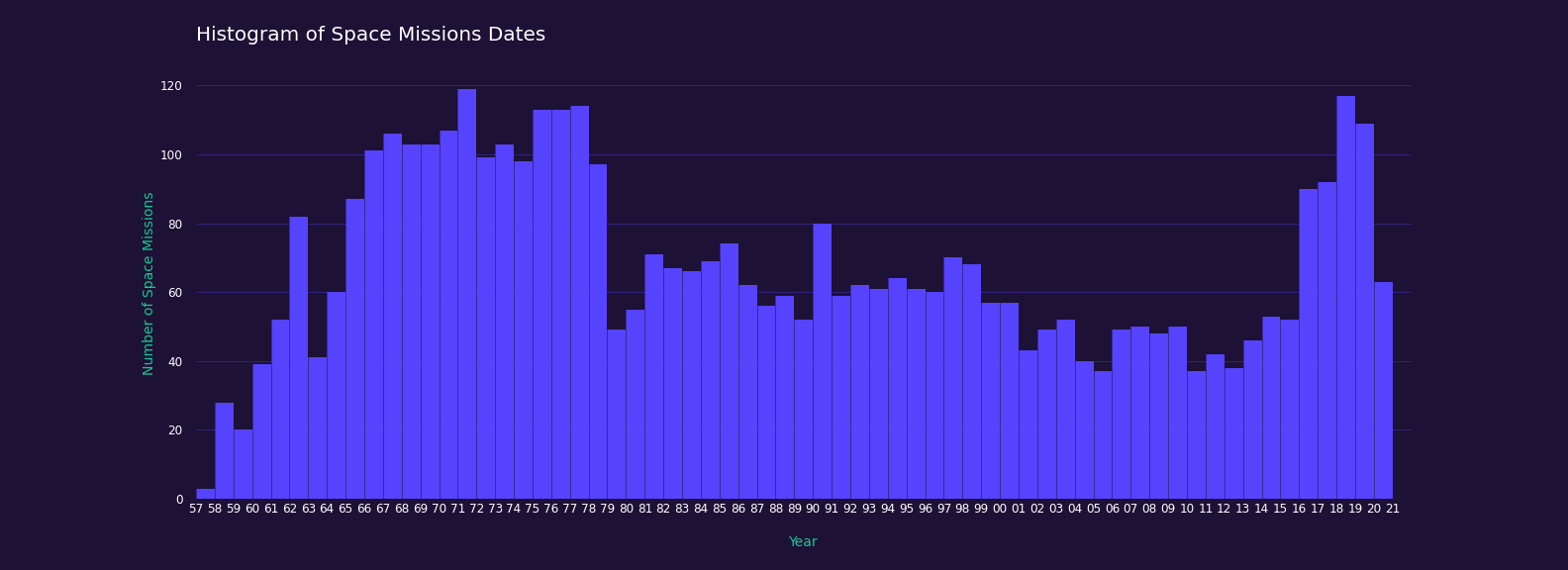
And that’s it! We built two histograms, got a look at the different ways we have to define the bins and classes, changed lots of visual elements to make our chart look just like we wanted to, explored date formats, major and minor ticks, grid lines, and texts.
就是这样! 我们构建了两个直方图,了解了定义箱位和类的不同方法,更改了许多可视元素以使图表看起来像我们想要的,探索了日期格式,主要和次要刻度线,网格线以及文本。
Thanks for reading my article. I hope you enjoyed it.
感谢您阅读我的文章。 我希望你喜欢它。
翻译自: https://towardsdatascience.com/histograms-with-pythons-matplotlib-b8b768da9305


 264
264

 被折叠的 条评论
为什么被折叠?
被折叠的 条评论
为什么被折叠?
 到【灌水乐园】发言


