


In this tutorial I will show you:
在本教程中,我将向您展示:
- How to render and update custom input blocks with a simple set of input instructions 如何使用一组简单的输入指令来呈现和更新自定义输入块
- How to call animations based on keyboard show / hide state. 如何根据键盘显示/隐藏状态调用动画。
- How to create smooth-looking custom animated input components 如何创建外观流畅的自定义动画输入组件
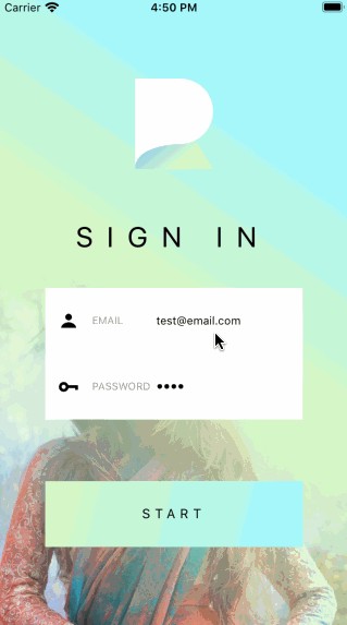
Below is to give you an idea of what the final result looks like.
下面是使您大致了解最终结果的想法。
React Native Starter Kit: This login screen is a sample taken from the React Native Share Starter Kit, which is available for purchase here.
React Native入门工具包 :此登录屏幕是从React Native Share入门工具包中获取的示例,可在此处购买。
React Native Resources: Want us to send you the latest React Native stories, tutorials, resources and more from around the web to help you build better apps. Signup here.
React Native资源:希望我们通过网络向您发送最新的React Native故事,教程,资源等,以帮助您构建更好的应用程序。 在这里注册 。
Git repo: I posted a public repo with the source code for this project here.
混帐回购协议 :我张贴的源代码公开回购此项目在这里 。
建立LogoView动画效果 (Building the LogoView animation effect)
The Login screen consists of three separate views, for which I created three different components: the LogoView, the InputView and a BlockButton.
Login屏幕由三个独立的视图组成,为此我创建了三个不同的组件: LogoView , InputView和BlockButton 。
Let’s begin with the first: the animated LogoView, for which I had to solve two challenges:
让我们从第一个开始:动画的LogoView,为此我必须解决两个挑战:
- How to keep track of the keyboard’s show / hide state? 如何跟踪键盘的显示/隐藏状态?
- How to make the logo animation appear smooth rather than jumpy? 如何使徽标动画显得流畅而不是跳跃?
Starting with the first, the LogoView contains two event listeners that keep track of the keyboard show/hide state:
从第一个开始, LogoView包含两个事件监听器,用于跟踪键盘的显示/隐藏状态:
What’s important to note is that the KeyboardEventName for android and iOS are different, hence the platform check.
需要注意的重要一点是,Android和iOS的KeyboardEventName不同,因此需要进行平台检查。
Each of the the event listeners calls the function that either grows or shrinks the logo and logo text. This brings us to the second challenge:
每个事件侦听器都调用增大或缩小徽标和徽标文本的函数。 这给我们带来了第二个挑战:

The ‘not so smooth animation effect’ on the left occurs when the animation is modified directly, rather than through a mutable reference of it.
当直接修改动画而不是通过对其进行可变引用时,会出现左侧的“动画效果不那么平滑”。
The official React Native docs offers the following warning with regards to this easily overlooked mistake:
官方React Native文档针对此容易被忽略的错误提供以下警告:
Note: Don’t modify the animated value directly. You can use the useRef Hook to return a mutable ref object. This ref object's current property is initialized as the given argument and persists throughout the component lifecycle.
注意:不要直接修改动画值。 您可以使用 useRef Hook 返回可变的ref对象。 该ref对象的 current 属性被初始化为给定的参数,并在组件的整个生命周期中保持不变。
With this useful tip in mind, the code for the actual animation is pretty straightforward:
考虑到这个有用的技巧,用于实际动画的代码非常简单:
For more background on the use of useNativeDriver, see this article.
有关useNativeDriver的更多使用背景,请参阅本文 。
从InputOptions数组创建自定义输入元素 (Creating custom input elements from an array of InputOptions)
Because apps typically have a number of authentication screens that require multiple custom input elements, it would be useful to be able to render our input elements in a way that is quick and easy to add and modify while writing a minimum amount of code.
由于应用程序通常具有许多需要多个自定义输入元素的身份验证屏幕,因此能够以编写最少数量的代码时快速,轻松地添加和修改的方式呈现输入元素将非常有用。
Another challenge we face is how to tell the screen which input element to grow and which to shrink as we interact with the screen.
我们面临的另一个挑战是如何在与屏幕交互时告诉屏幕哪些输入元素会增长,哪些输入元素会缩小。
Building the custom input element from a set of input options is the answer to both.
从一组输入选项构建自定义输入元素是两者的答案。
Consider the following setup:
请考虑以下设置:
- The login screen keeps track of state for each input value and keeps check of which input element is active at a give moment. 登录屏幕跟踪每个输入值的状态,并随时检查哪个输入元素处于活动状态。
- The state for each of these values is passed to our an array of input options objects. 每个值的状态都传递给我们的输入选项对象数组。
- The same input options can be used in a similar way to update each value based on user interaction. 可以类似的方式使用相同的输入选项,以基于用户交互更新每个值。
In practice, this looks as follows:
实际上,这看起来如下:
Each options object renders a custom input element by mapping over the array of objects and passing each set of options through props.
每个选项对象都通过在对象数组上进行映射并通过道具传递每组选项来呈现自定义输入元素。
Now we can simply render our custom input component as follows:
现在,我们可以简单地呈现自定义输入组件,如下所示:
将动画效果添加到我们的自定义输入元素 (Adding animation effects to our custom input element)
Adding animation to the custom input element is now rather straightforward as it basically comes down to copying the setup implemented earlier in the animated LogoView component.
现在,将动画添加到自定义输入元素非常简单,因为基本上可以归结为复制先前在动画LogoView组件中实现的设置。
The two challenges remaining are:
剩下的两个挑战是:
How to change focus between each TextInput when the user presses the input element — the objective being that the entire input element becomes interactive, and not just the TextInput section.
当用户按下输入元素时,如何在每个TextInput之间更改焦点-目的是使整个输入元素变得交互式,而不仅仅是TextInput部分。
- How to render a shadow only when the input element is active — thus leaving it invisible when inactive? 如何仅在输入元素处于活动状态时才渲染阴影,从而在不活动时使其不可见?
But let’s begin with the first. You may remember that the TextInput component for each element is set to active / inactive based on their incoming active state. By passing options to the second parameter array in useEffect, we make sure the input element updates whenever the input options object changes.
但是,让我们从第一个开始。 您可能还记得,每个元素的TextInput组件都基于传入的活动状态设置为活动/不活动。 通过将选项传递给useEffect中的第二个参数数组,我们确保只要输入选项对象发生更改,输入元素就会更新。
By checking the active property, and setting up a reference to the TextInput, it now is possible to programatically focus the TextInput for each individual input element.
通过检查active属性,并设置对TextInput的引用,现在可以以编程方式将TextInput集中在每个单独的输入元素上。
To display the grow / shrink animation for the input component, I wrapped the TextInput with both an Animated.View component and a TouchableOpacity component. The latter is added to assure that the on-press is not limited to the TextInput only but registers on the entire Input block.
为了显示输入组件的增长/收缩动画,我用Animated.View组件和TouchableOpacity组件包装了TextInput。 后者被添加以确保在机上不仅限于TextInput,还可以在整个Input块上注册。
The final step is to deactivate the TextInput gesture handlers as we no longer need these — since the TextInput focus is now being set through the Touchable’s onPress handler.
最后一步是停用TextInput手势处理程序,因为我们不再需要它们了-因为TextInput焦点现在是通过Touchable的onPress处理程序设置的。
Do this by setting the wrapper View’s pointerEvents: pointerEvents=”none”
通过设置包装器视图的pointerEvents:做到这一点: pointerEvents =“ none”
The remainder of the AnimatedTextInput component now looks as follows:
现在,AnimatedTextInput组件的其余部分如下所示:
You may note the $activeShadow styles property that is added to the animated View component. This helps us render the shadow once options’ active property is active.
您可能会注意到添加到动画“视图”组件中的$activeShadow样式属性。 一旦选项的active属性处于活动状态,这将有助于我们渲染阴影。
And that completes the tutorial. I hope this article inspired you to get original with the authentication screens for your next app. In the next tutorial I will show how to create a smooth sign in and logout experience with React Native.
到此完成了本教程。 我希望本文能启发您获得下一个应用程序的身份验证屏幕的原创。 在下一个教程中,我将展示如何使用React Native创建流畅的登录和注销体验 。


 739
739

 被折叠的 条评论
为什么被折叠?
被折叠的 条评论
为什么被折叠?
 到【灌水乐园】发言


