


flex angular
If you are developing a web application, chances are you will need a toolbar to display links to different sections of the site. That is all quite easy if your users are only on the desktop. But in today’s world, more of your users will be on the mobile or even tablets.
如果您正在开发Web应用程序,则可能需要一个工具栏来显示指向网站不同部分的链接。 如果您的用户仅在桌面上,那将非常容易。 但是在当今世界,您的更多用户将在移动设备或平板电脑上。
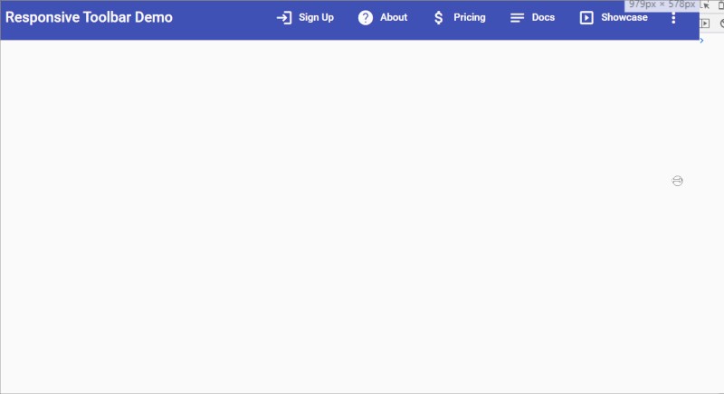
In this article, I will show you how to create a truly responsive toolbar using Angular Material components and Flex Layout. Here is the final result:
在本文中,我将向您展示如何使用Angular Material组件和Flex Layout创建真正响应的工具栏 。 这是最终结果:

设置项目 (Setting up the project)
Let’s first quickly set up a new Angular project with Angular Material and Flex Layout by running these commands.
首先,通过运行以下命令,使用Angular Material和Flex Layout快速设置一个新的Angular项目。
ng new responsive-toolbar
ng add @angular/material
npm install — save @angular/flex-layout
Next, let’s add our module dependencies to the app.module.ts:
接下来,让我们将模块依赖项添加到app.module.ts中 :
设置一个新组件 (Setting up a new component)
Once the project is set up, let’s start adding all the parts we need. First, let’s start by adding a new component to contain our responsive toolbar.
设置项目后,让我们开始添加所需的所有部分。 首先,让我们开始添加一个新组件以包含我们的响应式工具栏。
ng generate component responsive-toolbarWe’ll be coming back to this in a bit. We want our menu items to be defined in code for re-use in both the buttons and drop-down menu. So let’s also add a model for the menu item.
我们将稍后再讨论这一点。 我们希望菜单项在代码中定义,以便在按钮和下拉菜单中重复使用。 因此,我们还要为菜单项添加一个模型。
It’s strictly not needed, but with typescript it is always better to specify types — it gives a bit of structure to new developers and makes the development process easier by code hints in templates.
严格不需要,但是使用Typescript总是更好地指定类型-它为新开发人员提供了一些结构,并通过模板中的代码提示使开发过程更容易。
ng generate interface menu-item基本的响应式工具栏 (A basic responsive toolbar)
Let’s now add the menu items to our component. Here’s the responsive toolbar component:
现在,将菜单项添加到组件中。 这是响应式工具栏组件:
We’re just declaring the menu items array here. Let’s look at the template where the actual magic happens.
我们只是在这里声明菜单项数组。 让我们看一下实际发生魔术的模板。
Let’s go through what we’ve done in the template.
让我们看一下我们在模板中所做的事情。
- We have added a material toolbar component which contains everything 我们添加了一个包含所有内容的材质工具栏组件
We’re using Flex Layout’s
fxLayoutdirective to specify that everything in the container will be laid out in a row我们正在使用Flex Layout的
fxLayout指令来指定容器中的所有内容都将排成一行We’ve an
*ngFordirective which we’re using to create a button with icon for each menu item.我们有一个
*ngFor指令,用于为每个菜单项创建带有图标的按钮。- We’ve a “more” button icon at the end of the row, which triggers a material dropdown menu containing our items. 该行末尾有一个“更多”按钮图标,它会触发包含我们项目的物料下拉菜单。
All this is fine and well. But where is the responsive code? If you look closely, we also have fxHide and fxShow in some places. Basically, Flex Layout provides us with these directives and their breakpoint suffixes (such as xs, sm etc.) so that we can hide or show different elements at different screen sizes.
这一切都很好。 但是响应代码在哪里? 如果您仔细观察,我们在某些地方也有fxHide和fxShow 。 基本上,Flex Layout为我们提供了这些指令及其断点后缀(例如xs,sm等),以便我们可以在不同的屏幕尺寸下隐藏或显示不同的元素。
The behavior that we want is that the menu buttons should show when on desktop, but on mobile sizes, should all compress into a ‘more’ button and a dropdown menu.
我们想要的行为是菜单按钮应该在桌面上显示,但在移动尺寸下应该全部压缩成“更多”按钮和一个下拉菜单。
For the top buttons, the default is they’ll be shown (we don’t need to specify), so we use fxHide.xs to hide them when on mobile. Conversely, the default for the dropdown menu would be hidden, so we use fxHide. But then we use fxShow.xs to show the icon button at mobile sizes.
对于顶部按钮,默认情况下将显示它们(我们无需指定),因此在移动设备上时,我们使用fxHide.xs隐藏它们。 相反,下拉菜单的默认设置是隐藏的,因此我们使用fxHide 。 但是,然后我们使用fxShow.xs以移动尺寸显示图标按钮。
Here is how it looks!
看起来是这样!
我们想要更多的控制 (We want more control)
This is all looking good. However, as you can see in the animation above, our buttons compress into each other when we begin approaching the mobile size. It would be nice if we can have more control over which buttons to show on this intermediary size (e.g. tablet).
这一切看起来都不错 。 但是,如您在上面的动画中所见,当我们开始接近移动设备尺寸时,我们的按钮会相互压缩。 如果我们可以更好地控制在此中间尺寸上显示哪些按钮(例如平板电脑),那将是很好的。
For that to happen though, we need to add a bit more code. This will allow us to specify which menu item to show in the buttons menu or dropdown menu and on which screen sizes.
为此,我们需要添加更多代码。 这将使我们可以指定在按钮菜单或下拉菜单中显示哪个菜单项以及在哪个屏幕尺寸上显示。
Let’s modify our menu item interface to accommodate this flexibility.
让我们修改菜单项界面以适应这种灵活性。
We added three boolean types to specify for each item, where it should show and should not show.
我们为每个项目添加了三种布尔类型,分别指定应显示和不应显示的位置。
Next, let’s update out menu items array.
接下来,让我们更新菜单项数组。
As you can see, we’re specifying the “Sign-up” menu item to appear at the top on all breakpoints. In other words, it is getting the highest priority. These items will be useful for most used features in any app. Having prominent links to such features helps our users and ultimately the product in the end!
如您所见,我们指定“ Sign-up”菜单项显示在所有断点的顶部。 换句话说,它获得了最高优先级。 这些项目对于任何应用程序中最常用的功能很有用。 拥有指向此类功能的突出链接可以最终帮助我们的用户,最终帮助产品!
On the other hand, notice how the “Blog” section is never shown at the top. This is just an example, but you can have unimportant sections in your apps, which you need for completeness, but users don’t really need that much. So this section will just appear in the menu as an additional option when users want (or go looking for it).
另一方面,请注意,“博客”部分永远不会显示在顶部。 这只是一个示例,但是您可以在应用程序中包含一些不重要的部分,以确保完整性,而用户实际上并不需要那么多。 因此,当用户需要(或去寻找它)时,此部分将作为附加选项出现在菜单中。
使工具栏真正响应 (Making the toolbar truly responsive)
The only thing that’s left now is to actually add handling for this data to our templates. Here is how the template looks now.
现在剩下的唯一一件事就是将对这些数据的处理实际上添加到我们的模板中。 现在是模板的外观。
The only difference in this and the previous version is in how we’re now using the new properties we defined for each item and binding them with Flex Layout’s directives.
此版本与先前版本的唯一区别在于,我们现在如何使用为每个项目定义的新属性,并将它们与Flex Layout的指令绑定。
For the top buttons, we’re binding each item’s fxShow directive to the corresponding breakpoint.
对于顶部按钮,我们将每个项目的fxShow指令绑定到相应的断点。
As an example, fxShow.xs binds to item.showOnMobile – in other words, we’re telling the button for that item to only show on top on mobile, when it has showOnMobile to true. The logic is similar for desktop and tablet.
例如, fxShow.xs绑定到item.showOnMobile –换句话说,我们告诉该项目的按钮仅在showOnMobile为true时才显示在移动设备的顶部。 台式机和平板电脑的逻辑相似。
For the dropdown menu items, notice we’re not hiding or showing the “more” icon anymore, but instead adding more fine control over individual menu items.
对于下拉菜单项,请注意我们不再隐藏或显示“更多”图标,而是增加了对单个菜单项的更好控制。
This is the power of Flex Layout, where you can add a directive to virtually anything in the DOM.
这就是Flex Layout的强大功能,您可以在其中向几乎DOM中的任何内容添加指令。
For the dropdown menu items though, we use a reverse logic.
但是对于下拉菜单项,我们使用相反的逻辑。
As an example, fxShow.xs binds to !item.showOnMobile – in other words, we’re telling the button for that item to only show in the dropdown on mobile, when it has showOnMobile to false. This is when the button would be hidden on top.
例如, fxShow.xs绑定到!item.showOnMobile –换句话说,我们告诉该项目的按钮仅在showOnMobile为false时才在移动设备的下拉列表中显示。 这是按钮隐藏在顶部的时候。
The result of these changes will be the menu items moving in and out of the top buttons and the dropdown menu as the screen size changes. When they are hidden on the top, they get added to the dropdown and reverse!
这些更改的结果将是菜单项随着屏幕尺寸的变化而移入和移出顶部按钮和下拉菜单。 当它们隐藏在顶部时,它们会添加到下拉菜单中并反转!
And we’re done! Here is the result — a truly responsive, flexible toolbar ready for you to use in your projects.
我们完成了! 结果就是-一个真正响应Swift,灵活的工具栏,可供您在项目中使用。
下一步 (Next steps)
As you might have noticed, I didn’t add any real navigation functionality to the menu items. To do that, you could add a route property and use it navigate to the same for each item. And if you want to build upon this, you could also add nesting to the menu according to your needs.
您可能已经注意到,我没有在菜单项中添加任何真正的导航功能。 为此,您可以添加一个route属性,并使用它导航到每个项目相同的属性。 如果您希望以此为基础,还可以根据需要在菜单中添加嵌套。
The sky is the limit in this case!
在这种情况下,天空是极限!
Thanks for reading!
谢谢阅读!
The final code for this tutorial can be found here.
本教程的最终代码可以在这里找到。
Bye! 🙂
再见! 🙂
This story was originally published on zoaibkhan.com
这个故事最初发表在 zoaibkhan.com
flex angular


 584
584


 被折叠的 条评论
为什么被折叠?
被折叠的 条评论
为什么被折叠?
 到【灌水乐园】发言


