


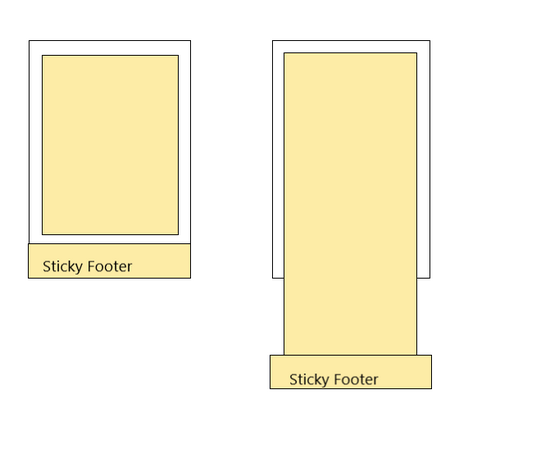
什么是 “Sticky Footer”
所谓 “Sticky Footer”,并不是什么新的前端概念和技术,它指的就是一种网页效果: 如果页面内容不足够长时,页脚固定在浏览器窗口的底部;如果内容足够长时,页脚固定在页面的最底部。但如果网页内容不够长,置底的页脚就会保持在浏览器窗口底部。
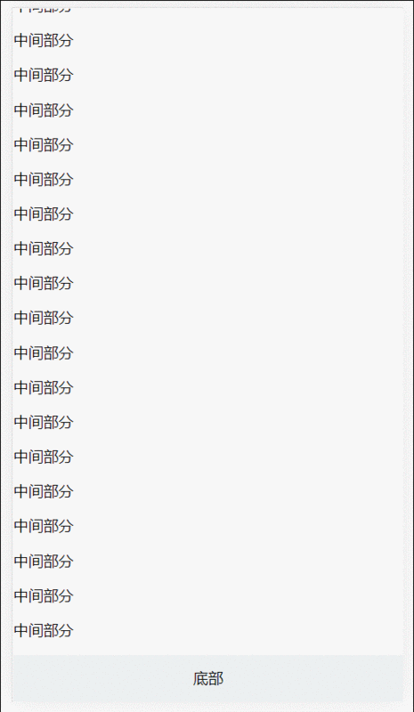
先来看看下面的例子, 代码如下
顶部
中间部分
中间部分
中间部分
中间部分
中间部分
中间部分
中间部分
中间部分
中间部分
中间部分
中间部分
中间部分
中间部分
中间部分
中间部分
.header {
background-color: #3498DB;
height: 50px;
line-height: 50px;
text-align: center;
color: #fff;
}
.main {
overflow: auto;
box-sizing: border-box;
}
.footer {
background-color: #ECF0F1;
height: 50px;
line-height: 50px;
text-align: center;
}
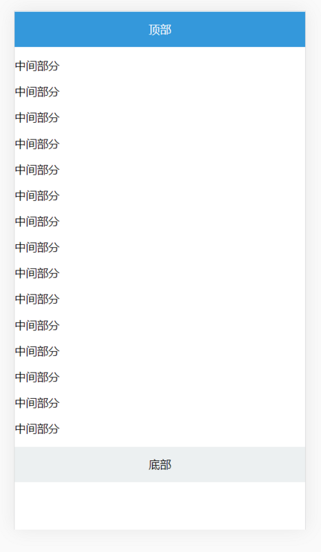
细心读者应该发现问题了,底部 footer 位置会随着主体内容高度变化自动变化,当主体内容小于视口的高度时, footer 并没有黏贴在底部. 那么解决这样问题尼?
negative margin
中间部分
中间部分
中间部分
中间部分
中间部分
中间部分
中间部分
中间部分
中间部分
中间部分
中间部分
中间部分
中间部分
中间部分
中间部分
中间部分
中间部分
中间部分
中间部分
中间部分
中间部分
中间部分
中间部分
中间部分
html,
body {
height: 100%;
}
.header{
background-color: #3498DB;
height: 50px;
line-height: 50px;
text-align: center;
color: #fff;
position: fixed;
width: 100%;
}
.main {
min-height: 100%;
overflow: auto;
box-sizing: border-box;
padding-bottom: 50px;
padding-top: 50px;
margin-bottom: -50px;
}
.footer {
background-color: #ECF0F1;
height: 50px;
line-height: 50px;
text-align: center;
}
固定高度解决方案
使用如下属性
min-height
calc
vh
calc() 是 CSS3引入的,让你在声明CSS属性值时可以执行一些计算.
它可以用在一些数值场合; 详细可以查阅这里MDN
vh(Viewport Height): 顾明思议,表示的是视口的高度.
详细信息以及兼容可以查阅这里: caniuse
针对上面的代码进行修改,如下
.main {
min-height: calc(100vh - 50px - 50px);
}
这样完成我们期望的,但是有个缺点就是每次我们都要去计算 header、footer 的高度.
这显然不完美, 假如DOM结构层级多的话,需要计算的内容更多.
absolute
absolute相信大家熟悉不过了,这里就不在啰嗦了; 这里注意这个就行, absolute 元素其位置是根据什么来进行计算并进行定位的?
头部
中间部分
中间部分
中间部分
中间部分
中间部分
中间部分
中间部分
中间部分
中间部分
中间部分
中间部分
中间部分
中间部分
html{
position: relative;
min-height: 100%;
}
body{
margin-bottom: 50px;
}
.header {
background-color: #3498DB;
height: 50px;
line-height: 50px;
text-align: center;
color: #fff;
}
.main {
overflow: auto;
}
.footer {
position: absolute;
bottom:0;
width: 100%;
background-color: #ECF0F1;
height: 50px;
line-height: 50px;
text-align: center;
}
代码是不是很简单,这里主要 position的应用:
1 默认情况下, 当给某个元素设置为 position:absolute 时, 在祖先元素没有设置 position: absolute or fixed or relative
时, 其默认相对于初始包含块( initial containing block ).
2 什么初始化包含块?
The containing block in which the root element lives is a rectangle called the initial containing block. For continuous media, it has the dimensions of the viewport and is anchored at the canvas origin;
这是w3c对包含块介绍, 这段话大概意思, 根元素(document)为默认为初始化包含块,其初始化块的大小为视口的大小.
理解这几个概念后,我们再来看上面的代码就一目了然了!
html{
position: relative;
min-height: 100%;
}
body{
margin-bottom: 50px;
}
position:relative 改变包含块,让设置absolute元素根据html元素来进行定位.
min-height: 保证在内容不足视口时, footer能黏贴在底部.
margin-bottom 值为 footer 元素的高度,这样保证内容区域不会被footer遮住.
Flexbox
Flexbox是最完美的方案。只需要几行CSS代码就可以实现,而且像上面计算或添加额外的HTML元素。
修改代码如下:
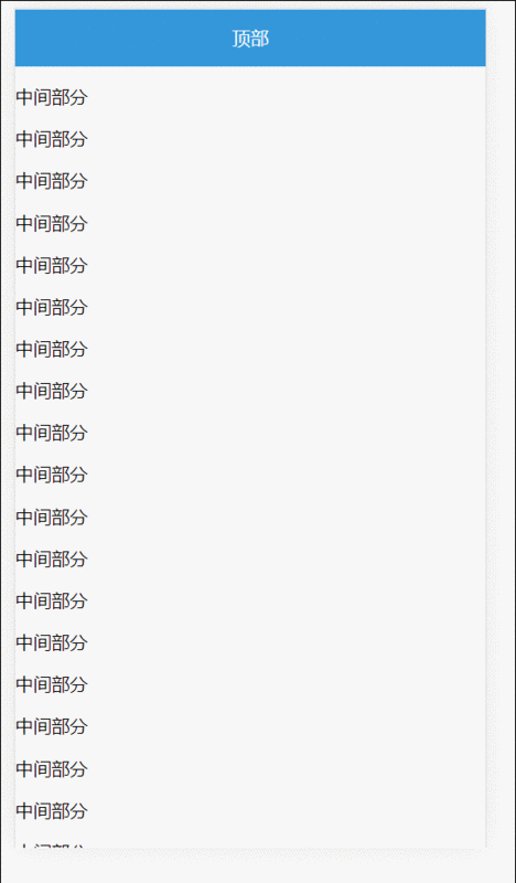
顶部
中间部分
中间部分
中间部分
中间部分
中间部分
中间部分
中间部分
中间部分
中间部分
中间部分
中间部分
中间部分
中间部分
中间部分
中间部分
html,
body {
height: 100%;
}
.container {
display: flex;
flex-direction: column;
min-height: 100%;
}
.header {
background-color: #3498DB;
height: 50px;
line-height: 50px;
text-align: center;
color: #fff;
}
.main {
overflow: auto;
box-sizing: border-box;
flex: 1;
}
.footer {
background-color: #ECF0F1;
height: 50px;
line-height: 50px;
text-align: center;
}
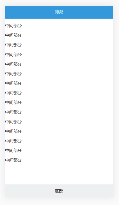
最终效果如下:
negative =margin、固定宽度、absolute 都依赖底部高度为固定.
一般推荐使用 absolute 和 flex 实现方式; 具体用那种可以根据具体场景来使用.
以上就是本文的全部内容,希望对大家的学习有所帮助,也希望大家多多支持脚本之家。


 140
140


 被折叠的 条评论
为什么被折叠?
被折叠的 条评论
为什么被折叠?
 到【灌水乐园】发言


