


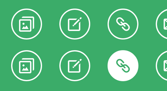
之前给大家分享了很多css3实现的按钮特效。今天给大家分享9款基于CSS3 Transitions实现的鼠标经过图标悬停特效。这款特效适用浏览器:360、FireFox、Chrome、Safari、Opera、傲游、搜狗、世界之窗. 不支持IE8及以下浏览器。效果图如下:
实现的代码。
html代码:
css3代码:
.hi-icon-effect-6 .hi-icon {
box-shadow: 0 0 0 4px rgba(255,255,255,1);
transition: background 0.2s, color 0.2s;
}
.no-touch .hi-icon-effect-6 .hi-icon:hover {
background: rgba(255,255,255,1);
color: #64bb5d;
}
.no-touch .hi-icon-effect-6 .hi-icon:hover:before {
animation: spinAround 2s linear infinite;
}
@keyframes spinAround {
from {
transform: rotate(0deg)
}
to {
transform: rotate(360deg);
}
}


 788
788


 被折叠的 条评论
为什么被折叠?
被折叠的 条评论
为什么被折叠?
 到【灌水乐园】发言


