目录树显示_vue目录树组件

89d990203c8b7563c66cfce35254b2ba.png

I would like to commemorate last year and today, my life is full of regret.

一般数据类展示内容,大多采用树状结构展示内容。类似效果如下:

左侧是导航分类,可以进行新建,对单项导航分享和删除。单击导航,在右侧查询出当前导航下所有目录结构,可以新建目录。新增类型分为三种,目录可以无限嵌套,当然也可以设置层级。

页面整体布局 页面分为左右两个部分。左侧列表,通过路由跳转显示右侧内容。左侧列表分为上下两块,顶部是添加按钮,下面是导航列表。

a23e9f36396accc13ca653dec11baf92.png

less样式。
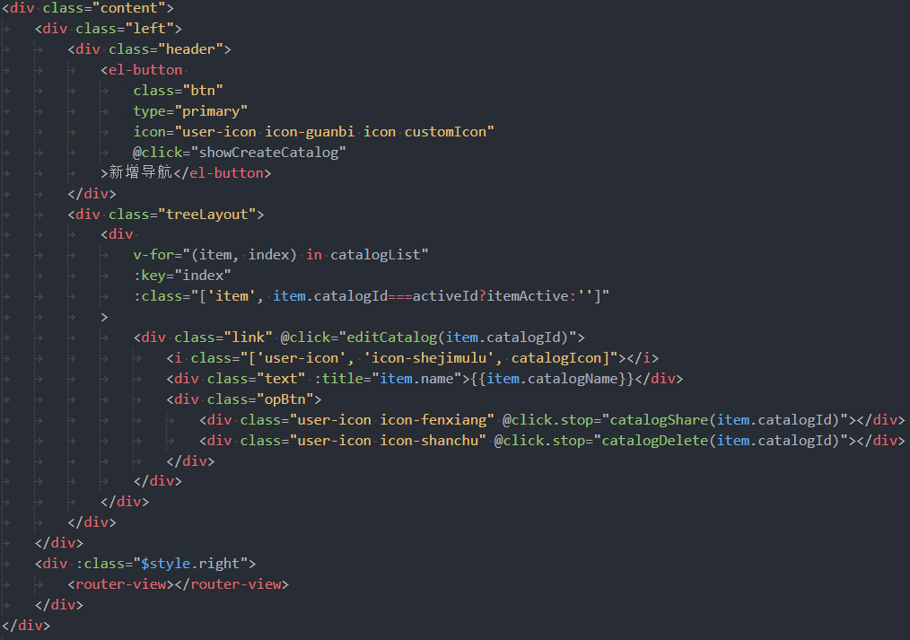
@import "../../theme/variables.less";.main {    position: relative;    height: 100%;    overflow: hidden;    .content {        border: 1px solid #dcdcdc;        position: relative;        height: 100%;        background: #f1f2f7;        display: flex;        border-radius: @borderRadius;        .left {            width: 240px;            background: #fff;            border-right: 1px solid rgba(220, 220, 220, 1);            padding: 15px 10px;            display: flex;            flex-direction: column;            overflow: auto;            .header {                width: 100%;                margin-bottom: 20px;                display: flex;                justify-content: center;                align-items: center;                .btn {                    width: 136px;                    margin: 0 6px;                    :global {                        .icon {                            margin-right: 14px;                        }                        .customIcon {                            display: inline-block;                            transform: rotate(45deg);                        }                    }                }            }            .treeLayout {                flex: 1;                .item {                    width: 100%;                    height: 32px;                    line-height: 32px;                    margin-bottom: 11px;                    position: relative;                    .link {                        display: flex;                        align-items: center;                        font-size: 14px;                        font-family: Microsoft YaHei;                        font-weight: 400;                        color: rgba(51, 51, 51, 1);                        padding-left: 21px;                        cursor: pointer;                        .catalogIcon {                            font-size: 12px;                        }                        .text {                            display: inline-block;                            flex: 1;                            margin-left: 12px;                        }                        .opBtn {                            width: 46px;                            display: flex;                            align-items: center;                            justify-content: space-between;                        }                        .operateIcon {                            display: none;                        }                        &:hover {                            color: #00a4ff;                            .opBtn {                                color: rgba(51, 51, 51, 1);                            }                            .operateIcon {                                display: block;                            }                        }                    }                    .iconBtns {                        position: absolute;                        top: 28px;                        right: 24px;                        width: 112px;                        background: rgba(255, 255, 255, 1);                        box-shadow: 0px 0px 6px 0px rgba(0, 0, 0, 0.13);                        border-radius: 4px;                        z-index: 10;                        .icon {                            width: 100%;                            height: 40px;                            border-radius: 2px;                            display: flex;                            align-items: center;                            justify-content: center;                            font-size: 12px;                            font-family: Microsoft YaHei;                            font-weight: 400;                            color: rgba(51, 51, 51, 1);                            cursor: pointer;                            .iconName {                                margin-left: 18px;                            }                            &:hover {                                background: #e7e8e9;                            }                        }                    }                }                .itemActive {                    .link {                        color: #00a4ff;                        .opBtn {                            color: rgba(51, 51, 51, 1);                        }                        .operateIcon {                            display: block;                        }                    }                }            }        }        .right {            flex: 1;            width: 100%;            overflow: hidden;        }    }}

这里的导航列表,新增导航,和删除都是调用相关接口。

目录树组件

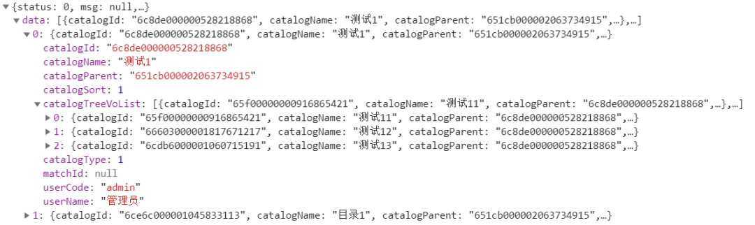
页面右侧就是树状结构列表,通过路由跳转携带catalogId参数,接口查询出列表数据,后端返回的数据就是有层级的树状结构。

我认为的写一个组件,单指这里的目录树组件,组件中只需要构造出页面布局,任何的交互逻辑都不涉及,只将相关事件抛出即可。这就需要先明确好数据结构,来写样式布局了。

数据结构,有id,name,父级id,子节点数组,类型catalogType:1是目录,2是场景,3是外链场景 ... 如下:

82b49f94b610cb4dae36f9c3fad8b692.png

树状结构会涉及到递归,这里为了处理方便,组件中分为两层。组件目录结构如下:

bf32d31797fcf720c867de5e5471bfb0.png

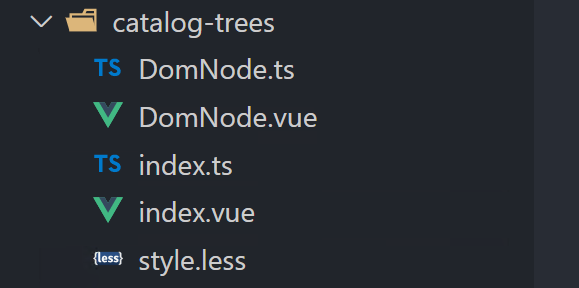
index就是对外暴露的窗口,主要目录树的布局样式是在DomNode中。先明确一下布局,目录树中单个一行,需要一个展开收起的图标,当前行类型的图标,这里业务上分三种类型,就需要以此判断显示不同图标。每项最后还会有四个操作按钮。

c0647e21b5d641dc51347267a66408e7.png

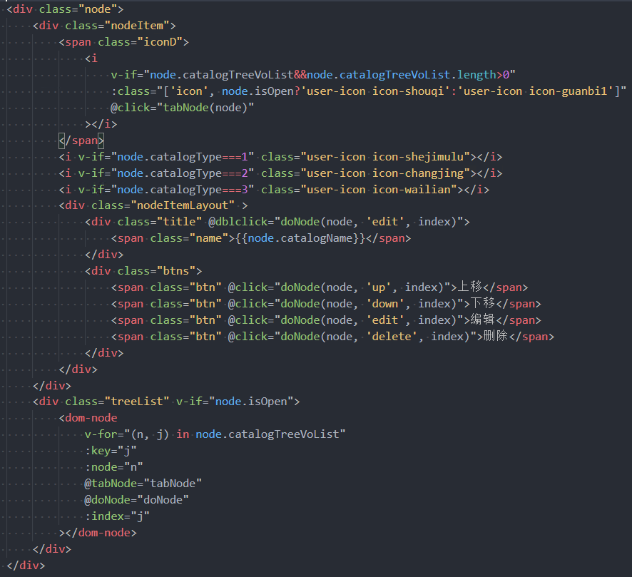
这里把事件简化了,只分了两个事件,一个是展开收起,一个是一系列编辑操作,传个type参数作为区分。

tabNode(node: ITree) {    this.$emit("tabNode", node);},// 操作doNode(node: ITree, type: string, index: number) {    this.$emit("doNode", node, type, index);},

index文件中引用DomNode,相关的接收的参数和抛出去的事件,和DomNode一致。

// index布局<div class="treeLayout">    <DomNode        v-for="(item, index) in trees"        :key="index"        :node="item"        @tabNode="tabNode"        @doNode="doNode"        :index="index"    >
// 接收的参数 props: { trees: { type: Array as () => ITree[], default: [], }, activeId: { type: String, default: "", }, }, 页面右侧实现 引用catalogTree组件。
  :trees="treeList"  @tabNode="tabNode"  @doNode="doNode"></catalog-tree>
前文已经提过,目录数据是后端返回的,那么treeList就是后端返回值res.data。但操作tabNode和doNode这两个方法,需要将treeList数组转换成map对象。 因为需要自定义添加一些字段,这些字段只作为前端交互操作逻辑使用,所以后端返回值中不会携带。 需要给每一项数据添加isOpen字段,用来判断展开收起状态。level字段,用来实现上移下移操作。 先来构造这个catalogMap,定义个方法setCatalogMap,需要的参数有存放结果的treeMap,原数据treeList数组。 setCatalogMap ,很简单的一个递归。

44f869ea9476bc8541e86aeab5490a0e.png

拿到map对象,就可以实现tabNode和doNode这两个方法。
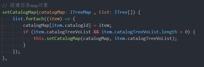
// 切换状态tabNode(node: ITree) {    if (node.isOpen) {        this.treeMap[node.catalogId].isOpen = false;    } else {        this.treeMap[node.catalogId].isOpen = true;    }},// 编辑等一系列操作,按照类型区分doNode(node: ITree, type: string, index: number) {    switch (type) {        case "up":            // 上移            this.doUp(node, index);            break;        case "down":            // 下移            this.doDown(node, index);            break;        case "edit":            // 编辑            this.doEdit(node.catalogId);            break;        case "delete":            // 删除            this.doDelete(node);            break;    }},
有认真看的话,会发现,并没有在哪里定义isOpen属性,怎么就在tabNode方法中使用了。 因为我还没有写。 拿到map对象,循环做个判断,用来保持isOpen状态。
Object.keys(treeMap).forEach((key) => {    const item = treeMap[key];    if (this.treeMap[key]) {        item.isOpen = this.treeMap[key].isOpen;    } else {        item.isOpen = true;    }});
doNode中的四个方法,编辑和删除就是调个接口,主要是上移下移操作,前端实现数据的排序,最后将最新的数据返回给后端保存,doSaveSort方法调接口保存。 上代码,好好琢磨琢磨。
doUp(node: ICatalogModel, index: number) {    if (index === 0) {        return;    }    const parentId: string = node.catalogParent as string;    const parentItem: ICatalogModel = this.treeMap[parentId];    let dataList: ICatalogModel[] = [];    // 如果为空则是顶级    if (parentItem) {        if (parentItem.catalogTreeVoList) {            dataList = parentItem.catalogTreeVoList;        }    } else {        dataList = this.treeList;    }    const item = dataList[index];    dataList.splice(index, 1);    dataList.splice(index - 1, 0, item);    this.doSaveSort(dataList);},doDown(node: ICatalogModel, index: number) {    const parentId: string = node.catalogParent as string;    const parentItem: ICatalogModel = this.treeMap[parentId];    // 如果为空则是顶级    let dataList: ICatalogModel[] = [];    if (parentItem) {        if (parentItem.catalogTreeVoList) {            // 最后一个不能下移            if (parentItem.catalogTreeVoList.length === (index + 1)) {                return;            } else {                dataList = parentItem.catalogTreeVoList;            }        }    } else {        // 一级最后一个不能下移        if ( this.treeList.length === (index + 1)) {            return;        }        dataList = this.treeList;    }    const item = dataList[index];    dataList.splice(index, 1);    dataList.splice(index + 1, 0, item);    this.doSaveSort(dataList);},
总结 树状结构列表,首先需要明确数据结构,必备的字段id,name,父级id,children数组,根据数据结构,使用递归构建布局。
over~加班快乐
  • 0
    点赞
  • 2
    收藏
    觉得还不错? 一键收藏
  • 0
    评论
Vue3中实现富文本目录的方法如下: 1. 首先,你需要安装并引入一个适用于Vue3的富文本编辑器插件,例如tinymce或quill。 2. 在Vue组件中,使用该富文本编辑器插件,并将其绑定到一个数据属性上,例如`content`。 3. 在组件中,创建一个用于存储目录的数据属性,例如`treeData`。 4. 监听`content`数据属性的变化,当内容发生变化时,解析富文本内容,提取标题和对应的层级关系,生成目录数据。 5. 在组件的模板中,使用递归组件或者循环遍历的方式,将目录数据渲染成目录的结构。 下面是一个示例代码: ```vue <template> <div> <div class="editor"> <rich-text-editor v-model="content" @change="handleContentChange"></rich-text-editor> </div> <div class="tree"> <tree-node :data="treeData"></tree-node> </div> </div> </template> <script> import RichTextEditor from 'tinymce' // 富文本编辑器插件 import TreeNode from './TreeNode.vue' // 目录节点组件 export default { components: { RichTextEditor, TreeNode }, data() { return { content: '', // 富文本内容 treeData: [] // 目录数据 } }, methods: { handleContentChange() { // 解析富文本内容,生成目录数据 // 这里需要根据具体的富文本编辑器插件进行解析 // 提取标题和对应的层级关系,生成目录数据 // 将生成的目录数据赋值给treeData } } } </script> ``` 请注意,上述代码中的`rich-text-editor`和`tree-node`是示意组件,你需要根据具体的富文本编辑器插件和目录组件进行替换。

“相关推荐”对你有帮助么?

  • 非常没帮助
  • 没帮助
  • 一般
  • 有帮助
  • 非常有帮助
提交
评论
添加红包

请填写红包祝福语或标题

红包个数最小为10个

红包金额最低5元

当前余额3.43前往充值 >
需支付:10.00
成就一亿技术人!
领取后你会自动成为博主和红包主的粉丝 规则
hope_wisdom
发出的红包
实付
使用余额支付
点击重新获取
扫码支付
钱包余额 0

抵扣说明:

1.余额是钱包充值的虚拟货币,按照1:1的比例进行支付金额的抵扣。
2.余额无法直接购买下载,可以购买VIP、付费专栏及课程。

余额充值