html 时钟怎样居中,怎么用css3做时钟刻度

d598dfe20882b90930fe1191761018a3.png

首先要明确,表盘一周是360°并有60个小刻度。也就是每个刻度从0°(12点位置)开始递加6°。拿其中5个刻度为例,代码如下:

html代码布局:

css样式表:(相关课程推荐:css视频教程)/* 清除默认样式 */

*{margin: 0;padding: 0}

li{list-style: none}

/* 将表盘设置成半径为100px的原型,并为其加上边框 */

#ul1{

width: 200px;height: 200px;

border: 1px solid #000;

border-radius: 50%;

position: relative;

}

/* 设置每个刻度的宽高,这里用定位将他们都定在表盘12点(0°)的位置,也就是ul1的宽度的一半。

并设置它们的选择奇点( -webkit-transform-origin: 0 100px),围绕着ul1的中心分布,

也就是ul1高度的一半 */

li{

width: 2px;height: 6px;

background: black;

position:absolute;

left:100px;top:0;

-webkit-transform-origin: 0 100px;

}

/* 这里利用css3的子元素选择器(因为本人懒,不想命名class),设置5个刻度的位置 */

li:nth-child(1){ -webkit-transform: rotate(0deg);}

li:nth-child(2){ -webkit-transform: rotate(6deg);}

li:nth-child(3){ -webkit-transform: rotate(12deg);}

li:nth-child(4){ -webkit-transform: rotate(18deg);}

li:nth-child(5){ -webkit-transform: rotate(24deg);}

效果如下:

01f8cbd3cae5abf21cb9723f053b2367.png

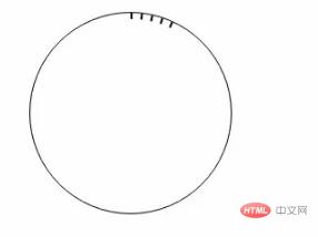
这里就简单的将5个刻度设置好了,是不是很简单呢!

接下来咱们就用js代码动态创建。/* 先获取表盘ul1 */

var oUl = document.getElementById('ul1');

/* 因为是60个刻度嘛,我们就创建60个li,并设置它们的旋转角度 */

for (var i=0;i<60;i++){

var oLi = document.createElement('li');

/* 因为i是从0~60,而每个刻度的旋转角度360°÷60=6°,所以每个刻度的旋转角度就是i*6° */

oLi.style.webkitTransform = 'rotate('+ i*6 +'deg)';

oUl.appendChild(oLi);

}

另:是不是每5个就有一个与众不同的li。所以这里就在css中设置每隔5n个设置一下,代码如下:li:nth-of-type(5n){

height: 14px;

width: 5px;

}

创建好的效果如下:

2650e7ecd89a48b138e0ac4051d83495.png

更多CSS相关技术文章,请访问CSS3答疑栏目进行学习!

  • 1
    点赞
  • 3
    收藏
    觉得还不错? 一键收藏
  • 0
    评论
好的,下面是一份使用 HTML+CSS+JS 实现炫酷时钟的示例代码: ```html <!DOCTYPE html> <html> <head> <title>Cool Clock</title> <style type="text/css"> body { background-color: #333; } .clock { position: absolute; top: 50%; left: 50%; transform: translate(-50%, -50%); border-radius: 50%; background-color: #fff; box-shadow: 0 0 20px rgba(0, 0, 0, 0.1); width: 300px; height: 300px; display: flex; align-items: center; justify-content: center; flex-direction: column; } .clock .hour, .clock .minute, .clock .second { position: relative; width: 70%; height: 70%; margin: auto; border-radius: 50%; background-color: #333; display: flex; align-items: center; justify-content: center; font-size: 2rem; color: #fff; } .clock .hour:before, .clock .minute:before, .clock .second:before { content: ""; position: absolute; top: 0; left: 50%; transform: translate(-50%, 0); height: 50%; width: 5px; background-color: #fff; border-radius: 5px; } .clock .hour { z-index: 3; } .clock .hour:before { height: 30%; } .clock .minute { z-index: 2; } .clock .minute:before { height: 40%; } .clock .second { z-index: 1; } .clock .second:before { height: 50%; } .clock .tick { position: absolute; top: 0; left: 50%; transform: translate(-50%, 0); height: 10%; width: 5px; background-color: #fff; border-radius: 5px; transform-origin: center 90%; animation: tick 1s linear infinite; } .clock .tick:nth-child(5n+1) { height: 20%; } .clock .tick:nth-child(10n+1) { height: 30%; } .clock .tick:nth-child(15n+1) { height: 40%; } .clock .tick:nth-child(20n+1) { height: 50%; } @keyframes tick { from { transform: rotate(0deg); } to { transform: rotate(360deg); } } </style> </head> <body> <div class="clock"> <div class="hour"></div> <div class="minute"></div> <div class="second"></div> <div class="tick"></div> <div class="tick"></div> <div class="tick"></div> <div class="tick"></div> <div class="tick"></div> <div class="tick"></div> <div class="tick"></div> <div class="tick"></div> <div class="tick"></div> <div class="tick"></div> </div> <script type="text/javascript"> function updateClock() { var now = new Date(); var hour = now.getHours(); var minute = now.getMinutes(); var second = now.getSeconds(); var hourHand = document.querySelector(".hour"); var minuteHand = document.querySelector(".minute"); var secondHand = document.querySelector(".second"); var hourAngle = (hour % 12) / 12 * 360 + minute / 60 * 30; var minuteAngle = minute / 60 * 360; var secondAngle = second / 60 * 360; hourHand.style.transform = "rotate(" + hourAngle + "deg)"; minuteHand.style.transform = "rotate(" + minuteAngle + "deg)"; secondHand.style.transform = "rotate(" + secondAngle + "deg)"; } setInterval(updateClock, 1000); </script> </body> </html> ``` 这份代码实现了一个圆形的时钟时钟的样式可以通过 CSS 进行自定义。时钟的指针是通过 CSS 的 `transform: rotate()` 属性来控制旋转角度的,指针的角度是根据当前时间计算出来的。时钟上的刻度线是通过 CSS 的 `animation` 属性来实现的,用 `transform-origin` 控制旋转中心,用 `@keyframes` 定义动画。

“相关推荐”对你有帮助么?

  • 非常没帮助
  • 没帮助
  • 一般
  • 有帮助
  • 非常有帮助
提交
评论
添加红包

请填写红包祝福语或标题

红包个数最小为10个

红包金额最低5元

当前余额3.43前往充值 >
需支付:10.00
成就一亿技术人!
领取后你会自动成为博主和红包主的粉丝 规则
hope_wisdom
发出的红包
实付
使用余额支付
点击重新获取
扫码支付
钱包余额 0

抵扣说明:

1.余额是钱包充值的虚拟货币,按照1:1的比例进行支付金额的抵扣。
2.余额无法直接购买下载,可以购买VIP、付费专栏及课程。

余额充值