


[java]代码库import java.awt.*;
import javax.swing.*;
public class WuJiaoXing extends JPanel {
public WuJiaoXing() {
this.setSize(800, 800);
}
public void paint(Graphics g) {
for (int i = 0; i < 100; i++) {
int c1, c2, c3, w, h, r;
c1 = (int) (Math.random() * 255);
c2 = (int) (Math.random() * 255);
c3 = (int) (Math.random() * 255);
Color c = new Color(c1, c2, c3);// 随机生成颜色的红绿蓝通道值
g.setColor(c);// 设置画笔颜色
w = (int) (Math.random() * 1000);
h = (int) (Math.random() * 800);
r = (int) (Math.random() * 80);
wujiaoxing(g, w, h, r, "fill");
}
}
public void wujiaoxing(Graphics g, int x0, int y0, int r, String f) {
double ch = 72 * Math.PI / 180;// 圆心角的弧度数
int x1 = x0, x2 = (int) (x0 - Math.sin(ch) * r), x3 = (int) (x0 + Math
.sin(ch) * r), x4 = (int) (x0 - Math.sin(ch / 2) * r), x5 = (int) (x0 + Math
.sin(ch / 2) * r);
int y1 = y0 - r, y2 = (int) (y0 - Math.cos(ch) * r), y3 = y2, y4 = (int) (y0 + Math
.cos(ch / 2) * r), y5 = y4;
int bx = (int) (x0 + Math.cos(ch) * Math.tan(ch / 2) * r);
int by = y2;
Polygon a = new Polygon();
Polygon b = new Polygon();
a.addPoint(x2, y2);
a.addPoint(x5, y5);
a.addPoint(bx, by);
b.addPoint(x1, y1);
b.addPoint(bx, by);
b.addPoint(x3, y3);
b.addPoint(x4, y4);
if (f.equals("draw")) {
g.drawPolygon(a);
g.drawPolygon(b);
}
if (f.equals("fill")) {
g.fillPolygon(a);
g.fillPolygon(b);
}
}
public static void main(String[] args) {
new f();
}
}
class f extends JFrame {
WuJiaoXing a = new WuJiaoXing();
public f() {
this.setSize(800, 800);
setLocation(100, 100);
this.add(a);
this.setVisible(true);
}
}
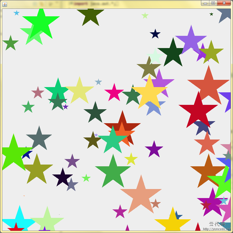
[代码运行效果截图]


 4011
4011


 被折叠的 条评论
为什么被折叠?
被折叠的 条评论
为什么被折叠?
 到【灌水乐园】发言


