


本文主要结合RN项目对Flex布局进行说明,以及结合其他属性打造RN布局,基础篇可以参考另一篇文章:https://www.zybuluo.com/fuxinghua/note/1341470
Flex属性
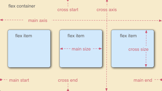
采用Flex布局的元素,即为Flex容器,容器内部所有子元素皆为容器成员,遵循Flex布局特性。相信看完上一篇文章对flex布局有了基本了解下面就不同布局进行讲解。
- flex-direction
- flex-wrap
- flex-flow
- justify-content
- align-items
- align-content
React native项目中用到最多的是flex-direction、flex-wrap、justify-content、align-items。下面就基于常用布局为大家介绍Flex使用。
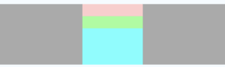
简单横向布局
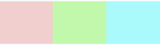
return <View style={{width: width, height: 100, backgroundColor: '#aaa', marginTop: 40, flexDirection: 'row', alignItems: 'center'}}>
            <View style={{flex: 1, height: 100, backgroundColor: '#ffcccc'}}></View>
            <View style={{flex: 1, height: 100, backgroundColor: '#99ff99'}}></View>
            <View style={{flex: 1, height: 100, backgroundColor: '#66ffff'}}></View>
        </View>
或者
return <View style={{width: width, height: 100, backgroundColor: '#aaa', marginTop: 40 , flexDirection: 'row', justifyContent: 'space-between'}}>
            <View style={{flex: 1, backgroundColor: '#ffcccc'}}></View>
            <View style={{flex: 1,  backgroundColor: '#99ff99'}}></View>
            <View style={{flex: 1,  backgroundColor: '#66ffff'}}></View>
        </View>
简单垂直布局

return <View style={{width: width, height: 100, backgroundColor: '#aaa', marginTop: 40, alignItems: 'center'}}>
            <View style={{flex: 1,  width: width, backgroundColor: '#ffcccc'}}></View>
            <View style={{flex: 1,  width: width, backgroundColor: '#99ff99'}}></View>
            <View style={{flex: 1,  width: width, backgroundColor: '#66ffff'}}></View>
        </View>
或者
render() {
        return <View style={{width: width, height: 100, backgroundColor: '#aaa', marginTop: 40 , justifyContent: 'space-between'}}>
            <View style={{flex: 1, backgroundColor: '#ffcccc'}}></View>
            <View style={{flex: 1,  backgroundColor: '#99ff99'}}></View>
            <View style={{flex: 1,  backgroundColor: '#66ffff'}}></View>
        </View>
    }
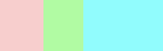
水平均分布局
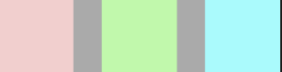
return <View style={{width: width, height: 100, backgroundColor: '#aaa', marginTop: 40 , flexDirection: 'row', justifyContent: 'space-around'}}>
            <View style={{width: 100, height: 100, backgroundColor: '#ffcccc'}}></View>
            <View style={{width: 100, height: 100, backgroundColor: '#99ff99'}}></View>
            <View style={{width: 100, height: 100, backgroundColor: '#66ffff'}}></View>
        </View>
通过设置主轴方向属性即可:justifyContent
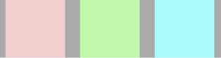
垂直均分布局


代码
return <View style={{width: width, height: 100, backgroundColor: '#aaa', marginTop: 40 , justifyContent: 'space-between', alignItems: 'center'}}>
            <View style={{width: 100, height: 20, backgroundColor: '#ffcccc'}}></View>
            <View style={{width: 100, height: 20, backgroundColor: '#99ff99'}}></View>
            <View style={{width: 100, height: 20, backgroundColor: '#66ffff'}}></View>
        </View>
设置主轴方向属性即可:justifyContent以及alignItems属性即可实现,以上均为均分布局,当然我们也可以设置不同大小块占据父布局。

return <View style={{width: width, height: 100, backgroundColor: '#aaa', marginTop: 40 , justifyContent: 'flex-start', alignItems: 'center'}}>
            <View style={{width: 100, height: 20, backgroundColor: '#ffcccc'}}></View>
            <View style={{width: 100, height: 20, backgroundColor: '#99ff99'}}></View>
            <View style={{width: 100, flexGrow: 1, backgroundColor: '#66ffff'}}></View>
        </View>
水平布局一样,不在做介绍。
下面介绍一些常用的复杂布局,在我们编程开发过程中十分常见,也是基础布局,供大家参考。
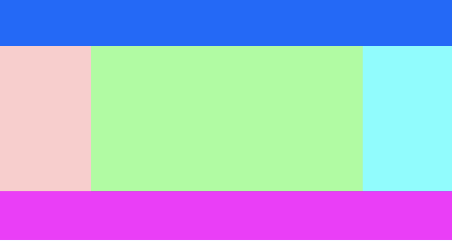
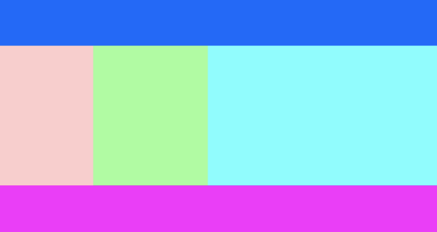
return <View style={{
            width: width,
            height: 200,
            backgroundColor: '#aaa',
            marginTop: 40,
            // justifyContent: 'flex-start',
            alignItems: 'center'
        }}>
            <View style={{width: width, height: 40, backgroundColor: '#0066FF'}}></View>
            <View style={{flexDirection: 'row', flexGrow: 1}}>
                <View style={{flex: 1, backgroundColor: '#ffcccc'}}></View>
                <View style={{flex: 3, backgroundColor: '#99ff99'}}></View>
                <View style={{flex: 1, backgroundColor: '#66ffff'}}></View>
            </View>
            <View style={{width: width, height: 40, backgroundColor: '#ff00ff'}}></View>
        </View>
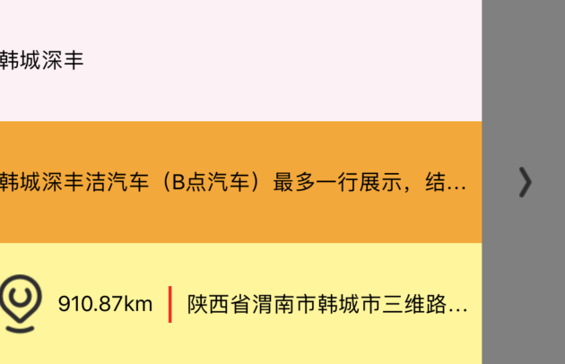
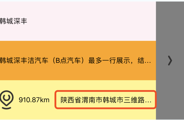
render() {
        return <View>
            <View style={{
                marginTop: 50,
                width: width,
                height: 240,
                backgroundColor: 'gray',
                flexDirection: 'row',
                alignItems: 'center',
            }}>
                <View style={{width: width - 57}}>
                    <View style={{flex: 1, backgroundColor: '#FFF0F5', justifyContent: 'center'}}>
                        <Text>韩城深丰</Text>
                    </View>
                    <View style={{flex: 2, backgroundColor: '#FFF68F',}}>
                        <View style={{flex: 1, justifyContent: 'center', backgroundColor: '#FFA500'}}>
                            <Text numberOfLines={1}>韩城深丰洁汽车(B点汽车)最多一行展示,结尾显示结尾显示结尾显示结尾显示</Text>
                        </View>
                        <View style={{flex: 1, justifyContent: 'center'}}>
                            <View numberOfLines={1} style={{flexDirection: 'row', alignItems: 'center'}}>
                                <Image
                                    style={{width: 29, height: 39}}
                                    source={require('../../images/shop_address.png')}/>
                                <Text style={{marginLeft: 10}}>910.87km</Text>
                                <View style={{backgroundColor: 'red', width: 2, height: 24, marginLeft: 10}}></View>
                                <Text numberOfLines={1} style={{marginLeft: 10, flexShrink: 1}}>陕西省渭南市韩城市三维路大国际名三维路大国际名苑三维路大国际名苑</Text>
                            </View>
                        </View>
                    </View>
                </View>
                <View style={{width: 57, alignItems: 'center'}}>
                    <Image
                        style={{
                            width: 8,
                            height: 20,
                        }}
                        source={require('../../images/shop_back.png')}/>
                </View>
            </View>
            {/*<View style={{
                marginTop: 50,
                flexDirection: 'column',
                justifyContent: 'space-between',
                alignItems: 'center',
                width: width,
                height: 100,
                backgroundColor: 'gray'
            }}>
                <View style={{width: 50, height: 20, backgroundColor: 'red'}}></View>
                <View style={{width: 50, height: 20, backgroundColor: 'green'}}></View>
                <View style={{width: 50, height: 20, backgroundColor: 'blue'}}></View>
            </View>*/}
        </View>
    }
以上为Flex布局实现的一些简单布局demo,下面开始介绍flex-grow、flex-shrink、flex-basis
flex-grow
flex-grow当然在RN中为:flexGrow 默认:default:0, 占据父布局中剩余空间,假设父布局的width为手机屏幕宽度,现在我们再假设view1、view2的width是100,那么剩余空间就是width-100*2。 这样是不是在于动态宽度布局中有很好作用,我们可以均等分两边布局,中间全部占据,效果如下:

<View style={{width: width, height: 40, backgroundColor: '#0066FF'}}></View>
            <View style={{flexDirection: 'row', flexGrow: 1}}>
                <View style={{flex: 1, backgroundColor: '#ffcccc'}}></View>
                <View style={{flex: 3, backgroundColor: '#99ff99'}}></View>
                <View style={{flex: 1, backgroundColor: '#66ffff'}}></View>
            </View>
            <View style={{width: width, height: 40, backgroundColor: '#ff00ff'}}></View>
所以这里flex-grow就是索取父容器的剩余空间,默认值是0,就是三个子容器都不索取剩余空间。但是当view1设置宽度100,剩余空间width-100,就会view2和view3按照比例分割,
<View style={{flexDirection: 'row', flexGrow: 1}}>
                <View style={{width: 100, height: 120, backgroundColor: '#ffcccc'}}></View>
                <View style={{flexGrow: 1, backgroundColor: '#99ff99'}}></View>
                <View style={{flexGrow: 2, backgroundColor: '#66ffff'}}></View>
            </View>
flex-basis
flex-basis属性值的作用和width相同。 子容器设置了flex-basis或者width,会在父容器占据这么多的空间,剩下空间进行分配,但是如果同时设置flex-basis和width,那么width属性会被覆盖,也就是说flex-basis的优先级比width高。有一点需要注意,如果flex-basis和width其中有一个是auto,那么另外一个非auto的属性优先级会更高。
<View style={{width: width, height: 40, backgroundColor: '#0066FF'}}></View>
            <View style={{flexDirection: 'row', flexGrow: 1}}>
                <View style={{flexBasis: 80, backgroundColor: '#ffcccc'}}></View>
                <View style={{flexGrow: 1, backgroundColor: '#99ff99'}}></View>
                <View style={{flexGrow: 2, backgroundColor: '#66ffff'}}></View>
            </View>
            <View style={{width: width, height: 40, backgroundColor: '#ff00ff'}}></View>
这些都是子View宽度和没有超过父布局宽度的,我们知道flex布局默认是不换行的,那么子View的宽度总和超过父容器的宽度呢,该如何解决呢?此时就会出现如下图所示情况,这种情况该如何解决呢?这时flex-shrink就会显示出其特殊的效果。

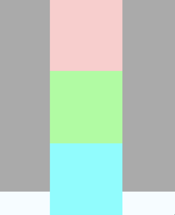
return <View style={{
            width: width,
            height: 400,
            backgroundColor: '#aaa',
            marginTop: 40,
            alignItems: 'center'
            // justifyContent: 'flex-start',
        }}>
            {/*<View style={{width: width, height: 40, backgroundColor: '#0066FF'}}></View>*/}
            {/*<View style={{flexDirection: 'c', flexGrow: 1, width: 400}}>*/}
                <View style={{width: 150, height: 150, backgroundColor: '#ffcccc'}}></View>
                <View style={{width: 150, height: 150, backgroundColor: '#99ff99'}}></View>
                <View style={{width: 150, height: 150, backgroundColor: '#66ffff'}}></View>
            {/*</View>*/}
            {/*<View style={{width: width, height: 40, backgroundColor: '#ff00ff'}}></View>*/}
        </View>
当我们设置最后一个View flexShrink: 1时,我们会发现超出容器的部分被收回去了,也就是压缩了view3空间,使3个view仍然占据父容器的大小
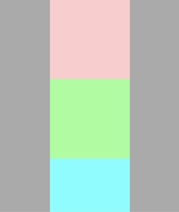
return <View style={{
            width: width,
            height: 400,
            backgroundColor: '#aaa',
            marginTop: 40,
            alignItems: 'center'
            // justifyContent: 'flex-start',
        }}>
            {/*<View style={{width: width, height: 40, backgroundColor: '#0066FF'}}></View>*/}
            {/*<View style={{flexDirection: 'c', flexGrow: 1, width: 400}}>*/}
                <View style={{width: 150, height: 150, backgroundColor: '#ffcccc'}}></View>
                <View style={{width: 150, height: 150, backgroundColor: '#99ff99'}}></View>
                <View style={{width: 150, height: 150, backgroundColor: '#66ffff', flexShrink: 1}}></View>
            {/*</View>*/}
            {/*<View style={{width: width, height: 40, backgroundColor: '#ff00ff'}}></View>*/}
        </View>
flex-shrink
这个属性其实就是定义一个子容器的压缩比例,根据父容器剩余空间进行压缩。应用场景:字数过多时显示省略号,占满不定宽(高) 容器空间等。例子如上图,下图省红框实现就是利用该属性
总结
以上只是介绍在react native项目中flex布局使用情况,以及常用布局构建,希望给大家一个参考的例子。


 扫一扫
扫一扫


 4004
4004

 被折叠的 条评论
为什么被折叠?
被折叠的 条评论
为什么被折叠?
 到【灌水乐园】发言


