如何在 Vue 项目中实现七天签到弹出框组件

vue七天签到弹出框_关闭按钮

在许多应用中,连续签到功能是一种常见的用户激励机制,旨在提高用户活跃度和留存率。本文将详细介绍如何在 Vue.js 项目中创建一个美观且功能齐全的七天签到弹出框组件。我们将从组件设计、代码实现到最终集成,一步步引导你完成这一过程。
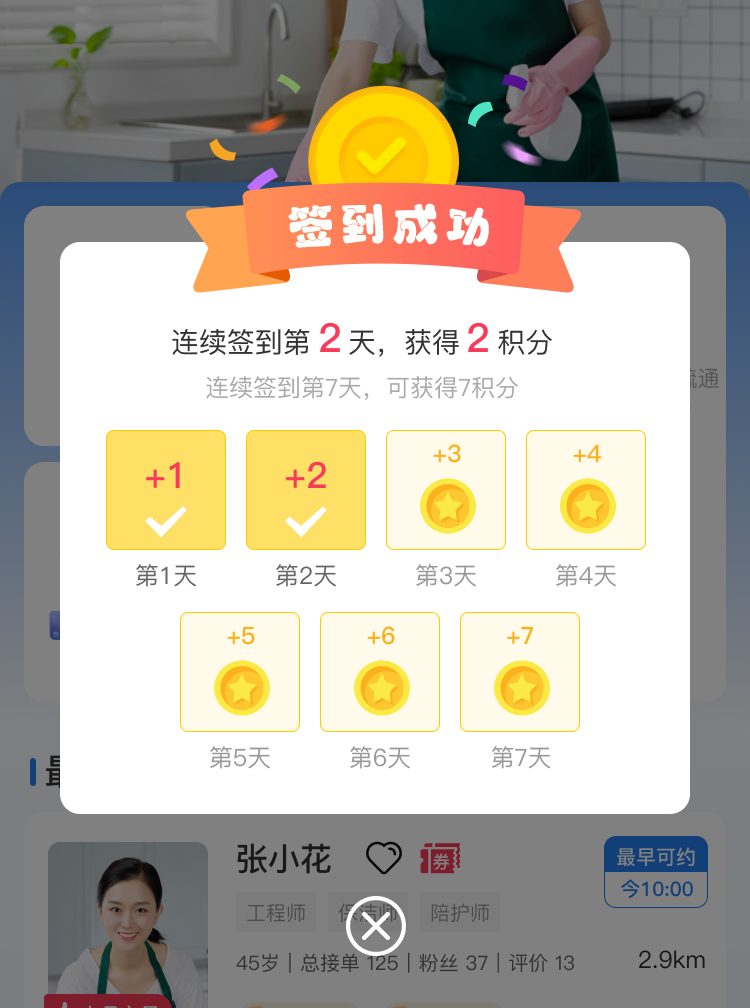
组件功能概述

本组件主要功能包括:

  • 动态显示用户的连续签到天数。
  • 根据签到天数显示不同的奖励提示。
  • 可视化展示一周内的签到状态,突出显示已签到的天数。
  • 提供关闭按钮,允许用户手动关闭弹窗。
技术栈
  • 前端框架:Vue.js
  • 样式语言:SCSS
  • 图片资源:静态图片文件
组件代码分析
HTML/模板
<template>
  <div class="tost" v-if="isShow">
    <!-- 签到头部 -->
    <div class="signheader">
      <img src="../static/home/signin/签到头.png" alt="签到头" style="width: 360rpx;">
    </div>
    <!-- 签到盒子 -->
    <div class="signbox">
      <div class="title">
        连续签到第<text>{{ day }}</text>天,获得<text>2</text>积分
      </div>
      <div class="tip">
        连续签到第7天,可获得3积分
      </div>
      <!-- 签到金币 -->
      <div class="signGold">
        <div v-for="(item, index) in week" :key="index" class="gold">
          <img :src="day > index ? '@/static/home/signin/+1.png' : '@/static/home/signin/1.png'" alt="签到金币">
          <span :style="{ color: day > index ? '#666666' : '#999999' }">第{{ index + 1 }}天</span>
        </div>
      </div>
    </div>
    <!-- 关闭按钮 -->
    <div class="btn">
      <img src="../static/home/share-toast/close.png" alt="关闭" style="width: 80rpx;" @click="isShow = false">
    </div>
  </div>
</template>
  • 1.
  • 2.
  • 3.
  • 4.
  • 5.
  • 6.
  • 7.
  • 8.
  • 9.
  • 10.
  • 11.
  • 12.
  • 13.
  • 14.
  • 15.
  • 16.
  • 17.
  • 18.
  • 19.
  • 20.
  • 21.
  • 22.
  • 23.
  • 24.
  • 25.
  • 26.
  • 27.
  • 28.
JavaScript/逻辑
<script>
export default {
  name: "WoodsSignin",
  data() {
    return {
      isShow: true,
      week: [1, 2, 3, 4, 5, 6, 7],
      day: 2
    };
  },
  watch: {
    isShow(visible) {
      this.$emit("visible", visible);
    }
  },
  methods: {
     
  }
}
</script>
  • 1.
  • 2.
  • 3.
  • 4.
  • 5.
  • 6.
  • 7.
  • 8.
  • 9.
  • 10.
  • 11.
  • 12.
  • 13.
  • 14.
  • 15.
  • 16.
  • 17.
  • 18.
  • 19.
  • 20.
CSS/样式
<style scoped lang="scss">
 .tost{
	position: fixed;
	top: 0;
	left: 0;
	width: 100%;
	height: 100vh;
	z-index: 999;
	background-color: rgba(0, 0, 0, 0.3);
	display: flex;
	justify-content: center;
	align-items: center;
	.signheader{
		 
		position: relative;
		bottom: -70rpx;
		text-align: center;
	}
	.signbox{
		 
		width: 630rpx;
		 
		background: #FFFFFF;
		border-radius: 20rpx;
		padding: 40rpx 20rpx;
		.title{
			font-weight: 600;
			font-size: 30rpx;
			color: #333333;
			line-height: 33rpx;
			text-align: center;
			margin-top: 20rpx;
			text{
				font-weight: bold;
				font-size: 40rpx;
				color: #F93A59;
				line-height: 47rpx;
			}
		}
		.tip{
			margin-top: 20rpx;
			font-weight: 500;
			font-size: 24rpx;
			color: #AAAAAA;
			line-height: 28rpx;
			text-align: center; 
		}
		.signGold{
			margin-top: 20rpx;
			display: flex;
			align-items: center;
			justify-content: center;
			flex-wrap: wrap;
			.gold{
				margin:18rpx 10rpx;
				text-align: center;
				image{
					width: 120rpx;
					height: 120rpx;
				}
				view{
					font-weight: 500;
					font-size: 24rpx;
					color: #999999;
					line-height: 28rpx;
					text-align: center;
				}
			}
		}
	}
	
	
	.btn{
		display: flex;
		justify-content: center;
		margin-top: 40rpx;
		 
	}
	
}

</style>
  • 1.
  • 2.
  • 3.
  • 4.
  • 5.
  • 6.
  • 7.
  • 8.
  • 9.
  • 10.
  • 11.
  • 12.
  • 13.
  • 14.
  • 15.
  • 16.
  • 17.
  • 18.
  • 19.
  • 20.
  • 21.
  • 22.
  • 23.
  • 24.
  • 25.
  • 26.
  • 27.
  • 28.
  • 29.
  • 30.
  • 31.
  • 32.
  • 33.
  • 34.
  • 35.
  • 36.
  • 37.
  • 38.
  • 39.
  • 40.
  • 41.
  • 42.
  • 43.
  • 44.
  • 45.
  • 46.
  • 47.
  • 48.
  • 49.
  • 50.
  • 51.
  • 52.
  • 53.
  • 54.
  • 55.
  • 56.
  • 57.
  • 58.
  • 59.
  • 60.
  • 61.
  • 62.
  • 63.
  • 64.
  • 65.
  • 66.
  • 67.
  • 68.
  • 69.
  • 70.
  • 71.
  • 72.
  • 73.
  • 74.
  • 75.
  • 76.
  • 77.
  • 78.
  • 79.
  • 80.
  • 81.
  • 82.
使用示例


在你的 Vue 应用中使用此组件,首先导入并注册它:

import WoodsSignin from './components/WoodsSignin.vue';

export default {
  components: {
    WoodsSignin
  },
  data() {
    return {
      showSignin: false
    };
  },
  methods: {
    toggleSignin() {
     this.$refs.woodsShareToast.isShow=true
    }
  }
}
  • 1.
  • 2.
  • 3.
  • 4.
  • 5.
  • 6.
  • 7.
  • 8.
  • 9.
  • 10.
  • 11.
  • 12.
  • 13.
  • 14.
  • 15.
  • 16.
  • 17.

然后在模板中使用它:

<template>
  <div>
    <button @click="toggleSignin">显示签到弹窗</button>
		<woodsSignin ref="woodsSignin" @visible="tovisible"/>  </div>
</template>
  • 1.
  • 2.
  • 3.
  • 4.
  • 5.
自定义与扩展
  • 动态奖励:根据后端返回的数据动态更新奖励信息。
  • 个性化样式:允许通过 props 传递自定义样式。
  • 国际化支持:根据用户语言设置调整文本内容。
结论

通过上述步骤,你已经学会了如何在 Vue.js 项目中创建并集成一个七天签到弹出框组件。这个组件不仅能够增强用户界面的互动性,还能有效提升用户参与度和留存率。希望这篇文章能帮助你在自己的项目中实现类似的功能!