


本文记录matlibplot常用基本操作,都是基本功能(代码解释了基本用法),不涉及复杂联合操作,其中各用法详细用法可参考官网。
对于matlibplot一些基本概念可以参考该片blog.解释的很详细。
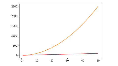
1. 基本画图操作
##mofan_matplotlib.pyplot

import matplotlib.pyplot as plt
import numpy as np

x = np.linspace(1,50)
y = 2*x + 1
#draw the lines
#plt.plot(x,y)
#show to draw the figure :must call at the last
#plt.show()

#figure的使用
##figure就是图片窗口
#如画两张图
y1 = x**2

#第一张图
plt.figure()
plt.plot(x,y)

#第二张图
#num指定第几章图, figsize指定图的大小
#plt.figure(num=3, figsize=(8,5))
##在一张图放两张线条
plt.plot(x, y1)
plt.plot(x, y, color= 'red', linewidth=1.0, linestyle='-')

plt.show()
Fig1:
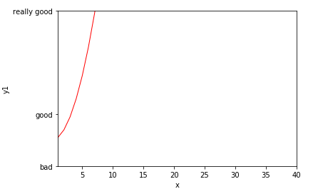
2. 描述坐标
#转换坐标单位:重写坐标
new_ticks = np.linspace(-15,70,0.5)
print(new_ticks)
plt.xticks(new_ticks)

plt.figure()

#限定坐标轴范围
plt.xlim(1,30)
plt.ylim(2,30)

#修改坐标轴名称
plt.xlabel('x')
plt.ylabel('y')

#将坐标换成字符标识
#利用正则做显示
plt.yticks([50, 10, -10], ['really good','good','bad'])
Fig2:
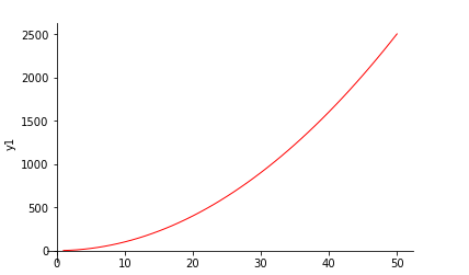
3. 设置坐标轴位置
# gca = 'get current axis'
ax = plt.gca()
#把右边的和上面的横轴去掉
ax.spines['right'].set_color('none')
ax.spines['top'].set_color('none')
#用下面的轴做x轴,左边的轴做y轴
ax.xaxis.set_ticks_position('bottom')
ax.yaxis.set_ticks_position('left')
#设置坐标轴位置
ax.spines['bottom'].set_position(('data',-1))
ax.spines['left'].set_position(('data',0))
Fig3:
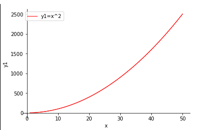
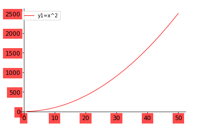
4. 图列
plt.plot(x, y1, color= 'red', linewidth=1.0, linestyle='-',label = 'y1=x^2')
#legend:参数可控制(handles=, labels = , loc = 'best')
plt.legend(loc = 'best')
Fig 4:
5. 对坐标轴每个刻度做处理
##把坐标轴上的标度拿出来单独做标注
for label in ax.get_xticklabels() + ax.get_yticklabels():
    label.set_fontsize(12)
    #alpha:坐标透明度
    label.set_bbox(dict(facecolor='red', edgecolor="None", alpha=0.7))
Fig 5:
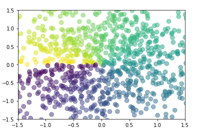
6. 散点图
import matplotlib.pyplot as plt
import numpy as np

n = 1024
X = np.random.normal(0,1,n)
Y = np.random.normal(0,1,n)
# 设置点颜色
T = np.arctan2(Y,X)

#s:size, c:color,
plt.scatter(X,Y, s=75, c=T,alpha=0.5 )

plt.xlim((-1.5, 1.5))
plt.ylim((-1.5, 1.5))

plt.show()
Fig 6:
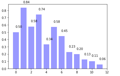
7. 柱状图
n = 12
X = np.arange(n)
Y1 = (1-X/float(n)) * np.random.uniform(0.5, 1.0, n)
Y2 = (1-X/float(n)) * np.random.uniform(0.5, 1.0, n)

#画柱状图
#facecolor:, edgecolor边缘颜色
#+Y1,往上
plt.bar(X, +Y1,facecolor='#9999ff', edgecolor ='white')

#加标准注
#把X,Y1的值成对传给x,y,形成坐标
for x, y in zip(X, Y1):
    plt.text(x +0.4, y +0.05,'%0.2f'%y, ha = 'center',va = 'bottom' )
Fig 7:
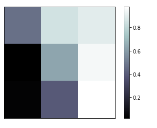
8. 画二维矩阵图
import matplotlib.pyplot as plt
import numpy as np
import random

#生成9个值 每个是一个格子
l = [random.random() for i in range(9)]
a = np.array(l).reshape((3,3))
#print(a)

#参数参考官网用法
#interpolation:是显示效果
plt.imshow(a, interpolation='nearest', cmap='bone', origin='lower')
#添加bar
plt.colorbar()

plt.xticks(())
plt.yticks(())
plt.show()
Fig 8:
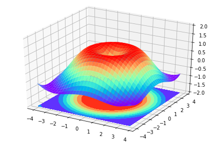
9. 画3D图
from mpl_toolkits.mplot3d import Axes3D

fig = plt.figure()
#在fig里面加一个3D的axes
ax = Axes3D(fig)

X = np.arange(-4,4, 0.25)
Y = np.arange(-4,4, 0.25)
#把X,Ymesh到二维空间
X,Y = np.meshgrid(X, Y)
#生成一个高
R = np.sqrt(X**2 + Y**2)
Z = np.sin(R)

#在Axes画3D图
#rstride,cstride是行/列跨度
#cmap是画图的方式
ax.plot_surface(X,Y,Z, rstride =1, cstride=1, cmap = plt.get_cmap('rainbow'))
#画等高线,zdir表示投射轴
#offset是投射的坐标位置
ax.contourf(X,Y,Z, zdir = 'z', offset = -2, cmap='rainbow')
#ax.contourf(X,Y,Z, xdir = 'x', offset = -4, cmap='rainbow')
#Z轴的范围
ax.set_zlim(-2,2)
#画高
Fig 9:
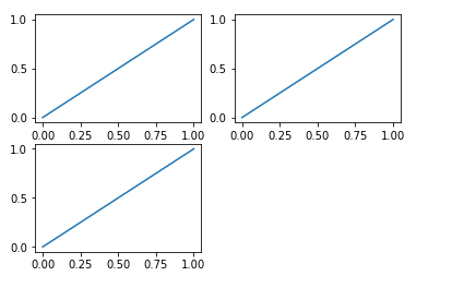
10. 画子图
#创建子图
#把一个fig划分为2*2,即4个图
#(2,2,1)画第一张图
plt.subplot(2,2,1)#plt.subplot(221)
plt.plot([0,1],[0,1])
#(2,2,2)画第二张图
plt.subplot(2,2,2)#plt.subplot(221)
plt.plot([0,1],[0,1])

plt.subplot(2,2,3)#plt.subplot(221)
plt.plot([0,1],[0,1])
Fig 10:
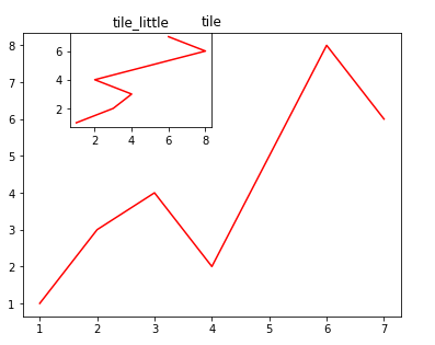
11. 图嵌套
fig = plt.figure()
x = [1,2,3,4,5,6,7]
y = [1,3,4,2,5,8,6]
#其实相当于按比例在fig这张大图画各个小图
#先画一张比列很大的
#参数是fig的百分比
left, bottom, width, height = 0.1, 0.1, 0.8, 0.9
ax1 = fig.add_axes([left, bottom, width, height])
#给图画图
ax1.plot(x,y,'r')
#注意是set_tile
ax1.set_title('tile')


#再画小图
#为小图加坐标,参数是fig的百分比
left, bottom, width, height = 0.2, 0.7, 0.3, 0.3
ax2 = fig.add_axes([left, bottom, width, height])
#给小图画图
ax2.plot(y,x,'r')
ax2.set_title('tile_little')
Fig 11:
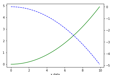
12. 共享x轴,不同Y周
x = np.arange(0,10,0.1)
y1 = 0.05 *x**2
y2 = -1*y1
#同时创建fig和sub
#实际是画两张图 然后重叠,故用subplot
fig,ax1 = plt.subplots()
#共享x
ax2 = ax1.twinx()
ax1.plot(x, y1,'g-')
ax2.plot(x, y2,'b--')

ax1.set_xlabel('x data')
ax.set_ylabel('Y1',color = 'g')
ax.set_ylabel('Y2',color = 'b')
plt.show()
Fig 12:


 745
745


 被折叠的 条评论
为什么被折叠?
被折叠的 条评论
为什么被折叠?
 到【灌水乐园】发言


