


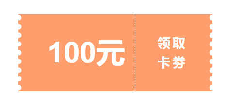
效果看下图:
左右的波浪边框用CSS搞定这个效果。利用CSS radial-gradient() 函数
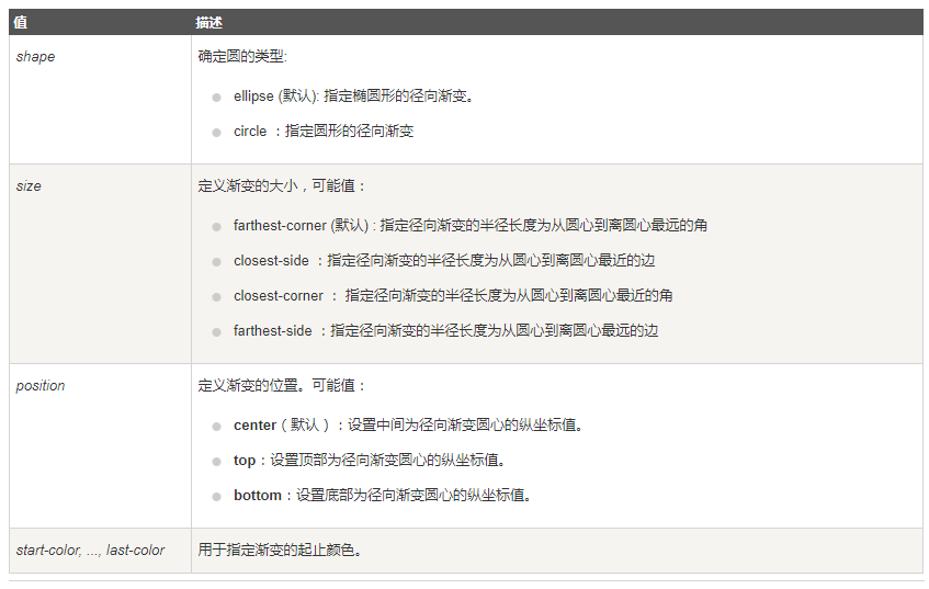
CSS 语法:
background: radial-gradient(shape size at position, start-color, ..., last-color);
直接上代码如下:
<div class="coupon"></div>
css部分:
.coupon {
  position: relative;
  width: 400px;
  height: 160px;
  margin: 100px auto;
  text-align: -webkit-auto;
  background-image: radial-gradient(
      circle at 1px 8px,
      transparent 6px,
      #ff9e6d 6px,
      #ff9e6d 0px
    ),
    radial-gradient(
      circle at 199px 8px,
      transparent 6px,
      #ff9e6d 6px,
      #ff9e6d 0px
    );
  background-size: 200px 18px;
  background-position: 0 0, 200px 0;
  background-repeat-x: no-repeat;

  font-size: 60px;
  color: #fff;
  font-weight: bold;
  line-height: 160px;
  padding-left: 60px;
  box-sizing: border-box;
  cursor: pointer;
}
.coupon::before {
  position: absolute;
  content: "";
  left: 240px;
  top: 0;
  bottom: 0;
  width: 0;
  border-left: 1px dashed #fff;
}
.coupon::after {
  position: absolute;
  content: "立即领取";
  font-size: 26px;
  width: 70px;
  top: 50%;
  right: 2%;
  transform: translate(-50%, -50%);
  line-height: 40px;
  letter-spacing: 5px;
}


 3412
3412


 被折叠的 条评论
为什么被折叠?
被折叠的 条评论
为什么被折叠?
 到【灌水乐园】发言


