


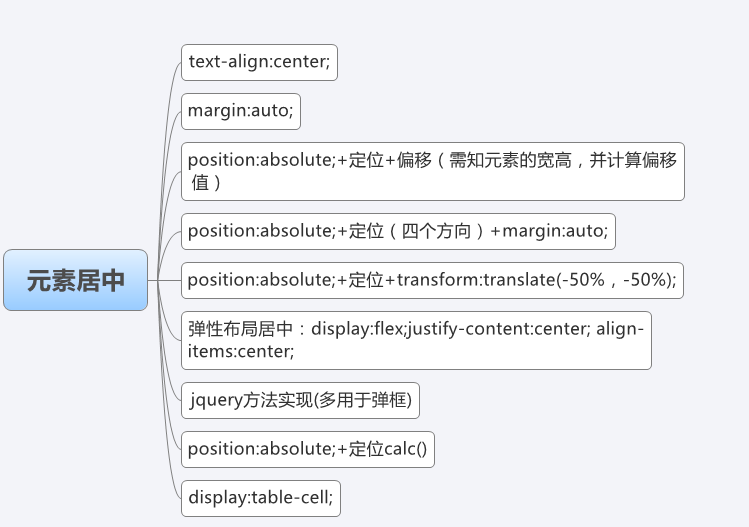
一、text-align:center;
前提:元素没有浮动,而且是内联元素(如:span、img、b)。如果是块级元素,要把块级元素设置成display:inline-block;或display:inline;
二、margin:auto;
前提:元素必须是块级元素,如果是内联元素,必须设置为display:block;
三、position:absolute;+定位+偏移(已知宽高,需计算偏移值)
div {
    position: relative;
    width: 250px;
    height: 250px;
}

div img {
    width: 200px;
    height: 140px;
    position: absolute;
    left: 50%;
    top: 50%;
    margin-left: -100px;
    margin-top: -70px;
}
四、position:absolute;+定位(四个方向)+margin:auto;
div {
    position: relative;
    width: 250px;
    height: 250px;
}

div img {
    position: absolute;
    left: 0;
    top: 0;
    right: 0;
    bottom: 0;
    margin: auto;
}
优点:不需要知道元素的宽、高,而且浏览器的兼容性好。
五、position:absolute;+定位+transform:translate(-50%,-50%);
div {
    position: relative;
    width: 250px;
    height: 250px;
}

div img {
    position: absolute;
    left: 50%;
    top: 50%;
    -webkit-transform: translate(-50%, -50%);
    -moz-transform: translate(-50%, -50%);
    -o-transform: translate(-50%, -50%);
    -ms-transform: translate(-50%, -50%);
    transform: translate(-50%, -50%);
}
说明:该方法的优点是不需要知道元素的宽度和高度,在移动端用的比较多,因为移动端对css3新属性的兼容性比较好。
六、利用弹性布局居中
div {
    width: 250px;
    height: 250px;
    display: flex;
    justify-content: center;/*水平居中*/
    align-items: center;/*垂直居中*/
}
- Flexbox布局最适合应用程序的组件和小规模布局,而 Gird 布局则适用于较大规模的布局。
- 设为Flex布局以后,子元素的float、clear和vertical-align属性将失效
- 使用flex居中不需要知道元素本身宽高以及元素的属性
七、jquery方法实现
jquery实现水平和垂直居中的原理是通过jquery设置div的css,获取div的左,上的边距偏移量,边距偏移量的算法就是用页面窗口的宽度减去该div的宽度,得到的值再除以2即左偏移量,右偏移量算法相同。注意div的css设置要在resize()方法中完成,就是每次改变窗口大小是,都要执行设置div的css,代码如下
$(function(){
          $(window).resize(function(){
            $('.mydiv').css({
              position:'absolute',
              left:($(window).width()-$('.mydiv').outerWidth())/2,
              top:($(window).height()-$('.mydiv').outerHeight())/2
            });
          });
      })
此方法的好处就是不需要知道div 的具体宽度和高度,直接用jquery就可以实现水平和垂直居中,并且兼容各种浏览器。这个方法在很多的弹出层效果中应用。
八、css3新属性calc()和定位配合使用(需要知道元素的宽高)
- 需要注意的是,运算符前后都需要保留一个空格,例如:width: calc(100% - 10px);
- 任何长度值都可以使用calc()函数进行计算;
- calc()函数支持 "+", "-", "*", "/" 运算;
- calc()函数使用标准的数学运算优先级规则;
div {
    position: relative;
    width: 250px;
    height: 250px;
}

div img {
    width: 200px;
    height: 140px;
    position: absolute;
    left: calc(50% - 100px);
    top: calc(50% - 70px);
}
九、display:table-cell;实现居中
合使用display:table-cell和vertical-align、text-align,使父元素内的所有行内元素水平垂直居中(内部div设置display:inline-block即可)。这在子元素不确定宽高和数量时,特别实用!
div {
    display: table-cell;
    width: 250px;
    height: 250px;
    text-align: center;
    vertical-align: middle;
    float: none;
}

div img {
    display: inline-block;
}
- 1.table-cell不感知margin,在父元素上设置table-row等属性,也会使其不感知height。
- 2.设置float或position会对默认布局造成破坏,可以考虑为之增加一个父div定义float等属性。


 1万+
1万+


 被折叠的 条评论
为什么被折叠?
被折叠的 条评论
为什么被折叠?
 到【灌水乐园】发言


