


分享一个以前项目中用到的简单的TabItem样式。
效果图如下: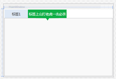
|
1
2
3
4
5
6
7
8
9
10
11
12
13
14
15
16
17
18
19
20
21
22
23
24
25
26
27
28
29
30
31
32
33
34
35
36
37
38
39
40
|
<SolidColorBrush x:Key=
"TabItemDisabledBackground"
Color=
"#F4F4F4"
/>
<SolidColorBrush x:Key=
"TabItemDisabledBorderBrush"
Color=
"#FFC9C7BA"
/>
<Style TargetType=
"{x:Type TabItem}"
>
<!--<Setter Property=
"FocusVisualStyle"
Value=
"{x:null}"
/>-->
<Setter Property=
"Foreground"
Value=
"#333333"
/>
<Setter Property=
"FontSize"
Value=
"16"
/>
<Setter Property=
"BorderBrush"
Value=
"{StaticResource TabControlNormalBorderBrush}"
/>
<Setter Property=
"Background"
Value=
"{StaticResource ButtonNormalBackground}"
/>
<Setter Property=
"HorizontalContentAlignment"
Value=
"Stretch"
/>
<Setter Property=
"VerticalContentAlignment"
Value=
"Stretch"
/>
<Setter Property=
"Template"
>
<Setter.Value>
<ControlTemplate TargetType=
"{x:Type TabItem}"
>
<Grid SnapsToDevicePixels=
"true"
Height=
"40"
MinWidth=
"110"
>
<Path Margin=
"0 0 0 -12"
x:Name=
"PATH"
Visibility=
"Collapsed"
Data=
"M0.5,0.5 L109.5,0.5 109.5,39.5 64,40 57,51 49,40 0.5,39.5 z"
Fill=
"#FF0FAF46"
Height=
"51.5"
Stretch=
"Fill"
Stroke=
"Transparent"
Width=
"110"
/>
<Border x:Name=
"Bd"
Background=
"#dfe9f6"
>
<ContentPresenter Margin=
"5 0 5 0"
x:Name=
"Content"
ContentSource=
"Header"
HorizontalAlignment=
"{Binding HorizontalContentAlignment, RelativeSource={RelativeSource AncestorType={x:Type ItemsControl}}}"
RecognizesAccessKey=
"True"
SnapsToDevicePixels=
"{TemplateBinding SnapsToDevicePixels}"
VerticalAlignment=
"{Binding VerticalContentAlignment, RelativeSource={RelativeSource AncestorType={x:Type ItemsControl}}}"
/>
</Border>
</Grid>
<ControlTemplate.Triggers>
<MultiTrigger>
<MultiTrigger.Conditions>
<Condition Property=
"IsSelected"
Value=
"true"
/>
<Condition Property=
"TabStripPlacement"
Value=
"Top"
/>
</MultiTrigger.Conditions>
<Setter Property=
"Visibility"
Value=
"visible"
TargetName=
"PATH"
/>
<Setter Property=
"Foreground"
Value=
"White"
></Setter>
<Setter Property=
"Background"
Value=
"#FF0FAF46"
TargetName=
"Bd"
/>
</MultiTrigger>
<Trigger Property=
"IsEnabled"
Value=
"false"
>
<Setter Property=
"Background"
TargetName=
"Bd"
Value=
"{StaticResource TabItemDisabledBackground}"
/>
<Setter Property=
"BorderBrush"
TargetName=
"Bd"
Value=
"{StaticResource TabItemDisabledBorderBrush}"
/>
<Setter Property=
"Foreground"
Value=
"{DynamicResource {x:Static SystemColors.GrayTextBrushKey}}"
/>
</Trigger>
</ControlTemplate.Triggers>
</ControlTemplate>
</Setter.Value>
</Setter>
</Style>
|
这里只实现了标签方向在Top的实现,其它动画或者显示效果都是可以随意增加的!


 977
977


 被折叠的 条评论
为什么被折叠?
被折叠的 条评论
为什么被折叠?
 到【灌水乐园】发言


