


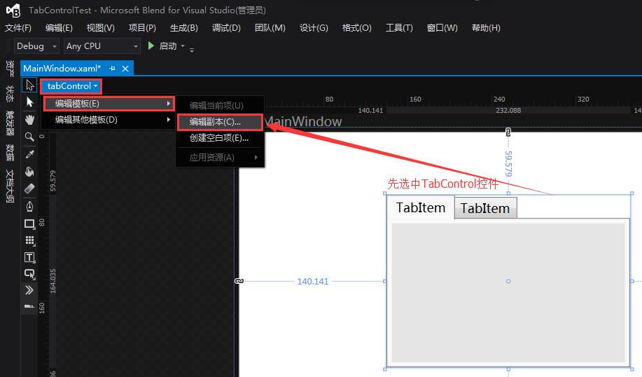
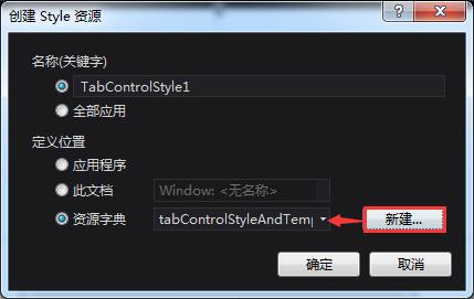
一、通过Blend查看TabControl模板代码
二、tabControlStyleAndTemplate.xaml代码
<ResourceDictionary xmlns="http://schemas.microsoft.com/winfx/2006/xaml/presentation"
                    xmlns:x="http://schemas.microsoft.com/winfx/2006/xaml"
                    xmlns:local="clr-namespace:TabControlTest">
    <SolidColorBrush x:Key="TabControlNormalBorderBrush" Color="#8C8E94"/>
    <Style x:Key="TabControlStyle1" TargetType="{x:Type TabControl}">
        <Setter Property="Foreground" Value="{DynamicResource {x:Static SystemColors.ControlTextBrushKey}}"/>
        <Setter Property="Padding" Value="4,4,4,4"/>
        <Setter Property="BorderThickness" Value="1"/>
        <Setter Property="BorderBrush" Value="{StaticResource TabControlNormalBorderBrush}"/>
        <Setter Property="Background" Value="#F9F9F9"/>
        <Setter Property="HorizontalContentAlignment" Value="Center"/>
        <Setter Property="VerticalContentAlignment" Value="Center"/>
        <Setter Property="Template">
            <Setter.Value>
                <ControlTemplate TargetType="{x:Type TabControl}">
                    <Grid ClipToBounds="true" SnapsToDevicePixels="true" KeyboardNavigation.TabNavigation="Local">
                        <Grid.ColumnDefinitions>
                            <ColumnDefinition x:Name="ColumnDefinition0"/>
                            <ColumnDefinition x:Name="ColumnDefinition1" Width="0"/>
                        </Grid.ColumnDefinitions>
                        <Grid.RowDefinitions>
                            <RowDefinition x:Name="RowDefinition0" Height="Auto"/>
                            <RowDefinition x:Name="RowDefinition1" Height="*"/>
                        </Grid.RowDefinitions>
                        <TabPanel x:Name="HeaderPanel" Grid.Column="0" IsItemsHost="true" Margin="2,2,2,0" Grid.Row="0" KeyboardNavigation.TabIndex="1" Panel.ZIndex="1"/>
                        <Border x:Name="ContentPanel" BorderBrush="{TemplateBinding BorderBrush}" BorderThickness="{TemplateBinding BorderThickness}" Background="{TemplateBinding Background}" Grid.Column="0" KeyboardNavigation.DirectionalNavigation="Contained" Grid.Row="1" KeyboardNavigation.TabIndex="2" KeyboardNavigation.TabNavigation="Local">
                            <ContentPresenter x:Name="PART_SelectedContentHost" ContentSource="SelectedContent" Margin="{TemplateBinding Padding}" SnapsToDevicePixels="{TemplateBinding SnapsToDevicePixels}"/>
                        </Border>
                    </Grid>
                    <ControlTemplate.Triggers>
                        <Trigger Property="TabStripPlacement" Value="Bottom">
                            <Setter Property="Grid.Row" TargetName="HeaderPanel" Value="1"/>
                            <Setter Property="Grid.Row" TargetName="ContentPanel" Value="0"/>
                            <Setter Property="Height" TargetName="RowDefinition0" Value="*"/>
                            <Setter Property="Height" TargetName="RowDefinition1" Value="Auto"/>
                            <Setter Property="Margin" TargetName="HeaderPanel" Value="2,0,2,2"/>
                        </Trigger>
                        <Trigger Property="TabStripPlacement" Value="Left">
                            <Setter Property="Grid.Row" TargetName="HeaderPanel" Value="0"/>
                            <Setter Property="Grid.Row" TargetName="ContentPanel" Value="0"/>
                            <Setter Property="Grid.Column" TargetName="HeaderPanel" Value="0"/>
                            <Setter Property="Grid.Column" TargetName="ContentPanel" Value="1"/>
                            <Setter Property="Width" TargetName="ColumnDefinition0" Value="Auto"/>
                            <Setter Property="Width" TargetName="ColumnDefinition1" Value="*"/>
                            <Setter Property="Height" TargetName="RowDefinition0" Value="*"/>
                            <Setter Property="Height" TargetName="RowDefinition1" Value="0"/>
                            <Setter Property="Margin" TargetName="HeaderPanel" Value="2,2,0,2"/>
                        </Trigger>
                        <Trigger Property="TabStripPlacement" Value="Right">
                            <Setter Property="Grid.Row" TargetName="HeaderPanel" Value="0"/>
                            <Setter Property="Grid.Row" TargetName="ContentPanel" Value="0"/>
                            <Setter Property="Grid.Column" TargetName="HeaderPanel" Value="1"/>
                            <Setter Property="Grid.Column" TargetName="ContentPanel" Value="0"/>
                            <Setter Property="Width" TargetName="ColumnDefinition0" Value="*"/>
                            <Setter Property="Width" TargetName="ColumnDefinition1" Value="Auto"/>
                            <Setter Property="Height" TargetName="RowDefinition0" Value="*"/>
                            <Setter Property="Height" TargetName="RowDefinition1" Value="0"/>
                            <Setter Property="Margin" TargetName="HeaderPanel" Value="0,2,2,2"/>
                        </Trigger>
                        <Trigger Property="IsEnabled" Value="false">
                            <Setter Property="Foreground" Value="{DynamicResource {x:Static SystemColors.GrayTextBrushKey}}"/>
                        </Trigger>
                    </ControlTemplate.Triggers>
                </ControlTemplate>
            </Setter.Value>
        </Setter>
    </Style>

</ResourceDictionary>①TabControl控件由2行2列的表格构成,定义为2行2列主要是为了方便后边控件的标签头上下左右方向的放置。
②TabPanel通过IsItemsHost="true"属性做为TabItem的容器。
③Border中的ContentPresenter通过ContentSource="SelectedContent"属性显示选中TabItem的内容。
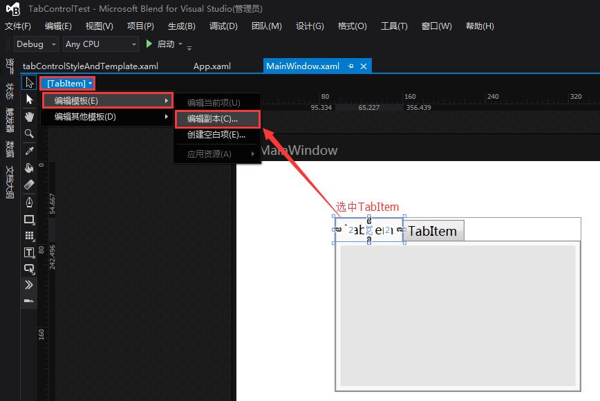
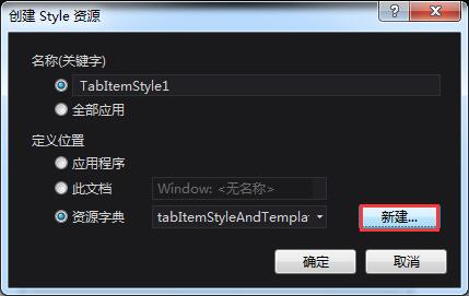
三、通过Blend查看TabItem模板代码
四、tabItemStyleAndTemplate.xaml代码
<ResourceDictionary xmlns="http://schemas.microsoft.com/winfx/2006/xaml/presentation"
                    xmlns:x="http://schemas.microsoft.com/winfx/2006/xaml"
                    xmlns:local="clr-namespace:TabControlTest">
    <Style x:Key="TabItemFocusVisual">
        <Setter Property="Control.Template">
            <Setter.Value>
                <ControlTemplate>
                    <Rectangle Margin="3,3,3,1" SnapsToDevicePixels="true" Stroke="{DynamicResource {x:Static SystemColors.ControlTextBrushKey}}" StrokeThickness="1" StrokeDashArray="1 2"/>
                </ControlTemplate>
            </Setter.Value>
        </Setter>
    </Style>
    <LinearGradientBrush x:Key="ButtonNormalBackground" EndPoint="0,1" StartPoint="0,0">
        <GradientStop Color="#F3F3F3" Offset="0"/>
        <GradientStop Color="#EBEBEB" Offset="0.5"/>
        <GradientStop Color="#DDDDDD" Offset="0.5"/>
        <GradientStop Color="#CDCDCD" Offset="1"/>
    </LinearGradientBrush>
    <LinearGradientBrush x:Key="TabItemHotBackground" EndPoint="0,1" StartPoint="0,0">
        <GradientStop Color="#EAF6FD" Offset="0.15"/>
        <GradientStop Color="#D9F0FC" Offset=".5"/>
        <GradientStop Color="#BEE6FD" Offset=".5"/>
        <GradientStop Color="#A7D9F5" Offset="1"/>
    </LinearGradientBrush>
    <SolidColorBrush x:Key="TabItemSelectedBackground" Color="#F9F9F9"/>
    <SolidColorBrush x:Key="TabItemHotBorderBrush" Color="#3C7FB1"/>
    <SolidColorBrush x:Key="TabItemDisabledBackground" Color="#F4F4F4"/>
    <SolidColorBrush x:Key="TabItemDisabledBorderBrush" Color="#FFC9C7BA"/>
    <Style x:Key="TabItemStyle1" TargetType="{x:Type TabItem}">
        <Setter Property="FocusVisualStyle" Value="{StaticResource TabItemFocusVisual}"/>
        <Setter Property="Foreground" Value="Black"/>
        <Setter Property="Padding" Value="6,1,6,1"/>
        <Setter Property="BorderBrush" Value="{StaticResource TabControlNormalBorderBrush}"/>
        <Setter Property="Background" Value="{StaticResource ButtonNormalBackground}"/>
        <Setter Property="HorizontalContentAlignment" Value="Stretch"/>
        <Setter Property="VerticalContentAlignment" Value="Stretch"/>
        <Setter Property="Template">
            <Setter.Value>
                <ControlTemplate TargetType="{x:Type TabItem}">
                    <Grid SnapsToDevicePixels="true">
                        <Border x:Name="Bd" BorderBrush="{TemplateBinding BorderBrush}" BorderThickness="1,1,1,0" Background="{TemplateBinding Background}" Padding="{TemplateBinding Padding}">
                            <ContentPresenter x:Name="Content" ContentSource="Header" HorizontalAlignment="{Binding HorizontalContentAlignment, RelativeSource={RelativeSource AncestorType={x:Type ItemsControl}}}" RecognizesAccessKey="True" SnapsToDevicePixels="{TemplateBinding SnapsToDevicePixels}" VerticalAlignment="{Binding VerticalContentAlignment, RelativeSource={RelativeSource AncestorType={x:Type ItemsControl}}}"/>
                        </Border>
                    </Grid>
                    <ControlTemplate.Triggers>
                        <Trigger Property="IsMouseOver" Value="true">
                            <Setter Property="Background" TargetName="Bd" Value="{StaticResource TabItemHotBackground}"/>
                        </Trigger>
                        <Trigger Property="IsSelected" Value="true">
                            <Setter Property="Panel.ZIndex" Value="1"/>
                            <Setter Property="Background" TargetName="Bd" Value="{StaticResource TabItemSelectedBackground}"/>
                        </Trigger>
                        <MultiTrigger>
                            <MultiTrigger.Conditions>
                                <Condition Property="IsSelected" Value="false"/>
                                <Condition Property="IsMouseOver" Value="true"/>
                            </MultiTrigger.Conditions>
                            <Setter Property="BorderBrush" TargetName="Bd" Value="{StaticResource TabItemHotBorderBrush}"/>
                        </MultiTrigger>
                        <Trigger Property="TabStripPlacement" Value="Bottom">
                            <Setter Property="BorderThickness" TargetName="Bd" Value="1,0,1,1"/>
                        </Trigger>
                        <Trigger Property="TabStripPlacement" Value="Left">
                            <Setter Property="BorderThickness" TargetName="Bd" Value="1,1,0,1"/>
                        </Trigger>
                        <Trigger Property="TabStripPlacement" Value="Right">
                            <Setter Property="BorderThickness" TargetName="Bd" Value="0,1,1,1"/>
                        </Trigger>
                        <MultiTrigger>
                            <MultiTrigger.Conditions>
                                <Condition Property="IsSelected" Value="true"/>
                                <Condition Property="TabStripPlacement" Value="Top"/>
                            </MultiTrigger.Conditions>
                            <Setter Property="Margin" Value="-2,-2,-2,-1"/>
                            <Setter Property="Margin" TargetName="Content" Value="0,0,0,1"/>
                        </MultiTrigger>
                        <MultiTrigger>
                            <MultiTrigger.Conditions>
                                <Condition Property="IsSelected" Value="true"/>
                                <Condition Property="TabStripPlacement" Value="Bottom"/>
                            </MultiTrigger.Conditions>
                            <Setter Property="Margin" Value="-2,-1,-2,-2"/>
                            <Setter Property="Margin" TargetName="Content" Value="0,1,0,0"/>
                        </MultiTrigger>
                        <MultiTrigger>
                            <MultiTrigger.Conditions>
                                <Condition Property="IsSelected" Value="true"/>
                                <Condition Property="TabStripPlacement" Value="Left"/>
                            </MultiTrigger.Conditions>
                            <Setter Property="Margin" Value="-2,-2,-1,-2"/>
                            <Setter Property="Margin" TargetName="Content" Value="0,0,1,0"/>
                        </MultiTrigger>
                        <MultiTrigger>
                            <MultiTrigger.Conditions>
                                <Condition Property="IsSelected" Value="true"/>
                                <Condition Property="TabStripPlacement" Value="Right"/>
                            </MultiTrigger.Conditions>
                            <Setter Property="Margin" Value="-1,-2,-2,-2"/>
                            <Setter Property="Margin" TargetName="Content" Value="1,0,0,0"/>
                        </MultiTrigger>
                        <Trigger Property="IsEnabled" Value="false">
                            <Setter Property="Background" TargetName="Bd" Value="{StaticResource TabItemDisabledBackground}"/>
                            <Setter Property="BorderBrush" TargetName="Bd" Value="{StaticResource TabItemDisabledBorderBrush}"/>
                            <Setter Property="Foreground" Value="{DynamicResource {x:Static SystemColors.GrayTextBrushKey}}"/>
                        </Trigger>
                    </ControlTemplate.Triggers>
                </ControlTemplate>
            </Setter.Value>
        </Setter>
    </Style>

</ResourceDictionary>


 扫一扫
扫一扫
 369
369

 被折叠的 条评论
为什么被折叠?
被折叠的 条评论
为什么被折叠?
 到【灌水乐园】发言


