


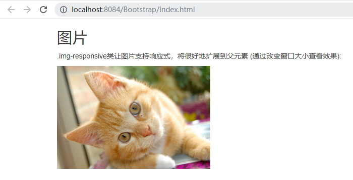
<!DOCTYPE html>
<html>
    <head>
        <meta charset="utf-8">
        <title>菜鸟教程(runoob.com)</title>
        <link rel="stylesheet" href="https://cdn.staticfile.org/twitter-bootstrap/3.3.7/css/bootstrap.min.css">
        <script src="https://cdn.staticfile.org/jquery/2.1.1/jquery.min.js"></script>
        <script src="https://cdn.staticfile.org/twitter-bootstrap/3.3.7/js/bootstrap.min.js"></script>
    </head>
    <body>

        <div class="container">
            <h2>图片</h2>
            <p> .img-responsive类让图片支持响应式,将很好地扩展到父元素 (通过改变窗口大小查看效果):</p>
            <img src="tu/cat.jpg" class="img-responsive" alt="Cinque Terre" width="304" height="236">
        </div>

    </body>
</html>


 80
80


 被折叠的 条评论
为什么被折叠?
被折叠的 条评论
为什么被折叠?
 到【灌水乐园】发言


