


概述:
我想我们在使用一些App的时候,应该不会出现一些“裸控件”的吧。除非是一些系统中的软件,那是为了保持风格的一致性,做出的一些权衡。我这里并非是在指责Android原生的控件不好看,说实在的,我很喜欢Android的一些原生控件。只是有些时候为了风格的一致性,就不得不去花些功夫在美工上。这于美工这一点,我对某讯的产品的确欣赏。下面就让我们开始一点一点学习Android UI编程中的自定义控件。
分析:
自定义控件就点像堆积木,并给它涂上颜色,和功能说明。下面就让我们用一个例子来逐一地简单讨论一下。
示例分析:
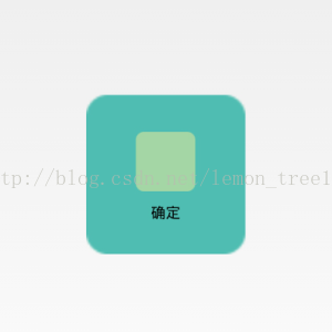
效果图展示:
本示例将选取ImageButton来做一个简单地分析。下面先来看看运行效果图:

搭建基本雏形:
对于雏形,首先要做的是积木的选择。我们选择的是一个ImageView和一个TextView,上下摆放,然后用一个约束将其绑定在一起。如下所示的代码片段:
<?xml version="1.0" encoding="utf-8"?>
<LinearLayout xmlns:android="http://schemas.android.com/apk/res/android"
    android:layout_width="fill_parent"
    android:layout_height="fill_parent"
    android:gravity="center_vertical"
    android:orientation="vertical" >

    <ImageView
        android:id="@+id/imageView1"
        android:layout_width="wrap_content"
        android:layout_height="wrap_content"
        android:layout_gravity="center_horizontal"
        android:paddingBottom="5dip"
        android:paddingTop="5dip"
        android:src="@drawable/right_icon" />

    <TextView
        android:id="@+id/textView1"
        android:layout_width="wrap_content"
        android:layout_height="wrap_content"
        android:layout_gravity="center_horizontal"
        android:layout_marginTop="5dp"
        android:text="确定"
        android:textColor="#000000" />

</LinearLayout>外观设计和功能添加:
外观设计:
现在我们就要进行颜色分配和功能说明了,它被实现在Java代码中了。如下关键代码:
/**
     * 设置图片资源
     */
    public void setImageResource(int resId) {
        imageView.setImageResource(resId);
    }

    /**
     * 设置显示的文字
     */
    public void setTextViewText(String text) {
        textView.setText(text);
    }
功能添加:
而对于此我们仅仅只是让这个“Button”更好看了一些罢了。于是我们现在还要做另外一件事。例如点击后要有一些指定的、绑定死的、使用这个控件所必然会进行的操作。其实和上面的加外套是一个性质。如下关键代码:
@Override
    public void setOnClickListener(OnClickListener l) {
        auxiliaryFunction();

        super.setOnClickListener(l);
    }

    protected void auxiliaryFunction() {
        Log.i("TAG", "log message.");
    }
上面添加的额外功能,我们可以在Log日志中查看是否有真的完成。
public class ImageButton extends LinearLayout {

    private ImageView imageView;
    private TextView textView;

    public ImageButton(Context context) {
        super(context);
    }

    public ImageButton(Context context, AttributeSet attrs) {
        super(context, attrs);
        LayoutInflater inflater = (LayoutInflater) context.getSystemService(Context.LAYOUT_INFLATER_SERVICE);
        inflater.inflate(R.layout.image_button, this);
        imageView = (ImageView) findViewById(R.id.imageView1);
        textView = (TextView) findViewById(R.id.textView1);
    }

    /**
     * 设置图片资源
     */
    public void setImageResource(int resId) {
        imageView.setImageResource(resId);
    }

    /**
     * 设置显示的文字
     */
    public void setTextViewText(String text) {
        textView.setText(text);
    }

    @Override
    public void setOnClickListener(OnClickListener l) {
        auxiliaryFunction();

        super.setOnClickListener(l);
    }

    protected void auxiliaryFunction() {
        Log.i("TAG", "log message.");
    }
}
使用分析:
1.xml代码中的使用
这里只是有一点需要注意,我们要指明自定义控件的完整路径,如下:
<com.demo.customview.imagebutton.widgets.ImageButton
        android:id="@+id/btn_right"
        android:layout_width="150dp"
        android:layout_height="150dp"
        android:background="@drawable/custom_button" />
2.动作效果配置
对于Button的动作也就是触摸、按下和抬起,对于这三个动作效果的配置需要在res包下的drawable文件夹中去创建(没有这个文件夹就新建一个)。如下代码:
<?xml version="1.0" encoding="utf-8"?>
<selector xmlns:android="http://schemas.android.com/apk/res/android">

    <item android:drawable="@drawable/button_unpress_background" android:state_focused="true" android:state_pressed="false"></item>
    <item android:drawable="@drawable/button_pressed_background" android:state_pressed="true"></item>
    <item android:drawable="@drawable/button_unpress_background" android:state_focused="false" android:state_pressed="false"></item>

</selector>
3.Java代码中的使用
在Java代码的使用与Button无异,如下:
public class MainActivity extends Activity {
private ImageButton mImageBtn1;
@Override
protected void onCreate(Bundle savedInstanceState) {
super.onCreate(savedInstanceState);
setContentView(R.layout.activity_main);
mImageBtn1 = (ImageButton) this.findViewById(R.id.btn_right);
mImageBtn1.setTextViewText("确定");
mImageBtn1.setImageResource(R.drawable.right_icon);
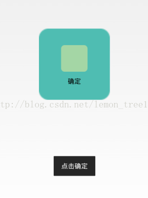
mImageBtn1.setOnClickListener(new View.OnClickListener() {
public void onClick(View v) {
Toast.makeText(getApplicationContext(), "点击确定", 0).show();
}
});
}
}源码分享:
对于以上的分析,我想大家应该也已经完成了一个很漂亮的自定义控件。不过也有可能因为本人讲解得不够清楚,致使你没有实现想要的效果,在此也分享了本人的源代码。如下连接:


 69
69

 被折叠的 条评论
为什么被折叠?
被折叠的 条评论
为什么被折叠?
 到【灌水乐园】发言


