


问题
现实中碰到这样的问题:项目中需要一个 icon,但是没有设计师资源给你作图。然后你查了下常用的 icon font,发现也没有可以用的。那么这个时候如果 icon 比较简洁(譬如只有横线、竖线、斜线、曲线),那么可以使用 css 来画这个 icon。接下来我们先来介绍下如何用 css 画曲线。
解决方案
我们用到的是 css3 中的径向渐变:radial-gradient。以下所有示例基于如下 html:
<html>
<head>
  <title></title>
</head>
<body>
  <div class="canvas"></div>
</body>
</html>
基本
我们先看下基本使用:
.canvas {
  width: 200px;
  height: 200px;
  background: radial-gradient( blue, red );
}
显示的是从 div 中心为圆心,对角线的一半为半径的一个渐变圆。
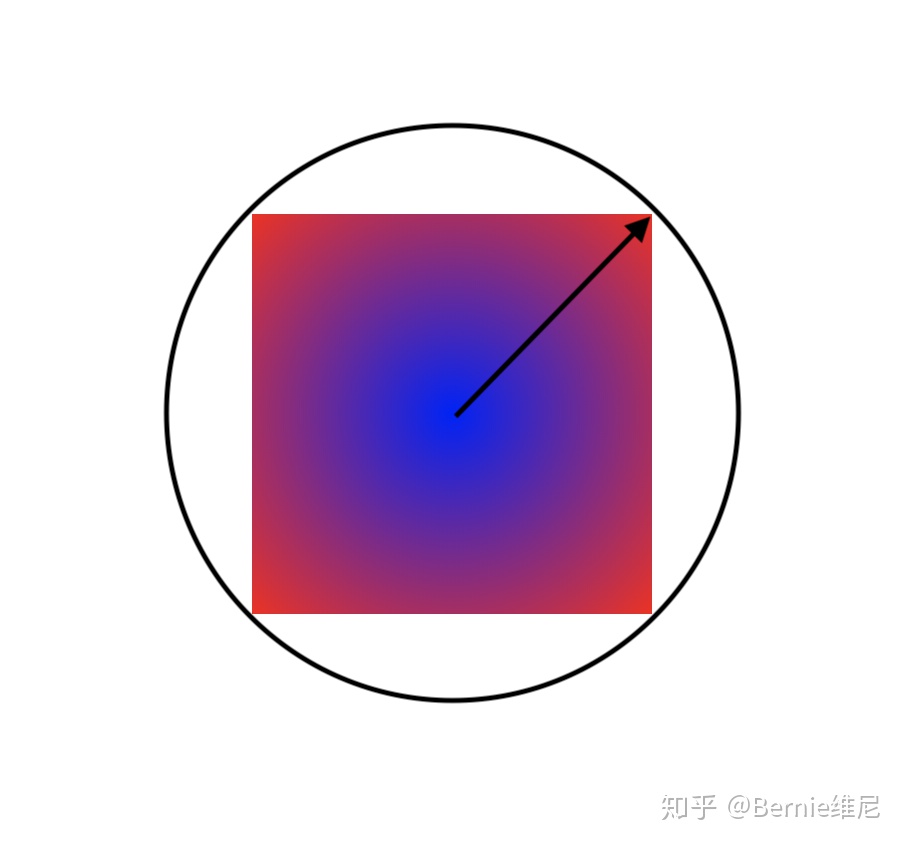
颜色按所给出的依次渐变排列,可以是多个颜色。
.canvas {
  width: 200px;
  height: 200px;
  background: radial-gradient( blue, red, yellow, red );
}
默认径向图形是一个圆,如果要指定图形可以这么写
.canvas {
  width: 200px;
  height: 200px;
  background: radial-gradient( circle, blue, red );
}
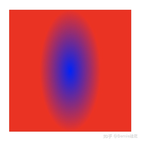
如果我们改下,改成 x 轴半径50px,y 轴半径100px 的椭圆,这么写:
.canvas {
  width: 200px;
  height: 200px;
  background: radial-gradient( 50px 100px ellipse, blue, red );
}
渐变半径
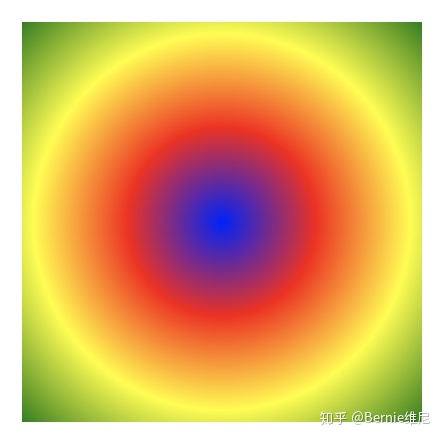
默认每种颜色的渐变分布是均匀的,但是你可以指定每个颜色的渐变半径,可以是像素或者百分比,譬如:
.canvas {
width: 200px;
height: 200px;
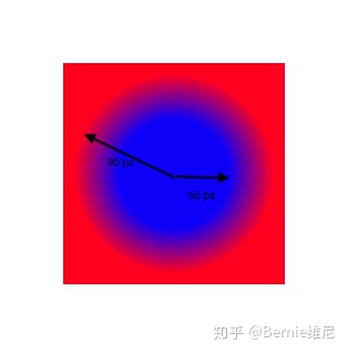
background: radial-gradient( circle, blue 50px, red 90px );
}
或者
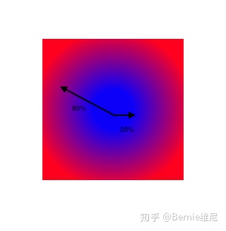
.canvas {
  width: 200px;
  height: 200px;
  background: radial-gradient( circle, blue 20%, red 80% );
}
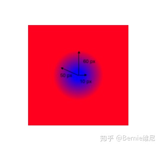
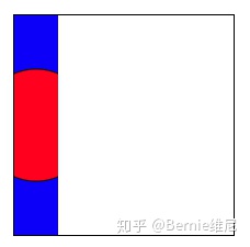
我还可以指定渐变的终止半径(写在circle前面),也就是说在这个半径内,颜色是渐变的,这个半径外,颜色是平铺的:
.canvas {
  width: 200px;
  height: 200px;
  background: radial-gradient( 60px circle, blue 10px, red 50px );
}
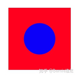
这里有一个特殊情况,当两个相邻的颜色的渐变半径相差很小时,很难看出来渐变效果,几乎就变成了分隔线:
.canvas {
  width: 200px;
  height: 200px;
  background: radial-gradient( circle, blue 50px, red 51px );
}
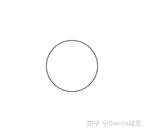
画圆
如果我们要模拟用黑色线单纯的画一个圆,那么就是:
.canvas {
  width: 200px;
  height: 200px;
  background: radial-gradient( circle, transparent 50px, black 51px, transparent 52px );
}
画曲线
上面是一个完整的圆,如果只需要画任意一段曲线,可以通过 background-size 来缩小这个作为背景的圆的边界,达到截取弧的目的。
.canvas {
  width: 200px;
  height: 200px;
  background: radial-gradient( circle, transparent 50px, black 51px, transparent 52px ) no-repeat;
  background-size: 20%;
}
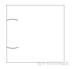
ps:还可以通过设置 background-position 来移动曲线对应的圆心的位置,以达到移动曲线的目的。
多重曲线
上面我们画了一条曲线,如果我一个 div 要画好几根这么办,background 这个属性可以设置多个 radial-gradient 真是太方便了:
.canvas {
  width: 200px;
  height: 200px;
  background: radial-gradient( circle at 0 0, transparent 150px, black 151px, transparent 152px ),
              radial-gradient( circle at 0 200px, transparent 150px, black 151px, transparent 152px ),
              radial-gradient( circle at 200px 0, transparent 150px, black 151px, transparent 152px ),
              radial-gradient( circle at 200px 200px, transparent 150px, black 151px, transparent 152px );
}
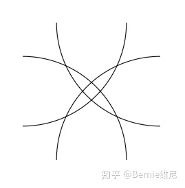
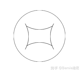
最后我们画一个实际的 icon 试试:
.canvas {
    width: 200px;
    height: 200px;
    background: radial-gradient( circle, transparent 99px, black 100px, transparent 101px ) no-repeat,
                radial-gradient( circle, transparent 99px, black 100px, transparent 101px ) no-repeat,
                radial-gradient( circle, transparent 99px, black 100px, transparent 101px ) no-repeat,
                radial-gradient( circle, transparent 99px, black 100px, transparent 101px ) no-repeat,
                radial-gradient( circle, transparent 99px, black 100px, transparent 101px ) no-repeat;
    background-position: 0, 50px -125px, -142px 52px, 142px 52px, 50px 125px;
    background-size: 100%, 100px 100%, 100% 100px, 100% 100px,100px 100%;
}
参考文献
- 10个demo示例学会CSS3 radial-gradient径向渐变;
- 一个div:css绘画


 3652
3652


 被折叠的 条评论
为什么被折叠?
被折叠的 条评论
为什么被折叠?
 到【灌水乐园】发言


