


实例 仿PHP中文网手机端首页
html>
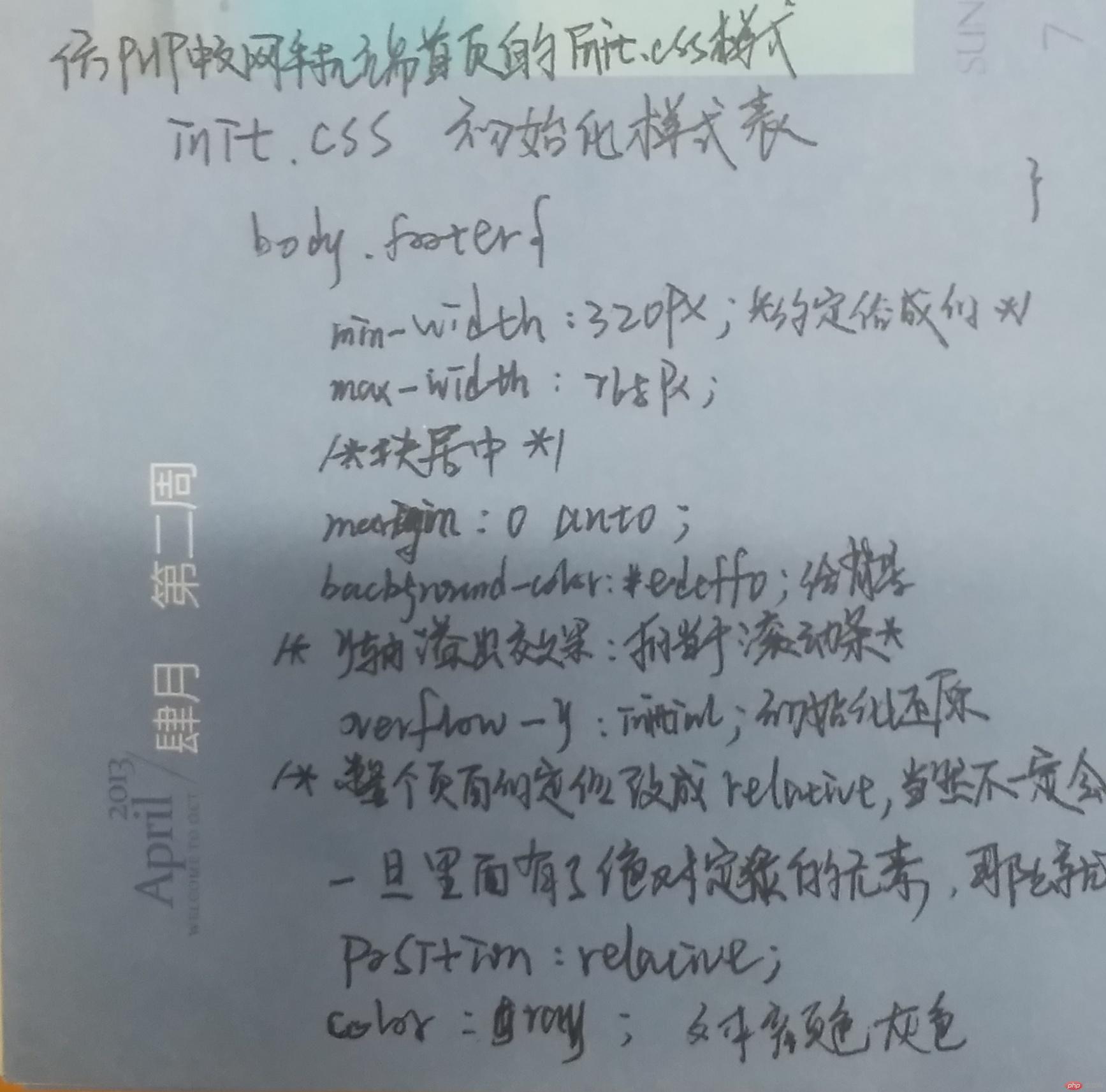
仿php中文网手机版首页/*初始样式*/
body, footer{
min-width: 320px;
max-width: 768px;
margin: 0 auto;
background: #edeff0;
overflow-y: initial;
position: relative;
color: gray;
/*不要出现水平滚动条*/
overflow-x: hidden;
/*设置点击链接跳转时出现高亮,设置为透明: ios / ipad*/
-webkit-tap-highlight-color: transparent;
}
/*设置所有图片全部自适应父容器,响应式显示*/
img {
width: 100%;
}
ul, li {
margin: 0;
padding: 0;
}
li {
list-style: none;
}
a {
text-decoration: none;
color: gray;
}
/*************** 头部样式 ***************/
header {
/*固定定位*/
position: fixed;
top: 0;
/*固定定位元素必须设置宽度与高度*/
width: 100%;
height: 42px;
background: #444444;
color: white;
/*设置最小尺寸*/
min-width: 320px;
max-width: 768px;
/*转为Flex容器,设置元素排列*/
display: flex;
/*元素主轴分散,两端对齐*/
justify-content: space-between;
/*元素交叉轴居中对齐*/
align-items: center;
}
/*第一张,最后一设置通用样式*/
header > img:first-of-type,
header > img:last-of-type {
width: 26px;
height: 26px;
margin: 5px;
}
/*第一张用户头像应该是正圆*/
header > img:first-of-type {
border-radius: 50%; /* 13px */
}
/*设置中间LOGO样式*/
header > img {
width: 94px;
}
/*************** 轮播图设置 ***************/
.banner {
display: flex;
height: 200px;
}
/*************** 导航区 ***************/
nav {
background-color: white;
display: flex;
/*主轴为垂直方向, 禁止换行*/
flex-flow: column nowrap;
}
/*图片默认大小*/
nav img {
width: 45px;
height: 49px;
}
/*每一行导航都应该是一个弹性容器以方便布局*/
nav > ul {
display: flex;
/*每个菜单项水平且不换行*/
flex-flow: row nowrap;
}
/*每一菜单项均分全部空间*/
nav ul li {
flex: 1;
}
/*图片与文本应该做为一个组件,统一设置*/
nav ul li a {
display: flex;
/*图片, 链接文本垂直排列*/
flex-flow: column wrap;
/*交叉轴上居中显示*/
align-items: center;
/*外边距可以使菜单项之间不太拥挤*/
margin: 10px;
}
/*菜单项文本与上面图标有一个间隙*/
nav ul li a span {
margin-top: 5px;
}
/*************** 主体内容区 ***************/
/******** 推荐课程区 *******/
main {
display: flex;
flex-flow: column nowrap;
}
/*设置水平排列的推荐课程*/
main > .recommend > section:first-of-type {
display: flex;
flex-flow: row nowrap;
}
/*每个课程图片平分全部空间*/
main > .recommend > section:first-of-type > a {
margin: 8px;
flex: 1;
}
/*设置图片高度*/
main > .recommend > section:first-of-type > a > img {
height: 90px;
}
/*设置垂直排列的推荐课程*/
main > .recommend > section:nth-of-type(2) {
display: flex;
flex-flow: column nowrap;
}
main > .recommend > section:nth-of-type(2) > div {
background-color: #fff;
margin: 10px;
padding: 8px;
/*也转为弹性容器*/
display: flex;
flex-flow: row nowrap;
}
main > .recommend > section:nth-of-type(2) > div img {
width: 350px;
height: 90px;
}
main > .recommend > section:nth-of-type(2) > div > span {
display: flex;
/*文本垂直排列*/
flex-flow: column nowrap;
padding-left: 10px;
}
main > .recommend > section:nth-of-type(2) > div > span span{
margin: 12px 0;
font-size: x-small;
}
main > .recommend > section:nth-of-type(2) > div > span i {
font-style: normal;
background-color: #333333;
color: white;
border-radius: 8px;
padding: 0 5px;
}
/******** 最新更新 *******/
main > .recommend > section:nth-of-type(3) > div{
/*转为弹性盒子*/
display: flex;
/*让内容离边框有点间隙*/
padding: 8px;
/*每一条内容之间有间隙*/
margin: 20px 0;
/*添加背景色*/
background-color: #ffffff;
}
main > .recommend > section:nth-of-type(3) > div > span{
/*清除父级盒子内边距边框对该盒子的影响*/
box-sizing: border-box;
/*给盒子固定宽高*/
width: 420px;
height: 80px;
/*转弹性盒子*/
display: flex;
/*主轴垂直不换行*/
flex-flow: column nowrap;
/*元素在主轴上两端对齐其余平分剩余空间*/
justify-content: space-between;
/*与图片有一点间距*/
margin-left: 10px;
}
main > .recommend > section:nth-of-type(3) > div > span > span:nth-of-type(2){
font-size: x-small;
}
main > .recommend > section:nth-of-type(3) > div > span > span:nth-of-type(3){
/*清除父级盒子内边距边框对该盒子的影响*/
box-sizing: border-box;
/*转弹性盒子*/
display: flex;
/*元素在主轴上两端对齐其余平分剩余空间*/
justify-content: space-between;
/*字体小一倍*/
font-size: x-small;
}
main > .recommend > section:nth-of-type(3) > div > span > span:nth-of-type(3) > i{
/*清除父级盒子内边距边框对该盒子的影响*/
box-sizing: border-box;
/*给宽高更效果*/
width: 25px;
height: 16px;
/*字体转正常*/
font-style: normal;
/*加背景色*/
background-color:#444444;
/*字体颜色*/
color: white;
/*转弹性盒子*/
display: flex;
/*元素水平垂直居中*/
justify-content: center;
align-items: center;
/*加圆角*/
border-radius: 6px;
}
main > .recommend > section:nth-of-type(3) > div > span > span > span{
margin-right: 10px;
}
main > .recommend > section:nth-of-type(3) > div img{
/*清除父级盒子内边距边框对该盒子的影响*/
box-sizing: border-box;
/*图片给宽高*/
width: 295px;
height: 80px;
}
/******** 最新文章 *******/
main > .recommend > section:nth-of-type(4) > div{
/*转为弹性盒子*/
display: flex;
/*主轴上首尾元素紧贴容器首尾,其余元素平分剩余空间*/
justify-content: space-between;
/*让内容离边框有点间隙*/
padding: 8px;
/*每一条内容之间有间隙*/
margin: 10px 0;
/*添加背景色*/
background-color: #ffffff;
}
main > .recommend > section:nth-of-type(4) > div:last-of-type{
/*给盒子高度*/
height: 15px;
/*转弹性盒子*/
display: flex;
/*内容水平垂直居中*/
justify-content: center;
align-items: center;
/*给背景*/
background-color: #ffffff;
}
main > .recommend > section:nth-of-type(4) > div > span{
/*清除父级盒子内边距边框对该盒子的影响*/
box-sizing: border-box;
/*转弹性盒子*/
display: flex;
/*主轴垂直不换行*/
flex-flow: column nowrap;
/*字体加粗*/
font-weight: bold;
/*字体14px*/
font-size: 14px;
}
main > .recommend > section:nth-of-type(4) > div > span a:last-of-type{
/*日期的字体小一倍*/
font-size: x-small;
/*将位置向下移15px*/
margin-top: 15px;
/*字体正常*/
font-weight: normal;
}
main > .recommend > section:nth-of-type(4) > div img{
/*清除父级盒子内边距边框对该盒子的影响*/
box-sizing: border-box;
/*图片给宽高*/
width: 218px;
height: 65px;
}
/******** 最新博文*******/
main > .recommend > section:nth-of-type(5) > div{
/*转为弹性盒子*/
display: flex;
/*主轴垂直不换行*/
flex-flow: column nowrap;
/*让内容离边框有点间隙*/
padding: 8px;
/*每一条内容之间有间隙*/
margin: 10px 0;
/*添加背景色*/
background-color: #ffffff;
}
main > .recommend > section:nth-of-type(5) > div:last-of-type{
/*给盒子高度*/
height: 15px;
/*转弹性盒子*/
display: flex;
/*内容水平垂直居中*/
justify-content: center;
align-items: center;
/*给背景*/
background-color: #ffffff;
}
main > .recommend > section:nth-of-type(5) > div > span{
/*清除父级盒子内边距边框对该盒子的影响*/
box-sizing: border-box;
/*转弹性盒子*/
display: flex;
/*主轴上首尾元素紧贴容器首尾,其余元素平分剩余空间*/
justify-content: space-between;
/*给下边距看起来美观*/
margin-bottom: 15px;
/*字体加粗*/
font-weight: bold;
/*字体14px*/
font-size: 14px;
}
main > .recommend > section:nth-of-type(5) > div > span a:first-of-type{
/*给个高度,不让他撑得太大*/
height: 20px;
/*给个宽度更真实模拟原站*/
width: 510px;
}
main > .recommend > section:nth-of-type(5) > div > span a:last-of-type{
/*日期的字体小一倍*/
font-size: x-small;
/*与左边水平对齐*/
margin-top: 5px;
/*字体正常*/
font-weight: normal;
}
/******** 最新问答*******/
main > .recommend > section:nth-of-type(6) > div{
/*转为弹性盒子*/
display: flex;
/*主轴垂直不换行*/
flex-flow: column nowrap;
/*让内容离边框有点间隙*/
padding: 8px;
/*每一条内容之间有间隙*/
margin: 10px 0;
/*添加背景色*/
background-color: #ffffff;
}
main > .recommend > section:nth-of-type(6) > div:last-of-type{
/*给盒子高度*/
height: 15px;
/*转弹性盒子*/
display: flex;
/*内容水平垂直居中*/
justify-content: center;
align-items: center;
/*给背景*/
background-color: #ffffff;
margin-bottom: 60px;
}
main > .recommend > section:nth-of-type(6) > div > span{
/*清除父级盒子内边距边框对该盒子的影响*/
box-sizing: border-box;
/*转弹性盒子*/
display: flex;
/*主轴上首尾元素紧贴容器首尾,其余元素平分剩余空间*/
justify-content: space-between;
/*给下边距看起来美观*/
margin-bottom: 15px;
/*字体加粗*/
font-weight: bold;
/*字体14px*/
font-size: 14px;
}
main > .recommend > section:nth-of-type(6) > div > span a:first-of-type{
/*给个高度,不让他撑得太大*/
height: 20px;
/*给个宽度更真实模拟原站*/
width: 510px;
}
main > .recommend > section:nth-of-type(6) > div > span a:last-of-type{
/*日期的字体小一倍*/
font-size: x-small;
/*与左边水平对齐*/
margin-top: 5px;
/*字体正常*/
font-weight: normal;
}
/*底部*/
footer{
/*固定定位*/
position: fixed;
bottom: 0;
/*固定定位元素必须设置宽度与高度*/
width: 100%;
height: 50px;
/*添加上边框*/
border-top: 1px solid lightgray;
/*padding: 5px;*/
/*转弹性盒子*/
display: flex;
/*主轴上弹性元素周围宽度相同,相同两个元素间宽度叠加*/
justify-content: space-around;
}
footer a{
/*清除父级盒子内边距边框对该盒子的影响*/
box-sizing: border-box;
/*设置宽高*/
height: 50px;
width: 147px;
/*距边框一点间隙*/
padding: 5px 0;
/*转弹性盒子*/
display: flex;
/*主轴垂直不换行*/
flex-flow: column nowrap;
/*元素水平垂直居中*/
justify-content: center;
align-items: center;
}
footer a:first-of-type{
/*前景色*/
color: red;
}
footer a img{
/*图标给宽高*/
height: 16px;
width: 16px;
/*图标居文字中间*/
margin-bottom: 2px;
margin-left: 2px;
}
HTML/CSS
JavaScript
服务端
数据库
移动端
手册
工具
直播
推荐课程
CI框架30分钟极速入门
中级49738次播放
2018前端入门基础
初级209952次播放
最新更新
2019python自学视频
本课程适合想从零开始学习 Python 编程语言的开发人员。由浅入深的带你进入p---
初级3909次播放
PHP开发免费公益直播课
主讲:php中文网-朱老师( Peter Zhu) 时间:2019.10.17 晚 20:00-22:00 主题---
初级2098次播放
从零开始到WEB响应式布局
重点介绍了HTML、CSS、web布局前端核心技术,通过视频讲解,了解可以利---
初级4429次播放
PHP文件基础操作
好多同学在PHP基础的时候对PHP文件的操作了解的不够多,本节课就带着大家---
中级2099次播放
memcache基础课程
本课程带你从零认识memcache,让你在一小时左右轻松掌握---
初级1003次播放
微信小程序--企业微网站
1,介绍小程序、开发者工具 2,介绍小程序文档 3,微官网项目 4,首页、产品---
初级4560次播放
最新文章
php常量存储的数据只能是哪些数据类型
发布时间:2019-11-16
php怎么将字符串炸开
发布时间:2019-11-16
再次回归!Discuz论坛重新恢复运营!
发布时间:2019-11-16
java是代表什么?
发布时间:2019-11-16
CentOS 8.0 今天已正式发布!一起看看有哪些新特性
发布时间:2019-09-25
最新博文
float浮动是魔鬼,如用需谨慎
2019-11-16
docker 常用命令
2019-11-15
Got permission denied while trying to connect to the Docker...
2019-11-13
centos7.2 安装go 环境
2019-11-13
前端常见的十道面试题
2019-11-12
最新问答
Laravel中文件上传的问题
2019-11-18
如何在一个php中读取两个表中的数据求破
2019-11-18
用UserModel::where('id',$id)->data($data)->update() 的方式来更新数据...
2019-11-18
phpcms后台登陆不了怎么办
2019-11-17
配置Apache时,添加对PHP的支持时语法错误
2019-11-17
首页
视频
社区
我的
运行实例 »
点击 "运行实例" 按钮查看在线实例
手写代码:


 94
94


 被折叠的 条评论
为什么被折叠?
被折叠的 条评论
为什么被折叠?
 到【灌水乐园】发言


