


声明:以上封面引自css3的搜索结果_百度图片搜索
本文章的demo引自:
纯CSS实现轮播图效果,你不知道的CSS3黑科技 - 悟空前端 - 博客园www.cnblogs.com
github文章地址:
css3系列之css动画 · Issue #1 · yaodebian/bloggithub.com
css动画是css3中新添加的特性,为我们提供了很多很方便的css特效,以前很多需要借助js(或者gif动效图)来完成的动画效果,简单通过css就能完成。
一.动画规则
css的动画的实现分两步:
- 通过@keyframes设置动画过渡规则
- 将动画规则部署到html元素中
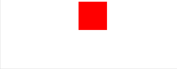
首先我们给出一个小示例:
<div id="box"></div>
/* 1.设置动画  */
@keyframes animation {
  from {background: red;}
  to {background: yellow;}
}

@-webkit-keyframes animation {
  from {background: red;}
  to {background: yellow;}
}

/* 2.部署动画  */
#box {
  width: 100px;
  height: 100px;
  margin: 0 auto;
  animation: animation 5s;
  -webkit-animation: animation 5s; /* Safari 与 Chrome */
}
二.css3动画属性
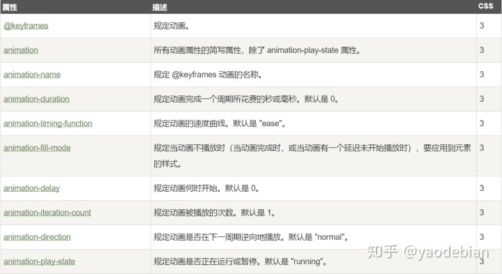
1.@keyframes(关键帧)规则
语法:
@keyframes animationname(规则名或者动画名) {

  keyframes-selector(关键帧选择器,用于标记动画的时间阶段){css-styles;}

}
规则的设置实际上是设置不同阶段下特定css样式的值,比如之前我们设置的:
@keyframes animation {
  from {background: red;}
  to {background: yellow;}
}
上面的from和to分别代表动画的开始点和结束点,分别可以用0%和100%来表示,如:
@keyframes animation {
  0% {background: red;}
  100% {background: yellow;}
}
2.animation-name(指定关键帧的名称)
语法:
animation-name: keyframename | none;
值说明keyframename指定要绑定到选择器的关键帧名称none指定没有动画(可用于覆盖从级联的动画)
3.animation-duration(指定动画播放完成花费的时间)
语法:
animation-duration: time;
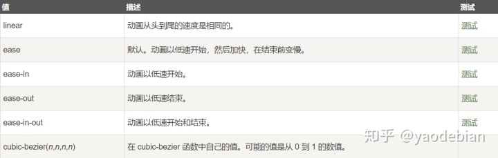
4.animation-timing-function(动画速度曲线函数)
语法:
animation-timing-function: value;
animation-timing-function使用的数学函数,称为三次贝塞尔曲线,速度曲线。使用此函数,您可以使用您自己的值,或使用预先定义的值之一:
5.animation-fill-mode
animation-fill-mode 属性规定当动画不播放时(当动画完成时,或当动画有一个延迟未开始播放时),要应用到元素的样式。
默认情况下,CSS 动画在第一个关键帧播放完之前不会影响元素,在最后一个关键帧完成后停止影响元素。animation-fill-mode 属性可重写该行为。
语法:
animation-fill-mode: none|forwards|backwards|both|initial|inherit;
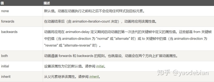
该css属性主要的两个值为forwards和backwards,还是能够很简单地理解的:
forwards表示当动画结束时,不会消除动画对HTML的影响,而是会将to关键帧中的css样式应用于元素中;
backwards则相反,动画延迟期间,会将from关键帧中的css样式应用于元素中(正常情况下);
6.animation-delay(动画延迟)
动画开始阶段的延迟时间
7.animation-iteration-count(动画播放次数)
它有两种值,一个数字n,或者"infinite"(表示动画无限次播放)
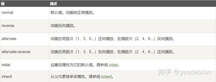
8.animation-direction(定义动画播放的方向)
语法:
animation-direction: normal|reverse|alternate|alternate-reverse|initial|inherit;
9.animation-play-state(指定动画的运行和暂停状态)
它仅有两个值:paused和running
10.animation(所有动画属性的缩写)
语法:
animation: name duration timing-function delay iteration-count direction fill-mode play-state
除了语法格式中的这些值,还有initial和inherit
三.css动画简单运用之——实现一个简单的轮播器
demo全部代码请详见:
https://github.com/yaodebian/Carousel/tree/master/%E7%BA%AFcss%E5%AE%9E%E7%8E%B0%E8%BD%AE%E6%92%AD%E6%95%88%E6%9E%9C/demo2github.com
首先,我们先来看下效果图:

html:
<div id="carousel-box">
    <!-- 表示图片顺序的索引 -->
    <a id="a1" class="num">1</a>
    <a id="a2" class="num">2</a>
    <a id="a3" class="num">3</a>
    <a id="a4" class="num">4</a>
    <a id="a5" class="num">5</a>
    <!-- 设定为五张图片 -->
    <div id="carousel-item">
      <img src="./imgs/1.jpg" alt="">
      <img src="./imgs/3.jpg" alt="">
      <img src="./imgs/4.jpg" alt="">
      <img src="./imgs/5.jpg" alt="">
      <img src="./imgs/2.jpg" alt="">

      <!-- 五张图片的标题 -->
      <ul id="showTag">
        <li>图片一</li>
        <li>图片二</li>
        <li>图片三</li>
        <li>图片四</li>
        <li>图片五</li>
      </ul>
    </div>
  </div>
css:
首先,我们先将整个轮播框的宽度固定为每张图片的宽度:
#carousel-box {
  position: relative;
  width: 300px;
  height: 200px;
  border-radius: 5px;
  margin: 0 auto;
  overflow: hidden;
}
因为是通过css来实现轮播的效果,所以我们设定为5张图片,并将每张图片平铺开来形成一张图片:
#carousel-item {
  position: absolute;
  width: calc(300px  *  5);
}

/* 将轮播器中的每张图片平铺开来形成一张图片  */
#carousel-item  img {
  float: left;
  width: 300px;
  height: 200px;
}
调整标题和轮播数字索引的位置:
#showTag {
  position: absolute;
  /* 调整标题项的垂直位置 */
  top: 10px;
  opacity: 0.5;
}

#showTag  li {
  /* 根据图片宽度来设定标题宽度,并让标题平铺以放置在对应的轮播图片中 */
  width: 200px;
  height: 20px;
  line-height: 20px;
  margin: 0  50px;
  float: left;
  text-align: center;
  color: #fff;
  border-radius: 10px;
  background: #000;
}

/* 设定图片索引位置 */
.num {
  width: 25px;
  height: 25px;
  color: #666;
  text-align: center;
  line-height: 25px;
  cursor: pointer;
  background: #fff;
  border-radius: 50%;
  position: absolute;
  z-index: 10;
  bottom: 10px;
  right: 10px;
  display: block;
  opacity: 0.8;
}

/* 调整索引位置 */
.num:nth-child(4) {
  margin-right: 30px;
}
.num:nth-child(3) {
  margin-right: 60px;
}
.num:nth-child(2) {
  margin-right: 90px;
}
.num:nth-child(1) {
  margin-right: 120px;
}
由于之前我们将图片平铺开来放在#carousel-item容器中,故而我们的轮播动态仅仅只要移动#carousel-item容器的位置即可:
/* 初试轮播动画 */
@keyframes initAnimation {
  /* 0-4s */
  0%, 20% {
    margin-left: 0px;
  }
  /* 4-8s */
  25%, 40% {
    margin-left: -300px;
  }
  /* 8-12s */
  45%, 60% {
    margin-left: -600px;
  }
  /* 12-16s */
  65%, 80% {
    margin-left: -900px;
  }
  /* 16-20s */
  85%, 100% {
    margin-left: -1200px;
    }
}

/* 动画部署 */
#carousel-item {
  animation: initAnimation 20s ease-out infinite;
}
索引悬浮触发高亮效果和轮播滚动:
/* 索引悬浮高亮效果 */
.num:hover {
  color: #fff;
  cursor: pointer;
  background: #f00;
}

/* 轮播悬浮暂停效果 */
#carousel-item:hover, .num:hover {
  animation-play-state: paused;
}

/* 索引悬浮触发动画 */
@keyframes Anim1 {
  100% {
    margin-left: 0;
  }
}

@keyframes Anim2 {
  100% {
    margin-left: -300px;
  }
}
@keyframes Anim3 {
  100% {
    margin-left: -600px;
  }
}
@keyframes Anim4 {
  100% {
    margin-left: -900px;
  }
}
@keyframes Anim5 {
  100% {
    margin-left: -1200px;
  }
}

/* 索引触发轮播效果 */
#a1:hover ~ #carousel-item {
  animation: Anim1 .5s ease-out forwards;
}
#a2:hover ~ #carousel-item {
  animation: Anim2 .5s ease-out forwards;
}
#a3:hover ~ #carousel-item {
  animation: Anim3 .5s ease-out forwards;
}
#a4:hover ~ #carousel-item {
  animation: Anim4 .5s ease-out forwards;
}
#a5:hover ~ #carousel-item {
  animation: Anim5 .5s ease-out forwards;
}
不过以上仍有很多缺陷和不足:
- 轮播索引不能实时滚动;
- 索引触发滚动后不能从当前轮播图片轮播,而是从第一张图片开始;


 被折叠的 条评论
为什么被折叠?
被折叠的 条评论
为什么被折叠?
 到【灌水乐园】发言


