


Part1效果展示

HTMLPart2Demo代码
html>
DocumentCSS
html, body {
margin: 0;
height: 100%;
}
body {
display: flex;
justify-content: center;
align-items: center;
background: #263238;
}
section {
width: 650px;
height: 300px;
padding: 10px;
position: relative;
display: flex;
align-items: center;
justify-content: center;
/* 红色边框仅作提示 */
border: 2px solid red;
}
span {
width: 96px;
height: 96px;
display: inline-block;
position: relative;
animation: zeroRotation 2s linear infinite alternate;
}
span::before, span::after {
content: '';
position: absolute;
background: red;
width: 32px;
height: 32px;
border-radius: 50%;
}
span::before {
bottom: 0;
right: 0;
}
span::after {
left: 0;
top: 0;
}
@keyframes zeroRotation {
0% {
transform: scale(1) rotate(0deg)
}
100% {
transform: scale(0) rotate(360deg)
}
}
Part3原理详解
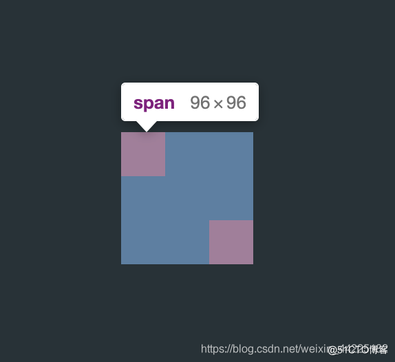
步骤1
使用span标签,设置为
宽度、高度均为96px
相对定位span {
width: 96px;
height: 96px;
position: relative;
}
步骤2
利用span::before、span::after伪类元素,作为红色小球部分
设置为
绝对定位
宽度、高度均为:32px
before位于左上角
after位于右下角
效果图如下

检查span元素
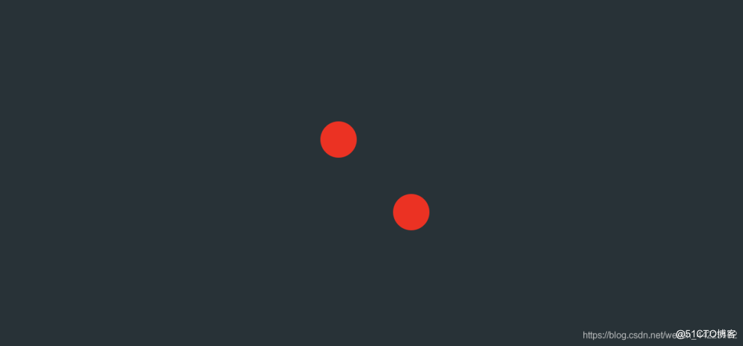
步骤3
span::before、span::after圆角化
border-radius: 50%;
效果图如下
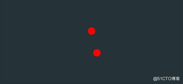
步骤4
为span添加动画
要求:
0-360旋转
旋转的同时 缩小span的大小
交替循环
关键帧
初始状态:从0度开始,大小为1(相对于原大小)
最终状态:到达360度,此时大小为0(相对于原大小)
变换过程(均匀变换)
角度:0-360度
大小:0-》1(相对于原大小)animation: zeroRotation 2s linear infinite alternate;
@keyframes zeroRotation {
0% {
transform: scale(1) rotate(0deg)
}
100% {
transform: scale(0) rotate(360deg)
}
}
效果图如下
https://mp.weixin.qq.com/s/RTuK5SRtd10ySIhqkXGBfg


 1万+
1万+


 被折叠的 条评论
为什么被折叠?
被折叠的 条评论
为什么被折叠?
 到【灌水乐园】发言


