


1. 实例演示如何消除子元素浮动造成父元素高度折叠的影响
实例
html>
.box1 {
width: 300px;
background: lightblue;
border: 5px dashed black;
}
.box2 {
width: inherit;
height: 300px;
background: lightcoral;
}
.box2 {
float: left;
}
.box1 {
overflow: hidden;
}
消除浮动影响运行实例 »
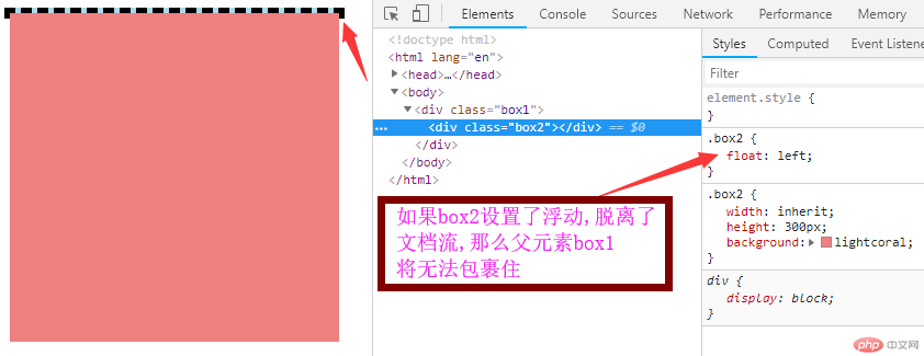
点击 "运行实例" 按钮查看在线实例当子元素 浮动后,会脱离文档流,父元素无法再包裹,就会有问题
解决办法有几种:
1:通过修改父元素高度来解决,此种方法,比较繁琐(不推荐)
2:父元素与子元素都浮动,但是遇到多层嵌套时,会非常的复杂(不推荐)
3:在浮动元素后加上
工作量的复杂性(不推荐)
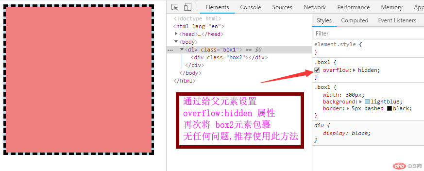
4:为父元素添加 overflow:hidden 属性 ,轻松 简单解决浮动影响问题,(推荐使用)
2. 实例演示三列布局的实现原理( 绝对定位实现, 浮动定位实现)
浮动定位实现 三列布局:
实例
html>
.container {
width: 1000px;
margin: 0 aoto;
}
.header,
.footer {
height: 60px;
background: lightgrey;
}
.main {
margin: 5px auto;
background-color: lemonchiffon;
position: relative;
}
.left {
width: 200px;
min-height: 800px;
background: aquamarine;
}
.content {
min-height: 800px;
background: bisque;
}
.right {
width: 200px;
min-height: 800px;
background: cornflowerblue;
}
.left {
position: absolute;
top: 0px;
left: 0px;
}
.right {
position: absolute;
top: 0px;
right: 0px;
}
.content {
margin-left: 200px;
margin-right: 200px;
}
Document运行实例 »
点击 "运行实例" 按钮查看在线实例
浮动定位实现三列布局:

实例
html>
.container {
width: 1000px;
margin: 0 aoto;
}
.header,
.footer {
height: 60px;
background: lightgrey;
}
.main {
margin: 5px auto;
background-color: lemonchiffon;
overflow: hidden;
}
.left {
width: 200px;
min-height: 800px;
background: lightcoral;
}
.content {
min-height: 800px;
background: bisque;
}
.right {
width: 200px;
min-height: 800px;
background: lightseagreen;
}
.left {
float: left;
}
.right {
float: right;
}
.content {
float: left;
width: 600px;
}
Document运行实例 »
点击 "运行实例" 按钮查看在线实例总结:
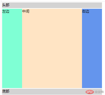
清除浮动影响,在父元素上增加 overflow:hidden 效果更好,更简便,推荐使用
绝对定位 在父元素上用 relative 定位 然后 对 left元素设置(top left) right元素设置 (top right) 中间 content 左右设置 margin 值,自动挤出
浮动定位 给父元素 设置 overflow:hidden 清除浮动影响 再使 left (float-left) right (float-left) 分别 设置浮动 方向
最后计算出中间 width值
对于没基础的我来说,听起来有点抽象,原理上能理解,希望经过以后更多的实战,来透彻的理解


 1345
1345


 被折叠的 条评论
为什么被折叠?
被折叠的 条评论
为什么被折叠?
 到【灌水乐园】发言


