


引言
其实很早就想写一篇关于 css 的文章了。(拖延症,一直没写。。。)
css 发展到今天已经越来越强大了。其语法的日新月异,让很多以前完成不了的事情,现在可以非常轻松的做到。
今天带大家看几个用css(部分会用到canvas和js)实现的好玩儿的效果(不好好琢磨下,还真写不出来)
本篇文章有参考一些
css大佬的杰作,具体参考链接在文末有提及
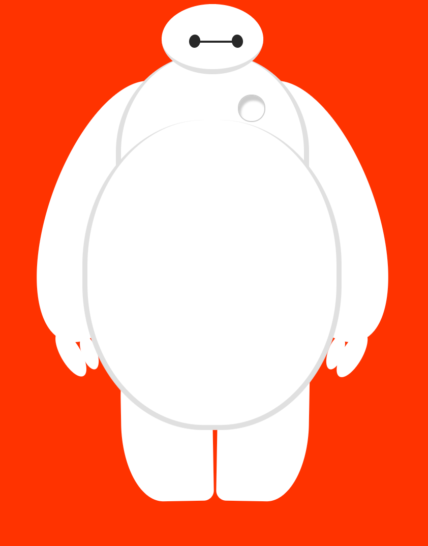
超能陆战队-大白
超能陆战队中的大白,相信你一定不陌生吧。影片中的大白又萌又可爱,十分惹人喜欢。
下面让我们打造属于自己的大白吧!
效果
思路
大白主要是由大大小小的圆和椭圆组成,主要会用到border-radius属性。
整体bigwhite由头部head(包含 eye、eye2 和 mouth)、躯干torso(heart)、躯干连接处belly(cover)、左臂left-arm(包含 l-bigfinger、l-smallfinger)、右臂right-arm(包含 r-bigfinger、r-smallfinger)、左腿left-leg和右腿right-leg组成。
相对还是比较简单的,具体实现如下:
代码实现
html
<body>
<div id="bigwhite">

<div id="head">
<div id="eye">div>
<div id="eye2">div>
<div id="mouth">div>
div>


<div id="torso">
<div id="heart">div>
div>
<div id="belly">
<div id="cover">div>

div>


<div id="left-arm">
<div id="l-bigfinger">div>
<div id="l-smallfinger">div>
div>


<div id="right-arm">
<div id="r-bigfinger">div>
<div id="r-smallfinger">div>
div>


<div id="left-leg">div>


<div id="right-leg">div>
body>
css
body {
background: #ff3300;
}
#bigwhite {
margin: 0 auto;
height: 600px;
/*隐藏溢出*/
overflow: hidden;
}
#head {
height: 64px;
width: 100px;
/*画圆*/
border-radius: 50%;
background: #fff;
margin: 0 auto;
margin-bottom: -20px;

border-bottom: 5px solid #e0e0e0;

/*元素的堆叠顺序*/
z-index: 100;

position: relative;
}

#eye,
#eye2 {
width: 11px;
height: 13px;
background: #282828;
border-radius: 50%;
position: relative;
top: 30px;
left: 27px;

/*旋转元素*/
transform: rotate(8deg);
}
#eye2 {
/*对称旋转*/
transform: rotate(-8deg);
left: 69px;
top: 17px;
}
#mouth {
width: 38px;
height: 1.7px;
background: #282828;
position: relative;
top: 10px;
left: 34px;
}

#torso,
#belly {
margin: 0 auto;
height: 200px;
width: 180px;
background: #fff;
border-radius: 47%;

border: 5px solid #e0e0e0;
border-top: none;
z-index: 1;
}
#belly {
height: 300px;
width: 245px;
margin-top: -140px;
z-index: 5;
}
#heart {
width: 25px;
height: 25px;
border-radius: 50px;
position: relative;
/*添加阴影*/
box-shadow: 2px 5px 2px #ccc inset;

right: -115px;
top: 40px;
z-index: 111;
border: 1px solid #ccc;
}

#left-arm,
#right-arm {
height: 270px;
width: 120px;
border-radius: 50%;
background: #fff;
margin: 0 auto;
position: relative;
top: -350px;
left: -100px;
transform: rotate(200deg);
z-index: -1;
}
#right-arm {
transform: rotate(-200deg);
left: 100px;
top: -620px;
}

#l-bigfinger,
#r-bigfinger {
height: 50px;
width: 20px;
border-radius: 50%;
background: #fff;
position: relative;
top: -35px;
left: 39px;
transform: rotate(-50deg);
}
#r-bigfinger {
left: 63px;
transform: rotate(50deg);
}
#l-smallfinger,
#r-smallfinger {
height: 35px;
width: 15px;
border-radius: 50%;
background: #fff;
position: relative;
top: -70px;
left: 25px;
transform: rotate(-40deg);
}
#r-smallfinger {
background: #fff;
transform: rotate(40deg);
top: -70px;
left: 80px;
}

#left-leg,
#right-leg {
height: 170px;
width: 90px;
border-radius: 40% 30% 10px 45%;
background: #fff;
position: relative;
top: -640px;
left: -45px;
transform: rotate(-1deg);
margin: 0 auto;
z-index: -2;
}
#right-leg {
border-radius: 40% 30% 45% 10px;
position: relative;
margin: 0 auto;
top: -810px;
left: 50px;
transform: rotate(1deg);
}
具体可查看https://codepen.io/jack-cool-the-lessful/pen/vYOYoPp
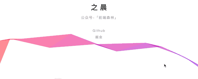
飘逸灵动的彩带(借鉴尤雨溪博客首页)
很早之前见过这种效果(当时还不知道这是尤大大的作品)。
第一次看到这个主页的时候,就觉得很惊艳。主页图案的组成元素只有一种:富有魅力的三角网格。整个页面简单却不单调,华丽而不喧闹。(简单来说就是有逼格)。
效果
思路
这里最关键的两个点,绘制三角形的算法和颜色的取值算法。具体参考https://zhuanlan.zhihu.com/p/28257724,这里面介绍的比较详细。
下面看一下代码实现(有注释):
代码
html
<body>
<div id="wrapper">
<h1>之晨h1>
<h2>公众号-「前端森林」h2>
<p>
<a href="https://github.com/Jack-cool" target="_blank">Githuba>
p>
<p>
<a href="https://juejin.im/user/5a767928f265da4e78327344/activities" target="_blank">掘金a>
p>
<p>
div>
<canvas width="1920" height="917">canvas>
body>
css
html,
body {
overflow: hidden;
margin: 0;
}

body {
font-family: "Open Sans", "Helvetica Neue", "Hiragino Sans GB", "LiHei Pro",
    Arial, sans-serif;
color: #333;
}

#wrapper {
position: absolute;
left: 0;
width: 320px;
text-align: center;
top: 50%;
left: 50%;
margin-left: -160px;
margin-top: -160px;
-webkit-user-select: none;
-moz-user-select: none;
user-select: none;
}

h1 {
font-family: "Montserrat", "Helvetica Neue", Arial, sans-serif;
font-weight: 700;
font-size: 30px;
letter-spacing: 9px;
text-transform: uppercase;
margin: 12px 0;
left: 4px;
}

h2 {
color: #999;
font-weight: normal;
font-size: 15px;
letter-spacing: 0.12em;
margin-bottom: 30px;
left: 3px;
}

h1,
h2 {
position: relative;
}

p {
font-size: 14px;
line-height: 2em;
margin: 0;
letter-spacing: 2px;
}

canvas {
position: absolute;
top: 0;
left: 0;
z-index: 0;
width: 100%;
height: 100%;
pointer-events: none;
}

a {
color: #999;
text-decoration: none;
transition: color 0.2s ease;
}

a:hover {
color: #f33;
}
js
document.addEventListener("touchmove", function(e) {
  e.preventDefault();
});
var canvasRibbon = document.getElementsByTagName("canvas")[0],
  ctx = canvasRibbon.getContext("2d"), // 获取canvas 2d上下文
  dpr = window.devicePixelRatio || 1, // the size of one CSS pixel to the size of one physical pixel.
  width = window.innerWidth, // 返回窗口的文档显示区的宽高
  height = window.innerHeight,
  RIBBON_WIDE = 90,
  path,
  math = Math,
  r = 0,
  PI_2 = math.PI * 2, // 圆周率*2
  cos = math.cos, // cos函数返回一个数值的余弦值(-1~1)
  random = math.random; // 返回0-1随机数
canvasRibbon.width = width * dpr; // 返回实际宽高
canvasRibbon.height = height * dpr;
ctx.scale(dpr, dpr); // 水平、竖直方向缩放
ctx.globalAlpha = 0.6; // 图形透明度
function init() {
  ctx.clearRect(0, 0, width, height); // 擦除之前绘制内容
  path = [
    { x: 0, y: height * 0.7 + RIBBON_WIDE },
    { x: 0, y: height * 0.7 - RIBBON_WIDE }
  ];
// 路径没有填满屏幕宽度时,绘制路径
while (path[1].x < width + RIBBON_WIDE) {
    draw(path[0], path[1]); // 调用绘制方法
  }
}
// 绘制彩带每一段路径
function draw(start, end) {
  ctx.beginPath(); // 创建一个新的路径
  ctx.moveTo(start.x, start.y); // path起点
  ctx.lineTo(end.x, end.y); // path终点
var nextX = end.x + (random() * 2 - 0.25) * RIBBON_WIDE,
    nextY = geneY(end.y);
  ctx.lineTo(nextX, nextY);
  ctx.closePath();
  r -= PI_2 / -50;
// 随机生成并设置canvas路径16进制颜色
  ctx.fillStyle =
"#" +
    (
      ((cos(r) * 127 + 128) << 16) |
      ((cos(r + PI_2 / 3) * 127 + 128) << 8) |
      (cos(r + (PI_2 / 3) * 2) * 127 + 128)
    ).toString(16);
  ctx.fill(); // 根据当前样式填充路径
  path[0] = path[1]; // 起点更新为当前终点
  path[1] = { x: nextX, y: nextY }; // 更新终点
}
// 获取下一路径终点的y坐标值
function geneY(y) {
var temp = y + (random() * 2 - 1.1) * RIBBON_WIDE;
return temp > height || temp < 0 ? geneY(y) : temp;
}
document.onclick = init;
document.ontouchstart = init;
init();
具体可查看https://codepen.io/jack-cool-the-lessful/pen/rNVaBVL
知乎(老版本)首页动态粒子效果背景
效果
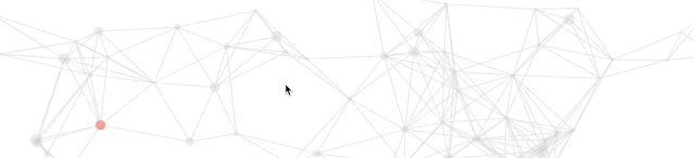
思路
涉及到的知识点主要是:canvas、ES6、requestAnimationFrame
大致思路就是:
- 定义一个类,创建圆和线的实例
- 设置单个粒子的随机 x,y 坐标和圆圈的半径。使用
window.innerWidth和window.innerHeight获取屏幕宽高,圆的大小设置在一定范围内随机
- 使用
canvas的 api 进行绘制粒子(圆圈)和粒子之间连线,设置一个范围,在此范围内的粒子圆心到圆心通过直线连接 - 让粒子在屏幕范围内移动
- 置鼠标的交互事件,相当于以鼠标位置的 x,y 坐标为圆心,固定或随机值为半径重新创建了一个粒子,并且也在一定范围内也设置和其他粒子的连线(同第二步)
- 定义一个变量用来存储生成的圆,遍历它,创建实例;
- 使用
requestAnimationFrame让所有圆动起来
代码实现
html
<canvas id="canvas">canvas>
css
html {
height: 100%;
}
body {
margin: 0;
height: 100%;
background: #fff;
}
canvas {
display: block;
width: 100%;
height: 100%;
}
js
class Circle {
//创建对象
//以一个圆为对象
//设置随机的 x,y坐标,r半径,_mx,_my移动的距离
//this.r是创建圆的半径,参数越大半径越大
//this._mx,this._my是移动的距离,参数越大移动
constructor(x, y) {
this.x = x;
this.y = y;
this.r = Math.random() * 10;
this._mx = Math.random();
this._my = Math.random();
  }

//canvas 画圆和画直线
//画圆就是正常的用canvas画一个圆
//画直线是两个圆连线,为了避免直线过多,给圆圈距离设置了一个值,距离很远的圆圈,就不做连线处理
  drawCircle(ctx) {
    ctx.beginPath();
//arc() 方法使用一个中心点和半径,为一个画布的当前子路径添加一条弧。
    ctx.arc(this.x, this.y, this.r, 0, 360);
    ctx.closePath();
    ctx.fillStyle = "rgba(204, 204, 204, 0.3)";
    ctx.fill();
  }

  drawLine(ctx, _circle) {
let dx = this.x - _circle.x;
let dy = this.y - _circle.y;
let d = Math.sqrt(dx * dx + dy * dy);
if (d < 150) {
      ctx.beginPath();
//开始一条路径,移动到位置 this.x,this.y。创建到达位置 _circle.x,_circle.y 的一条线:
      ctx.moveTo(this.x, this.y); //起始点
      ctx.lineTo(_circle.x, _circle.y); //终点
      ctx.closePath();
      ctx.strokeStyle = "rgba(204, 204, 204, 0.3)";
      ctx.stroke();
    }
  }

// 圆圈移动
// 圆圈移动的距离必须在屏幕范围内
  move(w, h) {
this._mx = this.x < w && this.x > 0 ? this._mx : -this._mx;
this._my = this.y < h && this.y > 0 ? this._my : -this._my;
this.x += this._mx / 2;
this.y += this._my / 2;
  }
}
//鼠标点画圆闪烁变动
class currentCirle extends Circle {
constructor(x, y) {
super(x, y);
  }

  drawCircle(ctx) {
    ctx.beginPath();
//注释内容为鼠标焦点的地方圆圈半径变化
//this.r = (this.r < 14 && this.r > 1) ? this.r + (Math.random() * 2 - 1) : 2;
this.r = 8;
    ctx.arc(this.x, this.y, this.r, 0, 360);
    ctx.closePath();
//ctx.fillStyle = 'rgba(0,0,0,' + (parseInt(Math.random() * 100) / 100) + ')'
    ctx.fillStyle = "rgba(255, 77, 54, 0.6)";
    ctx.fill();
  }
}
//更新页面用requestAnimationFrame替代setTimeout
window.requestAnimationFrame =
window.requestAnimationFrame ||
window.mozRequestAnimationFrame ||
window.webkitRequestAnimationFrame ||
window.msRequestAnimationFrame;

let canvas = document.getElementById("canvas");
let ctx = canvas.getContext("2d");
let w = (canvas.width = canvas.offsetWidth);
let h = (canvas.height = canvas.offsetHeight);
let circles = [];
let current_circle = new currentCirle(0, 0);

let draw = function() {
  ctx.clearRect(0, 0, w, h);
for (let i = 0; i < circles.length; i++) {
    circles[i].move(w, h);
    circles[i].drawCircle(ctx);
for (j = i + 1; j < circles.length; j++) {
      circles[i].drawLine(ctx, circles[j]);
    }
  }
if (current_circle.x) {
    current_circle.drawCircle(ctx);
for (var k = 1; k < circles.length; k++) {
      current_circle.drawLine(ctx, circles[k]);
    }
  }
  requestAnimationFrame(draw);
};

let init = function(num) {
for (var i = 0; i < num; i++) {
    circles.push(new Circle(Math.random() * w, Math.random() * h));
  }
  draw();
};
window.addEventListener("load", init(60));
window.onmousemove = function(e) {
  e = e || window.event;
  current_circle.x = e.clientX;
  current_circle.y = e.clientY;
};
window.onmouseout = function() {
  current_circle.x = null;
  current_circle.y = null;
};
具体可查看https://codepen.io/jack-cool-the-lessful/pen/YzXPzRy
canvas 生成验证码
我们在做一些后台系统登录功能的时候,一般都会用到验证码,现在用的比较多的一种是前端直接使用canvas生成验证码。
效果
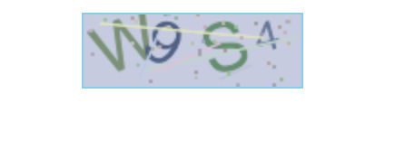
由于该功能相对比较简单,这里就不过多做解释了。(代码中有对应相关注解)
代码实现
html
<canvas width="120" height="40" id="c1">canvas>
css
body {
text-align: center;
}
canvas {
border: 1px solid skyBlue;
}
js
// 随机数
function rn(min, max) {
return parseInt(Math.random() * (max - min) + min);
}
// 随机颜色
function rc(min, max) {
var r = rn(min, max);
var g = rn(min, max);
var b = rn(min, max);
return `rgb(${r},${g},${b})`;
}
// 背景颜色,颜色要浅一点
var w = 120;
var h = 40;
var ctx = c1.getContext("2d");
ctx.fillStyle = rc(180, 230);
ctx.fillRect(0, 0, w, h);
// 随机字符串
var pool = "ABCDEFGHIJKLIMNOPQRSTUVWSYZ1234567890";
for (var i = 0; i < 4; i++) {
var c = pool[rn(0, pool.length)]; //随机的字
var fs = rn(18, 40); //字体的大小
var deg = rn(-30, 30); //字体的旋转角度
  ctx.font = fs + "px Simhei";
  ctx.textBaseline = "top";
  ctx.fillStyle = rc(80, 150);
  ctx.save();
  ctx.translate(30 * i + 15, 15);
  ctx.rotate((deg * Math.PI) / 180);
  ctx.fillText(c, -15 + 5, -15);
  ctx.restore();
}
// 随机5条干扰线,干扰线的颜色要浅一点
for (var i = 0; i < 5; i++) {
  ctx.beginPath();
  ctx.moveTo(rn(0, w), rn(0, h));
  ctx.lineTo(rn(0, w), rn(0, h));
  ctx.strokeStyle = rc(180, 230);
  ctx.closePath();
  ctx.stroke();
}
// 随机产生40个干扰的小点
for (var i = 0; i < 40; i++) {
  ctx.beginPath();
  ctx.arc(rn(0, w), rn(0, h), 1, 0, 2 * Math.PI);
  ctx.closePath();
  ctx.fillStyle = rc(150, 200);
  ctx.fill();
}
具体可查看https://codepen.io/jack-cool-the-lessful/pen/VwLYYbP
抖音 LOGO
抖音我们每天都在刷,抖音的 logo 大家也再熟悉不过。
效果
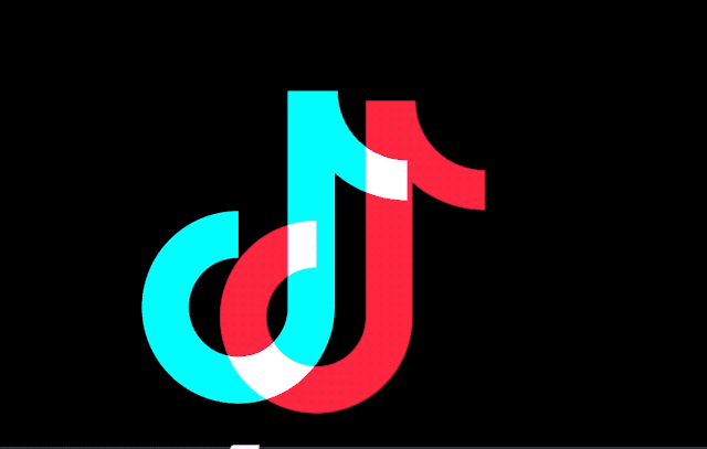
思路
抖音 logo 是两个音符 ♪ 叠加、混合而成的。这个音符可以拆分为三个部分:
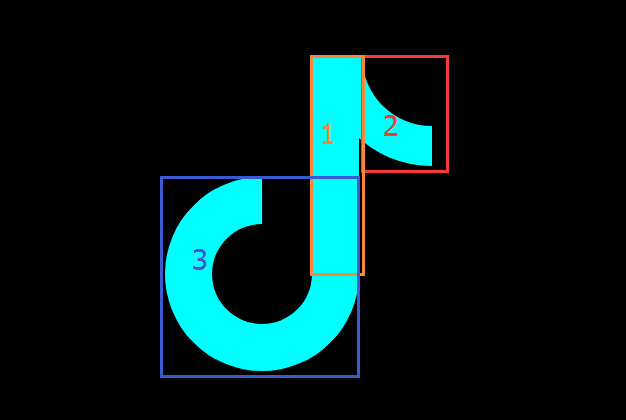
我们可以看到,它由三部分组成:
1、中间的竖线(矩形)
2、右上角的四分之一圆环(利用 border-radius 和 transform 旋转来实现)
3、左下角的四分之三圆环(利用 border-radius 和 transform 旋转来实现)
从上面的 logo,我们可以清晰的看到两个音符 ♪ 之间是有重叠部分的。这一块是通过mix-blend-mode属性实现的。
CSS3 新增了一个很有意思的属性 --
mix-blend-mode,其中 mix 和 blend 的中文意译均为混合,那么这个属性的作用直译过来就是混合混合模式,当然,我们我们通常称之为混合模式。
由此可以知道实现该 logo 的关键点在于:
- 主要借助伪元素实现了整体 J 结构,借助了 mix-blend-mode 实现融合效果
- 利用
mix-blend-mode: lighten混合模式实现两个 J 形结构重叠部分为白色
代码实现
html
<div class="g-container">
<div class="j">div>
<div class="j">div>
div>
css(scss)
body {
background: #000;
overflow: hidden;
}

.g-container {
position: relative;
width: 200px;
margin: 100px auto;
filter: contrast(150%) brightness(110%);
}

.j {
position: absolute;
top: 0;
left: 0;
width: 47px;
height: 218px;
z-index: 1;
background: #24f6f0;

  &::before {
content: "";
position: absolute;
width: 100px;
height: 100px;
border: 47px solid #24f6f0;
border-top: 47px solid transparent;
border-radius: 50%;
top: 121px;
left: -147px;
transform: rotate(45deg);
  }

  &::after {
content: "";
position: absolute;
width: 140px;
height: 140px;
border: 40px solid #24f6f0;
border-right: 40px solid transparent;
border-top: 40px solid transparent;
border-left: 40px solid transparent;
top: -110px;
right: -183px;
border-radius: 100%;
transform: rotate(45deg);
z-index: -10;
  }
}

.j:last-child {
left: 10px;
top: 10px;
background: #fe2d52;
z-index: 100;
mix-blend-mode: lighten;
animation: moveLeft 10s infinite;

  &::before {
border: 47px solid #fe2d52;
border-top: 47px solid transparent;
  }
  &::after {
border: 40px solid #fe2d52;
border-right: 40px solid transparent;
border-top: 40px solid transparent;
border-left: 40px solid transparent;
  }
}

@keyframes moveLeft {
  0% {
transform: translate(200px);
  }
  50% {
transform: translate(0px);
  }
  100% {
transform: translate(0px);
  }
}
具体可查看https://codepen.io/jack-cool-the-lessful/pen/poJvvVB
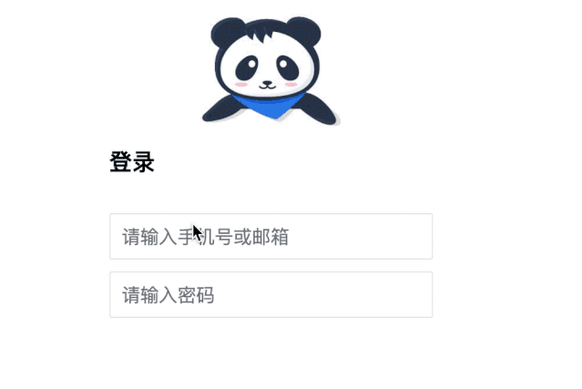
掘金登录特效
效果
思路
这里用到了平时不大可能会用到的:focus-within。
:focus-within 伪类选择器,它表示一个元素获得焦点,或,该元素的后代元素获得焦点。
这也就意味着,它或它的后代获得焦点,都可以触发 :focus-within。
深入了解可查看https://github.com/chokcoco/iCSS/issues/36
代码实现
html
<div class="g-container">
<h2>登录h2>
<div class="g-username">
<input name="loginPhoneOrEmail" maxlength="64" placeholder="请输入手机号或邮箱" class="input">
<img src="https://b-gold-cdn.xitu.io/v3/static/img/greeting.1415c1c.png" class="g-username">
div>

<div class="g-password">
<input name="loginPassword" type="password" maxlength="64" placeholder="请输入密码" class="input">
<img src="https://b-gold-cdn.xitu.io/v3/static/img/blindfold.58ce423.png" class="g-password">
div>

<img src="https://b-gold-cdn.xitu.io/v3/static/img/normal.0447fe9.png" class="g-normal">
div>
css(scss)
$bg-normal: "https://b-gold-cdn.xitu.io/v3/static/img/normal.0447fe9.png";
$bg-username: "https://b-gold-cdn.xitu.io/v3/static/img/greeting.1415c1c.png";
$bg-password: "https://b-gold-cdn.xitu.io/v3/static/img/blindfold.58ce423.png";

.g-container {
position: relative;
width: 318px;
margin: 100px auto;
height: 370px;
padding: 20px;
box-sizing: border-box;
background: #fff;
z-index: 10;

  h2 {
font-size: 20px;
font-weight: bold;
margin-bottom: 30px;
  }

input {
outline: none;
padding: 10px;
width: 100%;
border: 1px solid #e9e9e9;
border-radius: 2px;
outline: none;
box-sizing: border-box;
font-size: 16px;
  }
}

img {
position: absolute;
top: -20%;
left: 50%;
width: 120px;
height: 95px;
transform: translate(-50%, 0);
}

.g-username {
margin-bottom: 10px;

  img {
display: none;
width: 120px;
height: 113px;
  }
}

.g-username:focus-within ~ img {
display: none;
}

.g-username:focus-within {
  input {
border-color: #007fff;
  }
img {
display: block;
  }
}

.g-password {
margin-bottom: 10px;

  img {
display: none;
width: 103px;
height: 84px;
top: -15%;
  }
}

.g-password:focus-within ~ img {
display: none;
}

.g-password:focus-within {
  input {
border-color: #007fff;
  }
img {
display: block;
  }
}
具体可查看https://codepen.io/jack-cool-the-lessful/pen/VwLYYqz
波浪百分比
第一次见到这种效果好像还是在手机营业厅里面,展示剩余流量时。
不得不感叹,css 有时真的很强大。当然感觉这也属于 css 的奇技淫巧了。
效果
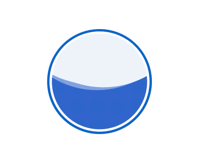
思路
这里我简单说明一下关键点:
- 利用
border-radius生成椭圆 - 让椭圆旋转起来
- 并不是利用旋转的椭圆本身生成波浪效果,而是利用它去切割背景,产生波浪的效果。
具体可参考https://zhuanlan.zhihu.com/p/28508128,里面分别提到了用svg、canvas和纯css来实现波浪效果。
我们这里是用纯css来实现的。
代码实现
html
<div class="container">
<div class="wave">div>
div>
css(scss)
.container {
position: absolute;
width: 200px;
height: 200px;
padding: 5px;
border: 5px solid rgb(0, 102, 204);
top: 50%;
left: 50%;
transform: translate(-50%, -50%);
border-radius: 50%;
overflow: hidden;
}
.wave {
position: relative;
width: 200px;
height: 200px;
background-color: rgb(51, 102, 204);
border-radius: 50%;

  &::before,
  &::after {
content: "";
position: absolute;
width: 400px;
height: 400px;
top: 0;
left: 50%;
background-color: rgba(255, 255, 255, 0.4);
border-radius: 45%;
transform: translate(-50%, -70%) rotate(0);
animation: rotate 6s linear infinite;
z-index: 10;
  }

  &::after {
border-radius: 47%;
background-color: rgba(255, 255, 255, 0.9);
transform: translate(-50%, -70%) rotate(0);
animation: rotate 10s linear -5s infinite;
z-index: 20;
  }
}

@keyframes rotate {
  50% {
transform: translate(-50%, -73%) rotate(180deg);
  }
  100% {
transform: translate(-50%, -70%) rotate(360deg);
  }
}
具体可查看https://codepen.io/jack-cool-the-lessful/pen/XWbJJLd
酷炫的充电动画
看完上面的波浪百分比动画,在此基础上我们来实现一个更为复杂的动画效果,也就是常见的充电动画。
效果
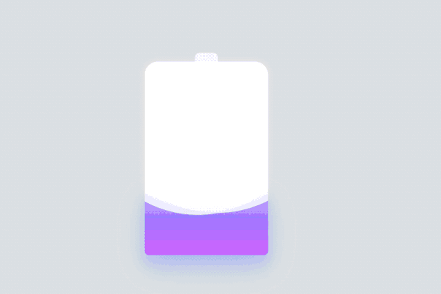
思路
- 画一个电池
- 增加阴影及颜色的变化(使用
filter: hue-rotate()对渐变色彩进行色彩过渡变换动画) - 添加波浪,这里用一张动图说明(结合上个
波浪百分比,相信你很快就明白了) 
代码实现
html
<div class="container">
<div class="header">div>
<div class="battery">
div>
<div class="battery-copy">
<div class="g-wave">div>
<div class="g-wave">div>
<div class="g-wave">div>
div>
div>
css(scss)
html,
body {
width: 100%;
height: 100%;
display: flex;
background: #e4e4e4;
}
.container {
position: relative;
width: 140px;
margin: auto;
}

.header {
position: absolute;
width: 26px;
height: 10px;
left: 50%;
top: 0;
transform: translate(-50%, -10px);
border-radius: 5px 5px 0 0;
background: rgba(255, 255, 255, 0.88);
}

.battery-copy {
position: absolute;
top: 0;
left: 0;
height: 220px;
width: 140px;
border-radius: 15px 15px 5px 5px;
overflow: hidden;
}

.battery {
position: relative;
height: 220px;
box-sizing: border-box;
border-radius: 15px 15px 5px 5px;
box-shadow: 0 0 5px 2px rgba(255, 255, 255, 0.22);
background: #fff;
z-index: 1;

  &::after {
content: "";
position: absolute;
left: 0;
right: 0;
bottom: 0;
top: 80%;
background: linear-gradient(
      to bottom,
      #7abcff 0%,
      #00bcd4 44%,
      #2196f3 100%
    );
border-radius: 0px 0px 5px 5px;
box-shadow: 0 14px 28px rgba(33, 150, 243, 0),
0 10px 10px rgba(9, 188, 215, 0.08);
animation: charging 10s linear infinite;
filter: hue-rotate(90deg);
  }
}

.g-wave {
position: absolute;
width: 300px;
height: 300px;
background: rgba(255, 255, 255, 0.8);
border-radius: 45% 47% 44% 42%;
bottom: 25px;
left: 50%;
transform: translate(-50%, 0);
z-index: 1;
animation: move 10s linear infinite;
}

.g-wave:nth-child(2) {
border-radius: 38% 46% 43% 47%;
transform: translate(-50%, 0) rotate(-135deg);
}

.g-wave:nth-child(3) {
border-radius: 42% 46% 37% 40%;
transform: translate(-50%, 0) rotate(135deg);
}

@keyframes charging {
  50% {
box-shadow: 0 14px 28px rgba(0, 150, 136, 0.83),
0px 4px 10px rgba(9, 188, 215, 0.4);
  }

  95% {
top: 5%;
filter: hue-rotate(0deg);
border-radius: 0 0 5px 5px;
box-shadow: 0 14px 28px rgba(4, 188, 213, 0.2),
0 10px 10px rgba(9, 188, 215, 0.08);
  }
  100% {
top: 0%;
filter: hue-rotate(0deg);
border-radius: 15px 15px 5px 5px;
box-shadow: 0 14px 28px rgba(4, 188, 213, 0),
0 10px 10px rgba(9, 188, 215, 0.4);
  }
}

@keyframes move {
  100% {
transform: translate(-50%, -160px) rotate(720deg);
  }
}
具体可查看https://codepen.io/jack-cool-the-lessful/pen/gOpbpaB
参考链接:
https://github.com/chokcoco/iCSShttps://github.com/chokcoco/CSS-Inspiration


 647
647


 被折叠的 条评论
为什么被折叠?
被折叠的 条评论
为什么被折叠?
 到【灌水乐园】发言


