


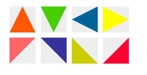
我们的网页因为 CSS 而呈现千变万化的风格。这一看似简单的样式语言在使用中非常灵活,只要你发挥创意就能实现很多比人想象不到的效果。特别是随着 CSS3 的广泛使用,更多新奇的 CSS 作品涌现出来。此处我们学习使用纯CSS打造三角形的样式。先前的文章是使用PS的形式。直接上DEMO图。
直接上代码:
HTML纯CSS绘制三角形(各种角度)ul li{list-style: none;float:left;width:100px;height:100px;background:#eee;margin:10px;}
#triangle-up {
width: 0;
height: 0;
border-left: 50px solid transparent;
border-right: 50px solid transparent;
border-bottom: 100px solid #ff5800;
}
#triangle-down {
width: 0;
height: 0;
border-left: 50px solid transparent;
border-right: 50px solid transparent;
border-top: 100px solid #47ce00;
}
#triangle-left {
width: 0;
height: 0;
border-top: 50px solid transparent;
border-right: 100px solid #006699;
border-bottom: 50px solid transparent;
}
#triangle-right {
width: 0;
height: 0;
border-top: 50px solid transparent;
border-left: 100px solid #FFFF00;
border-bottom: 50px solid transparent;
}
#triangle-top-left {
width: 0;
height: 0;
border-top: 100px solid #FF6666;
border-right: 100px solid transparent;
}
#triangle-top-right {
width: 0;
height: 0;
border-top: 100px solid #333399;
border-left: 100px solid transparent;
}
#triangle-bottom-left {
width: 0;
height: 0;
border-bottom: 100px solid #CCCC00;
border-right: 100px solid transparent;
}
#triangle-bottom-right {
width: 0;
height: 0;
border-bottom: 100px solid #FF0033;
border-left: 100px solid transparent;
}
相关友情链接:
时间可以治愈一颗受伤的心,同样也可以撕裂一颗等待的心.


 580
580


 被折叠的 条评论
为什么被折叠?
被折叠的 条评论
为什么被折叠?
 到【灌水乐园】发言


