


三列布局指的是两边两列定宽,中间的宽度自适应。
常用三种方法:
定位
浮动
弹性盒布局
定位方式
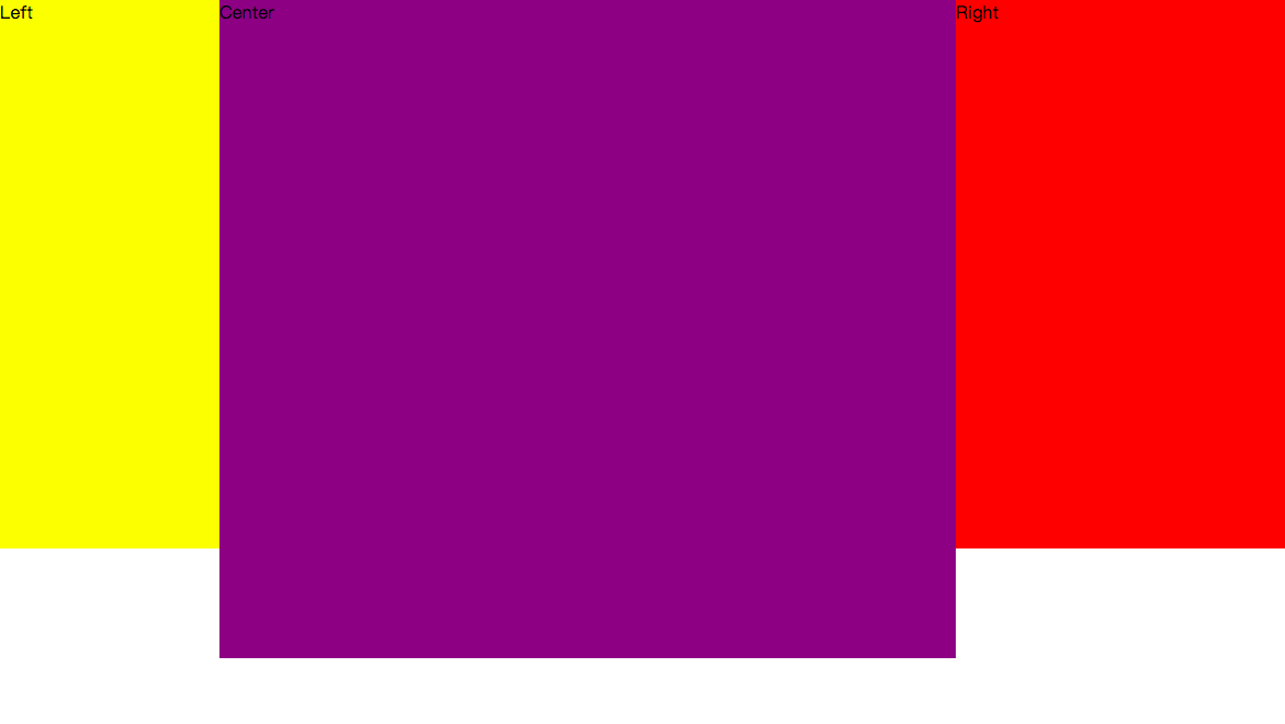
最直观和容易理解的一种方法,左右两栏选择绝对定位,固定于页面的两侧,中间的主体选择用margin确定位置
1
2
3
4
5
定位方法创建三列布局6
7 *{
8 margin: 0;
9 padding: 0;
10 }
11 .left{
12 width: 200px;
13 height: 500px;
14 background-color: yellow;
16 position: absolute; /* 绝对定位,使位置固定 */
17 left: 0;
18 top: 0;
19 }
20 .center{
21 height: 600px;
22 background-color: purple;
23 margin: 0 300px 0 200px; /* 通过外边距确定宽度 */
24 }
25 .right{
26 width: 300px;
27 height: 500px;
28 background-color: red;
30 position: absolute; /* 绝对定位,使位置固定 */
31 right: 0;
32 top: 0;
33 }
34
35
36
37
38
39
40
41
42
结果
浮动方法
让左右两边部分浮动,脱离文档流后对中间部分使用margin来自适应
1
2
3
4
5
浮动法创建三列布局6
7 *{
8 margin: 0;
9 padding: 0;
10 }
11 .left{
12 width: 200px;
13 height: 500px;
14 background-color: yellow;
15 float: left;
16 }
17 .center{
18 height: 600px;
19 background-color: purple;
20 margin: 0 300px 0 200px;
21 min-width: 100px; /* 最小宽度,防止浏览器缩小后中间部分被隐藏 */
22 }
23 .right{
24 width: 300px;
25 height: 500px;
26 background-color: red;
27 float: right;
28 }
29
30
31
32
33
34
35
36
弹性盒布局
使用容器包裹三栏,并将容器的display设置为flex,左右两部分宽度设置为固定,中间flex设置为1,左右两边的值固定,所以中间的自适应
1
2
3
4
5
弹性盒子创建三列布局6
7 *{
8 margin: 0;
9 padding: 0;
10 }
11 .container{
12 display: flex;
13 }
14 .left{
15 width: 200px;
16 height: 500px;
17 background-color: yellow;
18 }
19 .center{
20 height: 600px;
21 flex: 1;
22 background-color: purple;
23 }
24 .right{
25 width: 300px;
26 height: 500px;
27 background-color: red;
28 }
29
30
31
32
33
34
35
36
37
38


 3370
3370


 被折叠的 条评论
为什么被折叠?
被折叠的 条评论
为什么被折叠?
 到【灌水乐园】发言


