


Around September of 2016 I wrote two articles on using Python for accessing, visualizing, and evaluating trading strategies (see part 1 and part 2). These have been my most popular posts, up until I published my article on learning programming languages (featuring my dad’s story as a programmer), and has been translated into both Russian (which used to be on backtest.ru at alink that now appears to no longer work) and Chinese (here and here). R has excellent packages for analyzing stock data, so I feel there should be a “translation” of the post for using R for stock data analysis.
This post is the first in a two-part series on stock data analysis using R, based on a lecture I gave on the subject for MATH 3900 (Data Science) at the University of Utah. In these posts, I will discuss basics such as obtaining the data from Yahoo! Finance using pandas, visualizing stock data, moving averages, developing a moving-average crossover strategy, backtesting, and benchmarking. The final post will include practice problems. This first post discusses topics up to introducing moving averages.
NOTE: The information in this post is of a general nature containing information and opinions from the author’s perspective. None of the content of this post should be considered financial advice. Furthermore, any code written here is provided without any form of guarantee. Individuals who choose to use it do so at their own risk.
Introduction
Advanced mathematics and statistics have been present in finance for some time. Prior to the 1980s, banking and finance were well-known for being “boring”; investment banking was distinct from commercial banking and the primary role of the industry was handling “simple” (at least in comparison to today) financial instruments, such as loans. Deregulation under the Regan administration, coupled with an influx of mathematical talent, transformed the industry from the “boring” business of banking to what it is today, and since then, finance has joined the other sciences as a motivation for mathematical research and advancement. For example one of the biggest recent achievements of mathematics was the derivation of the Black-Scholes formula, which facilitated the pricing of stock options (a contract giving the holder the right to purchase or sell a stock at a particular price to the issuer of the option). That said, bad statistical models, including the Black-Scholes formula, hold part of the blame for the 2008 financial crisis.
In recent years, computer science has joined advanced mathematics in revolutionizing finance andtrading, the practice of buying and selling of financial assets for the purpose of making a profit. In recent years, trading has become dominated by computers; algorithms are responsible for making rapid split-second trading decisions faster than humans could make (so rapidly, the speed at which light travels is a limitation when designing systems). Additionally, machine learning and data mining techniques are growing in popularity in the financial sector, and likely will continue to do so. In fact, a large part of algorithmic trading is high-frequency trading (HFT). While algorithms may outperform humans, the technology is still new and playing an increasing role in a famously turbulent, high-stakes arena. HFT was responsible for phenomena such as the 2010 flash crashand a 2013 flash crash prompted by a hacked Associated Press tweet about an attack on the White House.
My articles, however, will not be about how to crash the stock market with bad mathematical models or trading algorithms. Instead, I intend to provide you with basic tools for handling and analyzing stock market data with R. We will be using stock data as a first exposure to time series data, which is data considered dependent on the time it was observed (other examples of time series include temperature data, demand for energy on a power grid, Internet server load, and many, many others). I will also discuss moving averages, how to construct trading strategies using moving averages, how to formulate exit strategies upon entering a position, and how to evaluate a strategy with backtesting.
DISCLAIMER: THIS IS NOT FINANCIAL ADVICE!!! Furthermore, I have ZERO experience as a trader (a lot of this knowledge comes from a one-semester course on stock trading I took at Salt Lake Community College)! This is purely introductory knowledge, not enough to make a living trading stocks. People can and do lose money trading stocks, and you do so at your own risk!
Getting and Visualizing Stock Data
Getting Data from Yahoo! Finance with quantmod
Before we analyze stock data, we need to get it into some workable format. Stock data can be obtained from Yahoo! Finance, Google Finance, or a number of other sources, and the quantmodpackage provides easy access to Yahoo! Finance and Google Finance data, along with other sources. In fact, quantmod provides a number of useful features for financial modelling, and we will be seeing those features throughout these articles. In this lecture, we will get our data from Yahoo! Finance.
# Get quantmod
if (!require("quantmod")) {
    install.packages("quantmod")
    library(quantmod)
}

start <- as.Date("2016-01-01")
end <- as.Date("2016-10-01")

# Let's get Apple stock data; Apple's ticker symbol is AAPL. We use the
# quantmod function getSymbols, and pass a string as a first argument to
# identify the desired ticker symbol, pass 'yahoo' to src for Yahoo!
# Finance, and from and to specify date ranges

# The default behavior for getSymbols is to load data directly into the
# global environment, with the object being named after the loaded ticker
# symbol. This feature may become deprecated in the future, but we exploit
# it now.

getSymbols("AAPL", src = "yahoo", from = start, to = end)
##     As of 0.4-0, 'getSymbols' uses env=parent.frame() and
##  auto.assign=TRUE by default.
##
##  This  behavior  will be  phased out in 0.5-0  when the call  will
##  default to use auto.assign=FALSE. getOption("getSymbols.env") and
##  getOptions("getSymbols.auto.assign") are now checked for alternate defaults
##
##  This message is shown once per session and may be disabled by setting
##  options("getSymbols.warning4.0"=FALSE). See ?getSymbols for more details.
## [1] "AAPL"
# What is AAPL?
class(AAPL)
## [1] "xts" "zoo"
# Let's see the first few rows
head(AAPL)
##            AAPL.Open AAPL.High AAPL.Low AAPL.Close AAPL.Volume
## 2016-01-04    102.61    105.37   102.00     105.35    67649400
## 2016-01-05    105.75    105.85   102.41     102.71    55791000
## 2016-01-06    100.56    102.37    99.87     100.70    68457400
## 2016-01-07     98.68    100.13    96.43      96.45    81094400
## 2016-01-08     98.55     99.11    96.76      96.96    70798000
## 2016-01-11     98.97     99.06    97.34      98.53    49739400
##            AAPL.Adjusted
## 2016-01-04     102.61218
## 2016-01-05     100.04079
## 2016-01-06      98.08303
## 2016-01-07      93.94347
## 2016-01-08      94.44022
## 2016-01-11      95.96942
Let’s briefly discuss this. getSymbols() created in the global environment an object called AAPL (named automatically after the ticker symbol of the security retrieved) that is of the xts class (which is also a zoo-class object). xts objects (provided in the xts package) are seen as improved versions of the ts object for storing time series data. They allow for time-based indexing and provide custom attributes, along with allowing multiple (presumably related) time series with the same time index to be stored in the same object. (Here is a vignette describing xts objects.) The different series are the columns of the object, with the name of the associated security (here, AAPL) being prefixed to the corresponding series.
Yahoo! Finance provides six series with each security. Open is the price of the stock at the beginning of the trading day (it need not be the closing price of the previous trading day), high is the highest price of the stock on that trading day, low the lowest price of the stock on that trading day, and close the price of the stock at closing time. Volume indicates how many stocks were traded. Adjusted close (abreviated as “adjusted” by getSymbols()) is the closing price of the stock that adjusts the price of the stock for corporate actions. While stock prices are considered to be set mostly by traders, stock splits (when the company makes each extant stock worth two and halves the price) and dividends (payout of company profits per share) also affect the price of a stock and should be accounted for.
Visualizing Stock Data
Now that we have stock data we would like to visualize it. I first use base R plotting to visualize the series.
plot(AAPL[, "AAPL.Close"], main = "AAPL")
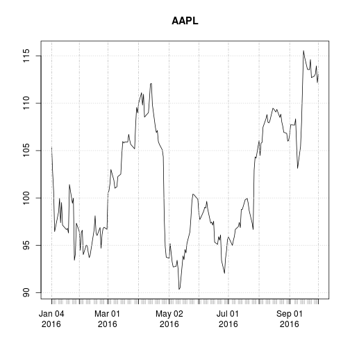
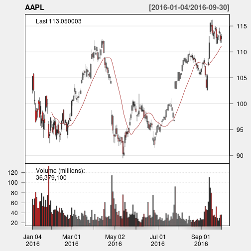
A linechart is fine, but there are at least four variables involved for each date (open, high, low, and close), and we would like to have some visual way to see all four variables that does not require plotting four separate lines. Financial data is often plotted with a Japanese candlestick plot, so named because it was first created by 18th century Japanese rice traders. Use the functioncandleChart() from quantmod to create such a chart.
candleChart(AAPL, up.col = "black", dn.col = "red", theme = "white")
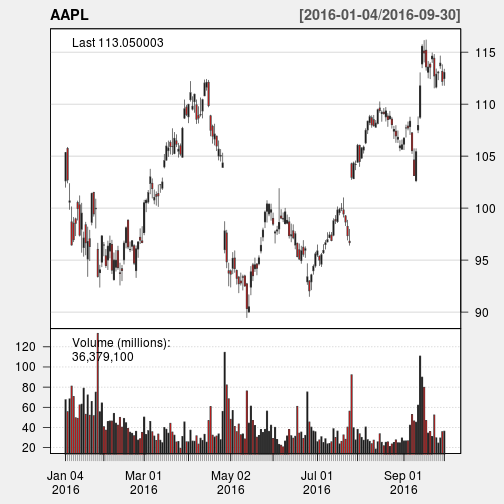
With a candlestick chart, a black candlestick indicates a day where the closing price was higher than the open (a gain), while a red candlestick indicates a day where the open was higher than the close (a loss). The wicks indicate the high and the low, and the body the open and close (hue is used to determine which end of the body is the open and which the close). Candlestick charts are popular in finance and some strategies in technical analysis use them to make trading decisions, depending on the shape, color, and position of the candles. I will not cover such strategies today.
(Notice that the volume is tracked as a bar chart on the lower pane as well, with the same colors as the corresponding candlesticks. Some traders like to see how many shares are being traded; this can be important in trading.)
We may wish to plot multiple financial instruments together; we may want to compare stocks, compare them to the market, or look at other securities such as exchange-traded funds (ETFs). Later, we will also want to see how to plot a financial instrument against some indicator, like a moving average. For this you would rather use a line chart than a candlestick chart. (How would you plot multiple candlestick charts on top of one another without cluttering the chart?)
Below, I get stock data for some other tech companies and plot their adjusted close together.
# Let's get data for Microsoft (MSFT) and Google (GOOG) (actually, Google is
# held by a holding company called Alphabet, Inc., which is the company
# traded on the exchange and uses the ticker symbol GOOG).
getSymbols(c("MSFT", "GOOG"), src = "yahoo", from = start, to = end)
## [1] "MSFT" "GOOG"
# Create an xts object (xts is loaded with quantmod) that contains closing
# prices for AAPL, MSFT, and GOOG
stocks <- as.xts(data.frame(AAPL = AAPL[, "AAPL.Close"], MSFT = MSFT[, "MSFT.Close"],
    GOOG = GOOG[, "GOOG.Close"]))
head(stocks)
##            AAPL.Close MSFT.Close GOOG.Close
## 2016-01-04     105.35      54.80     741.84
## 2016-01-05     102.71      55.05     742.58
## 2016-01-06     100.70      54.05     743.62
## 2016-01-07      96.45      52.17     726.39
## 2016-01-08      96.96      52.33     714.47
## 2016-01-11      98.53      52.30     716.03
# Create a plot showing all series as lines; must use as.zoo to use the zoo
# method for plot, which allows for multiple series to be plotted on same
# plot
plot(as.zoo(stocks), screens = 1, lty = 1:3, xlab = "Date", ylab = "Price")
legend("right", c("AAPL", "MSFT", "GOOG"), lty = 1:3, cex = 0.5)

What’s wrong with this chart? While absolute price is important (pricey stocks are difficult to purchase, which affects not only their volatility but your ability to trade that stock), when trading, we are more concerned about the relative change of an asset rather than its absolute price. Google’s stocks are much more expensive than Apple’s or Microsoft’s, and this difference makes Apple’s and Microsoft’s stocks appear much less volatile than they truly are (that is, their price appears to not deviate much).
One solution would be to use two different scales when plotting the data; one scale will be used by Apple and Microsoft stocks, and the other by Google.
plot(as.zoo(stocks[, c("AAPL.Close", "MSFT.Close")]), screens = 1, lty = 1:2,
    xlab = "Date", ylab = "Price")
par(new = TRUE)
plot(as.zoo(stocks[, "GOOG.Close"]), screens = 1, lty = 3, xaxt = "n", yaxt = "n",
    xlab = "", ylab = "")
axis(4)
mtext("Price", side = 4, line = 3)
legend("topleft", c("AAPL (left)", "MSFT (left)", "GOOG"), lty = 1:3, cex = 0.5)
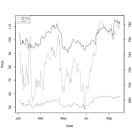
Not only is this solution difficult to implement well, it is seen as a bad visualization method; it can lead to confusion and misinterpretation, and cannot be read easily.
A “better” solution, though, would be to plot the information we actually want: the stock’s returns. This involves transforming the data into something more useful for our purposes. There are multiple transformations we could apply.
One transformation would be to consider the stock’s return since the beginning of the period of interest. In other words, we plot:

This will require transforming the data in the stocks object, which I do next.
# Get me my beloved pipe operator!
if (!require("magrittr")) {
    install.packages("magrittr")
    library(magrittr)
}
## Loading required package: magrittr
stock_return % t %>% as.xts

head(stock_return)
##            AAPL.Close MSFT.Close GOOG.Close
## 2016-01-04  1.0000000  1.0000000  1.0000000
## 2016-01-05  0.9749407  1.0045620  1.0009975
## 2016-01-06  0.9558614  0.9863139  1.0023994
## 2016-01-07  0.9155197  0.9520073  0.9791734
## 2016-01-08  0.9203607  0.9549271  0.9631052
## 2016-01-11  0.9352634  0.9543796  0.9652081
plot(as.zoo(stock_return), screens = 1, lty = 1:3, xlab = "Date", ylab = "Return")
legend("topleft", c("AAPL", "MSFT", "GOOG"), lty = 1:3, cex = 0.5)
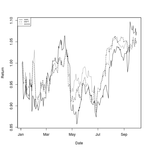
This is a much more useful plot. We can now see how profitable each stock was since the beginning of the period. Furthermore, we see that these stocks are highly correlated; they generally move in the same direction, a fact that was difficult to see in the other charts.
Alternatively, we could plot the change of each stock per day. One way to do so would be to plot the percentage increase of a stock when comparing day 


But change could be thought of differently as:

These formulas are not the same and can lead to differing conclusions, but there is another way to model the growth of a stock: with log differences.
 - \log(\text{price}_{t - 1})")
(Here, 
 - \log(\text{price}_{t - 1})")
 - \log(\text{price}_{t})")
We can obtain and plot the log differences of the data in stocks as follows:
stock_change % log %>% diff
head(stock_change)
##              AAPL.Close    MSFT.Close   GOOG.Close
## 2016-01-04           NA            NA           NA
## 2016-01-05 -0.025378648  0.0045516693  0.000997009
## 2016-01-06 -0.019763704 -0.0183323194  0.001399513
## 2016-01-07 -0.043121062 -0.0354019469 -0.023443064
## 2016-01-08  0.005273804  0.0030622799 -0.016546113
## 2016-01-11  0.016062548 -0.0005735067  0.002181138
plot(as.zoo(stock_change), screens = 1, lty = 1:3, xlab = "Date", ylab = "Log Difference")
legend("topleft", c("AAPL", "MSFT", "GOOG"), lty = 1:3, cex = 0.5)
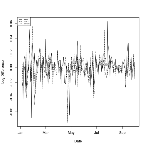
Which transformation do you prefer? Looking at returns since the beginning of the period make the overall trend of the securities in question much more apparent. Changes between days, though, are what more advanced methods actually consider when modelling the behavior of a stock. so they should not be ignored.
Moving Averages
Charts are very useful. In fact, some traders base their strategies almost entirely off charts (these are the “technicians”, since trading strategies based off finding patterns in charts is a part of the trading doctrine known as technical analysis). Let’s now consider how we can find trends in stocks.
A 


Moving averages smooth a series and helps identify trends. The larger
quantmod allows for easily adding moving averages to charts, via the addSMA() function.
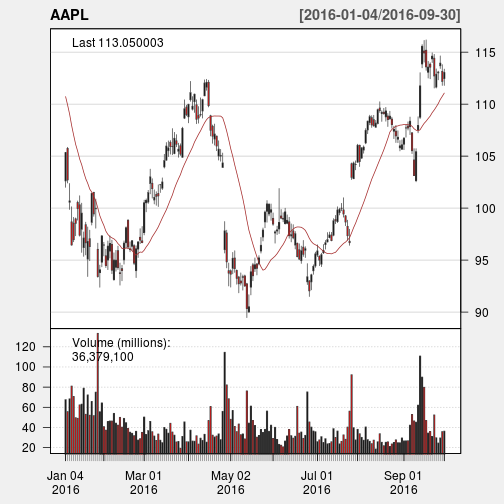
candleChart(AAPL, up.col = "black", dn.col = "red", theme = "white")
addSMA(n = 20)
Notice how late the rolling average begins. It cannot be computed until 20 days have passed. This limitation becomes more severe for longer moving averages. Because I would like to be able to compute 200-day moving averages, I’m going to extend out how much AAPL data we have. That said, we will still largely focus on 2016.
start = as.Date("2010-01-01")
getSymbols(c("AAPL", "MSFT", "GOOG"), src = "yahoo", from = start, to = end)
## [1] "AAPL" "MSFT" "GOOG"
# The subset argument allows specifying the date range to view in the chart.
# This uses xts style subsetting. Here, I'm using the idiom
# 'YYYY-MM-DD/YYYY-MM-DD', where the date on the left-hand side of the / is
# the start date, and the date on the right-hand side is the end date. If
# either is left blank, either the earliest date or latest date in the
# series is used (as appropriate). This method can be used for any xts
# object, say, AAPL
candleChart(AAPL, up.col = "black", dn.col = "red", theme = "white", subset = "2016-01-04/")
addSMA(n = 20)
You will notice that a moving average is much smoother than the actual stock data. Additionally, it’s a stubborn indicator; a stock needs to be above or below the moving average line in order for the line to change direction. Thus, crossing a moving average signals a possible change in trend, and should draw attention.
Traders are usually interested in multiple moving averages, such as the 20-day, 50-day, and 200-day moving averages. It’s easy to examine multiple moving averages at once.
candleChart(AAPL, up.col = "black", dn.col = "red", theme = "white", subset = "2016-01-04/")
addSMA(n = c(20, 50, 200))
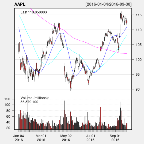
The 20-day moving average is the most sensitive to local changes, and the 200-day moving average the least. Here, the 200-day moving average indicates an overall bearish trend: the stock is trending downward over time. The 20-day moving average is at times bearish and at other timesbullish, where a positive swing is expected. You can also see that the crossing of moving average lines indicate changes in trend. These crossings are what we can use as trading signals, or indications that a financial security is changing direction and a profitable trade might be made.
Visit next week to read about how to design and test a trading strategy using moving averages.
# Package/system information
sessionInfo()
## R version 3.3.3 (2017-03-06)
## Platform: i686-pc-linux-gnu (32-bit)
## Running under: Ubuntu 15.10
##
## locale:
##  [1] LC_CTYPE=en_US.UTF-8       LC_NUMERIC=C
##  [3] LC_TIME=en_US.UTF-8        LC_COLLATE=en_US.UTF-8
##  [5] LC_MONETARY=en_US.UTF-8    LC_MESSAGES=en_US.UTF-8
##  [7] LC_PAPER=en_US.UTF-8 LC_NAME=C ## [9] LC_ADDRESS=C LC_TELEPHONE=C ## [11] LC_MEASUREMENT=en_US.UTF-8 LC_IDENTIFICATION=C ## ## attached base packages: ## [1] methods stats graphics grDevices utils datasets base ## ## other attached packages: ## [1] magrittr_1.5 quantmod_0.4-7 TTR_0.23-1 xts_0.9-7 ## [5] zoo_1.7-14 RWordPress_0.2-3 optparse_1.3.2 knitr_1.15.1 ## ## loaded via a namespace (and not attached): ## [1] lattice_0.20-34 XML_3.98-1.5 bitops_1.0-6 grid_3.3.3 ## [5] formatR_1.4 evaluate_0.10 highr_0.6 stringi_1.1.3 ## [9] getopt_1.20.0 tools_3.3.3 stringr_1.2.0 RCurl_1.95-4.8 ## [13] XMLRPC_0.3-0
转自:https://ntguardian.wordpress.com/2017/03/27/introduction-stock-market-data-r-1/


 541
541


 被折叠的 条评论
为什么被折叠?
被折叠的 条评论
为什么被折叠?
 到【灌水乐园】发言


