


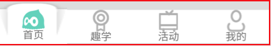
要实现下图这样的效果,请忽略红线。
本人的实现综指是以最少的代码来实现。

每一个tab使用自定义view.每个tab是由两个控件叠加的。没有选中的时候下面一层的背景为透明,选中的时候下面一层的背景为放大效果的图片。tab的上面一层的背景为白色。
tabLayout.setupWithViewPager(mViewPager);
for (int i = 0; i < tabLayout.getTabCount(); i++) {
    TabLayout.Tab tab = tabLayout.getTabAt(i);
    if(tab==null){
        continue;
    }
    View view = mSectionsPagerAdapter.getTabView(this,i);
    tab.setCustomView(view);
}
adapter
public class SectionsPagerAdapter extends FragmentPagerAdapter {
    private List<Fragment> mFragments = new ArrayList<>();
    private int[] imageResId = {
            R.drawable.bottom_button_index,
            R.drawable.bottom_button_study,
            R.drawable.bottom_button_activity,
            R.drawable.bottom_button_my
    };//图片资源
    private int[] titleResId = {
            R.string.bottom_button_index,
            R.string.bottom_button_study,
            R.string.bottom_button_activity,
            R.string.bottom_button_my
    };//标题资源
    public SectionsPagerAdapter(FragmentManager fm,Fragment... fragments) {
        super(fm);
        mFragments.addAll(Arrays.asList(fragments));
    }

    @Override
    public Fragment getItem(int position) {
        return mFragments.get(position);
    }

    @Override
    public int getCount() {
        // Show 3 total pages.
        return 4;
    }

    //加载自定义布局
    View getTabView(Context context, int position){
        View view = LayoutInflater.from(context).inflate(R.layout.bottom_button,null);
        ((ImageView) view.findViewById(R.id.bottom_button_img)).setImageDrawable(context.getResources().getDrawable(imageResId[position]));
        ((TextView) view.findViewById(R.id.bottom_button_title)).setText(context.getResources().getString(titleResId[position]));
        return view;
    }
}
每个tab的布局
<LinearLayout xmlns:android="http://schemas.android.com/apk/res/android"
    xmlns:app="http://schemas.android.com/apk/res-auto"
    xmlns:tools="http://schemas.android.com/tools"
    android:layout_width="match_parent"
    android:layout_height="match_parent"
    android:background="@drawable/bottom_button"
    android:orientation="vertical">
<!--外层的LinearLayout即为下面一层的放大区域,选中时设置放大的背景图。当然也可以用FrameLayout。里层的LinearLayout为按钮,背景为白色,选中时背景为绿色。
    <LinearLayout
        android:layout_width="match_parent"
        android:layout_height="match_parent"
        android:layout_marginTop="@dimen/tab_height_limit"//这里需要给放大的区域留一个空间,不然看不到放大的效果
        android:orientation="vertical"
        android:background="@drawable/bottom_button2">

        <ImageView
            android:id="@+id/bottom_button_img"
            android:layout_width="@dimen/tab_img_width"
            android:layout_height="@dimen/tab_img_width"
            android:layout_gravity="center_horizontal"
            android:scaleType="fitCenter"
            tools:src="@drawable/bottom_button_index" />

        <TextView
            android:id="@+id/bottom_button_title"
            android:layout_width="match_parent"
            android:layout_height="@dimen/bottom_btn_text_height"
            android:layout_gravity="bottom"
            android:gravity="bottom|center_horizontal"
            tools:text="@string/bottom_button_index" />
    </LinearLayout>
</LinearLayout>
外层的图片bottom_button.xml,选中时是放大的图片,不选中时是透明的

<?xml version="1.0" encoding="utf-8"?>
<selector xmlns:android="http://schemas.android.com/apk/res/android">
    <item android:drawable="@drawable/tab_selected_bg" android:state_selected="true" />
    <item android:drawable="@android:color/transparent" />
</selector>
里层的背景图片botton_button2.xml,选中时是透明的,不选中时白色的。
<selector xmlns:android="http://schemas.android.com/apk/res/android">
    <item android:drawable="@android:color/white" android:state_selected="false"  />
    <item android:drawable="@android:color/transparent" android:state_selected="true"  />
</selector>
这样就基本上实现了上述功能。不过你会发现第一个tab最开始是没有这种效果的。
不管你是设置
android:state_...="true"还是实现tabselectlistener,去手动更改背景图片也好。效果都不理想。
由此我在想 android:state_selected =true 是如何工作的?怎么样才叫selected?
最终我发现view中有一个方法叫setSelected(true),通过以下代码使第一个tab刚开始时实现我们的效果。
if (tabLayout.getSelectedTabPosition() == 0){
    tabLayout.getTabAt(0).getCustomView().setSelected(true);
}
由此不得不吐槽一下,既然 tabLayout.getSelectedTabPosition()==0,为啥还要我手动去设置selected效果。
还有viewpager刚开始时,也就是最初显示viewpager时也不触发onpageselected事件。就算你设置setcurrentitem(0)也没有用,因为现在就是显示的就是第0页。
最后再提一点就是,如果设置了tablayout的ontabselectedlistener,你会发现点击tab之后,viewpager不切换了,看一下源代码就知道为什么了。


 扫一扫
扫一扫
 465
465

 被折叠的 条评论
为什么被折叠?
被折叠的 条评论
为什么被折叠?
 到【灌水乐园】发言


