


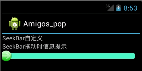
案例使用的图片如下:


1.在res/drawable目录下新增一个xml风格文件,seekbar_define_style.xml
xmlns:android="http://schemas.android.com/apk/res/android">
android:id="@android:id/background"
android:drawable="@drawable/hou"/>
android:id="@android:id/progress"
android:drawable="@drawable/qian"/>
android:id="@android:id/secondaryProgress"
android:drawable="@drawable/qian"/>
2.在res/drawable下定义个seekbar_thumb.xml文件
android:state_focused="true"
android:state_pressed="true"
android:drawable="@drawable/ic_launcher" />
android:state_focused="false"
android:state_pressed="false"
android:drawable="@drawable/orbino_icon_pack_006" />
android:state_focused="true"
android:state_pressed="false"
android:drawable="@drawable/ios" />
android:state_focused="true"
android:drawable="@drawable/ios"/>
3.在res/layut下定义布局资源文件seekbar_define.xml
android:layout_width="fill_parent"
android:layout_height="fill_parent"
>
android:layout_width="fill_parent"
android:layout_height="fill_parent"
android:orientation="vertical"
>
android:id="@+id/seekbar_tetview_one"
android:layout_width="wrap_content"
android:layout_height="wrap_content"
android:text="SeekBar自定义"
/>
android:id="@+id/seekbar_tetview_two"
android:layout_width="wrap_content"
android:layout_height="wrap_content"
android:text="SeekBar拖动时信息提示"
/>
android:layout_width="321px"
android:layout_height="wrap_content"
android:layout_centerInParent="true"
android:maxHeight="20px"
android:minHeight="20px"
android:paddingLeft="18px"
android:paddingRight="18px"
android:max="100"
android:progressDrawable="@drawable/seekbar_define_style"
android:thumb="@drawable/seekbar_thumb"
android:id="@+id/seekBar"/>
4.定义java文件通过 引用布局文件:
package com.test;
import android.R.integer;
import android.app.Activity;
import android.os.Bundle;
import android.os.Handler;
import android.os.Message;
import android.widget.SeekBar;
import android.widget.SeekBar.OnSeekBarChangeListener;
import android.widget.TextView;
public class SeekBarDemo_DefineDemo extends Activity {
private SeekBar seekBar;
private TextView textView_one, textView_two;
@Override
protected void onCreate(Bundle savedInstanceState) {
super.onCreate(savedInstanceState);
setContentView(R.layout.seekbar_define);
seekBar = (SeekBar) findViewById(R.id.seekBar);
textView_one = (TextView) findViewById(R.id.seekbar_tetview_one);
textView_two = (TextView) findViewById(R.id.seekbar_tetview_two);
seekBar.setOnSeekBarChangeListener(seekbarChangeListener);
}
private OnSeekBarChangeListener seekbarChangeListener = new OnSeekBarChangeListener() {
// 停止拖动时执行
@Override
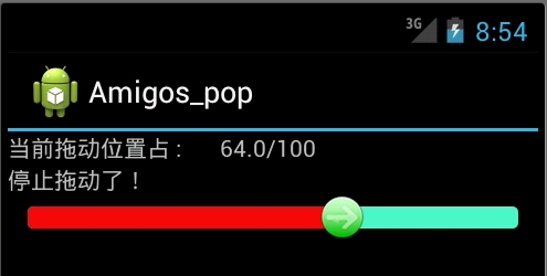
public void onStopTrackingTouch(SeekBar seekBar) {
// TODO Auto-generated method stub
textView_two.setText("停止拖动了!");
}
// 在进度开始改变时执行
@Override
public void onStartTrackingTouch(SeekBar seekBar) {
// TODO Auto-generated method stub
textView_two.setText("进度开始改变");
}
// 当进度发生改变时执行
@Override
public void onProgressChanged(SeekBar seekBar, int progress,
boolean fromUser) {
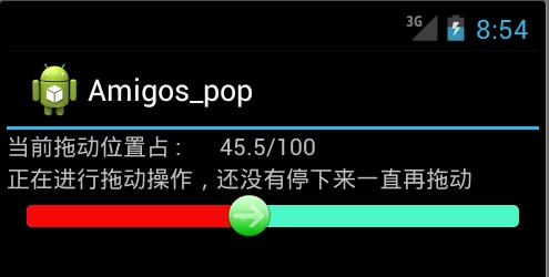
textView_two.setText("正在进行拖动操作,还没有停下来一直再拖动");
Message message = new Message();
Bundle bundle = new Bundle();// 存放数据
float pro = seekBar.getProgress();
float num = seekBar.getMax();
float result = (pro / num) * 100;
bundle.putFloat("key", result);
message.setData(bundle);
message.what = 0;
handler.sendMessage(message);
}
};
/**
* 用Handler来更新UI
*/
private Handler handler = new Handler() {
@Override
public void handleMessage(Message msg) {
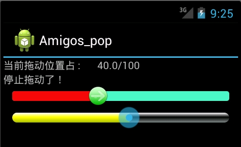
textView_one.setText("当前拖动位置占 : "
+ msg.getData().getFloat("key") + "/100");
}
};
}
最后执行效果:
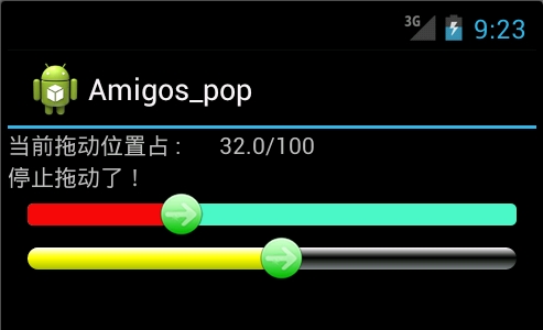
二:使用颜色显示,和尚面是一样的,只有我们定义颜色资源来替代图片资源文件seekbar_define_color_style.xml:如下:
android:paddingTop="3px"
android:paddingBottom="3px">
android:startColor="#ffffffff"
android:centerColor="#ff000000"
android:endColor="#ff808A87"
android:centerY="0.45"
android:angle="270"/>
android:paddingTop="3px"
android:paddingBottom="3px" >
android:startColor="#ffffffff"
android:centerColor="#ffFFFF00"
android:endColor="#ffAABD00"
android:centerY="0.45"
android:angle="270"/>
之后再SeekBar标签使用如下属性进行引入:其他保持不变
android:progressDrawable="@drawable/seekbar_define_color_style"
执行效果:
由于SeekBar的属性thumb引入了自定义的seekbar_thumb.xml文件,拖动图标是我们自定义的图片:除去这个属性
android:thumb="@drawable/seekbar_thumb"
就回复系统默认状态效果最后效果如下:
我们可以通过颜色值再次休息seekbar_thumb.xml文件,使拖动按钮设置成自定义颜色:


 633
633


 被折叠的 条评论
为什么被折叠?
被折叠的 条评论
为什么被折叠?
 到【灌水乐园】发言


